Difference between revisions of "ISSS608 2016-17 T3 Assign Jan Patrick Mabilangan Insight"
| Line 161: | Line 161: | ||
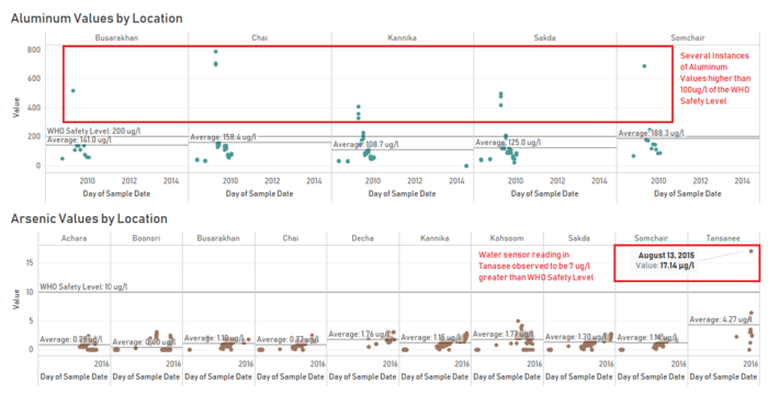
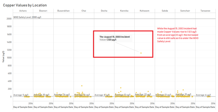
Figure 3.2b shows the measures with the prescribed safety levels as a reference line. From it, we can see values for the different measures have exceeded the safety levels multiple times in different locations, causing additional wellbeing concerns to the waterways situation. | Figure 3.2b shows the measures with the prescribed safety levels as a reference line. From it, we can see values for the different measures have exceeded the safety levels multiple times in different locations, causing additional wellbeing concerns to the waterways situation. | ||
</td> | </td> | ||
| − | <td>[[File: | + | <td>[[File:3.2a.PNG|500px|center]] |
| + | [[File:3.2b_rb.png|700px|center]] | ||
| + | [[File:3.2b_(co)_br.png|700px|center]]</td> | ||
</tr> | </tr> | ||
<tr> | <tr> | ||
| Line 169: | Line 171: | ||
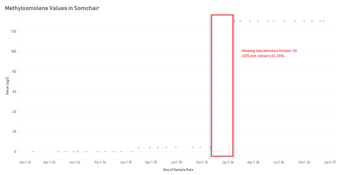
This is where sampling ties in with understanding. If data were present on the gap, the Hydrology Department would have been alerted earlier of the existence of the toxic chemical, be able to monitor the growth of the values – either abrupt or gradual, and possibly respond sooner to the situation. | This is where sampling ties in with understanding. If data were present on the gap, the Hydrology Department would have been alerted earlier of the existence of the toxic chemical, be able to monitor the growth of the values – either abrupt or gradual, and possibly respond sooner to the situation. | ||
</td> | </td> | ||
| − | <td>[[File: | + | <td>[[File:3.3 rb.png|700px|center]]</td> |
</tr> | </tr> | ||
</table> | </table> | ||
Revision as of 11:51, 8 July 2018
ISSS608_2017-18_T3_Assign_Jan_Patrick_Mabilangan_Gosioco
Visualizations and Insights
Chemical Trends
| Patterns | Visualization |
|---|---|
| 1. General Pattern across the Years
An overview of the water sensor readings across the years will give us a starting point and rough idea of how the waterways are faring.
|
|
| 2. Measure Insight - Aluminum Contamination
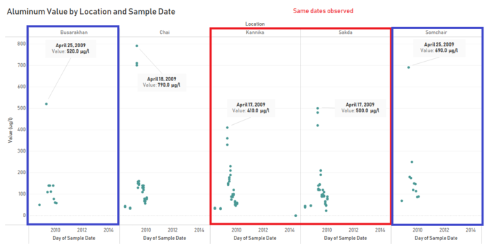
Water sensor readings have shown Aluminum to be present in 2008-2010 in 2 of the waterways: from Busarakha, Chai, to Kannika and from Somchair to Sakda. In all 5 of the locations, Aluminum value rose to over 400 ug/l in the month of April 2009. Aluminum values were observed to be the greatest in April 17, 18, and 25, all within the span of a week and occurring on the same day for pairs of the locations. |
|
| 3. Measure Insight - Total Chlorodine and Hardness Groups
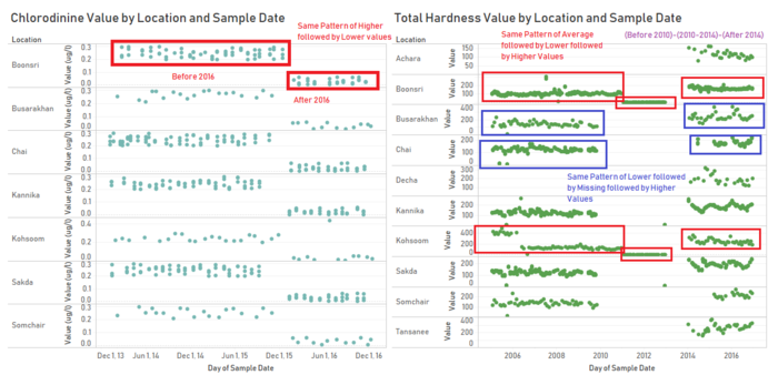
Total Hardness and Chlorodinine have been observed to have very distinct group of values before and after a certain period across the locations in the waterway.
|
|
| 4. Measure Insight - Growing presence of Arsenic
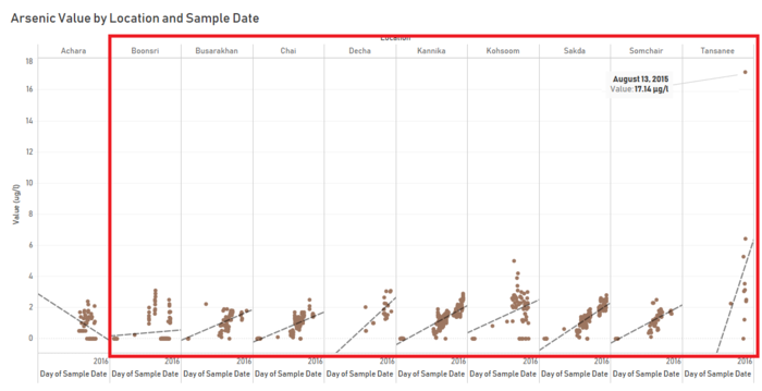
In figure 1.4, Arsenic has been observed to have increasing value in the recent years across most of the locations in the reserve and as far is the data is concerned, has shown no signs of stopping. Further investigation as to the possible cause of such continuous growth would be advised as to keep it from getting into dangerous levels. |
|
| 5. Location Insight - Kohsoom Fecal Fears
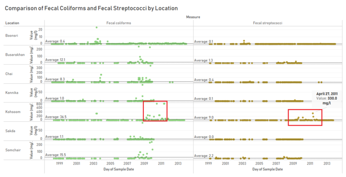
While several of the locations have their share of fecal coliforms, possibly excrements of the wildlife in the area, Kohsoom has significantly more traces of fecal streptococci, peaking at 330mg/l in April 27, 2011, seen in figure 1.5. Streptococci is a strain of bacteria that can cause urinary tract infections, meningitis, and respiratory infections to animals. While the values for the measures have dropped ever since, it would be wise to further study the contamination event, as the bacteria present in the animal feces is indicative of the animal’s health and they may have indeed been infected at the time. |
|
| 6. Location Insight - November 22, 2014 in Tanasee
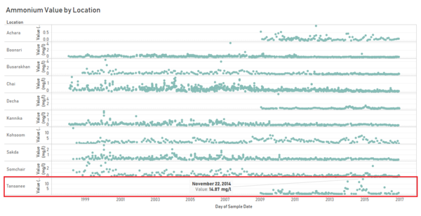
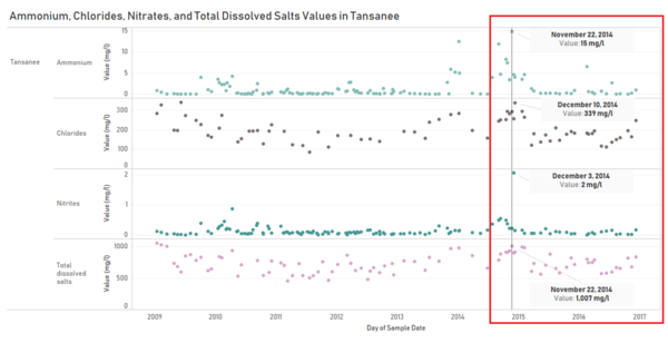
As seen in the figure 1.6A, among the locations, Tanasee was observed to have a recent period of high ammonium that peaked with 15 mg/l on November 22, 2014. After examining the rest of the data for Tanasee around that date, figure 1.6B shows that Chlorides, Nitrites, and Total Dissolved Salts have also been shown to have the same pattern of heightened increase. This suggests that contamination may have occurred prompting the increased values for the measures. |
|
| 7. The incident of August 15, 2003
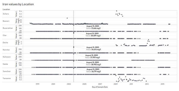
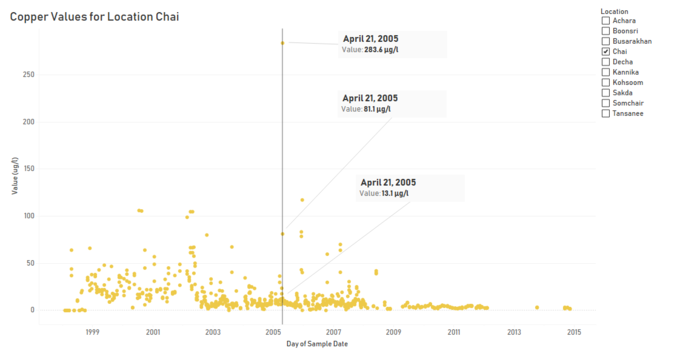
After earlier identifying Iron as having the top value of all the measures that were read, figure 1.8A was created to see the trend of Iron across all locations. With the exception of Achara, Decha, and Tanasee, locations that have just recently had traces of Iron, Iron had been consistently low for Boonsri, Busarakhan, Chai, Kannika, Kohsoom, Sakda, and Somchair. However, a spike in the value of Iron is observed among the latter group of locations. On average, without the spike, Iron values for these group of locations is around 1 mg/l. For Boonsri, the value had jumped to 30mg/l on October 15, 2002, 30 times more. For the rest of the locations, all having the spike on the same day, August 15, 2003, the value had reached 5 digits ranging from 17,970 in Chai to 37,959 in Kohsoom. Taking the sum of the values on the spike, the iron observed on the day accounts for 99.07% of total iron values collected from the reserve. Investigating further on August 15, 2003, figure 1.8C shows that values for Chromium and Copper have also spiked during the same day for the locations. This is especially true for Kohsoom, having the peak of all 3 measures on the same day. While we cannot say entirely for certain the cause, the correlation of such values seem to suggest a contamination incident around the said date. |
Dataset Anomalies
| Patterns | Visualization |
|---|---|
| 1. Multiple Readings and Varying Values
As seen in figure 2.1A, several waterway sensor readings were taken for the same measure on the same day and the same location. The dataset did not specify whether these readings were from different sensors in the same location, a retake on the reading at a different time, or some error on data collection. Regardless of the case, such readings could affect the accuracy of analysis as there are instances, such as those in figure 2.1B, where the values greatly differ. Taking one or the other or an average for multiple of these values would influence the correctness of interpretation. |
|
| 2. Incomplete Location Data
The waterway sensor readings data collection starts differently for the locations, making it especially difficult to compare the last three with the rest of the locations. The Gantt chart in figure 2.2 highlights the beginning of data collection for each location.
|
|
| 3. Missing data for specific years
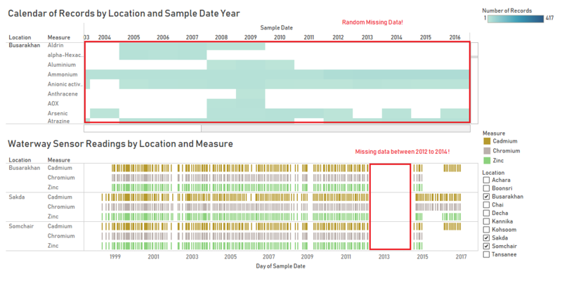
Aside from data not being present initially, there are also missing data in throughout he years for measures that are seemingly consistent. Such gaps can occur consistently across locations and measures, such as those between 2012 and 2014 in the example of figure 2.3B. But there are also those that have no particular pattern such as those found earlier in figure 1.1C. Missing data would best be rectified to have a complete historical view of the waterways to examine. |
|
| 4. Inconsistent Frequency of Data Collection
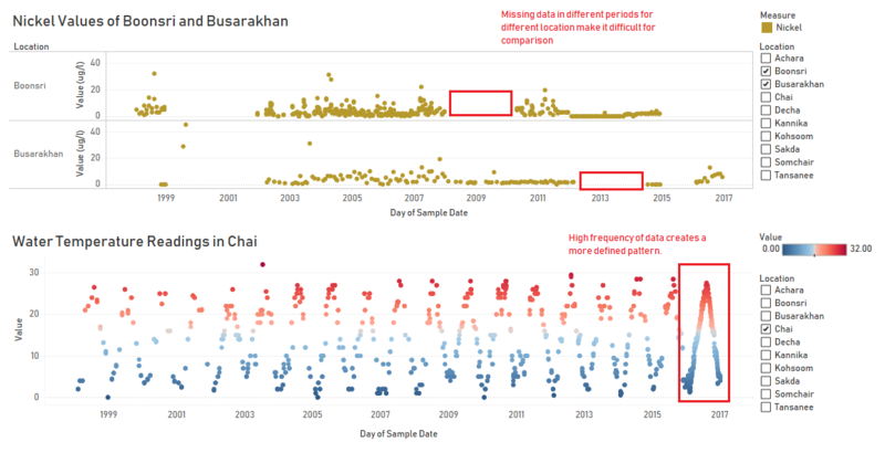
Inconsistent frequency of data collection, like those in figure 2.4, make it difficult to compare measure values between locations and form distinct patterns, since values in one measure may be frequent enough to form a line, while values in another may be infrequent enough to just form some points. Increasing the frequency of data collection will allow the Hydrology Department to have a much clearer understanding of the data. In figure 2.4b, the increased frequency of recording for water temperature in location Chai in 2016 has lead to a more defined increase, peak, and decrease. |
Wildlife Hazard
| Patterns | Visualization |
|---|---|
| 1. Methylosmolene Found
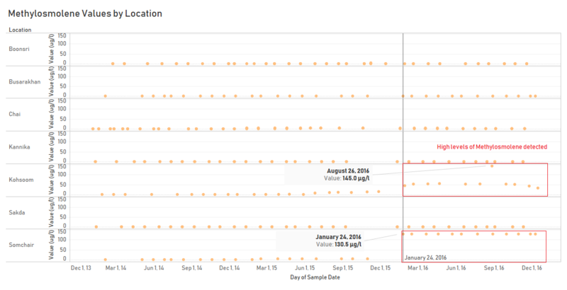
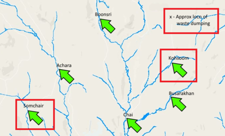
While soil samples taken from the dumping site have been inconclusive in detecting Methylosmolene (the toxic manufacturing chemical that was suspected to have been dumped by Kasios), figure 3.1a shows that the chemical has made its way to the waterways of the preserve. While traces of Methylosmolene have been present in 2014 in multiple locations, a significant increase in value is observed in Kohsoom and Somchair starting January of 2016. For Kohsoom, the value had started off gradual at around 50 ug/l, had spiked to 145 ug/l on August 26, 2016, and then gone back down to 50 ug/l afterwards. For Somchair, the value had been consistent 130.5 ug/l. Considering the location of the Kohsoom in relation to the approximate location of waste dumping, seen in figure 3.1b, it may not be as far a stretch to say that the recent excavation and building activities going on is a cover-up for Kasios to dump the soil into the waterways. Since Somchair is further away, the consistent 130.5 ug/l may be the work of a vehicle with a consistent load limit. Of course, this is but a speculation. While the true source of the measure may not be determined until further investigation, the existence of Methylosmolene in the waters of the preserve causes danger to the wildlife. |
|
| 2. Other Toxins and their Safety Levels
Aside from Methylosmolene and Fecal Streptococcus that have already previously been shown to be hazardous to wildlife, other measures in Section 1 General Pattern across the Years are also toxic given the excessive amounts observed. The table in figure 3.2a recaps the measures, their potential health effects, and prescribed safety levels. Data for the table was taken from the Water Quality Association International Headquarters and Laboratory.(https://www.wqa.org/learn-about-water/common-contaminants) Figure 3.2b shows the measures with the prescribed safety levels as a reference line. From it, we can see values for the different measures have exceeded the safety levels multiple times in different locations, causing additional wellbeing concerns to the waterways situation. |
|
| 3. Sampling and Understanding
Figure 3.3 shows the Methylosmoline values across all years, focused on the location Somchair. From this, we can see that there is missing data between October 2015 and January 2016. This is where sampling ties in with understanding. If data were present on the gap, the Hydrology Department would have been alerted earlier of the existence of the toxic chemical, be able to monitor the growth of the values – either abrupt or gradual, and possibly respond sooner to the situation. |

