Difference between revisions of "ISSS608 2016-17 T3 Assign Chen Fan Data Preparation"
(Created page with "<div style=background:#2B3856 border:#A3BFB1> 250px <font size = 5; color="#FFFFFF">VAST Challenge 2018:Like a Duck to Water</font> </div> <!--MAIN HEA...") |
|||
| Line 25: | Line 25: | ||
<br/> | <br/> | ||
| − | + | <font size="5"><font color="#8B4513">'''Finding Clues'''</font></font> | |
| + | |||
| + | We want to see the change between the past and most recent situation, so we can conduct heat map to do the visualization analysis. Firstly we can see the overall trend of all the chemical contaminants and then input another variable location to see in different location, whether we can see different changes. And the second way to do the visualization is to use the geo-map, which can give us a more direct visualization. | ||
| + | |||
| + | ==Processing Confusing Clues== | ||
| + | <table> | ||
| + | <table border='1'> | ||
| + | <tr> | ||
| + | <th>Description</th> | ||
| + | <th>Illustration</th> | ||
| + | </tr> | ||
| + | <tr> | ||
| + | <td><b> 1.Overview of the measures by year </b> | ||
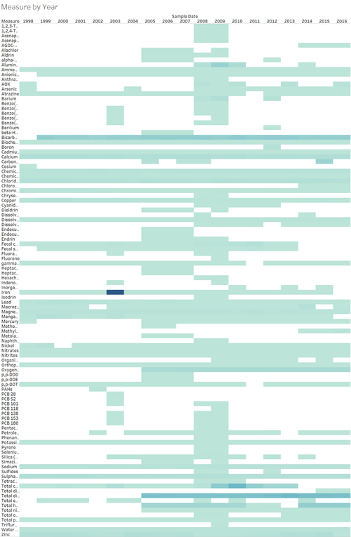
| + | <br>The measure values are changing in different year, trends can be spotted by making a chart of measure against year.It's an overview and an easily spotted dark blue can been observed in Iron. The value is extremely high</td> | ||
| + | <td>[[File:IronRevised1.png|500px|center]]</td> | ||
| + | </tr> | ||
| + | |||
| + | <tr> | ||
| + | <td><b> 2. Handling the abnormal data </b> | ||
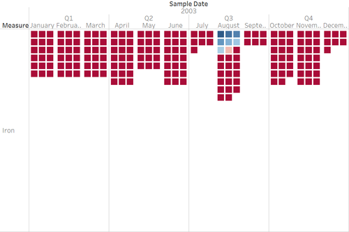
| + | <br>By further exploring the details of the data, the abnormal data are collected in the same day and these high values(highlighted in red) can't happen in the real world, these error data can be deleted because we using the average value, so it will not much influence our analysis. | ||
| + | </td> | ||
| + | <td>[[File:dataerror.png|500px|center]]</td> | ||
| + | </tr> | ||
| + | |||
| + | <tr> | ||
| + | <td><b> 3. Preparing the data for heat map </b> | ||
| + | <br>For each measure, calculate the percentile. | ||
| + | </td> | ||
| + | <td>[[File:dataerror.png|500px|center]]</td> | ||
| + | </tr> | ||
| + | ==Finding Useful Clues== | ||
Revision as of 12:24, 7 July 2018
|
|
|
|
|
Finding Clues
We want to see the change between the past and most recent situation, so we can conduct heat map to do the visualization analysis. Firstly we can see the overall trend of all the chemical contaminants and then input another variable location to see in different location, whether we can see different changes. And the second way to do the visualization is to use the geo-map, which can give us a more direct visualization.
Processing Confusing Clues
Finding Useful Clues
| Description | Illustration |
|---|---|
| 1.Overview of the measures by year
The measure values are changing in different year, trends can be spotted by making a chart of measure against year.It's an overview and an easily spotted dark blue can been observed in Iron. The value is extremely high |
|
| 2. Handling the abnormal data
|
|
| 3. Preparing the data for heat map
|


