Difference between revisions of "Group09 Report"
Zyyang.2017 (talk | contribs) |
Ycchen.2017 (talk | contribs) |
||
| Line 89: | Line 89: | ||
|| | || | ||
[[File:Group9 2.jpg|600px|left]]<br> | [[File:Group9 2.jpg|600px|left]]<br> | ||
| + | <br> | ||
<br>After processing:<br> | <br>After processing:<br> | ||
| + | <br> | ||
[[File:Group9_table4.png|600px|left]]<br> | [[File:Group9_table4.png|600px|left]]<br> | ||
[[File:Group9_table5.png|600px|left]]<br> | [[File:Group9_table5.png|600px|left]]<br> | ||
| Line 109: | Line 111: | ||
===Methodology=== | ===Methodology=== | ||
| − | ====Centrality==== | + | ====Centrality==== |
The centrality of a node / edge measures how central (or important) is a node or edge in the network.<br> | The centrality of a node / edge measures how central (or important) is a node or edge in the network.<br> | ||
| Line 132: | Line 134: | ||
| − | ====Community Detection==== | + | ====Community Detection==== |
Commonly, there are two ways of doing community detection on networks, one relies on the clustering algorithm, the other relies on network structure (graph typology). We have tried k-means clustering and pam clustering algorithm to perform community detection, and both of them work not well on our data, one possible reason is there are only three attributes can be used for clustering. Hence, we choose modularity detection algorithms, which are embedded in R package “igraph” to perform community detection.<br> | Commonly, there are two ways of doing community detection on networks, one relies on the clustering algorithm, the other relies on network structure (graph typology). We have tried k-means clustering and pam clustering algorithm to perform community detection, and both of them work not well on our data, one possible reason is there are only three attributes can be used for clustering. Hence, we choose modularity detection algorithms, which are embedded in R package “igraph” to perform community detection.<br> | ||
| Line 140: | Line 142: | ||
| − | ====Purpose of Applying Above Algorithms==== | + | ====Purpose of Applying Above Algorithms==== |
For researchers, they would like to explore the data with their domain knowledge, we offer such algorithms as alternative options for them to explore the relationships between diseases and symptoms from unrelated but still scientific perspectives. To make the algorithm result more readable for users without knowing graph theory, we calculate the mean of the clustering score as the network score for the user to choose. The higher the score, the better the algorithm works. The score indicates how reliable the clustering algorithm is.<br> | For researchers, they would like to explore the data with their domain knowledge, we offer such algorithms as alternative options for them to explore the relationships between diseases and symptoms from unrelated but still scientific perspectives. To make the algorithm result more readable for users without knowing graph theory, we calculate the mean of the clustering score as the network score for the user to choose. The higher the score, the better the algorithm works. The score indicates how reliable the clustering algorithm is.<br> | ||
Latest revision as of 18:53, 14 August 2018
| Overview | Proposal | Poster | Application | Report |
Contents
Introduction
Infectious diseases are caused by pathogenic microorganisms, such as bacteria, viruses, parasites or fungi; the diseases can be spread, directly or indirectly, from person to person, even from animals to humans. Zoonotic diseases are infectious diseases of animals that can cause disease when transmitted to humans.
The 21st century has already been marked by major epidemics. Old diseases - cholera, plague and yellow fever - have returned, and new ones have emerged - SARS, pandemic influenza, MERS, Ebola and Zika. These epidemics and their impact on global public health are quite remarkable.
Although disease patterns change constantly, communicable diseases remain the leading cause of mortality and morbidity in the least and less developed countries. Despite decades of economic growth and development in countries that belong to the World Health Organization (WHO) South-East Asia Region, most countries in this region still have a high burden of communicable diseases. This raises some urgent concerns. The first is that despite policies and interventions to prevent and control communicable diseases, most countries have failed to eradicate vaccine-preventable diseases. Second, sustainable financing to scale up interventions is lacking, especially for emerging and re-emerging diseases that can produce epidemics.
Objectives and Motivations
Diseases are prevalent no matter in which society, whilst, as the economy developing, healthcare becomes the major concern in daily life. Recently, there are still a lot of contagious diseases such as TB, malaria, cholera and meningitis, influenza A(H5N1) virus (avian flu), severe acute respiratory syndrome(SARS) and chikungunya reach high epidemic proportions in some countries, especially in developing countries. Thus, we want to apply visual analytics techniques to analyze historical records of seven contagious diseases: Smallpox, Rubella, Hepatitis, Measles, Polio, Mumps, Pertussis from US 1916-2010 and medical records of diseases and their corresponding symptoms. It can help us to find out patterns from these historical typical contagious diseases and apply to other diseases.
Scientific methods align with a huge amount of reliable researches always come out with the convincing and inspiring result. we intend to use a large-scale biomedical literature database to construct a symptom-based human disease network and investigate the connections with related diseases.
Nonetheless, this project also serves following purposes: 1) provide exploratory analysis of datasets; 2) aid domain experts seek for unexpected association among diseases as well as validate their research results; 3) bridge the gap between knowledge obtained by experts only as well as produced at the lab bench and its use at the clinical bedside; 4) non-specialists can gain straightforward and useful information (e.g. which symptom suspiciously causes a specific contagious disease) from the application.
Previous Work
Summary
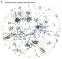
In human symptoms-disease [3], previous researchers used a large-scale biomedical literature database constructing a symptom-based human disease network and investigate the connection between clinical manifestations of diseases and their underlying molecular interactions. They demonstrated the similarity of two diseases correlates strongly with the number of shared symptoms.
Their research starts from crawling large-scale bibliographic records PubMed, they used its related Medical Subject Headings (MeSH) to extract symptom terms and disease terms from the bibliographies and applied text analysis techniques to generate co-occurrence and to calculate the TF-IDF score of each pair of symptoms and diseases. The dataset after their processing contains hundreds of diseases and thousands of symptoms.
Shortages
- It is very difficult to see the trend and spread area for those public users without any domain knowledge.
- Previous symptoms-disease network contains the majority of human diseases, the relationship among diseases and symptoms is obscured with such a large amount of data.
- Their data source is crawling medical reports from medical websites, as they have mentioned, the number of reports is less than the real incidences.
To improve, we obtain contagious disease records from Kaggle, which records the number of contagious incidence in US from 1916 to 2010.
Data process
Dataset Overview
|
Table |
Description |
|
Table 1: |
|
|
Table 2: |
|
|
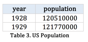
Table 3: |
Data Wrangling
|
Step |
Procedure |
|
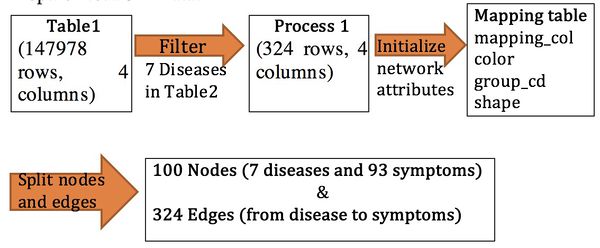
Step1: Prepare Network Data |
|
|
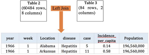
Step 2: Prepare Analysis Data |
- Calculated fields:
Filter the disease count > 1
Real cases = sum of cases
Real_rate = sum of cases / population
Estimated = (estimated_per_capita/100000) *Population
Estimated_rate = estimated sum of (incidence_per_capita/52)
Decade is calculated by per 10 years
Methodology
Centrality
The centrality of a node / edge measures how central (or important) is a node or edge in the network.
Betweenness centrality of node is given by the expression
where is the total number of shortest paths from node s to node t and is the number of those paths that pass through.
Closeness centrality of a node is a measure of centrality in a network, calculated as the reciprocal of the sum of the length of the shortest paths between the node and all other nodes in the graph. Thus, the more central a node is, the closer it is to all other nodes.
where d(x,y) is the distance between vertices x and y. When speaking of closeness centrality, people usually refer to its normalized form which represents the average length of the shortest paths instead of their sum. It is generally given by the previous formula multiplied by N-1, where N is the number of nodes in the graph. For large graphs this difference becomes inconsequential so the -1 is dropped resulting in:
This adjustment allows comparisons between nodes of graphs of different sizes.
Taking distances from or to all other nodes is irrelevant in undirected graphs, whereas it can produce totally different results in directed graphs (e.g. a website can have a high closeness centrality from an outgoing link, but low closeness centrality from incoming links).
Eigenvector centrality is a measure of the influence of a node in a network. Relative scores are assigned to all nodes in the network based on the concept that connections to high-scoring nodes contribute more to the score of the node in question than equal connections to low-scoring nodes. A high eigenvector score means that a node is connected to many nodes who themselves have high scores.
Community Detection
Commonly, there are two ways of doing community detection on networks, one relies on the clustering algorithm, the other relies on network structure (graph typology). We have tried k-means clustering and pam clustering algorithm to perform community detection, and both of them work not well on our data, one possible reason is there are only three attributes can be used for clustering. Hence, we choose modularity detection algorithms, which are embedded in R package “igraph” to perform community detection.
It was designed to measure the strength of division of a network into modules (also called groups, clusters or communities). Networks with high modularity have dense connections between the nodes within modules but sparse connections between nodes in different modules. Modularity is often used in optimization methods for detecting community structure in networks.
Purpose of Applying Above Algorithms
For researchers, they would like to explore the data with their domain knowledge, we offer such algorithms as alternative options for them to explore the relationships between diseases and symptoms from unrelated but still scientific perspectives. To make the algorithm result more readable for users without knowing graph theory, we calculate the mean of the clustering score as the network score for the user to choose. The higher the score, the better the algorithm works. The score indicates how reliable the clustering algorithm is.
Design framework
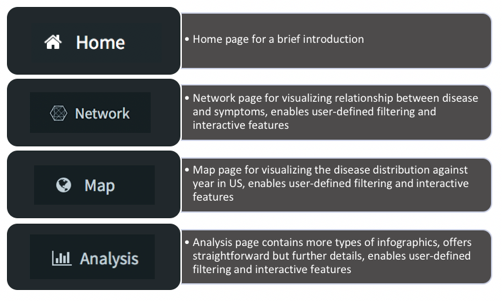
Interface design
Functionality Design
Network visualization
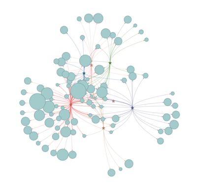
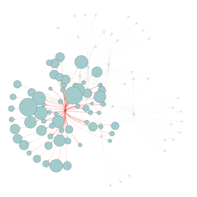
Network diagrams allow visualizing relationships between a group of entities, describing how things are interconnected. Customizing nodes appearance allows comparing with an expected structure. So in the network, we offer the selection from a different type of algorithm of centrality and modularity to compare the results.
The user is able to find out the diseases similarity based on the symptoms connection.
Map tab
Geophysics dataset is very useful for discovering state levels and visualize the location as well as spreading the area among the US.
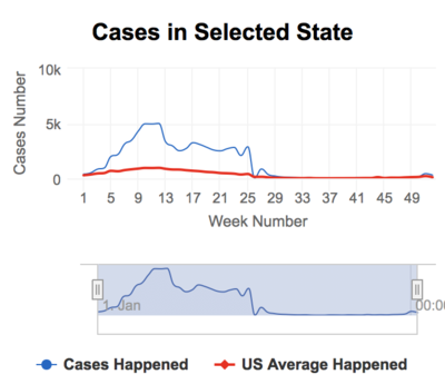
We offer the selection of different diseases at different years. The default selection is all states, and many states can be chosen to find out the detailed cases happened for selected diseases and year. The trend of cases in the year is displayed by series line as well one reference line of US average cases in this year.
Analysis tab
This tab offers a combination of infographics for the user to further explore the historical records of the 7 contagious diseases.
For each infographic, the user can select the corresponding attribute to compare. For example, if the user chooses “Estimate VS Real”, the options will change correspondingly, the graph itself is showing the number of cases against year, so the user can compare differently. diseases. Besides, the graph title will response correspondingly.
R Packages Design
The application is built in R, a versatile open-source programming language with numerous libraries/packages to choose from. The main package that we will be using is Shiny, which is integral to produce our application in an interactive web format.
Various other packages will be used to allow our application to function properly, the following packages are used:
- Data preparation- tidyr, tidyverse lubridate,dplyr,DT,magrittr, readxl, those packages are used to manipulate and aggregate data. And that provide easier way to use commands to customize the dataset.
- Data Visualiztion -visNetwork, networkD3, igraph, ggraph, ggplot2, viridis, ggridges,plotly, highcharter, those packages offer us all types of graph to visualize the data.
Initially, we used networkD3, which is based on JavaScript and open source library, to build up the network. It provides features for dynamic data manipulation and visualization and allow users to become active participants in data visualization process. And there is one function called igraph_to_networdD3, that uses an igraph object to convert it into a format that networkD3 uses to create a network representation. While there are some limitations such as different types of nodes and edges or line style, and we cannot conduct the layout. And we cannot assign edge labels or use multiple node labels, there are no filtering or zoom-in-zoom-out options that would accounted for different network structures (node clusters as a high-level visualization vs node within clusters as a low-level, in-depth visualization), etc.
So We selected visNetwork as our tools to display the network. It can provide the customised shapes, styles, colors, size and handle a few thousand nodes and edges. More importantly, it is able to give users interactivity controls such as highlight, collapsed nodes, selection, zoom, physics, movement of nodes, tooltips, events..)
For the maps data and contagious cases, we select Highcharter as our packages, which is a R wrapper for Highcharts javascript libray and its modules. Highcharts is very mature and flexible javascript charting library. The main features of this package are:
It is able to handle all various chart type with the same style: scatters, bubble, line, time series, heatmaps, treemap, bar charts, networks. And it supports highmap charts to create chorophleths or add information in geojson format. And because of our data doesn’t contain the longitude and latitude, it is easier to contain the state level information in this package.
Dashboard Design: shinydashboard makes it easy to use Shiny to create dashboards and provides a theme on top of 'Shiny'.
Insights
Disease- symptoms Network
All of the seven contagious diseases share quite similar of symptoms, but some symptoms are only exclusive to the certain disease.
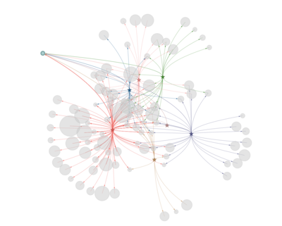
And Fever linked to all seven diseases, and hepatitis connected with 64 type of symptoms.
While, Smallpox is linked to three symptoms only: Purpura, Body weight, Fever.
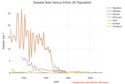
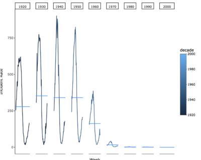
Incident rate changes
Overall, all of the seven contagious diseases has the decrease trend at US.
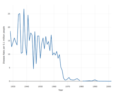
And measles has the highest incident rate in the past decades, and the volatility rate is quite higher.
And most of the diseases are eliminated with two diseases still remained after 2002: Hepatitis, Pertussis.
Discovery from geographical data from case study
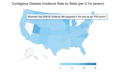
Based on the discovery from the previous step, we would like a deep dive into 1938 with Measles, which incident rate in the US from the map data.
Wisconsin has the highest incidence rate in this particular year and disease cases are significantly higher than the average of US during week 1-29.
Seasonality patter of diseases
the Measles, Rubella, mumps, polios has strong seasonality pattern among all diseases when we aggregate the incident rate at decades.
Conclusion
Some disease has strong seasonality pattern; we can prevent the diseases according to this pattern.
And the spread is not such wide for all type of diseases. And most of all contagious diseases are not eliminated in the US after 2002 with the development of healthcare, except for Hepatitis A and Pertussis. And it is relatively server the eastern part of America and the north part of America respectively.
US government may pay more attention to those two diseases and the symptoms found in the related diseases such as Neurologic Manifestations, mental retardation, purpura, thrombotic and so on, which can be found from the network with importance.
Limitation and Future works
Limitation of current application
The population at the state level is not available, so we cannot conduct the estimated incident rate according to the state level. Our calculation field is based on the whole population of US.
Network filtering with symptoms is not reflected when clicking the dropdown list from user selection, it will be more interactive when both information in sync.
Last but not least, more data details for improving visualizing granularity such as disease description, city levels data, the detailed date and so on.
Future improvement of application
There are a lot of new infectious diseases coming out, we can apply the application for those diseases to find out the epidemic area and seasonal patterns by allowing user uploading their dataset.
With more detailed dataset, predicted model is an alternative way to see the time series changes and forecast the future trend.
Moreover, the network for gene and diseases will be useful for those health care industry user to find out the relationship between diseases, symptoms, and genes.
Acknowledgments
The authors wish to thank Dr.Kam Tin Seong, Associate Professor of Singapore Management University, School of Information System(Practice), for his mentorship and guidance in making this project a success.
References
1 Project Tycho: Contagious diseases dataset
2 US population statistic
3 Human symptoms-disease network
4 R Documentation visNetwork-shiny
5 Visualizing and analyzing Geographical data
6 htmliwidgets for R
7 Highcharter in R
8 Visualising and analyzing network data in R
9 The Must Do’s of Marketing Dashboards
10 Making Flow Happen
11 With Dashboards: Formatting and layout Definitely Matter

