Difference between revisions of "Group12 Report"
Sameerp.2017 (talk | contribs) |
Sameerp.2017 (talk | contribs) |
||
| Line 67: | Line 67: | ||
* <font size = 4><span style="font-family:Abadi;">We exported the World Development Index [https://databank.worldbank.org/data/source/world-development-indicators/| Data]. from world bank database from their World Development Indicators and Sustainable Development Goals section with 1580 parameters across 58 years and 217 countries. The data set was very large (19.9 Million Rows) and many metrics did not make sense. We selectively filtered all the measures into 9 categories we thought are the most impactful. We then merged the data into a single file across 58 years and the UN recognized 201 countries.</span></font><br/><br/> | * <font size = 4><span style="font-family:Abadi;">We exported the World Development Index [https://databank.worldbank.org/data/source/world-development-indicators/| Data]. from world bank database from their World Development Indicators and Sustainable Development Goals section with 1580 parameters across 58 years and 217 countries. The data set was very large (19.9 Million Rows) and many metrics did not make sense. We selectively filtered all the measures into 9 categories we thought are the most impactful. We then merged the data into a single file across 58 years and the UN recognized 201 countries.</span></font><br/><br/> | ||
[[Image:samimage3.png|center|500px]] | [[Image:samimage3.png|center|500px]] | ||
| + | |||
| + | * <font size = 4><span style="font-family:Abadi;">The series originally consisted of a mishmash of all the demographic, education, finance, economic, public sector, health etc without any categories. Using JMP and Excel, the data was thoroughly organized and wrangled to make use for analysis. We reduced the key data points from 1580 to 58. We identified 9 main categories to spread out those 58 parameters we now call the KPIs. These KPIs (Key Performance Indicators) are the important measure of development across these 9 sectors/categories.</span></font><br/><br/> | ||
| + | |||
| + | 9 Main Categories: or image | ||
| + | 1. Population --- How has been the population control/demographics split? | ||
| + | 2. Climate --- How has Climate change impacted the nation & what is being done? | ||
| + | 3. Energy --- Energy production rates? Dependency? | ||
| + | 4. Education --- Education spending? What is literacy rate? | ||
| + | 5. Employment --- What are the employment statistics & their education levels? | ||
| + | 6. Economy --- How is the economy doing? How has been the rate of growth? | ||
| + | 7. Debt --- How much is the debt of the nation? | ||
| + | 8. GDP --- Per capita income and GDP growth? | ||
| + | 9. Health --- Health statistics and birth rates? | ||
| + | |||
| + | Each of these categories have 6-8 metrics we call as a KPI (Key Performance Indicator). Each of these KPIs indicate the well being of a nation when compared to each other for that category. These KPIs were carefully selected on the basis of their impact on the country’s development. A mapping is given below: | ||
| + | |||
| + | <<KPI TABLE>>[[Image:samimage3.png|center|500px]] | ||
| + | |||
| + | JMP | ||
| + | 1. We used JMP to refine the measures from 1500 to 227 variables in Phase one of cleaning up. And then further eliminating the unimportant columns to arrive at 58 in phase 2. | ||
| + | |||
| + | <<JMP IMAGE 1>>[[Image:samimage4.png|center|500px]] | ||
| + | |||
| + | 2. We used JMP to add category. Each of these 227 in Phase 1 and then finally 58 in Phase 2, we created a broad buckets listed earlier: Population, Climate, Energy, Education, Employment, Economy, Debt, GDP and Health. We then placed each of those 58 columns transposed into a single column | ||
| + | |||
| + | <<JMP IMAGE 2>>[[Image:samimage5.png|center|500px]] | ||
| + | |||
| + | 3. JMP was used for Transposing the data sets from the existing columnar format to a single column for KPIs. | ||
| + | |||
| + | <<JMP IMAGE 3>>[[Image:samimage6.png|center|500px]] | ||
| + | |||
| + | Excel: | ||
| + | Finally we cleaned up the final data set of ~700K records (201 X 58 X 58) and saved it as a Excel file. We then created regions, data type and category columns. Regions is a grouping of countries. Data type is either # or %. Category columns is a grouping of KPIs. So we have 7 columns in total: | ||
| + | |||
| + | <<METADATA TABLE>> | ||
| + | |||
| + | We save the final data as a CSV file. | ||
| + | |||
| + | |||
| + | 5 VISUAL DESIGN FRAMEWORK | ||
| + | |||
| + | R Shiny: | ||
| + | We then save the final file in csv format and loaded into R shiny application for generating the graphs. We have used dplyr library to add a condition that we are using only greater than 0 datapoints. | ||
| + | We added interactive chart features using R Shiny. We have Filters, Sortable table/lists with ranking, Maps, | ||
| + | Libraries used: | ||
| + | 1. Ltidyverse | ||
| + | 2. sf | ||
| + | 3. tmap | ||
| + | 4. classInt | ||
| + | 5. shiny | ||
| + | 6. leaflet | ||
| + | 7. ggplot2 | ||
| + | 8. shinydashboard | ||
| + | 9. maps | ||
| + | 10. plotly | ||
| + | 11. dplyr | ||
| + | 12. shinyWidgets | ||
| + | 13. treemap | ||
| + | 14. treemapify | ||
| + | 15. gridBase | ||
| + | 16. RColorBrewer | ||
| + | |||
| + | |||
| + | Trend charts, Treemaps and Geomaps charts for each of the selected 9 categories to give a full perspective of the metrics, for example: the three main charts are: | ||
| + | A> Line chart for showcasing time series trend based on years selected and country(ies) selected. | ||
| + | |||
| + | <<LINE CHART 1>>[[Image:samimage7.png|center|500px]] | ||
| + | |||
| + | The trend view is useful to see a time series analysis of a given metric for a given country(ies) | ||
| + | Features of line chart: | ||
| + | • Plotly used | ||
| + | Date filter | ||
| + | • Animated slider input (with play & pause) | ||
| + | • Range of years selected | ||
| + | • Default range is 15 years | ||
| + | Country filter | ||
| + | • Singapore is default country | ||
| + | • Multiple country selection support | ||
| + | • Support for removing countries via mouse click | ||
| + | • Countries are colour coded | ||
| + | • Each line corresponds different country | ||
| + | • The first country selected will act as the comparison for other countries | ||
| + | |||
| + | KPI filter (measures) | ||
| + | • Each measure will correspond to the year range and country selected | ||
| + | • The data value for the measure will be displayed on the y-axis of the chart. | ||
| + | • Plotly function to compare values among different countries for the year. | ||
| + | • Hover function achieved through plotly | ||
| + | |||
| + | Three Value boxes to highlight selection | ||
| + | • The years being used. | ||
| + | • The KPI measure being used | ||
| + | • The first country selected, on which other countries are being compared with. | ||
| + | |||
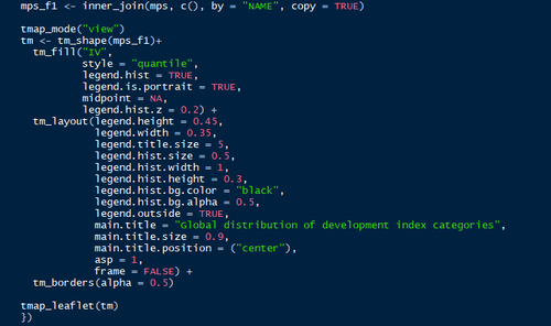
| + | B> Treemap for viewing all the countries in globe or region based on the KPI | ||
| + | |||
| + | <<CODE 1>>[[Image:samimage8.png|center|500px]] | ||
| + | |||
| + | C> Geo MAP with colour shaded for each country based on KPI selected | ||
| + | |||
| + | <<GEOMAP 1>>[[Image:samimage9.png|center|500px]] | ||
| + | |||
| + | <<CODE 2>>[[Image:samimage10.png|center|500px]] | ||
| + | |||
| + | We have used the combination of leaflet and tmap to visualize the interactive globe map in r shiny. | ||
| + | We used the global boundary shape file to execute the map | ||
| + | |||
| + | Dashboard | ||
| + | We take a visual analytics approach to measure KPI's across different parameters to gauge the progress of all 201 countries over the last 58 years across a selected metrics using interactive charts and filters. | ||
| + | Lines charts can be used for comparative feature across multiple countries and view a trend across a given KPI | ||
| + | Treemaps show a share of countries on a specific metric. This is very useful for comparing lots of countries in a single chart. We have three comparisons: | ||
| + | Grouped by Region | ||
| + | Grouped by KPIs | ||
| + | Grouped by Categories | ||
| + | We use Geographic Maps to visually showcase the country performance in positive or negative across last 10 years. The red and green is based on percentile, hence relative for that KPI for that period and hence very valid comparison. | ||
| + | We have two visualizations in Geo Map: KPI and category. This shows a comparison of countries. | ||
| + | Filters | ||
| + | 1. Year filter is a slider/Dropdown, in some cases we have a start and end year in the slider. | ||
| + | 2. Region filter: this will be multi select for better interactivity. This will be a nested filter for countries. | ||
| + | 3. Country filter: this will be multi select for better interactivity. | ||
| + | 4. Categories filter: This will be a nested filter for KPIs | ||
| + | 5. KPI filter: This is the key selection metric for all charts | ||
| + | For the filters to work, we used Reactive: | ||
| + | |||
| + | <<CODE 3>>[[Image:samimage11.png|center|500px]] | ||
| + | |||
| + | Reactive subsets the data based on input parameters on which interactive filters are based. This was the most important function we used | ||
| + | |||
| + | 6 VISUALIZATIONS & INSIGHTS | ||
| + | 6.1 Time Series | ||
| + | |||
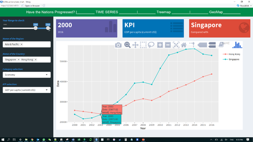
| + | <<LINE CHART 2>>[[Image:samimage12.png|center|500px]] | ||
| + | |||
| + | We analysed the trend between two developed port nations Singapore & Hong Kong. We observe that at 2003, their GDP per capita figure was near identical at USD 23K. As the years progressed, we find that Singapore saw a brief exponential growth resulting in a difference of almost USD 20K difference between their GDP per capita income values. | ||
| + | |||
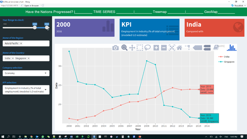
| + | <<LINE CHART 3>>[[Image:samimage13.png|center|500px]] | ||
| + | |||
| + | Next, we were curious about the employment percentage in the industry sector between Singapore and India. Surprisingly, we found a declining trend in Singapore’s employment metric from the year 2011. | ||
| + | We can select years along with multiple countries as a filter condition to compare the time series trend to evaluate many growth parameters. | ||
| + | 6.2 Treemap Visualization | ||
| + | For the treemap, the application uses interactive features between category and year. | ||
Revision as of 13:39, 14 August 2018
 Have the Nations really progressed ?
|
|
|
|
|
|
|
Report
Contents
Introduction
World Development Indicators (WDI) is the primary World Bank collection of development indicators, compiled from officially recognized international sources. It presents the most current and accurate global development data available including national, regional and global estimates. It covers more than 7 million data points collected over the span of 58 years. This statistical reference includes over 1500 indicators covering more than 200 economies. The annual publication is released in April of each year.
The massive amount of world development data has by far exceeds the ability for students, policymakers, analysts and officials to transform the data into proper visualization for analysing and gaining insight of the global developmental landscape. Thus, creating an adverse impact on the financial and technical assistance World Bank is providing to the developing countries around the world.
Through our visualizations, we seek to utilize existing data to derive meaningful insights over how various socioeconomic factors have had an impact on development of different nations and to tell their story of growth and downfall across years. This dashboard also helps decide on various areas the countries need help on and has the aid provided earlier has any effect or not. The Key objective is to deep dive in a countries development across 9 parameters.
Motivation and Objective
Our main objective is to utilize visual and graphical techniques in R for preparation of a user-friendly dashboard. Countries requiring aid from various organizations would receive benefit from this analysis by their performances being gauged over the years from which they first received assistance. Furthermore, analysts get the option to switch between different forms of visualization to allow them to make better financial and technical decision in helping the developing countries. This application should enable financial aid providers to decide on funding future aid or ROI on existing aid given.
Previous Works
Sustainable Development Goals
World Bank website has a dashboard in place with respect to Sustainable Development goals, which contains more than 15 different goals to visualize for all the countries in view of different measures on a line chart covered over various regions. The dashboard is too complicated and requires an expert view of the exact goal to visualize.
CRAN Download Monitor
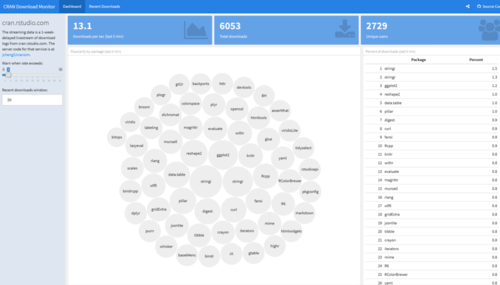
For our dashboard design, we were inspired by the CRAN Download monitor to perform reactive output based on input parameters.
Google Charts Demo

We attempted to create the charts with an easy interface for users to see the aesthetics in an appealing manner.
Dataset & Preparation
Raw Data
- We exported the World Development Index Data. from world bank database from their World Development Indicators and Sustainable Development Goals section with 1580 parameters across 58 years and 217 countries. The data set was very large (19.9 Million Rows) and many metrics did not make sense. We selectively filtered all the measures into 9 categories we thought are the most impactful. We then merged the data into a single file across 58 years and the UN recognized 201 countries.

- The series originally consisted of a mishmash of all the demographic, education, finance, economic, public sector, health etc without any categories. Using JMP and Excel, the data was thoroughly organized and wrangled to make use for analysis. We reduced the key data points from 1580 to 58. We identified 9 main categories to spread out those 58 parameters we now call the KPIs. These KPIs (Key Performance Indicators) are the important measure of development across these 9 sectors/categories.
9 Main Categories: or image 1. Population --- How has been the population control/demographics split? 2. Climate --- How has Climate change impacted the nation & what is being done? 3. Energy --- Energy production rates? Dependency? 4. Education --- Education spending? What is literacy rate? 5. Employment --- What are the employment statistics & their education levels? 6. Economy --- How is the economy doing? How has been the rate of growth? 7. Debt --- How much is the debt of the nation? 8. GDP --- Per capita income and GDP growth? 9. Health --- Health statistics and birth rates?
Each of these categories have 6-8 metrics we call as a KPI (Key Performance Indicator). Each of these KPIs indicate the well being of a nation when compared to each other for that category. These KPIs were carefully selected on the basis of their impact on the country’s development. A mapping is given below:
<<KPI TABLE>>
JMP 1. We used JMP to refine the measures from 1500 to 227 variables in Phase one of cleaning up. And then further eliminating the unimportant columns to arrive at 58 in phase 2.
<<JMP IMAGE 1>>
2. We used JMP to add category. Each of these 227 in Phase 1 and then finally 58 in Phase 2, we created a broad buckets listed earlier: Population, Climate, Energy, Education, Employment, Economy, Debt, GDP and Health. We then placed each of those 58 columns transposed into a single column
<<JMP IMAGE 2>>
3. JMP was used for Transposing the data sets from the existing columnar format to a single column for KPIs.
<<JMP IMAGE 3>>
Excel: Finally we cleaned up the final data set of ~700K records (201 X 58 X 58) and saved it as a Excel file. We then created regions, data type and category columns. Regions is a grouping of countries. Data type is either # or %. Category columns is a grouping of KPIs. So we have 7 columns in total:
<<METADATA TABLE>>
We save the final data as a CSV file.
5 VISUAL DESIGN FRAMEWORK
R Shiny: We then save the final file in csv format and loaded into R shiny application for generating the graphs. We have used dplyr library to add a condition that we are using only greater than 0 datapoints. We added interactive chart features using R Shiny. We have Filters, Sortable table/lists with ranking, Maps, Libraries used: 1. Ltidyverse 2. sf 3. tmap 4. classInt 5. shiny 6. leaflet 7. ggplot2 8. shinydashboard 9. maps 10. plotly 11. dplyr 12. shinyWidgets 13. treemap 14. treemapify 15. gridBase 16. RColorBrewer
Trend charts, Treemaps and Geomaps charts for each of the selected 9 categories to give a full perspective of the metrics, for example: the three main charts are:
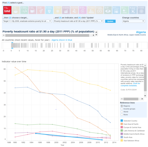
A> Line chart for showcasing time series trend based on years selected and country(ies) selected.
<<LINE CHART 1>>

The trend view is useful to see a time series analysis of a given metric for a given country(ies) Features of line chart: • Plotly used Date filter • Animated slider input (with play & pause) • Range of years selected • Default range is 15 years Country filter • Singapore is default country • Multiple country selection support • Support for removing countries via mouse click • Countries are colour coded • Each line corresponds different country • The first country selected will act as the comparison for other countries
KPI filter (measures) • Each measure will correspond to the year range and country selected • The data value for the measure will be displayed on the y-axis of the chart. • Plotly function to compare values among different countries for the year. • Hover function achieved through plotly
Three Value boxes to highlight selection • The years being used. • The KPI measure being used • The first country selected, on which other countries are being compared with.
B> Treemap for viewing all the countries in globe or region based on the KPI
<>

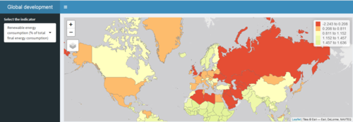
C> Geo MAP with colour shaded for each country based on KPI selected
<<GEOMAP 1>>

<>

We have used the combination of leaflet and tmap to visualize the interactive globe map in r shiny.
We used the global boundary shape file to execute the map
Dashboard
We take a visual analytics approach to measure KPI's across different parameters to gauge the progress of all 201 countries over the last 58 years across a selected metrics using interactive charts and filters.
Lines charts can be used for comparative feature across multiple countries and view a trend across a given KPI
Treemaps show a share of countries on a specific metric. This is very useful for comparing lots of countries in a single chart. We have three comparisons:
Grouped by Region
Grouped by KPIs
Grouped by Categories
We use Geographic Maps to visually showcase the country performance in positive or negative across last 10 years. The red and green is based on percentile, hence relative for that KPI for that period and hence very valid comparison.
We have two visualizations in Geo Map: KPI and category. This shows a comparison of countries.
Filters
1. Year filter is a slider/Dropdown, in some cases we have a start and end year in the slider.
2. Region filter: this will be multi select for better interactivity. This will be a nested filter for countries.
3. Country filter: this will be multi select for better interactivity.
4. Categories filter: This will be a nested filter for KPIs
5. KPI filter: This is the key selection metric for all charts
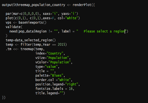
For the filters to work, we used Reactive:
<>
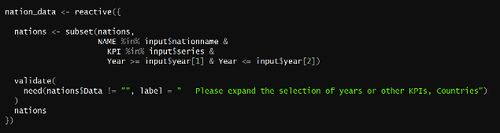

Reactive subsets the data based on input parameters on which interactive filters are based. This was the most important function we used
6	VISUALIZATIONS & INSIGHTS
6.1	Time Series
<<LINE CHART 2>>

We analysed the trend between two developed port nations Singapore & Hong Kong. We observe that at 2003, their GDP per capita figure was near identical at USD 23K. As the years progressed, we find that Singapore saw a brief exponential growth resulting in a difference of almost USD 20K difference between their GDP per capita income values.
<<LINE CHART 3>>

Next, we were curious about the employment percentage in the industry sector between Singapore and India. Surprisingly, we found a declining trend in Singapore’s employment metric from the year 2011.
We can select years along with multiple countries as a filter condition to compare the time series trend to evaluate many growth parameters.
6.2	Treemap Visualization
For the treemap, the application uses interactive features between category and year.