Difference between revisions of "Group08 Report"
| Line 87: | Line 87: | ||
===<div style="font-family:Segoe UI Semibold;"><font size = 3; color="#176585">Indicator display</font></div>=== | ===<div style="font-family:Segoe UI Semibold;"><font size = 3; color="#176585">Indicator display</font></div>=== | ||
| + | ====Indicator exploration==== | ||
The first part of our application focuses on the showcase of indicators used in the analysis that follows; what type of structure does the data follow, what countries were selected, and eventually what variables are used for modelling. | The first part of our application focuses on the showcase of indicators used in the analysis that follows; what type of structure does the data follow, what countries were selected, and eventually what variables are used for modelling. | ||
| Line 93: | Line 94: | ||
[[Image:G8 img1.jpeg|800px]] | [[Image:G8 img1.jpeg|800px]] | ||
| − | + | ====Changing patterns==== | |
What follows next is a time-series display of each indicator, showing in country level, region level and income group level. | What follows next is a time-series display of each indicator, showing in country level, region level and income group level. | ||
| Line 105: | Line 106: | ||
The line charts were created with the R package plotly (the choice of visualisation being the most commonly preferred method to look at time-series data). Using plotly has a lot of benefits. It enabled a smart highlighting of the selected country against a backdrop of other countries within the selected region. In addition, the nifty tool-tip helped provide a quick view of the key data when users hovered their mouse over the line or each specific point on the graph. | The line charts were created with the R package plotly (the choice of visualisation being the most commonly preferred method to look at time-series data). Using plotly has a lot of benefits. It enabled a smart highlighting of the selected country against a backdrop of other countries within the selected region. In addition, the nifty tool-tip helped provide a quick view of the key data when users hovered their mouse over the line or each specific point on the graph. | ||
| + | |||
| + | ===<div style="font-family:Segoe UI Semibold;"><font size = 3; color="#176585">Relationship display</font></div>=== | ||
| + | ====Indicator correlation matrix==== | ||
| + | After getting an overview of the trends of various indicators, the next step for the user is understand the extent of correlations between indicators and perform a clustering on the 31 countries based on selected indicators. | ||
| + | |||
| + | [[Image:G8img3.jpg|800px]] | ||
| + | |||
| + | The first tab shows the correlation matrix for finding the high or low-correlated indicators. In case the time range is a concern, users can choose the range of years other than just the indicator that they would like to exclude from the correlation analysis. | ||
| + | |||
| + | The corrplot package is used to demonstrate the correlation between indicators. Blue indicates positive correlation, while red denotes negative correlation. In addition, the width of ellipse can represents the size of the correlation. Compared to heatmaply correlation matrix, corrplot is more intuitive for viewing correlation – it also allows us to reduce the visual clutter by only displaying half of the tradition correlation matrix, split along the diagonal. | ||
| + | |||
| + | ====Number of clusters==== | ||
| + | When it comes to clustering, one of the dilemmas faced is effectively deciding the optimal number of clusters. We provide two ways to do this in our application as seen below: | ||
| + | |||
| + | [[Image:G8img4.jpg|800px]] | ||
| + | |||
| + | The two methods provide different results on the final suggested number of clusters, which can then be input by the user into later sections for clustering analysis. | ||
| + | |||
| + | ====Country clustering==== | ||
| + | This panel provides three main parameters, including transformation, distance method as well as agglomeration method. The previous selected indicators will be passed to compute clusters of countries. We see in each cluster similarities relating to the topic for certain indicators. For example, in chart below, when we select education related indicators for input, the heatmap shows that “Spain”, “Netherlands”, “Ireland”, “Sweden”, “France”, “Argentina” are grouped into one cluster and this cluster perform better on education variables for empowerment of women. For this function, heatmaply is suitable for its ability to represent values of each indicator in shades from the same colour palette. | ||
| + | |||
| + | [[Image:G8img5.jpg|800px]] | ||
| + | |||
| + | |||
| + | ===<div style="font-family:Segoe UI Semibold;"><font size = 3; color="#176585">Variable Importance 1 (cross sectional analysis) </font></div>=== | ||
| + | In this section, we provide users with more specific information to aid in the final selection of variables. The first tab in the menu displays the correlation matrix plot which we saw in an earlier tab, with an accompanying VIF table (leveraging on the vif function from Car package). These values immediately show the multicollinearity of the regression model each time users change their input variables, so they can easily determine which indicators they should put into model (usually VIF should be less than 10). | ||
| + | |||
| + | [[Image:G8img6.jpg|800px]] | ||
| + | |||
| + | To give a better idea of the rate of change in indicators, the changes are provided in a tabular form, based on the input of starting and end years. This table is captured in the second tab. | ||
| + | While model results are an important reference, we have opted to compress the visual real estate of this section within the app by enabling scrolling with CSS styling; this allows us to better show case other important results in the same page. | ||
| + | |||
| + | [[Image:G8img7.jpg|800px]] | ||
| + | |||
| + | The modelling section contains both parameter options on the left side and regression model summary and two kinds of plots on the right side. Parameters’ change results in every result change (from left to right). | ||
| + | |||
| + | The packages MASS and Car, amongst others, have been used mainly for multi-regression model because they have many handy statistics related functions which are useful for interpreting of the model results. Diagnostic plots illustrate the assumptions of econometric model (e.g Non-normality, non-constant error variance, and nonlinearity). The Car package possesses a function influencePlot to display influential observations. However, this was abandoned in favour of using Plotly which is far superior in terms of visualisation. This is shown at the bottom right in the screenshot, where the three countries which may affect response variable significantly are clearly seen from the graph. | ||
| + | |||
| + | [[Image:G8img8.jpg|800px]] | ||
| + | |||
| + | In the last tab as shown above, the function regsubsets() in the library leaps is used for regression subset selection. Users can view the ranked models according to different scoring criteria (we provide BIC, R2 and adjusted R2 values) by plotting the results of regsubsets(). R function Step() is used for stepwise variable selection method, offering p-values and AIC criterion with regression direction and significance level. These parameters affect the updated model summary output. | ||
| + | |||
| + | As we want to find what the dominant factors are in each year, the method can extract independent variables which meet the input method conditions with their coefficients. Besides, we focus on retrieving the information that reflects how important the selected variables are against response variables. The Relaimpo package provides a function to calculate relative importance for each predictor and obtain bootstrap measures of relative importance. However, similar to the Car package, we found the plotting capabilities lacking. To address this, we defined a new function by calculating correlations between original predictors, new orthogonal variables, and regression coefficients of dependent variable Y on orthogonal variables to derive the percentage of the predictor to the overall R2 value. This is then visualised in the form of a simple pie chart with plotly. | ||
| + | |||
| + | |||
| + | ===<div style="font-family:Segoe UI Semibold;"><font size = 3; color="#176585">Variable Importance 2 (Panel Analysis) </font></div>=== | ||
| + | Apart from the earlier cross-sectional analysis, the base dataset of contains indicators that have panel data. Thus we created a separate section which aims to perform analysis on panel data based on year range and the response variables selected by users. | ||
| + | |||
| + | [[Image:G8img9.jpg|800px]] | ||
| + | |||
| + | The above featured menu mainly uses PLM package to perform panel data analysis based on the year range and response variable use selects. Unit root test is to find whether the data is stationary, while the Dickey-Fuller test enables users to check for stochastic trends. The null hypothesis assumes the series has a unit root (i.e. non-stationary). If unit root is present, it takes the first difference of the variable. Additionally, with the heteroscedasticity test, robust covariance matrix is used to account for any detected heteroscedasticity. | ||
| + | |||
| + | The PLM package make it more convenient to compare different models by calling fitting model functions. Usually it compares fixed models (without country, year and so on) and random models as well as mix pooling models. In the large scheme of things, our application takes these models and makes comparisons between each before providing a summary output of the optimal one | ||
| + | |||
| + | [[Image:G8img10.jpg|800px]] | ||
| + | |||
| + | Next to the results tab, we’ve also added a visual of the estimated individual effects using countries as independent variables, in the form of a bar chart. Sorted by descending order, users can quickly understand and identify from the bar chart which countries’ data have affected the response variable most. No additional colouring or shading has been applied to minimise visual cluster. | ||
</font></div></div> | </font></div></div> | ||
Revision as of 23:49, 13 August 2018
Econometric Modeling with Gender Equality and Women Empowerment
Contents
Introduction
As civilisation advances across the world and nations’ priorities shift from economic survival to economic growth and creation of wealth, people are awakened to consequences of marginalisation and inequalities left behind in the wake of economic progress. Increasingly, questions shift towards how to address or mitigate these risks, balancing these trade-offs, and even whether tackling them upfront may even be beneficial and facilitate economic growth. One of the biggest inequalities of our time is in gender inequality. Gender equality has been touted as a strong way to unlock greater economic potential for countries, by various leading organisations – the World Economic Forum made a case for gender equality, the Economist highlights how inequality affects growth , and the OECD illustrates how growth gaps can be attributed to gender inequality . Intuitively this makes sense since labour inputs is one of the primary drivers of economic growth, and women effectively represented half the population’s potential for labour input.
Economic growth aside, gender inequality also has severe social repercussions as we have observed in the recent rise of the #MeToo movement. All these underscores the importance of better understanding gender inequality and how to address it.
The purpose of this project thus aims to look at existing economic and development data and lend new or reinforce existing perspectives through a data visualisation application which encompasses econometric models.
Data Review
The World Bank stores an enormous amount of data across more than 200 countries and over 1,300 indicators under its ‘World Development Indicators’ database.
Much of this information covers mainly economic related data for each country, over a long period time from 1972 to the latest 2016 data. The gamut of topics covers an extremely wide range, including – GDP, income, inequality, population indicators such as age, health, labour statistics, energy use, financial industry information, even environmental impact and other factors.
Challenges
Given the vast breadth and depth of coverage, undertaking any project that leverages on this data can require a potentially large menial effort in sieving and gathering the data. For the purposes of the topic, we needed to first narrow down the indicators to those that may be relevant to women’s empowerment and gender equality to create a base dataset for analysis. The selection of the variables was done qualitatively and reduced to 47 identified potential indicators.
Next, a preview of the data reveals sparsity issues on two fronts – on time-period and frequency, as well as available countries. Several of these indicators had data that was only collected from a later stage rather than since the start of data collection by the World Bank. And even after data collection had commenced, it was not necessarily done on a sufficiently regular basis (typically yearly, as with all the indicators). This was understandable as the awareness and attention to this area had only seen some impact on data collection activities in the past couple decades. At the same time, the regimen of consistent collection of such data may not have been consistently enforced across all participating countries, which resulted in a glaring gap in yearly data for a large majority of countries.
Data Reduction
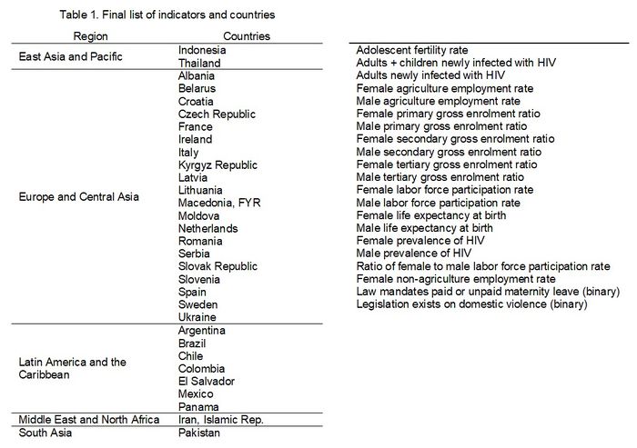
For consistency, only countries with enough yearly data points were picked out, and indicators with the same set of data sparsity (or rather, lack thereof) were used. Eventually this was whittled down to 21 indicators for 31 countries, and the time horizon reduced to the period from 2000-2016.
Final dataset structure
After data selection process, some basic transformation was performed to enable greater ease of usage in the subsequent analysis. Some additional factors relating to the data were also added to present a dimension to the countries for use in data clustering.
Designing the Application
The primary aim of the visual application is to provide a structured method to visualising and understanding data, so it can help to enable discovery of new perspectives or reinforce existing theories on gender equality. In designing this piece, therefore, an important aspect was high flexibility. Users need to be able to go through data exploration and discovery, run some basic techniques to better help them decide on features that will be useful, before eventually building the model and gathering results – all within the same application.
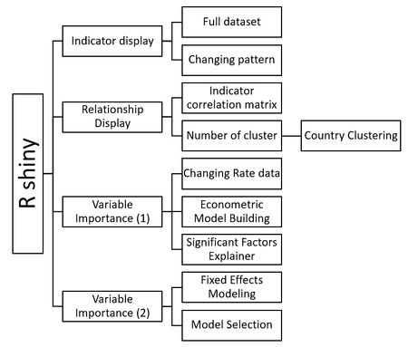
To enable this, we first constructed a basic hierarchical map of the functions we wished to include. The structure would include elements of exploratory data analysis as well as econometric modelling, as follows:
Dashboard Design
Next, we embarked on design of the dashboard, using a basic storyboard to layout the intended functions in a logical, user-centric manner to aid navigation. While the eventual application went through multiple iterations to look different from the original design, the initial process helped to better structure and crystallise our thoughts in a visual format. It also acted as a useful reference point to keep our intentions focused.
Application Functions
Based on the described design, we set out to build the application in R Shiny, combined with various packages to support the different intended functions. The following sections detail each of these functions, the respective packages used, as well as the rationale.
Indicator display
Indicator exploration
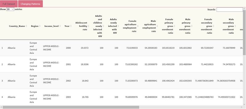
The first part of our application focuses on the showcase of indicators used in the analysis that follows; what type of structure does the data follow, what countries were selected, and eventually what variables are used for modelling.
One of the most basic views is a straightforward data table, which is generated using the package DT. This is shown below.
Changing patterns
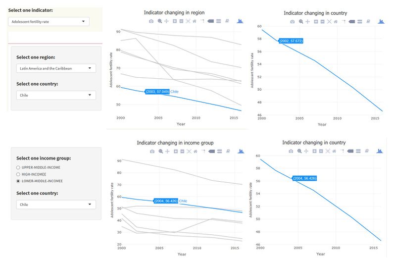
What follows next is a time-series display of each indicator, showing in country level, region level and income group level.
Naturally, we leveraged on Shiny to enable selection of variables, as well as enabling a high-level filtering by way of the geographic regions which is available in our base data.
As a first step, the user can choose the indicator they wish to explore. Next, they can select the region and country from the drop-down box, as well as the income level.
The above illustrates the view displayed to the right of the selectors. The top two shows the trend of the selected country compared to that of overall region. The selected country is highlighted by the blue line, against a backdrop of other countries in the region which are in light gray. The right chart provides a better view of the indicator on its own, with the y-axes rescaled to fit the maximum and minimum values observed. This approach allows the user to more quickly detect fluctuations visually in a more obvious manner, as compared to countries which look relatively stable compared to others with wider variance of change over the years. This same behaviour is also adapted for the ‘income level’ tab.
The line charts were created with the R package plotly (the choice of visualisation being the most commonly preferred method to look at time-series data). Using plotly has a lot of benefits. It enabled a smart highlighting of the selected country against a backdrop of other countries within the selected region. In addition, the nifty tool-tip helped provide a quick view of the key data when users hovered their mouse over the line or each specific point on the graph.
Relationship display
Indicator correlation matrix
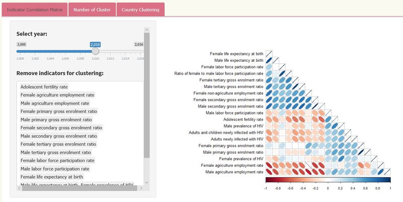
After getting an overview of the trends of various indicators, the next step for the user is understand the extent of correlations between indicators and perform a clustering on the 31 countries based on selected indicators.
The first tab shows the correlation matrix for finding the high or low-correlated indicators. In case the time range is a concern, users can choose the range of years other than just the indicator that they would like to exclude from the correlation analysis.
The corrplot package is used to demonstrate the correlation between indicators. Blue indicates positive correlation, while red denotes negative correlation. In addition, the width of ellipse can represents the size of the correlation. Compared to heatmaply correlation matrix, corrplot is more intuitive for viewing correlation – it also allows us to reduce the visual clutter by only displaying half of the tradition correlation matrix, split along the diagonal.
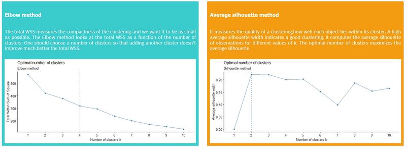
Number of clusters
When it comes to clustering, one of the dilemmas faced is effectively deciding the optimal number of clusters. We provide two ways to do this in our application as seen below:
The two methods provide different results on the final suggested number of clusters, which can then be input by the user into later sections for clustering analysis.
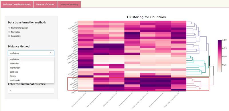
Country clustering
This panel provides three main parameters, including transformation, distance method as well as agglomeration method. The previous selected indicators will be passed to compute clusters of countries. We see in each cluster similarities relating to the topic for certain indicators. For example, in chart below, when we select education related indicators for input, the heatmap shows that “Spain”, “Netherlands”, “Ireland”, “Sweden”, “France”, “Argentina” are grouped into one cluster and this cluster perform better on education variables for empowerment of women. For this function, heatmaply is suitable for its ability to represent values of each indicator in shades from the same colour palette.
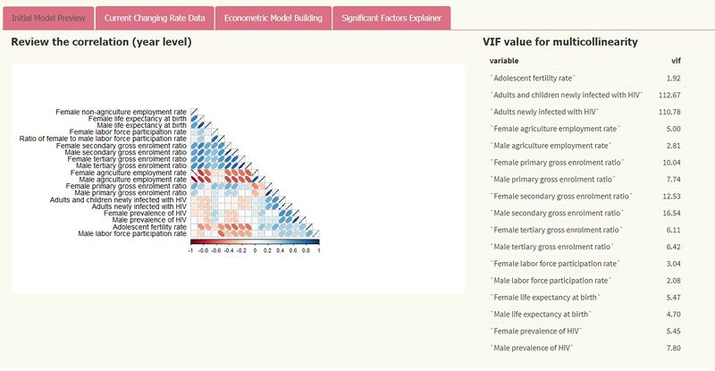
Variable Importance 1 (cross sectional analysis)
In this section, we provide users with more specific information to aid in the final selection of variables. The first tab in the menu displays the correlation matrix plot which we saw in an earlier tab, with an accompanying VIF table (leveraging on the vif function from Car package). These values immediately show the multicollinearity of the regression model each time users change their input variables, so they can easily determine which indicators they should put into model (usually VIF should be less than 10).
To give a better idea of the rate of change in indicators, the changes are provided in a tabular form, based on the input of starting and end years. This table is captured in the second tab. While model results are an important reference, we have opted to compress the visual real estate of this section within the app by enabling scrolling with CSS styling; this allows us to better show case other important results in the same page.
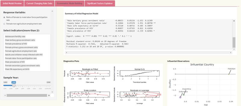
The modelling section contains both parameter options on the left side and regression model summary and two kinds of plots on the right side. Parameters’ change results in every result change (from left to right).
The packages MASS and Car, amongst others, have been used mainly for multi-regression model because they have many handy statistics related functions which are useful for interpreting of the model results. Diagnostic plots illustrate the assumptions of econometric model (e.g Non-normality, non-constant error variance, and nonlinearity). The Car package possesses a function influencePlot to display influential observations. However, this was abandoned in favour of using Plotly which is far superior in terms of visualisation. This is shown at the bottom right in the screenshot, where the three countries which may affect response variable significantly are clearly seen from the graph.
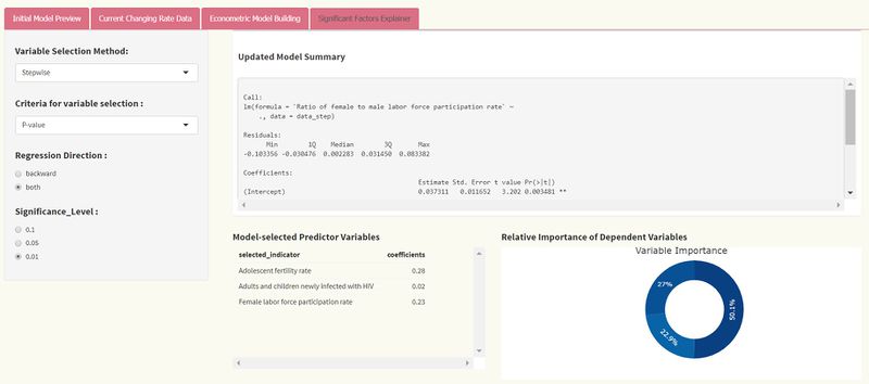
In the last tab as shown above, the function regsubsets() in the library leaps is used for regression subset selection. Users can view the ranked models according to different scoring criteria (we provide BIC, R2 and adjusted R2 values) by plotting the results of regsubsets(). R function Step() is used for stepwise variable selection method, offering p-values and AIC criterion with regression direction and significance level. These parameters affect the updated model summary output.
As we want to find what the dominant factors are in each year, the method can extract independent variables which meet the input method conditions with their coefficients. Besides, we focus on retrieving the information that reflects how important the selected variables are against response variables. The Relaimpo package provides a function to calculate relative importance for each predictor and obtain bootstrap measures of relative importance. However, similar to the Car package, we found the plotting capabilities lacking. To address this, we defined a new function by calculating correlations between original predictors, new orthogonal variables, and regression coefficients of dependent variable Y on orthogonal variables to derive the percentage of the predictor to the overall R2 value. This is then visualised in the form of a simple pie chart with plotly.
Variable Importance 2 (Panel Analysis)
Apart from the earlier cross-sectional analysis, the base dataset of contains indicators that have panel data. Thus we created a separate section which aims to perform analysis on panel data based on year range and the response variables selected by users.
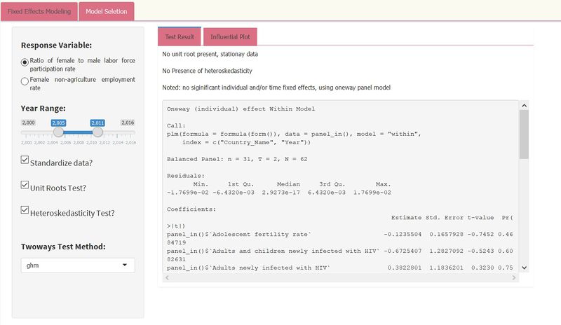
The above featured menu mainly uses PLM package to perform panel data analysis based on the year range and response variable use selects. Unit root test is to find whether the data is stationary, while the Dickey-Fuller test enables users to check for stochastic trends. The null hypothesis assumes the series has a unit root (i.e. non-stationary). If unit root is present, it takes the first difference of the variable. Additionally, with the heteroscedasticity test, robust covariance matrix is used to account for any detected heteroscedasticity.
The PLM package make it more convenient to compare different models by calling fitting model functions. Usually it compares fixed models (without country, year and so on) and random models as well as mix pooling models. In the large scheme of things, our application takes these models and makes comparisons between each before providing a summary output of the optimal one
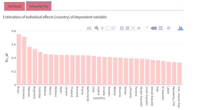
Next to the results tab, we’ve also added a visual of the estimated individual effects using countries as independent variables, in the form of a bar chart. Sorted by descending order, users can quickly understand and identify from the bar chart which countries’ data have affected the response variable most. No additional colouring or shading has been applied to minimise visual cluster.
section
placeholder
Acknowledgements
We wish to thank Professor Kam Tin Seong for his strong support and close inputs to improve on our application. The multiple iterations and improvements would not have been possible without his valuable advice.
