Difference between revisions of "Group15 Report"
Pachen.2017 (talk | contribs) |
|||
| Line 80: | Line 80: | ||
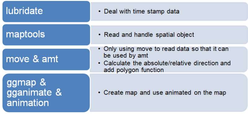
Below are the packages that we used:<br> | Below are the packages that we used:<br> | ||
| − | [[Image:datap11.png | + | [[Image:datap11.png|center]]<br> |
| − | + | ||
</p> | </p> | ||
| Line 115: | Line 115: | ||
ii) The absolute direction sub tab has the following features: | ii) The absolute direction sub tab has the following features: | ||
| − | [[Image: | + | [[Image:15design4.png|center]]<br> |
• Year selection – By clicking on the radio button, the user can select from the period 2015 – 2017.<br> | • Year selection – By clicking on the radio button, the user can select from the period 2015 – 2017.<br> | ||
• Bird selection – By ticking on the checkbox, the user can select the bird he is interested in.<br> | • Bird selection – By ticking on the checkbox, the user can select the bird he is interested in.<br> | ||
| Line 121: | Line 121: | ||
• The direction bearing ranges from 0 to 360 degrees.<br> | • The direction bearing ranges from 0 to 360 degrees.<br> | ||
• 0,90,180 and 270 indicates that the bird is travelling north, east, west and south respectively.<br> | • 0,90,180 and 270 indicates that the bird is travelling north, east, west and south respectively.<br> | ||
| + | • The denser the area of the triangle, the move frequent the bird travelled in that direction.<br> | ||
| + | iii) The relative direction sub tab has the following features: | ||
| + | [[Image:15design5.png|center]]<br> | ||
| + | • Year selection – By clicking on the radio button, the user can select from the period 2015 – 2017.<br> | ||
| + | • Bird selection – By ticking on the checkbox, the user can select the bird he is interested in.<br> | ||
| + | • From the relative angles, we can tell the direction which the bird turns. <br> | ||
| + | • The direction bearing ranges from 0 to 180/-180 degrees.<br> | ||
| + | • 0,90, -90 and 180/-180 indicates that the bird is travelling straight, left, right and backwards respectively.<br> | ||
• The denser the area of the triangle, the move frequent the bird travelled in that direction.<br> | • The denser the area of the triangle, the move frequent the bird travelled in that direction.<br> | ||
| + | iv) The ground speed sub tab has the following features: | ||
| + | [[Image:15design6.png|center]]<br> | ||
| + | • Year selection – By clicking on the radio button, the user can select from the period 2015 – 2017.<br> | ||
| + | • Bird selection – By ticking on the checkbox, the user can select the bird he is interested in.<br> | ||
| + | • The scatter plot shows the ground speed over the months. Each point represents a day.<br> | ||
| + | ===Group View=== | ||
| + | The functions of absolute/relative angles are the same as previously described above. | ||
| + | The group view tab contains 3 sub-tabs:<br> | ||
| + | i) Absolute direction <br> | ||
| + | ii) Relative direction<br> | ||
| + | iii) Ground speed<br> | ||
| + | i) and ii) The absolute/relative direction design are the same as previously described in section 5.2. The only difference being that the drop-down list has only 2 options (age/sex). | ||
| − | + | iii) The ground speed sub tab has the following features: | |
| − | + | [[Image:15design7.png|center]]<br> | |
| − | + | • Measure selection – Select from the drop-down list either age or sex. <br> | |
| − | + | • The box plot displayed allows one to make comparison between the ground speed of different characteristics of the birds. <br> | |
| − | |||
==DEMONSTRATION== | ==DEMONSTRATION== | ||
Revision as of 19:35, 13 August 2018
| Proposal | Poster | Application | Report | Project Groups |
Contents
MOTIVATION
Animal migration has long received much attention as a research topic in biology. Information about animal movement serves to allow us to understand animal behavior and their interactions with each other and the environment. In addition, it allows us to address environmental challenges such as climate and land use change.
Understanding animal migration helps conservationists to conserve these animals through the protection of their habitats and their resources.
We utilize trajectory data to provide an interactive visual analytics approach for valuable insights into the migration of these animals.
OBJECTIVES
We present an interactive visual approach to explore and analyze animal movement data. We applied this approach to a data set of Osprey bird migration flows.
Through this project, we hope that ecologists and conservationists alike will be able to gain insights into the following:
• Bird migration (both as a group and individual) flight path over a period of time. • How differences in individual characteristics (e.g. female vs male, juvenile vs adult) affect flight behavior. • The home range a of these birds.
To achieve the objectives above, we used trajectory data available in the Osprey data set.
REVIEW AND CRITICS OF PAST WORKS
There are plenty of studies on animal migration, each which comes with its own different set of visualization tools. These are customized tools which have been designed by the researchers of the studies in the course of the study. The links to some of these tools are no longer working and they do not allow for upload of user data set, further limiting its widespread adoption for other animal migration studies.
Our application makes use of RStudio, a free popular open software and Shiny which make interactive web applications for visualizing data. In order to use the application, the researchers can easily download the required software from the internet. They can make use of their own animal movement data to extract the migration flows which they wish to analyze.
DATA CLEANING, PREPARATION AND MODELING
The dataset has some duplicate rows which has the same individual-local-identifier and timestamp, so it can’t be imported into R by move package, so we firstly dropped them through python. The code shows as blow.
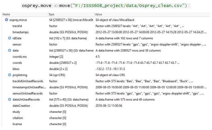
We used move package in R which is different from other teams. For the move package, we used it to read our data.
After imported the data by move, the data shows the format as below in R.
We need to transform the data as dataframe, then we used filter, group_by and summarise function in tidyverse package to make some preprocess. And we merged the dataset with the reference-data to get the sex and age data. We grouped the location data by day and got the average for our map visualization.
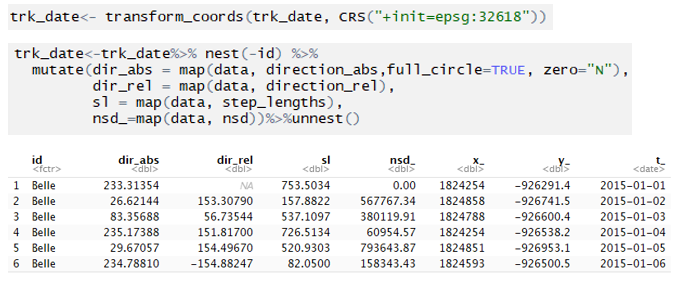
After simple data preparation, we calculated the absolute and relative direction using amt package which is one of our main packages. The original data display as below.
We used the mk_track function in amt package to transform the data into the specific format. The code and result display as below.
Then we need to transform the coordinates to the type that calculation of direction needs by using transform_coords() fuction, then we use direction_abs(), direction_rel() to calculate the absolute direction and relative direction, and step_lengths(), nsd() to calculate the Step Length and Net Squared Displacement (squared distance from a starting location). After visualizing them all, we selected absolute and relative direction into our dashboard because the plots of Step Length and Net Squared Displacement were quite similar to the ground-speed scatter plot and timeseries chart of location we drew.
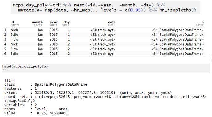
Next, we need to calculate the home range to create polygon by day on our map. The process of creating dataframe named trk is similar to above.
We used the hr_mcp()(minimum convex polygon) and hr_isopleths()(to get the isopleths) in amt package to get the coordinates of home range polygon, the hr_kde()(Kernel Density Estimation) and hr_mcp() both for the homerange calculation. Due to limitation of time, we only put result by using hr_mcp() into our dashboard. We set levels to 0.95, which means the range includes 95% of the data. The column named “a” contains our polygon data. It is the spatial polygons dataframe data.
We used the match to transform the abbreviation into numbers, so we can filter month by number in our dashboard.
The coordinates of polygon can’t be directly used in leaflet, so we created a function called trans_poly() to transform our data.
The dat1 is the data filtered from mcps.dat_poly. For each one in poly, we used the trans_poly() to transform then use the addPolygons() to the leaflet.
For the data about sex and age, we did the similar things.
Below are the packages that we used:
DESIGN FRAMEWORK AND USER GUIDE
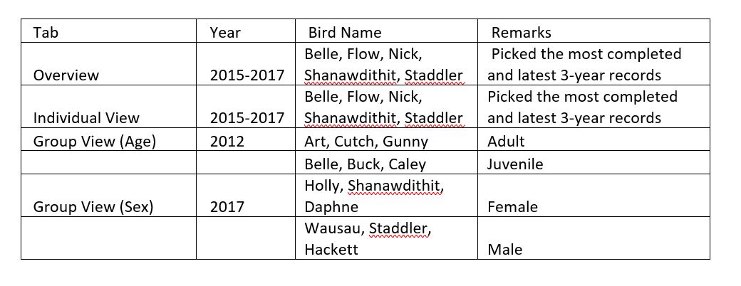
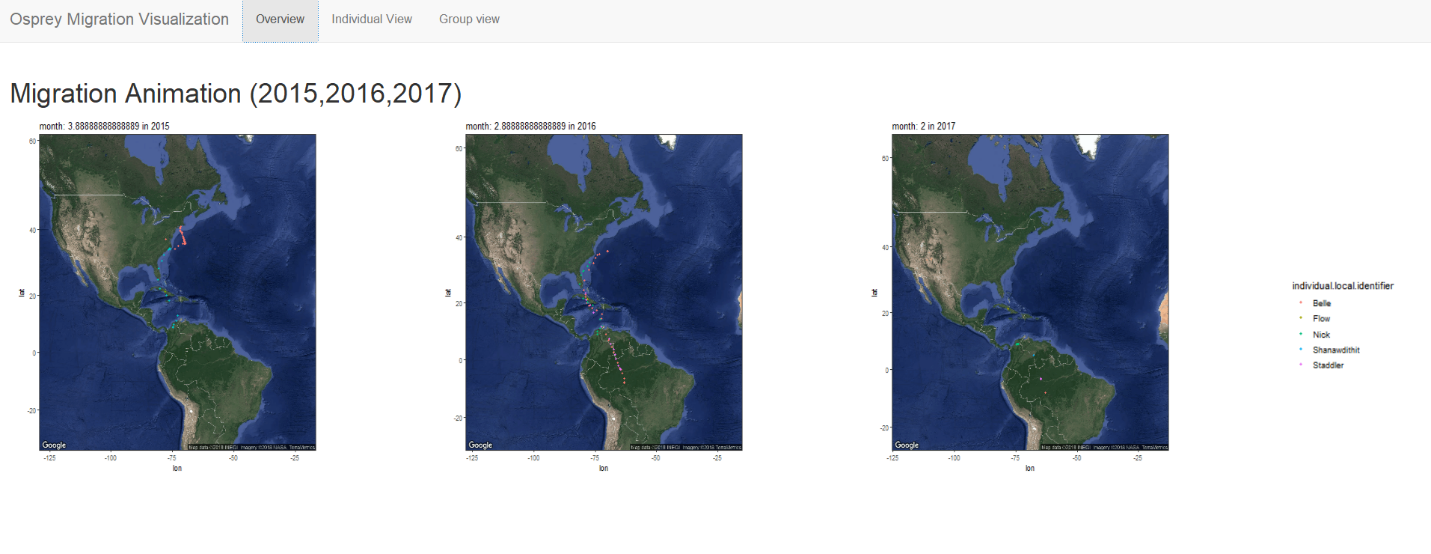
The visualization that we have created contains 3 different tabs. They have been split into overview, individual view and group view.
Overview
The visualization animates the flight migration of a group of birds across the months for the periods of 2015 - 2017.
Each dot represents the location of the bird on a particular day and each coloured line of dots represents the flight migration path of each bird.
Individual Movement
The individual movement tab contains 4 sub-tabs
i) Map
ii) Absolute direction
iii) Relative direction
iv) Ground speed
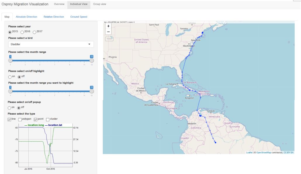
i) The map sub tab has the following features:
• Year selection – By clicking on the radio button, the user can select from the period 2015 – 2017.
• Bird selection – By choosing from the drop-down list available, the user can select the bird that he wishes to study.
• Month range – The slider here allows one to select from the months of Jan – Dec.
• On/off highlight – Click on the radio button to reveal the highlighted points.
• Month range highlight – Slider allows one to select the months that they want to highlight, which will appear as a red line.
• On/off popup – Click on the radio button to display pop-up of bird name and date.
• Select a type – 4 visualization choices are available line, polygon, point and cluster.
Line and point – The places that the bird were in can be seen either as a blue line/ blue point.
Polygon – shows the home range of the birds.
Cluster – shows the number of days the birds spend in that area.
• Graph – The graph is linked to the year and bird selected. A horizontal line parallel to the x-axis indicates that the bird is stationary at a location during that period.
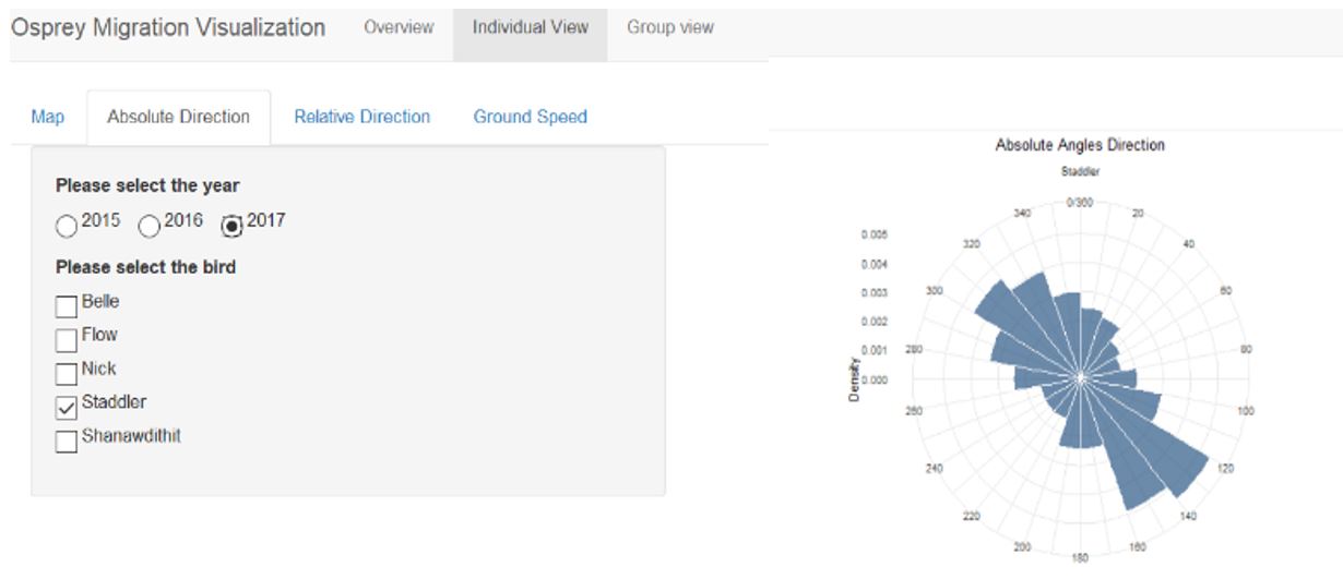
ii) The absolute direction sub tab has the following features:
• Year selection – By clicking on the radio button, the user can select from the period 2015 – 2017.
• Bird selection – By ticking on the checkbox, the user can select the bird he is interested in.
• From the absolute angles, we can tell the cardinal direction which the bird travels in.
• The direction bearing ranges from 0 to 360 degrees.
• 0,90,180 and 270 indicates that the bird is travelling north, east, west and south respectively.
• The denser the area of the triangle, the move frequent the bird travelled in that direction.
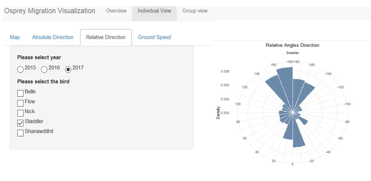
iii) The relative direction sub tab has the following features:
• Year selection – By clicking on the radio button, the user can select from the period 2015 – 2017.
• Bird selection – By ticking on the checkbox, the user can select the bird he is interested in.
• From the relative angles, we can tell the direction which the bird turns.
• The direction bearing ranges from 0 to 180/-180 degrees.
• 0,90, -90 and 180/-180 indicates that the bird is travelling straight, left, right and backwards respectively.
• The denser the area of the triangle, the move frequent the bird travelled in that direction.
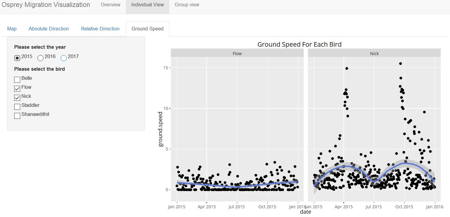
iv) The ground speed sub tab has the following features:
• Year selection – By clicking on the radio button, the user can select from the period 2015 – 2017.
• Bird selection – By ticking on the checkbox, the user can select the bird he is interested in.
• The scatter plot shows the ground speed over the months. Each point represents a day.
Group View
The functions of absolute/relative angles are the same as previously described above.
The group view tab contains 3 sub-tabs:
i) Absolute direction
ii) Relative direction
iii) Ground speed
i) and ii) The absolute/relative direction design are the same as previously described in section 5.2. The only difference being that the drop-down list has only 2 options (age/sex).
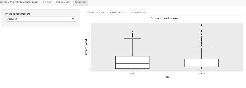
iii) The ground speed sub tab has the following features:
• Measure selection – Select from the drop-down list either age or sex.
• The box plot displayed allows one to make comparison between the ground speed of different characteristics of the birds.
DEMONSTRATION
The purpose of this section is to demonstrate the main aspects of our application using some use cases.
Overview
Individual Movement
Map
Absolute Direction
Relative Direction
Ground Speed
Group View
DISCUSSION
Our application has been designed to study animal movement using bird migration as an example. Utilizing trajectory data from the Osprey data set, we developed our application to include the following visualizations:
• Group movement of birds
• Individual movement of birds
• Home range of birds
• Directions the birds traveled in
The user will be able to derive findings from the visualizations. Findings from our use cases includes the following:
• Flight patterns of the birds: From March – April, the birds travel from South America to North America and vice versa from September – October.
• Ground Speed by age: The median speed of adults is higher than juveniles.
• Ground speed by sex: The median speed of females is higher than males.
