Difference between revisions of "Group2 Proposal"
| Line 65: | Line 65: | ||
| <div style="font-family:Century Gothic; border-radius: 1px "> | | <div style="font-family:Century Gothic; border-radius: 1px "> | ||
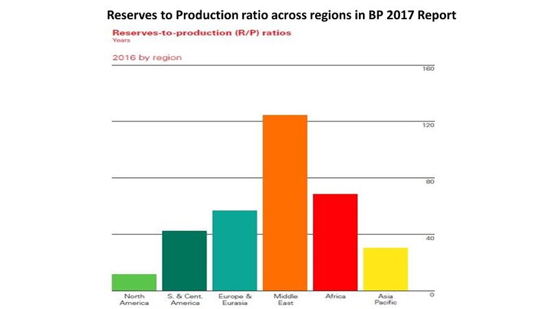
| − | + | Visualizations available on the energy outlook reports consists of basic graph types such as bar, line and pie charts which are static in nature and do not facilitate any discovery apart from what they are made to deliver. A sample visualization is presented below: | |
| + | <br><br> | ||
[[File:Group2_critique_viz2.JPG|800px|centre]] | [[File:Group2_critique_viz2.JPG|800px|centre]] | ||
| − | <br><br>As shown above, the visualization does not allow user to dig deeper into the dataset. Hence, to enhance usability of the the data, we have come up with interactive plots in order to gain deeper insights.<br><br> | + | <br><br>As shown above, the visualization does not allow user to dig deeper into the dataset. There is a lot of scope for improvement in the visualization methodology used and with the open source community contributing aggressively to the plethora of R packages, the possibilities are endless. Hence, to enhance usability of the the data, we have come up with interactive plots in order to gain deeper insights.<br><br> |
</div> | </div> | ||
| Line 74: | Line 75: | ||
<!--Critique of Existing Visualization--> | <!--Critique of Existing Visualization--> | ||
| − | <!--Visualization Deliverable--> | + | <!--Visualization Deliverable--> |
| + | |||
==Visualization Deliverable== | ==Visualization Deliverable== | ||
{| class="wikitable" | {| class="wikitable" | ||
Revision as of 18:14, 11 August 2018
World Energy Production & Consumption: A Visual Study
|
|
|
|
|
|
Contents
Project Overview
Properly functioning markets for electricity, natural gas, oil and pollution allowances are essential for the rational allocation of resources and cost-effective attainment of environmental goals. Rapidly changing energy dynamics determine the course of our economic development, geopolitics, technological breakthroughs, massive investments and trade flows.With renewable energy moving from niche to mainstream, the fuel mix is shifting.
|
About The Data Source
BP plc, formerly British Petroleum, is a British multinational oil and gas company headquartered in London, England. It is the world's sixth-largest oil and gas company, the sixth-largest energy company by market capitalization and the company with the world's twelfth-largest revenue (turnover). It is a vertically integrated company operating in all areas of the oil and gas industry, including exploration and production, refining, distribution and marketing, petrochemicals, power generation and trading. It also has renewable energy interests in biofuels and wind power.
|
Critique of the Existing Visualizations
Visualizations available on the energy outlook reports consists of basic graph types such as bar, line and pie charts which are static in nature and do not facilitate any discovery apart from what they are made to deliver. A sample visualization is presented below:
|
Visualization Deliverable
Below are some of the Visualizations that we would be working on: |
Challenges
Project Scope: The data set we've picked up has information on different types of energies across countries since 1965. This information can be used in a number of different ways and hence we need to narrow down the scope of our project to focus on our objective.
|

