Difference between revisions of "ISSS608 2017-18 T3 Assign Miko Tan Mei Jia Data Preparation"
| Line 55: | Line 55: | ||
==Dashboard Design== | ==Dashboard Design== | ||
| − | [[File: | + | [[File:Dashboard_Miko.png|600px|center]] |
<p>View the interactive Tableau dashboard here: [(https://public.tableau.com/profile/miko.tan#!/vizhome/VASTMiniChallenge2LikeaDucktoWaterHydrologyDashboard/HydrologyDashboard) Link to tableau dashboard]</p> | <p>View the interactive Tableau dashboard here: [(https://public.tableau.com/profile/miko.tan#!/vizhome/VASTMiniChallenge2LikeaDucktoWaterHydrologyDashboard/HydrologyDashboard) Link to tableau dashboard]</p> | ||
| Line 105: | Line 105: | ||
</td> | </td> | ||
| − | <td>[[File: | + | <td>[[File:Filter_Miko.png|200px|center]] |
</tr> | </tr> | ||
Latest revision as of 13:58, 14 July 2018
|
|
|
|
|
Methodology & Dashboard Design
Approaching the problem
To investigate hydrology data for soil contamination, specific chemical contaminants should be surfaced for analysis. This is especially important considering there are a total of 106 measures in the given hydrology data. Research was done to find the key contaminants in soil that are in close proximity to industrial sites, and have significant environment impact.
In addition to the toxic manufacturing chemical Methylosmolene, heavy metals have been identified as key industrial contaminants of soil. The following will be analysed:
- Arsenic
- Anionic Active Surfactant
- Chlorodinine
- Chromium
- Nickel
- Biochemical Oxygen
- Cyanide
- Lead
- Iron
The selection of heavy metals is based on the text Heavy Metals in Soils: Trace Metals and Metalloids in Soils and their Bioavailability, Third Edition edited by Brian J. Alloway.
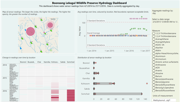
A dashboard is created to visualize the hydrology data in a way such that the 3 questions in the Mini-challenge may be answered. The dashboard is designed for Mistford College professors to analyse historical data from water sensors in the preserve.
1. Characterize the past and most recent situation with respect to chemical contamination in the Boonsong Lekagul waterways.
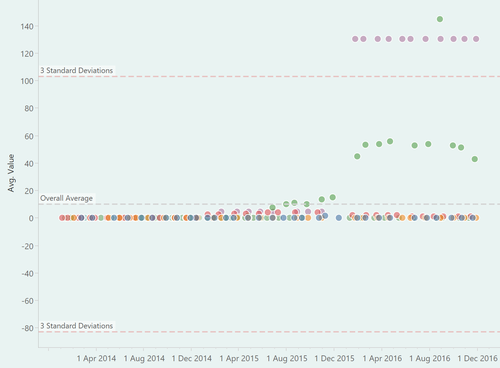
A control chart showing sensor readings over time will be used to look at the trends in chemical contamination in the preserve.
2. Finding anomalies in the waterway samples dataset and proposing data collection changes.
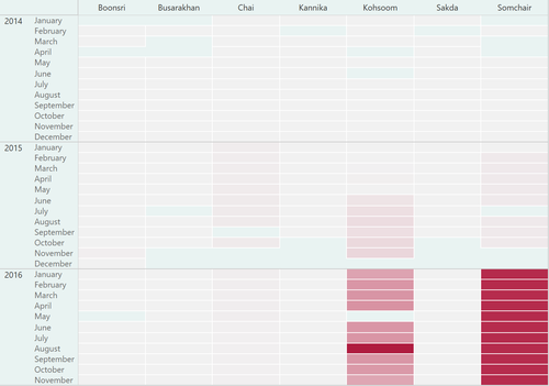
A highlight table showing data taken by sensor readings will be used to find anomalies in the data.
3. Recommending changes in sampling strategy.
The dashboard will be used as a whole to identify areas of improvement in the hydrology data.
Dashboard Design
View the interactive Tableau dashboard here: [(https://public.tableau.com/profile/miko.tan#!/vizhome/VASTMiniChallenge2LikeaDucktoWaterHydrologyDashboard/HydrologyDashboard) Link to tableau dashboard]
Methodology
| Description | Illustration |
|---|---|
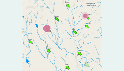
| 1. Symbol Map: Mapping out sensor readings by location
|
|
| 2. Control Chart: Setting limits for sensor readings
|
|
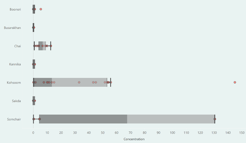
| 3. Boxplot: Distribution of sensor readings
|
|
| 4. Highlight chart: Showing trends in readings over time by location
|
|
| 5. Filters
|

