Difference between revisions of "ISSS608 2017-18 T3 Assign Saurav Jhajharia (Q2)"
Sauravj.2017 (talk | contribs) |
Sauravj.2017 (talk | contribs) |
||
| Line 69: | Line 69: | ||
To help investigators toggle for different chemicals and analyze the location and time wise pattern for each chemical, I have created a dashboard view. | To help investigators toggle for different chemicals and analyze the location and time wise pattern for each chemical, I have created a dashboard view. | ||
| − | This can be accessed via Tableau public [https://public.tableau.com/profile/saurav.jhajharia5962#!/vizhome/ | + | This can be accessed via Tableau public [https://public.tableau.com/profile/saurav.jhajharia5962#!/vizhome/Q21/Dashboard1 here]. |
| − | |||
[[File:Chemicals.gif|1000px]] | [[File:Chemicals.gif|1000px]] | ||
Latest revision as of 14:51, 11 July 2018
VAST Challenge 2018 MC2: Like a Duck to Water
Q2
What anomalies do you find in the waterway samples dataset? How do these affect your analysis of potential problems to the environment? Is the Hydrology Department collecting sufficient data to understand the comprehensive situation across the Preserve? What changes would you propose to make in the sampling approach to best understand the situation?
Anomalies (Chemical wise)
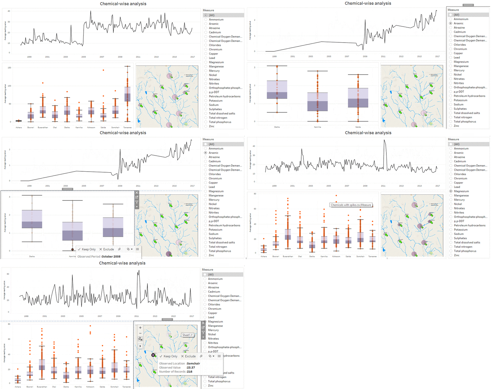
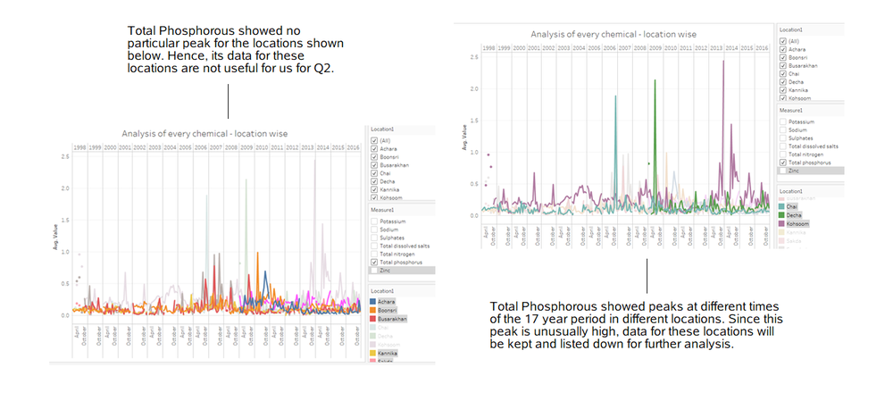
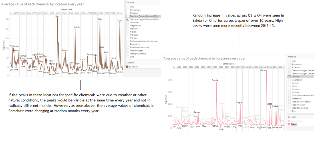
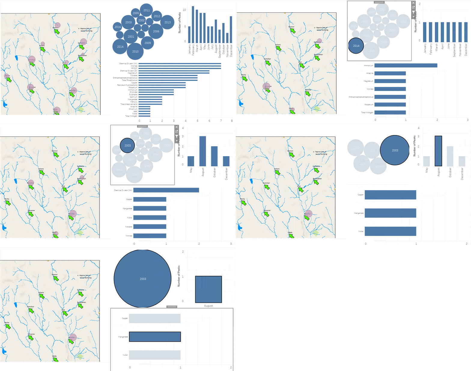
There was a chemical wise filtration done to remove chemicals that showed no major unconventional change in values over the years or had no unusual spike in their dataset. Any spike, as shown below, as per the location it is present in, was considered to be worth noting down for investigators to take a deeper look into.
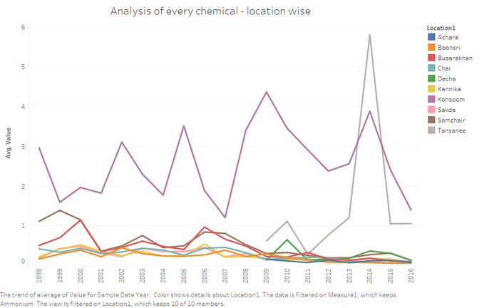
The image below clearly indicates that Ammonium showed a sharp increase in value in Tansanee and therefore only that dataset is of prime value for the investigators.
There are many more such chemicals which have shown unusual peaks at different locations at different points in time. To better analyze these specific chemicals, I have created a list of these chemicals as per their date and the locations.
To allow investigators to better understand and visualize this data, I have created a dashboard in Tableau which will give the investigators a chance to toggle with this data and get a better sense of these unusual peaks at different locations at different points in time.
This dashboard can be accessed via Tableau public here.
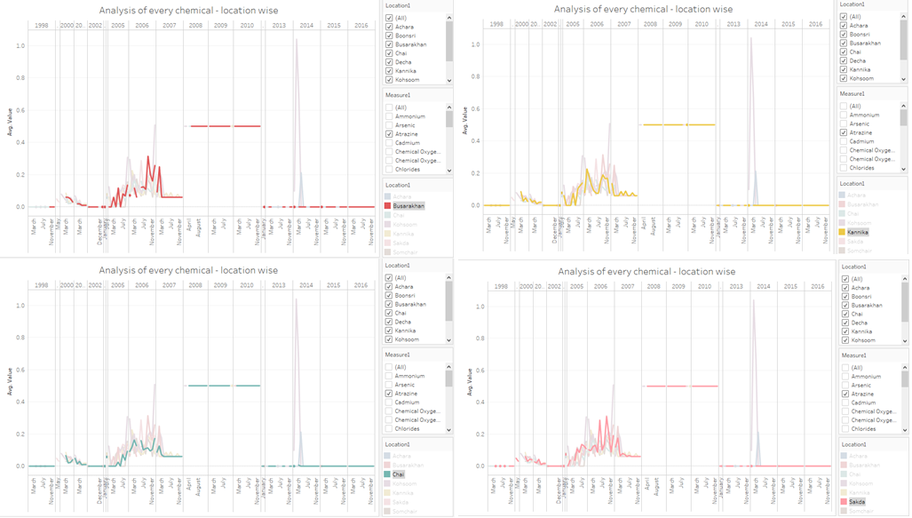
Similarly, there is some anomaly location wise as well. For the chemical Atrazine, Busrakahan, Kannika, Sakda, and Chai were seen with the exact same trend in average values.
Anomalies (Location wise)
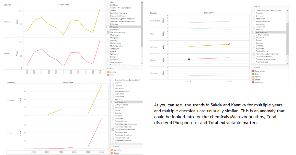
To compare how the same chemical was behaving in its average value over time at different locations, I compared them against one another to find strange similarities in values between Kannika and Chai & Kannika and Sakda. Their average values over time for certain chemicals were exactly the same.
For multiple chemicals, a strange similarity in trend was visible between Kannika and Sakda as well. It is shown here below.
To help investigators toggle for different chemicals and analyze the location and time wise pattern for each chemical, I have created a dashboard view.
This can be accessed via Tableau public here.
