Difference between revisions of "ISSS608 2017-18 T3 Assign Wang Runyu Data Visualization"
| Line 38: | Line 38: | ||
[[File:Pattern overview area chart.png]] <br> | [[File:Pattern overview area chart.png]] <br> | ||
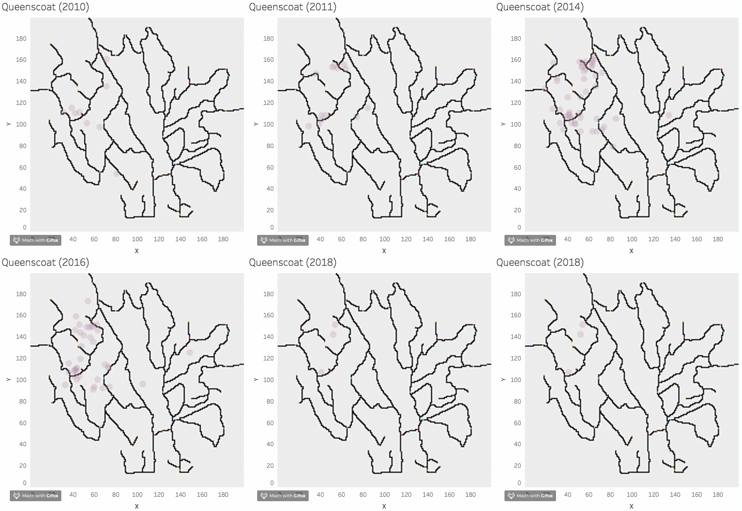
From 2010 to 2018, we can find all the birds are living in the same region over the years. <br> | From 2010 to 2018, we can find all the birds are living in the same region over the years. <br> | ||
| − | Below are four examples: Bombadli, Ordinary Shape, Rose Pipit, | + | Below are four examples: Bombadli, Ordinary Shape, Rose Pipit, Queenscoa. |
{| class="wikitable" | {| class="wikitable" | ||
|- | |- | ||
Revision as of 14:39, 8 July 2018
|
|
|
|
|
Question 1: Patterns of all of the bird species
Overview Patterns
The plot below indicates the birds location of all the species. The darker color indicated more appearances are recorded at the same location. All species spread over the entire preserve. Most of birds form their own society. They likely to live together as a community.
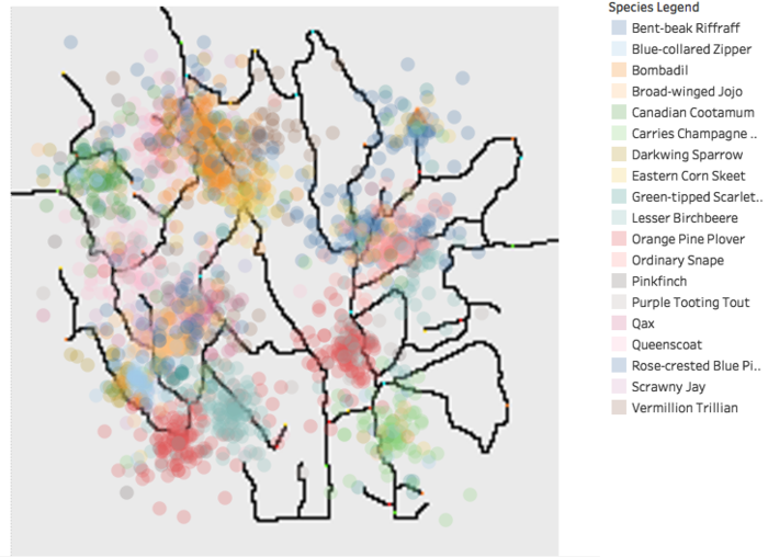
To confirm the pattern for every bird species, plot the graph and observe the location. Below are some examples.
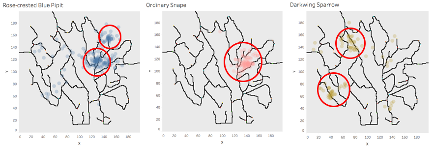
Form the pattern, we can find that all the birds species intend to live together. Some are living closer and some bird community are more widely spread.
Pattern over the years
The are graph shows that there is no significant number of audio recording provided before 2010. We can interpret meaningful result from insufficient data. So in this assignment, we will only take the audio recording from 2010 onward into consideration.

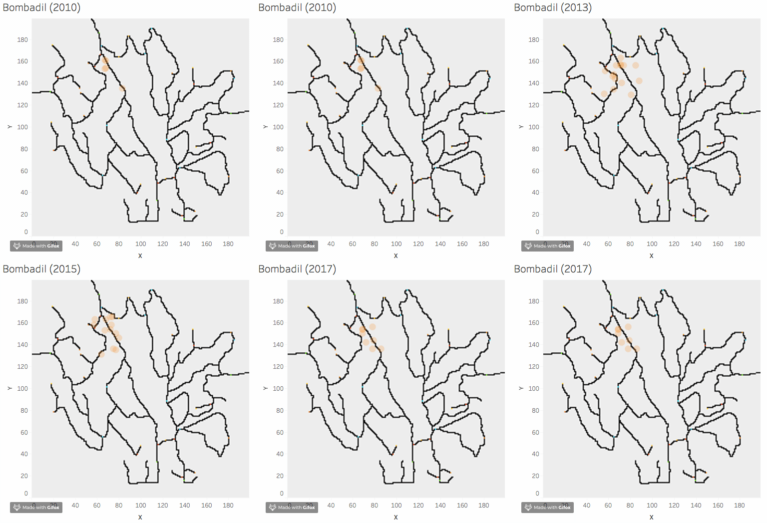
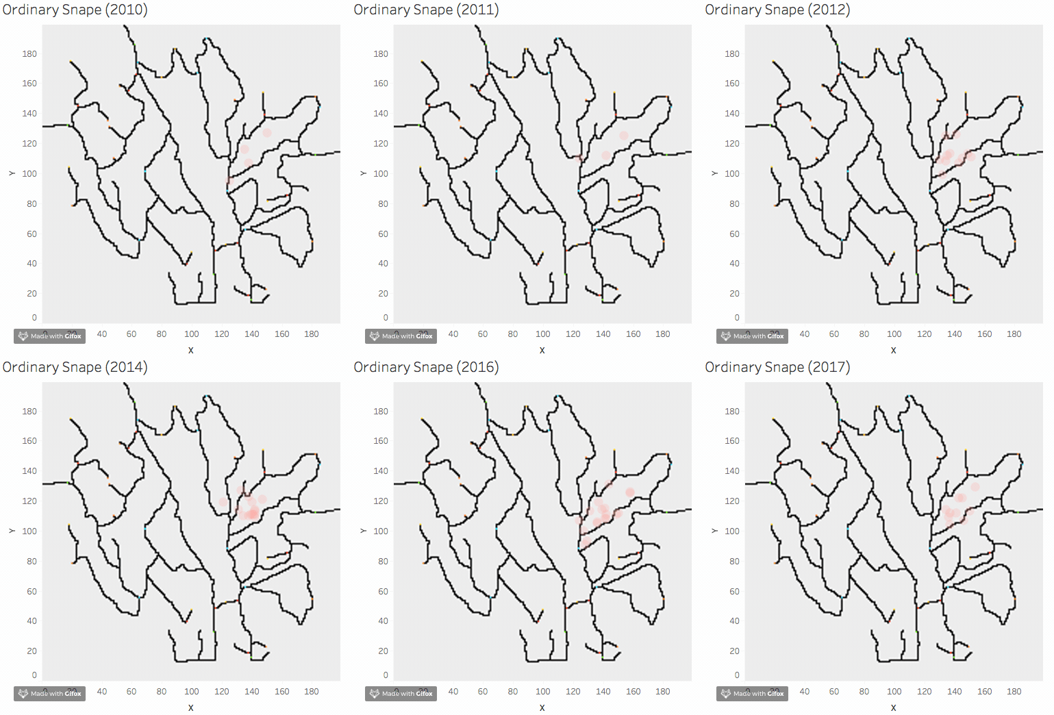
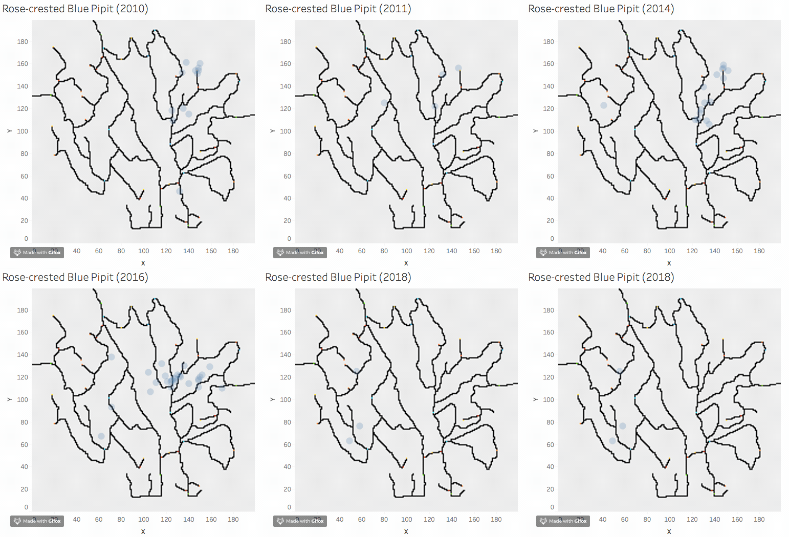
From 2010 to 2018, we can find all the birds are living in the same region over the years.
Below are four examples: Bombadli, Ordinary Shape, Rose Pipit, Queenscoa.
Pattern of Different Quarter
Pattern Around Dumping Site
Question 2
Visual Analytical Approach
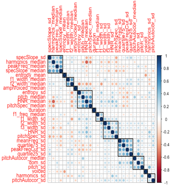
As the text format outcome from seewave package(analyzeFolder function) contains 69 features, it is not practical for us to analyze all the features visually. In the first step, I use findCorrelation() function to eliminate highly correlated features. I set the pair-wise absolute correlation cut off to 0.6.
Correlation Plot
remove features based on corr plot observations
Corrplot, select variables, we not only consider to check the variables nearby, but all the variables For example, group of 'specSlape_sd', 'harmonics_median', 'peakFreq_median', I choose 'peakFreq_median'.
