Difference between revisions of "ISSS608 2017-18 T3 Assign Jyoti Bukkapatil Methodology & Dashboard Design"
Jump to navigation
Jump to search
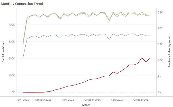
Figure 1
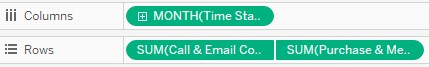
Figure 2
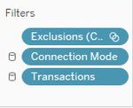
Figure 3
(Created page with "==Tools Used == I have used below four tools for data analysis and visualization. # JMP Pro 13 - Used for Data Preparation # Tableau 2018.1 - Used to create a Calendar View a...") |
|||
| Line 10: | Line 10: | ||
*'''Time Series Graph :''' | *'''Time Series Graph :''' | ||
| − | [[Image:ISSS608_2018_Jyoti_Bukkapatil_Methodology_1.jpg| | + | [[Image:ISSS608_2018_Jyoti_Bukkapatil_Methodology_1.jpg|600px|center|border]] |
| − | <center style="font-size:13px;"> <u> | + | <center style="font-size:13px;"> <u>Figure 1</u> </center> |
Time series graph was created for four big data files to visualize monthly and hourly pattern of the company's communication and purchase habits. | Time series graph was created for four big data files to visualize monthly and hourly pattern of the company's communication and purchase habits. | ||
| − | I have used Tableau to create time series patterns. | + | I have used Tableau to create time series patterns. To make the above plot, the fields added to Tableau rows and columns and the filters applied are shown below: |
| + | <div style="float:left;;width:60%;"><br/><br/> | ||
| + | [[Image:ISSS608_2018_Jyoti_Bukkapatil_Methodology_3.jpg|500px|center|border]]<br/> | ||
| + | <center style="font-size:13px;"> <u>Figure 2</u> </center> | ||
| + | </div> | ||
| + | <div style="float:left;;width:40%;> | ||
| + | [[Image:ISSS608_2018_Jyoti_Bukkapatil_Methodology_2.jpg|150px|center|border]]<br/> | ||
| + | <center style="font-size:13px;"> <u> Figure 3</u> </center> | ||
| + | </div> | ||
Revision as of 09:17, 8 July 2018
Tools Used
I have used below four tools for data analysis and visualization.
- JMP Pro 13 - Used for Data Preparation
- Tableau 2018.1 - Used to create a Calendar View and Timer Series Graph for All transactions in company
- Gephi 0.9.2 - Used to create Network Graph
- Microsoft Excel - Used to map Employee ID with Name
Methodology
- Time Series Graph :

Time series graph was created for four big data files to visualize monthly and hourly pattern of the company's communication and purchase habits. I have used Tableau to create time series patterns. To make the above plot, the fields added to Tableau rows and columns and the filters applied are shown below:

