Difference between revisions of "ISSS608 2017-18 T3 Assign Yeo Kaijun Method"
| Line 59: | Line 59: | ||
*Note: It is important to change the values to fit the units provided in the waterways sample datasets | *Note: It is important to change the values to fit the units provided in the waterways sample datasets | ||
| − | + | <br><br> | |
<div style="background:#000000; border:#002060; padding-left:15px; text-align:left;"> | <div style="background:#000000; border:#002060; padding-left:15px; text-align:left;"> | ||
<font size = 3; color="#FFFFFF"><span style="font-family:Century Gothic;">Software used</span></font> | <font size = 3; color="#FFFFFF"><span style="font-family:Century Gothic;">Software used</span></font> | ||
</div> | </div> | ||
| − | The main software used in data preparation and analysis are: | + | The main software used in data preparation and analysis are:<br> |
| − | 1. Tableau | + | 1. Tableau<br> |
2. Microsoft Excel | 2. Microsoft Excel | ||
<br><br> | <br><br> | ||
[[Assignments|<font face="Segoe UI Light" color="#3C33FF">Back to Assignments</font>]] | [[Assignments|<font face="Segoe UI Light" color="#3C33FF">Back to Assignments</font>]] | ||
Revision as of 15:32, 7 July 2018
VAST Mini Challenge 2: Methodology
|
|
|
|
|
Methodology
The data will be analyzed upon 3 different methods:
1. Comparison between different areas
2. Comparison across time
3. Comparison with a standardized water quality criteria
1. Comparison between different area
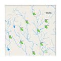
Firstly, there are 4 main exits of the waterway (Decha, Tansanee, Sakda & Kannika) The pollutant values of these 4 exits will be analyzed.
Next, upon spotting higher pollutant values in either of the exits, further investigation will be done on the sampling areas of each exits
To ensure recency of the data, only values from the recent 5 years will be used in the analysis
2.Comparison across time
Firstly, the waterways will be analyzed as a whole using a highlight cell chart, where % increase/decrease compared to the previous year will be highlighted. 2 main trend will be flagged out and further analyzed:
1. Sharp % increase/decrease
2. Consistent increases
As the data are no collected consistently for all years across all areas, a sharp % increase/decrease can indicate the following:
1. There is a sharp increase of pollutant dumping in an area in the waterway during the year
2. There was an area with high values of pollutant that was not sampled in the current/previous year
A consistent increase of pollutant would also be a case of concern as it might indicate that pollutants are building up in that area
Pollutants with the above mentioned situations will be further delved in to figure out the area of concern
3. Comparison with a standardized water quality criteria
To check for high levels of pollutant levels, the avg pollutant value and max pollutant value for each pollutant for the past 5 years will be compared with US National Recommended Water Quality Criteria. Any avg pollutant values above the continuous concentration criterion or any max pollutant values above the maximum concentration criterion will be highlighted and will indicate that the water might be polluted
- Note: It is important to change the values to fit the units provided in the waterways sample datasets
Software used
The main software used in data preparation and analysis are:
1. Tableau
2. Microsoft Excel
