From Visual Analytics and Applications
Jump to navigation
Jump to search
|
|
| Line 43: |
Line 43: |
| | <tr> | | <tr> |
| | <td><b> 2.Suspicious Group </b> | | <td><b> 2.Suspicious Group </b> |
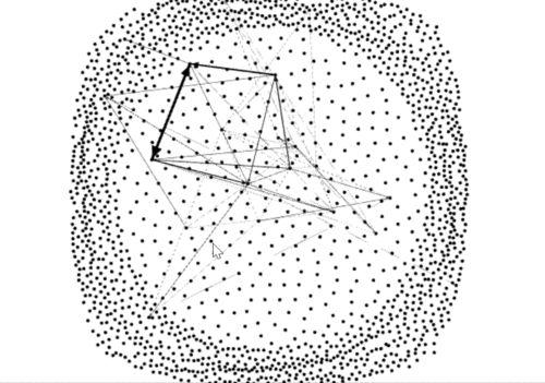
| − | <br> | + | <br>To locate the suspicious in the larger group.I input node.csv as node and sus.csv as edge into gephi. It's clear to find that where the suspicious is. |
| | </td> | | </td> |
| − | <td></td> | + | <td>[[File:YzcNet1.gif|500px|center]]</td> |
| | </tr> | | </tr> |
Revision as of 01:32, 8 July 2018
 VAST Challenge 2018:Secrets of Kasios

Visualization
| Description |
Illustration |
| 1.Overview the development of the company
Line chart is good for reflecting the development.
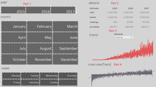
The number of calls,emails, meetings and purchases indicate the development of the whole company.The dashboard is divided into 4 parts. Users can chose the date they want to explore by selecting exact date in the first part. The second part shows us the exact number of all attributes during the date. The third part reflects the changing of each attribute over the time.(Note: All data have been scaled to be compared in the similar level).The last part summary the changing of all attributes over the time. (The trend has been indicated by the red line )
|
|
| 2.Suspicious Group
To locate the suspicious in the larger group.I input node.csv as node and sus.csv as edge into gephi. It's clear to find that where the suspicious is.
|
|


