Difference between revisions of "Preparation"
Pachen.2017 (talk | contribs) |
Pachen.2017 (talk | contribs) |
||
| (11 intermediate revisions by the same user not shown) | |||
| Line 9: | Line 9: | ||
{|width=100%, height=150%, style="background-color:#0000A8; font-family:Calibri; font-size:120%; text-align:center;" | {|width=100%, height=150%, style="background-color:#0000A8; font-family:Calibri; font-size:120%; text-align:center;" | ||
|- | |- | ||
| − | | | [[Background|<font color = "#ffffff" style="font-family:Comic Sans MS">Background</font>]] || [[Preparation|<font color = "#ffffff" style="font-family:Comic Sans MS">Preparation</font>]] || [[Visualization|<font color = "#ffffff" style="font-family:Comic Sans MS">Visualization</font>]] || [[Observations & Insights|<font color = "#ffffff" style="font-family:Comic Sans MS">Observations & Insights</font>]] || [[ | + | | | [[Background|<font color = "#ffffff" style="font-family:Comic Sans MS">Background</font>]] || [[Preparation|<font color = "#ffffff" style="font-family:Comic Sans MS">Data Preparation</font>]] || [[Visualization|<font color = "#ffffff" style="font-family:Comic Sans MS">Visualization</font>]] || [[Observations & Insights|<font color = "#ffffff" style="font-family:Comic Sans MS">Observations & Insights</font>]] || [[Assignments|<font color = "#ffffff" style="font-family:Comic Sans MS"> Assignments</font>]] |
|- | |- | ||
| | | | ||
| Line 22: | Line 22: | ||
[[File:2anAn3.png|500px]] | [[File:2anAn3.png|500px]] | ||
| − | [[File:2anan4.png| | + | [[File:2anan4.png|800px]] |
=Explore the Location picture= | =Explore the Location picture= | ||
| Line 34: | Line 34: | ||
Above dataset, Boonsong Lekagul waterways readings, contains most of the information that we could analyze. Next, we decide to use the second dataset, Location.csv. It contains X coordinate column and Y coordinate column. However, these two columns are blank. We need to add these two columns by ourselves. Notice the LR and UL are 249. Later when we insert the picture into tableau, we need to set the picture’s format. | Above dataset, Boonsong Lekagul waterways readings, contains most of the information that we could analyze. Next, we decide to use the second dataset, Location.csv. It contains X coordinate column and Y coordinate column. However, these two columns are blank. We need to add these two columns by ourselves. Notice the LR and UL are 249. Later when we insert the picture into tableau, we need to set the picture’s format. | ||
| − | [[File:2anan6.png| | + | [[File:2anan6.png|250px]] |
Using Tableau to open Location file and drag X coord and Ycoord into columns and Rows desperately. Drag Location into Details and also drag location into Filters. Click all. | Using Tableau to open Location file and drag X coord and Ycoord into columns and Rows desperately. Drag Location into Details and also drag location into Filters. Click all. | ||
| − | [[File:2anan7.png| | + | [[File:2anan7.png|700px]] |
To add picture into this sheet. Click on Map, Background Image, and then choose the Sheet 1. Click on Add Image. | To add picture into this sheet. Click on Map, Background Image, and then choose the Sheet 1. Click on Add Image. | ||
| Line 47: | Line 47: | ||
<br>Y Field on Top: type 249 | <br>Y Field on Top: type 249 | ||
| − | [[File:2anAn10.png| | + | [[File:2anAn10.png|300px]] |
When we pick one dot nearby each location, it would should up the X and Y coordinate details. We re-write it into Location.txt and repeat the process until 10 places have already picked up. | When we pick one dot nearby each location, it would should up the X and Y coordinate details. We re-write it into Location.txt and repeat the process until 10 places have already picked up. | ||
| − | [[File:2anAn11.png| | + | [[File:2anAn11.png|300px]] [[File:2anAn12.png|250px]] |
=Merge two files by tableau = | =Merge two files by tableau = | ||
Merge “Boonsong Lekagul waterways readings.txt” and “Location” into one file. I have already changed the name from “Boonsong Lekagul waterways readings” to “data”. Using left outer join to match properly. | Merge “Boonsong Lekagul waterways readings.txt” and “Location” into one file. I have already changed the name from “Boonsong Lekagul waterways readings” to “data”. Using left outer join to match properly. | ||
| − | [[File:2anAn13.png| | + | [[File:2anAn13.png|700px]] |
=Calendar chart= | =Calendar chart= | ||
Drag sample date into columns and Measure into Rows. We set the sample date as Year level and change it into discrete. Darg Number of records into Color and Labels, and then change the color to red. Change automatic to Square to let color fill in and then use “All” at mark label. | Drag sample date into columns and Measure into Rows. We set the sample date as Year level and change it into discrete. Darg Number of records into Color and Labels, and then change the color to red. Change automatic to Square to let color fill in and then use “All” at mark label. | ||
| − | [[File:2anAn14.png| | + | [[File:2anAn14.png|150px]] [[File:2anAn15.png|300px]]<br> |
| + | [[File:2anAn17.png|200px]] | ||
| + | [[File:2anAn16.png|150px]] | ||
Using calender chart we could tell that not every measures have recourds every years and every years’ sampling records are not completed. Therefore, add Measure, Sample date into filter that we could pick the year that we are concerned. Histagram would introduce we use conscade Year (Sample Date) filter to help us link sheets together. | Using calender chart we could tell that not every measures have recourds every years and every years’ sampling records are not completed. Therefore, add Measure, Sample date into filter that we could pick the year that we are concerned. Histagram would introduce we use conscade Year (Sample Date) filter to help us link sheets together. | ||
| Line 69: | Line 71: | ||
Count_appear_year and number of records into Rows. Drag Count_appear_year into Label that the upper histogram would display the amount of aggregate counted year. Click on “All” at marks label. Next, we sort out count_of_year by ascending. | Count_appear_year and number of records into Rows. Drag Count_appear_year into Label that the upper histogram would display the amount of aggregate counted year. Click on “All” at marks label. Next, we sort out count_of_year by ascending. | ||
| − | [[File:2anAn18.png| | + | <p> [[File:2anAn18.png|400px]] |
| − | [[File:2anAn19.png| | + | [[File:2anAn19.png|300px]][[File:2anAn20.png|200px]][[File:2anAn21.png|200px]]</p> |
Owing to Number of Records on Rows, also drag Number of Records into mark label. Click on “Highlighted” at mark label that when I have already selected the amount of count_appear_year I would like, the number of Records would also display. Using the second histogram, we could see that every measure’s number of records are different. It tells us the sensors are not consistent to detect. It is random to pick up water. | Owing to Number of Records on Rows, also drag Number of Records into mark label. Click on “Highlighted” at mark label that when I have already selected the amount of count_appear_year I would like, the number of Records would also display. Using the second histogram, we could see that every measure’s number of records are different. It tells us the sensors are not consistent to detect. It is random to pick up water. | ||
| − | [[File:2anAn22.png| | + | [[File:2anAn22.png|200px]][[File:2anAn23.png|200px]] |
Also, add Sample_date on Year level, count_appear_year, and Measure into filter. Here is the tricky that I click on right triangle of Year (Sample Date) filter, click on apply for Worksheets, and choose Selected Worksheet. I have already completed my whole tableau file, so the list would display whole sheets. The list I would tick all exclude Map because map do not need time on filter. It would help me when years I have selected on histogram, it would reflect to all sheets which contain Year (Sample Date) filter. | Also, add Sample_date on Year level, count_appear_year, and Measure into filter. Here is the tricky that I click on right triangle of Year (Sample Date) filter, click on apply for Worksheets, and choose Selected Worksheet. I have already completed my whole tableau file, so the list would display whole sheets. The list I would tick all exclude Map because map do not need time on filter. It would help me when years I have selected on histogram, it would reflect to all sheets which contain Year (Sample Date) filter. | ||
| − | [[File:2anAn24.png| | + | [[File:2anAn24.png|300px]][[File:2anAn25.png|300px]][[File:2anAn26.png|400px]] |
| + | |||
=Line chart= | =Line chart= | ||
Create Anomaly calculation to help us point out some outliers which anomalies should be. Use three times of Standard Deviation to identify the outliers. | Create Anomaly calculation to help us point out some outliers which anomalies should be. Use three times of Standard Deviation to identify the outliers. | ||
| − | [[File:2anAn27.png| | + | [[File:2anAn27.png|700px]] |
Drag Sample date into Columns and change it to continuous, drag Measure, Value, Value into Rows. We have already known some of the values of data appear one more time at the same date, location and measure. Therefore, we use average value to correct this situation. Here we also got tricks, right click on one of the AVG(Value) on Dual Axis. The rows would combine together, and we untick one of each headers. Also, drag Anomaly into color of the second layer of AVG(Value)and assigned two colors to identify outliers. Next, change to Circle. | Drag Sample date into Columns and change it to continuous, drag Measure, Value, Value into Rows. We have already known some of the values of data appear one more time at the same date, location and measure. Therefore, we use average value to correct this situation. Here we also got tricks, right click on one of the AVG(Value) on Dual Axis. The rows would combine together, and we untick one of each headers. Also, drag Anomaly into color of the second layer of AVG(Value)and assigned two colors to identify outliers. Next, change to Circle. | ||
| − | [[File:2anAn28.png| | + | [[File:2anAn28.png|700px]] |
Create measure_filter calculation. Darg Measure, Sample Date, and Measure_filter into Filters. We have already chosen measures on the previous histogram and click on show filter on measure_filter. Click on the right triangle to have expand option, not only click on Selected Worksheet that we mentioned before but click on Only Relevant Values. It could help us to filter out the measures we are only concerned. | Create measure_filter calculation. Darg Measure, Sample Date, and Measure_filter into Filters. We have already chosen measures on the previous histogram and click on show filter on measure_filter. Click on the right triangle to have expand option, not only click on Selected Worksheet that we mentioned before but click on Only Relevant Values. It could help us to filter out the measures we are only concerned. | ||
| − | [[File:2anAn29.png| | + | {| class="wikitable" |
| + | |- | ||
| + | ! !! | ||
| + | |- | ||
| + | | [[File:2anAn29.png|300px]] || [[File:2Anan30.png|300px]] | ||
| + | |} | ||
| + | |||
| + | |||
Add reference line: average value and expected band. The expected band we defined no more or less than 3 times of Standard Deviation. | Add reference line: average value and expected band. The expected band we defined no more or less than 3 times of Standard Deviation. | ||
| − | [[File:2anAn31.png| | + | |
| + | {| class="wikitable" | ||
| + | |- | ||
| + | ! !! | ||
| + | |- | ||
| + | | [[File:2anAn31.png|250px]] || [[File:2anAn32.png|250px]] | ||
| + | |} | ||
Latest revision as of 21:59, 11 July 2018
| Background | Data Preparation | Visualization | Observations & Insights | Assignments |
Contents
Explore data
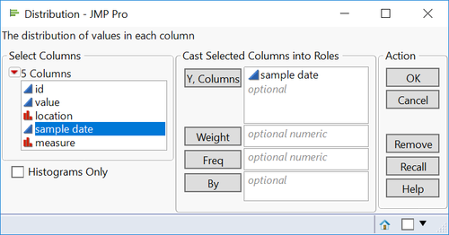
Import data “Boonsong Lekagul waterways readings.csv”. Explore data by JMP. We found this dataset displays multiple different values among the same sample data, measure, and locations. Shown as below picture. However, we could use average value to compute when using Tableau. Therefore, decide to leave it at first.
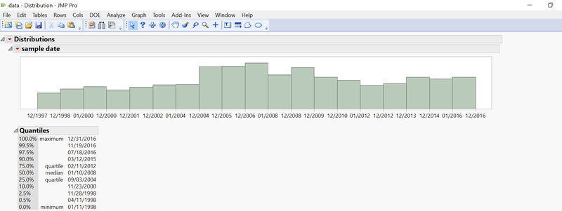
Using Analysis> Distribution function and drag Sample date to Y, columns. We get the data distribution which is from 01/11/1998 to 12/31/2016, total 19 years.
Explore the Location picture
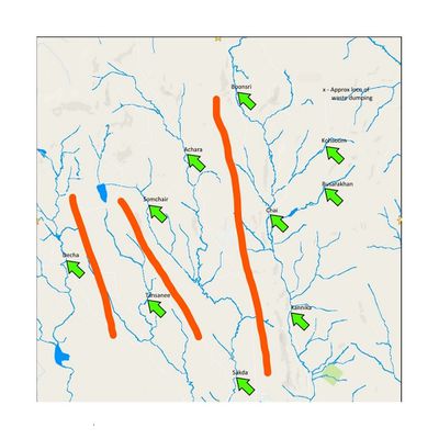
Waterways Final.jpg is the picture that we would use. This picture has 10 places’ names. We look at Boonsong Lekagul waterways readings dataset and found column location matches locations name in picture. There are water quality sensors placed.
Next, we look carefully at this picture. Small rivers merging into a bigger river is the normal. Therefore, we could also tell rivers should flow from north to south. We could divide the 10 locations into 4 parts due to direction of streamflow. Split 10 locations into 4 parts would help us to analyze the following question 3 easily. We save this file name as “Waterways Final_changed.”
Using Tableau and Excel to add X, Y coordinate
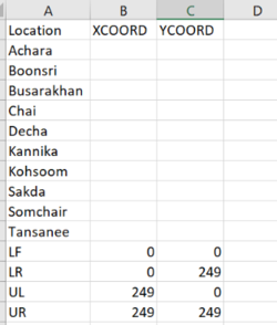
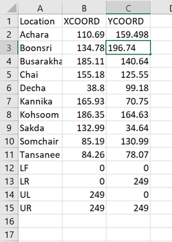
Above dataset, Boonsong Lekagul waterways readings, contains most of the information that we could analyze. Next, we decide to use the second dataset, Location.csv. It contains X coordinate column and Y coordinate column. However, these two columns are blank. We need to add these two columns by ourselves. Notice the LR and UL are 249. Later when we insert the picture into tableau, we need to set the picture’s format.
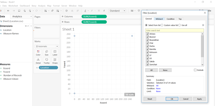
Using Tableau to open Location file and drag X coord and Ycoord into columns and Rows desperately. Drag Location into Details and also drag location into Filters. Click all.
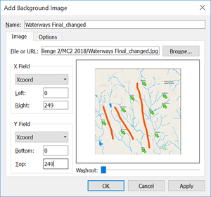
To add picture into this sheet. Click on Map, Background Image, and then choose the Sheet 1. Click on Add Image.
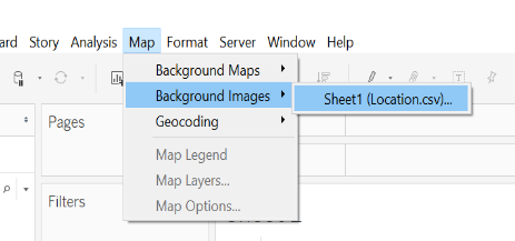
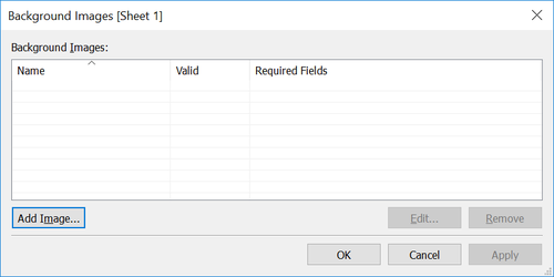
Insert the Waterways Final_changed. Jpg
X Field on Right: type 240
Y Field on Top: type 249
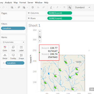
When we pick one dot nearby each location, it would should up the X and Y coordinate details. We re-write it into Location.txt and repeat the process until 10 places have already picked up.
Merge two files by tableau
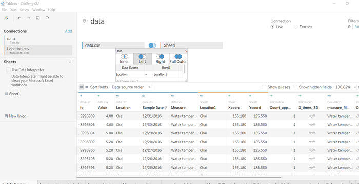
Merge “Boonsong Lekagul waterways readings.txt” and “Location” into one file. I have already changed the name from “Boonsong Lekagul waterways readings” to “data”. Using left outer join to match properly.
Calendar chart
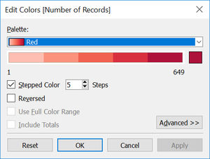
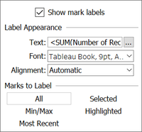
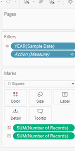
Drag sample date into columns and Measure into Rows. We set the sample date as Year level and change it into discrete. Darg Number of records into Color and Labels, and then change the color to red. Change automatic to Square to let color fill in and then use “All” at mark label.
Using calender chart we could tell that not every measures have recourds every years and every years’ sampling records are not completed. Therefore, add Measure, Sample date into filter that we could pick the year that we are concerned. Histagram would introduce we use conscade Year (Sample Date) filter to help us link sheets together.
Histogram
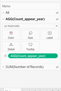
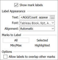
For histogram, I create one calculation called “Count_appear_year” which can help me count how many years that measures appear. Drag Measure into Columns and Count_appear_year and number of records into Rows. Drag Count_appear_year into Label that the upper histogram would display the amount of aggregate counted year. Click on “All” at marks label. Next, we sort out count_of_year by ascending.
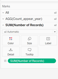
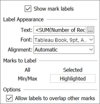
Owing to Number of Records on Rows, also drag Number of Records into mark label. Click on “Highlighted” at mark label that when I have already selected the amount of count_appear_year I would like, the number of Records would also display. Using the second histogram, we could see that every measure’s number of records are different. It tells us the sensors are not consistent to detect. It is random to pick up water.
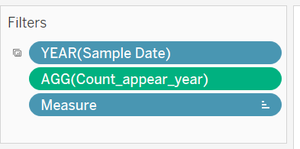
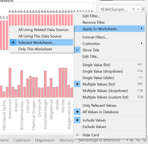
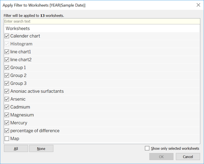
Also, add Sample_date on Year level, count_appear_year, and Measure into filter. Here is the tricky that I click on right triangle of Year (Sample Date) filter, click on apply for Worksheets, and choose Selected Worksheet. I have already completed my whole tableau file, so the list would display whole sheets. The list I would tick all exclude Map because map do not need time on filter. It would help me when years I have selected on histogram, it would reflect to all sheets which contain Year (Sample Date) filter.
Line chart
Create Anomaly calculation to help us point out some outliers which anomalies should be. Use three times of Standard Deviation to identify the outliers.
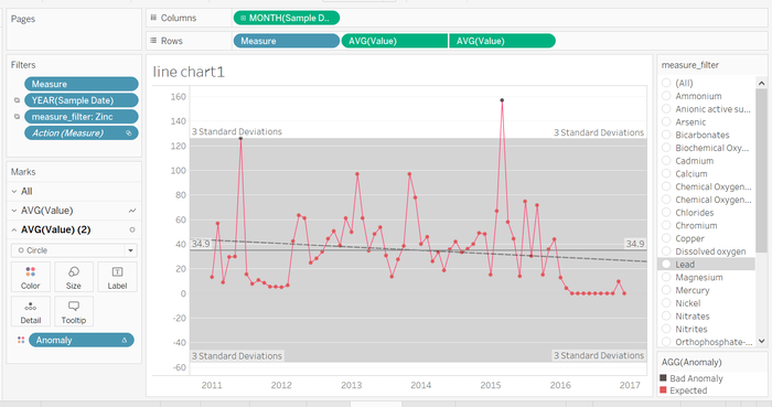
Drag Sample date into Columns and change it to continuous, drag Measure, Value, Value into Rows. We have already known some of the values of data appear one more time at the same date, location and measure. Therefore, we use average value to correct this situation. Here we also got tricks, right click on one of the AVG(Value) on Dual Axis. The rows would combine together, and we untick one of each headers. Also, drag Anomaly into color of the second layer of AVG(Value)and assigned two colors to identify outliers. Next, change to Circle.
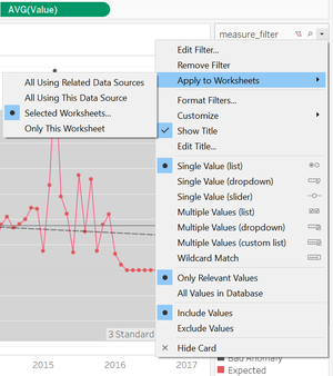
Create measure_filter calculation. Darg Measure, Sample Date, and Measure_filter into Filters. We have already chosen measures on the previous histogram and click on show filter on measure_filter. Click on the right triangle to have expand option, not only click on Selected Worksheet that we mentioned before but click on Only Relevant Values. It could help us to filter out the measures we are only concerned.
 |
|
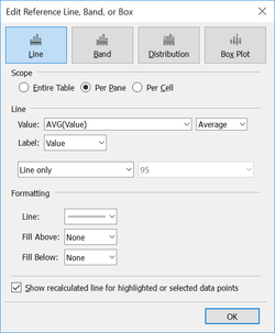
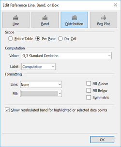
Add reference line: average value and expected band. The expected band we defined no more or less than 3 times of Standard Deviation.
 |
|


