Difference between revisions of "Visualization"
Pachen.2017 (talk | contribs) |
Pachen.2017 (talk | contribs) |
||
| (3 intermediate revisions by the same user not shown) | |||
| Line 10: | Line 10: | ||
{|width=100%, height=150%, style="background-color:#0000A8; font-family:Calibri; font-size:120%; text-align:center;" | {|width=100%, height=150%, style="background-color:#0000A8; font-family:Calibri; font-size:120%; text-align:center;" | ||
|- | |- | ||
| − | | | [[Background|<font color = "#ffffff" style="font-family:Comic Sans MS">Background</font>]] || [[Preparation|<font color = "#ffffff" style="font-family:Comic Sans MS">Preparation</font>]] || [[Visualization|<font color = "#ffffff" style="font-family:Comic Sans MS">Visualization</font>]] || [[Observations & Insights|<font color = "#ffffff" style="font-family:Comic Sans MS">Observations & Insights</font>]] || [[ | + | | | [[Background|<font color = "#ffffff" style="font-family:Comic Sans MS">Background</font>]] || [[Preparation|<font color = "#ffffff" style="font-family:Comic Sans MS">Data Preparation</font>]] || [[Visualization|<font color = "#ffffff" style="font-family:Comic Sans MS">Visualization</font>]] || [[Observations & Insights|<font color = "#ffffff" style="font-family:Comic Sans MS">Observations & Insights</font>]] || [[Assignments|<font color = "#ffffff" style="font-family:Comic Sans MS"> Assignments</font>]] |
|- | |- | ||
| | | | ||
| Line 20: | Line 20: | ||
[[File:an3_1png.png|500px]] | [[File:an3_1png.png|500px]] | ||
| − | |||
=Calendar chart= | =Calendar chart= | ||
| − | + | The calendar chart enables the user to know the number of records taken each year for each chemical. | |
[[File:an3 2.png|500px]] | [[File:an3 2.png|500px]] | ||
| Line 37: | Line 36: | ||
[[File:an3.4.png|500px]] | [[File:an3.4.png|500px]] | ||
| + | |||
| + | =Tableau Public= | ||
| + | |||
| + | #Worksheets please download here![[https://public.tableau.com/profile/pin.an.chen#!/vizhome/Challenge2_0-Chenpin-an/Histogram?publish=yes]] | ||
Latest revision as of 22:00, 11 July 2018
| Background | Data Preparation | Visualization | Observations & Insights | Assignments |
Contents
Histogram
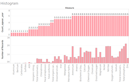
The year has been filtered from 2011-2016.
From the upper histogram, the number 6 indicates that the corresponding chemicals in the lower histogram have records from 2011- 2016. The lower histogram below indicates the total number of records which the chemicals have from 2011-2016
Calendar chart
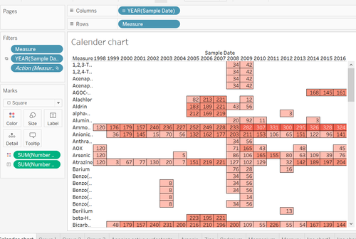
The calendar chart enables the user to know the number of records taken each year for each chemical.
Line chart by group
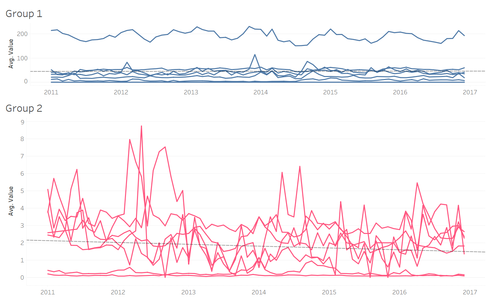
Easily tell the different chemicals related group. Also, by doing cluster manually, we could also notice some of the chemicals are hard to group. We could investigate what patterns they are and assume what happened at that time.
Average value in line chart by measure
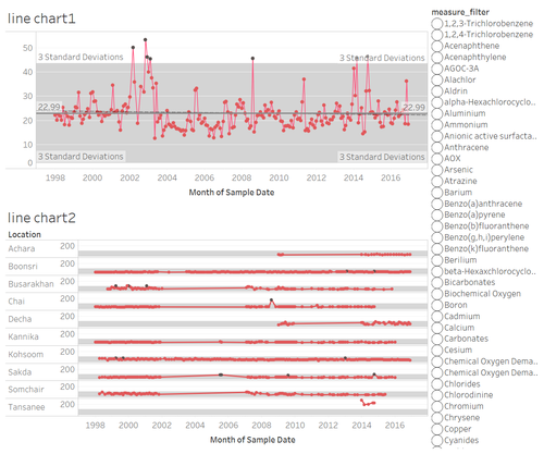
This dashboard enables the user to visualize the monthly readings of a selected chemical over a period of time (line chart 1). The breakdown by locations can also be seen (line chart 2)
Tableau Public
- Worksheets please download here![[1]]


