Difference between revisions of "Data Preparation"
Alagua.2017 (talk | contribs) |
|||
| (17 intermediate revisions by 3 users not shown) | |||
| Line 1: | Line 1: | ||
| − | + | <div style=background:#2B3856 border:#A3BFB1> | |
| − | <div style= | ||
[[Image:Pic.jpg|400px]] | [[Image:Pic.jpg|400px]] | ||
| − | <font size = | + | <font size = 6; color="#FFFFFF"> VAST Mini Challenge 2 - Like Duck To Water |
| + | </font> | ||
</div> | </div> | ||
| + | <!--MAIN HEADER --> | ||
| + | {|style="background-color:#1B338F;" width="100%" cellspacing="0" cellpadding="0" valign="top" border="0" | | ||
| + | | style="font-family:Century Gothic; font-size:100%; solid #000000; background:#2B3856; text-align:center;" width="20%" | | ||
| + | ; | ||
| + | [[Introduction| <font color="#FFFFFF">'''INTRODUCTION'''</font>]] | ||
| − | + | | style="font-family:Century Gothic; font-size:100%; solid #1B338F; background:#2B3856; text-align:center;" width="20%" | | |
| − | + | ; | |
| − | | style="font-family: | + | [[Data Preparation| <font color="#FFFFFF">'''DATA PREPARATION AND DASHBOARD DESIGN'''</font>]] |
| − | ; | + | |
| − | [[ | + | | style="font-family:Century Gothic; font-size:100%; solid #1B338F; background:#2B3856; text-align:center;" width="20%"| |
| − | | style="font-family: | + | ; |
| − | ; | + | |
| − | [[ | + | [[Insights| <font color="#FFFFFF">'''OBSERVATION AND INSIGHTS'''</font>]] |
| − | | style="font-family: | + | |
| − | ; | + | | style="font-family:Century Gothic; font-size:100%; solid #1B338F; background:#0b3d53; text-align:center;" width="25%" | |
| − | [[ | + | ; |
| − | | style="font-family: | + | [[CONCLUSION| <font color="#FFFFFF">'''CONCLUSION'''</font>]] |
| − | ; | + | |
| − | [[ | + | | style="font-family:Century Gothic; font-size:100%; solid #1B338F; background:#2B3856; text-align:center;" width="20%" | |
| + | ; | ||
| + | [[Assignment_Dropbox_G1| <font color="#FFFFFF">Back to Dropbox</font>]] | ||
| | | | ||
|} | |} | ||
| − | == | + | <br/> |
| − | + | ||
| + | <br/> | ||
| + | <div style=" text-align:left"> | ||
| + | <font size = 3; color="#000000"><span style="font-family:Trebuchet MS; font-weight:bold;"><h2>Data Description</h2></span></font> | ||
| + | </div> | ||
| + | The data available for the assignment is shown in detail below:<br><br> | ||
| + | [[File:Alagu_Data_Prep_1.png|1000px|]] | ||
| + | <br> | ||
| + | <div style=" text-align:left"> | ||
| + | <font size = 3; color="#000000"><span style="font-family:Trebuchet MS; font-weight:bold;"><h2>Tools Used</h2></span></font> | ||
| + | </div> | ||
| + | Below are the tools used for the Data analysis and visualization for this assignment:<br> | ||
| + | 1. SAS JMP Pro 13<br> | ||
| + | 2. Microsoft Excel<br> | ||
| + | 3. Tableau | ||
| + | <br> | ||
| + | |||
| + | <div style=" text-align:left"> | ||
| + | <font size = 3; color="#000000"><span style="font-family:Trebuchet MS; font-weight:bold;"><h2>Data Preparation</h2></span></font> | ||
| + | </div> | ||
| + | |||
| + | The data given in the vast challenge need to be merged and prepared before performing the analysis in the tableau for visualization. The data preparation needed was broadly classified into three steps merging the input files, cleaning the data and mapping the Geolocation for the sites in the preserve. | ||
| + | |||
| + | <div style=" text-align:left"> | ||
| + | <font size = 2; color="#000000"><span style="font-family:Trebuchet MS; font-weight:bold;"><h2>Data Consolidation</h2></span></font> | ||
| + | </div> | ||
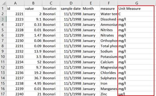
| + | The data files given for the vast challenge has two excel files named chemical units of measure and Boonsong Lekagul waterway readings. The chemical units of measure had the unit as each chemical has different measuring scale. As a first step the two excel files has been merged using lookup of the chemical name in excel and merged as shown below:<br><br> | ||
| + | [[File:Alagu_Data_Prep_2.png|500px|]]<br><br> | ||
| + | [[File:Alagu_Data_Prep_3.png|500px|]] | ||
| + | |||
| + | <div style=" text-align:left"> | ||
| + | <font size = 2; color="#000000"><span style="font-family:Trebuchet MS; font-weight:bold;"><h2>Data Cleaning</h2></span></font> | ||
| + | </div> | ||
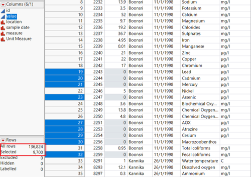
| + | Looking at the data after merging, the chemical measure value had many chemical readings value as 0.0 as these records are equivalent to not having the chemical contamination in the location, these records need to be deleted before the data analysis for better visualization. Nearly 2.5 percentile records about 9700 rows have value has 0 as shown below:<br><br> | ||
| + | [[File:Alagu_Data_Prep_4.png|500px|]]<br><br> | ||
| + | [[File:Alagu_Data_Prep_5.png|500px|]] | ||
| + | |||
| + | <div style=" text-align:left"> | ||
| + | <font size = 2; color="#000000"><span style="font-family:Trebuchet MS; font-weight:bold;"><h2>GeoLocation Mapping</h2></span></font> | ||
| + | </div> | ||
| + | A new excel file is created with all the location names under the column Location and two new coordinates X and Y empty. The lower and upper limits for left and right, bottom and top in the values as 0 and 249 are defined. Taking the excel file in tableau as data source, the background image is inserted in tableau as the Waterway image given in the data. Each of the location is annotated in tableau to find the X and Y coordinates for every location. The values are traced back and manually input in the initial data file to map in tableau each location. This is necessary to locate the regions in tableau. after the reverse Geocoding, the tooltip shows the location coordinates with respect to other location.<br> | ||
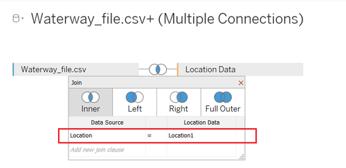
| + | In tableau after the above step the initial excel file prepared and the location file created from Geolocation mapping is joined using inner join with the key column as Location so that the file for visualization has the coordinates of the locations in the map.<br> | ||
| + | [[File:Alagu_Data_Prep_7.png|500px|]]<br><br> | ||
| + | [[File:Alagu_Data_Prep_6.png|500px|]] | ||
| + | <div style=" text-align:left"> | ||
| + | <font size = 3; color="#000000"><span style="font-family:Trebuchet MS; font-weight:bold;"><h2>Dashboard Design</h2></span></font> | ||
| + | </div> | ||
| + | |||
| + | <br>The data is prepared using Excel, JMP and joined in tableau for the visualization. In tableau each of the questions raised by vast challenge has been handled separately in different sheets and the pattern is showed up in the dashboard. The story board of the tableau file looks as shown below : | ||
| + | [[File:Alagu_StoryBoard.png|700px|]] | ||
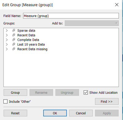
| + | <br>For making it easy for the analysis , I created grouping of the chemical measure into five categories according to their data sampling to see the trends across the data. The measure group has five categories as Complete Data, Recent Data missing, Last 10 years data, Only Recent Data available and Sparse data. This is done only for the tableau development perspective.<br> | ||
| + | |||
| + | [[File:Alagu_M0.png|400px|]] | ||
| − | + | <br> <b>1.Hydrology Samples Overview Dashboard:</b> It has two graphs to look at the data collection over the chemicals and to find any patterns over the years the data is captured by the sensors. I have created a new parameter “Date Parameter” to dynamically display the water samples collection across month, day and weekday. I have created a Parameter named “Date Measure” to pick the corresponding date measure from the Sample Date. | |
| − | + | <br>[[File:Alagu_M1.png|400px|]] | |
| + | [[File:Alagu_M2.png|400px|]] | ||
| + | <br><br><br><b>2.Chemical Trends Overview dashboard:</b> This dashboard has two graphs line chart and box plot to show the trends across the years for each chemical. As the data is not complete as seen in the first dashboard, both the plots are created to display the pattern. | ||
| + | <br><b>3.Deep Dive into Locations:</b> This dashboard shows up the line chart and deep diving into locations to display any pattern that prevails across locations at the same time. | ||
| + | <br><b>4.Anomaly Detection:</b> This dashboard has two grahs one representing the locations across the preserve and the other dot plot to show the readings with each value represented to determine any anomalies across the years or locations. An colour indicator has been created to show the colour for above average and below average values. | ||
| + | [[File:Alagu_M5.png|400px|]] | ||
| + | <br><b>5.Need for Sampling Startegy:</b> This shows the number of records taken over the locations and years displaying the discrepancy and the need for better sampling strategy. | ||
| + | <br><b>6.2016 Sampling :</b> This has the calendar view created for the year 2016 to show the number of records taken in all the locations for the chemicals. The 2016 Sampling overview calendar plot required two calculated fields namely Row Index and Column Index to be created as below: | ||
| + | [[File:Alagu_M3.png|400px|]] | ||
| + | [[File:Alagu_M4.png|400px|]] | ||
| + | <br><b>7.Area of Concern:</b> The dashboard shows up the location and the pattern where there is high increasing trend of chemicals causing harm to wildlife and birds across the preserve. | ||
Latest revision as of 23:12, 8 July 2018
|
|
|
|
|
|
Contents
Data Description
The data available for the assignment is shown in detail below:

Tools Used
Below are the tools used for the Data analysis and visualization for this assignment:
1. SAS JMP Pro 13
2. Microsoft Excel
3. Tableau
Data Preparation
The data given in the vast challenge need to be merged and prepared before performing the analysis in the tableau for visualization. The data preparation needed was broadly classified into three steps merging the input files, cleaning the data and mapping the Geolocation for the sites in the preserve.
Data Consolidation
The data files given for the vast challenge has two excel files named chemical units of measure and Boonsong Lekagul waterway readings. The chemical units of measure had the unit as each chemical has different measuring scale. As a first step the two excel files has been merged using lookup of the chemical name in excel and merged as shown below:
![]()
Data Cleaning
Looking at the data after merging, the chemical measure value had many chemical readings value as 0.0 as these records are equivalent to not having the chemical contamination in the location, these records need to be deleted before the data analysis for better visualization. Nearly 2.5 percentile records about 9700 rows have value has 0 as shown below:

GeoLocation Mapping
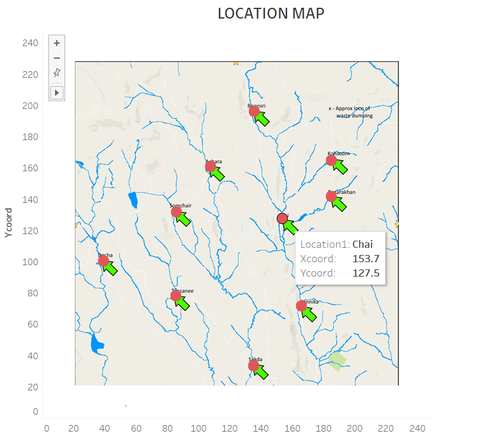
A new excel file is created with all the location names under the column Location and two new coordinates X and Y empty. The lower and upper limits for left and right, bottom and top in the values as 0 and 249 are defined. Taking the excel file in tableau as data source, the background image is inserted in tableau as the Waterway image given in the data. Each of the location is annotated in tableau to find the X and Y coordinates for every location. The values are traced back and manually input in the initial data file to map in tableau each location. This is necessary to locate the regions in tableau. after the reverse Geocoding, the tooltip shows the location coordinates with respect to other location.
In tableau after the above step the initial excel file prepared and the location file created from Geolocation mapping is joined using inner join with the key column as Location so that the file for visualization has the coordinates of the locations in the map.
Dashboard Design
The data is prepared using Excel, JMP and joined in tableau for the visualization. In tableau each of the questions raised by vast challenge has been handled separately in different sheets and the pattern is showed up in the dashboard. The story board of the tableau file looks as shown below :
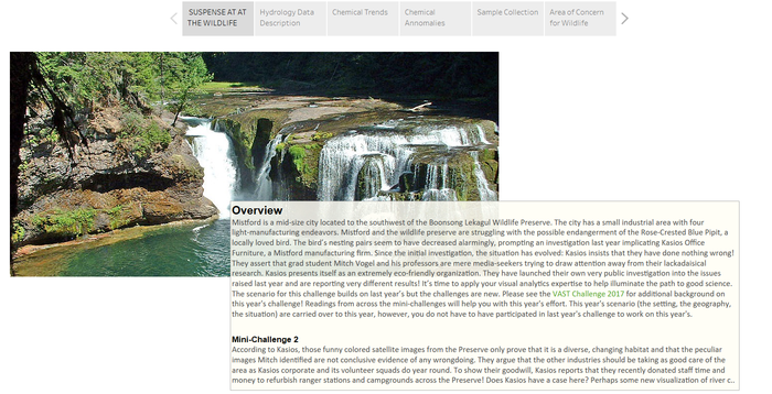
For making it easy for the analysis , I created grouping of the chemical measure into five categories according to their data sampling to see the trends across the data. The measure group has five categories as Complete Data, Recent Data missing, Last 10 years data, Only Recent Data available and Sparse data. This is done only for the tableau development perspective.
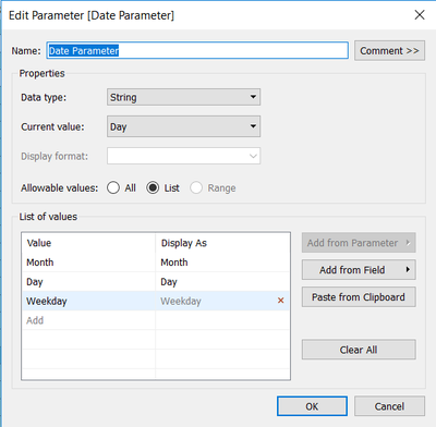
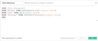
1.Hydrology Samples Overview Dashboard: It has two graphs to look at the data collection over the chemicals and to find any patterns over the years the data is captured by the sensors. I have created a new parameter “Date Parameter” to dynamically display the water samples collection across month, day and weekday. I have created a Parameter named “Date Measure” to pick the corresponding date measure from the Sample Date.
2.Chemical Trends Overview dashboard: This dashboard has two graphs line chart and box plot to show the trends across the years for each chemical. As the data is not complete as seen in the first dashboard, both the plots are created to display the pattern.
3.Deep Dive into Locations: This dashboard shows up the line chart and deep diving into locations to display any pattern that prevails across locations at the same time.
4.Anomaly Detection: This dashboard has two grahs one representing the locations across the preserve and the other dot plot to show the readings with each value represented to determine any anomalies across the years or locations. An colour indicator has been created to show the colour for above average and below average values.
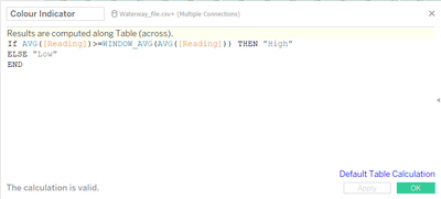
5.Need for Sampling Startegy: This shows the number of records taken over the locations and years displaying the discrepancy and the need for better sampling strategy.
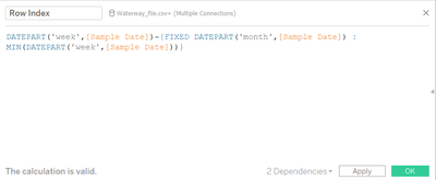
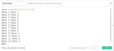
6.2016 Sampling : This has the calendar view created for the year 2016 to show the number of records taken in all the locations for the chemicals. The 2016 Sampling overview calendar plot required two calculated fields namely Row Index and Column Index to be created as below:
7.Area of Concern: The dashboard shows up the location and the pattern where there is high increasing trend of chemicals causing harm to wildlife and birds across the preserve.

