Difference between revisions of "Group12 Report"
Sameerp.2017 (talk | contribs) |
Lokeshv.2017 (talk | contribs) |
||
| (11 intermediate revisions by 2 users not shown) | |||
| Line 1: | Line 1: | ||
| − | <div style=background:# | + | <div style=background:#000000 border:#A3BFB1> |
| − | [[Image: | + | [[Image:o1.gif|300px]] |
| − | <font size = 5; color="# | + | <font size = 5; color="#FDFEFE"><span style="font-family:Lucida Sans; font-size:150%; solid #000000; background:#000000;"> Have the Nations really progressed ? <br/> </span></font> |
</div> | </div> | ||
<!--NAV BAR --> | <!--NAV BAR --> | ||
{|style="background-color:#F44336;" width="100%" cellspacing="0" cellpadding="0" valign="top" border="3" | | {|style="background-color:#F44336;" width="100%" cellspacing="0" cellpadding="0" valign="top" border="3" | | ||
| − | | style="font-family: | + | | style="font-family:Tahoma; font-size:105%; solid #1B338F; background:#212121; text-align:center;" width="16.66%" | |
; | ; | ||
[[Group12_Overview| <font color="#FDFEFE">About Us</font>]] | [[Group12_Overview| <font color="#FDFEFE">About Us</font>]] | ||
| − | | style="font-family: | + | | style="font-family:Tahoma; font-size:105%; solid #1B338F; background:#212121; text-align:center;" width="16.66%" | |
; | ; | ||
[[Group12_Proposal| <font color="#FDFEFE">Proposal</font>]] | [[Group12_Proposal| <font color="#FDFEFE">Proposal</font>]] | ||
| − | | style="font-family: | + | | style="font-family:Tahoma; font-size:105%; solid #1B338F; background:#212121; text-align:center;" width="16.66%" | |
; | ; | ||
[[Group12_Poster| <font color="#FDFEFE">Poster</font>]] | [[Group12_Poster| <font color="#FDFEFE">Poster</font>]] | ||
| − | | style="font-family: | + | | style="font-family:Tahoma; font-size:105%; solid #1B338F; background:#212121; text-align:center;" width="16.66%" | |
; | ; | ||
[[Group12_Application| <font color="#FDFEFE">Application</font>]] | [[Group12_Application| <font color="#FDFEFE">Application</font>]] | ||
| − | | style="font-family: | + | | style="font-family:Tahoma; font-size:105%; solid #1B338F; background:#212121; text-align:center;" width="16.66%" | |
; | ; | ||
[[Group12_Report| <font color="#FDFEFE">Report</font>]] | [[Group12_Report| <font color="#FDFEFE">Report</font>]] | ||
| − | | style="font-family: | + | | style="font-family:Tahoma; font-size:105%; solid #1B338F; background:#212121; text-align:center;" width="16.66%" | |
; | ; | ||
[https://wiki.smu.edu.sg/1718t3isss608/Project_Groups <font color="#FDFEFE">Project Groups</font>] | [https://wiki.smu.edu.sg/1718t3isss608/Project_Groups <font color="#FDFEFE">Project Groups</font>] | ||
| Line 32: | Line 32: | ||
|} | |} | ||
<!--REPORT--> | <!--REPORT--> | ||
| − | + | <br/> | |
| − | + | =Introduction= | |
| − | + | <span style="font-size:14px;"> | |
| − | |||
| − | |||
| − | |||
World Development Indicators (WDI) is the primary World Bank collection of development indicators, compiled from officially recognized international sources. It presents the most current and accurate global development data available including national, regional and global estimates. It covers more than 7 million data points collected over the span of 58 years. This statistical reference includes over 1500 indicators covering more than 200 economies. The annual publication is released in April of each year.<br/> | World Development Indicators (WDI) is the primary World Bank collection of development indicators, compiled from officially recognized international sources. It presents the most current and accurate global development data available including national, regional and global estimates. It covers more than 7 million data points collected over the span of 58 years. This statistical reference includes over 1500 indicators covering more than 200 economies. The annual publication is released in April of each year.<br/> | ||
The massive amount of world development data has by far exceeds the ability for students, policymakers, analysts and officials to transform the data into proper visualization for analysing and gaining insight of the global developmental landscape. Thus, creating an adverse impact on the financial and technical assistance World Bank is providing to the developing countries around the world.<br/> | The massive amount of world development data has by far exceeds the ability for students, policymakers, analysts and officials to transform the data into proper visualization for analysing and gaining insight of the global developmental landscape. Thus, creating an adverse impact on the financial and technical assistance World Bank is providing to the developing countries around the world.<br/> | ||
Through our visualizations, we seek to utilize existing data to derive meaningful insights over how various socioeconomic factors have had an impact on development of different nations and to tell their story of growth and downfall across years. This dashboard also helps decide on various areas the countries need help on and has the aid provided earlier has any effect or not. The Key objective is to deep dive in a countries development across 9 parameters. | Through our visualizations, we seek to utilize existing data to derive meaningful insights over how various socioeconomic factors have had an impact on development of different nations and to tell their story of growth and downfall across years. This dashboard also helps decide on various areas the countries need help on and has the aid provided earlier has any effect or not. The Key objective is to deep dive in a countries development across 9 parameters. | ||
| − | <br/></span | + | <br/></span> |
<br/> | <br/> | ||
| − | = | + | |
| − | + | =Motivation and Objective= | |
| + | <span style="font-size:14px;"> | ||
Our main objective is to utilize visual and graphical techniques in R for preparation of a user-friendly dashboard. Countries requiring aid from various organizations would receive benefit from this analysis by their performances being gauged over the years from which they first received assistance. Furthermore, analysts get the option to switch between different forms of visualization to allow them to make better financial and technical decision in helping the developing countries. This application should enable financial aid providers to decide on funding future aid or ROI on existing aid given.<br/> | Our main objective is to utilize visual and graphical techniques in R for preparation of a user-friendly dashboard. Countries requiring aid from various organizations would receive benefit from this analysis by their performances being gauged over the years from which they first received assistance. Furthermore, analysts get the option to switch between different forms of visualization to allow them to make better financial and technical decision in helping the developing countries. This application should enable financial aid providers to decide on funding future aid or ROI on existing aid given.<br/> | ||
| − | </span | + | </span> |
<br/> | <br/> | ||
| − | = | + | =Previous Works= |
| − | == | + | ==Sustainable Development Goals== |
<br/> | <br/> | ||
[[Image:samimage0.png|link=http://datatopics.worldbank.org/sdgs/|center|500px]] | [[Image:samimage0.png|link=http://datatopics.worldbank.org/sdgs/|center|500px]] | ||
| − | + | <span style="font-size:14px;">> World Bank website has a dashboard in place with respect to Sustainable Development goals, which contains more than 15 different goals to visualize for all the countries in view of different measures on a line chart covered over various regions. The dashboard is too complicated and requires an expert view of the exact goal to visualize.</span><br/> | |
<br/> | <br/> | ||
==<font size="4.75">CRAN Download Monitor</font>== | ==<font size="4.75">CRAN Download Monitor</font>== | ||
[[Image:samimage1.png|link=https://jjallaire.shinyapps.io/shiny-crandash/#dashboard|center|500px]] | [[Image:samimage1.png|link=https://jjallaire.shinyapps.io/shiny-crandash/#dashboard|center|500px]] | ||
| − | + | <span style="font-size:14px;">For our dashboard design, we were inspired by the CRAN Download monitor to perform reactive output based on input parameters.</span><br/> | |
<br/> | <br/> | ||
==<font size="4.75">Google Charts Demo</font>== | ==<font size="4.75">Google Charts Demo</font>== | ||
[[Image:samimage2.png|center|500px]] | [[Image:samimage2.png|center|500px]] | ||
| − | + | <span style="font-size:14px;">We attempted to create the charts with an easy interface for users to see the aesthetics in an appealing manner.</span><br/> | |
<br/> | <br/> | ||
| − | = | + | |
| − | == | + | =Dataset & Preparation= |
| − | * | + | ==Raw Data== |
| + | * <span style="font-size:14px;">We exported the World Development Index [https://databank.worldbank.org/data/source/world-development-indicators/| Data]. from world bank database from their World Development Indicators and Sustainable Development Goals section with 1580 parameters across 58 years and 217 countries. The data set was very large (19.9 Million Rows) and many metrics did not make sense. We selectively filtered all the measures into 9 categories we thought are the most impactful. We then merged the data into a single file across 58 years and the UN recognized 201 countries.</span><br/><br/> | ||
[[Image:samimage3.png|center|500px]] | [[Image:samimage3.png|center|500px]] | ||
| − | * | + | * <span style="font-size:14px;">The series originally consisted of a conglomeration of all the demographic, education, finance, economic, public sector, health etc without any categories. Using JMP and Excel, the data was thoroughly organized and wrangled to make use for analysis. We reduced the key data points from 1580 to 58. We identified 9 main categories to spread out those 58 parameters we now call the KPIs. These KPIs (Key Performance Indicators) are the important measure of development across these 9 sectors/categories.</span><br/><br/> |
==<font size="4.75">Main Categories</font>== | ==<font size="4.75">Main Categories</font>== | ||
[[Image:samimage32.png|center|500px]] | [[Image:samimage32.png|center|500px]] | ||
| − | + | <span style="font-size:14px;">Each of these categories have 6-8 metrics we call as a KPI (Key Performance Indicator). Each of these KPIs indicate the well being of a nation when compared to each other for that category. These KPIs were carefully selected on the basis of their impact on the country’s development. A mapping is given below: </span><br/><br/> | |
{| class="wikitable" style="margin-left: auto; margin-right: auto; text-align: center;border: none;" | {| class="wikitable" style="margin-left: auto; margin-right: auto; text-align: center;border: none;" | ||
| Line 256: | Line 255: | ||
|} | |} | ||
| − | == | + | ==JMP== |
| − | # | + | # <span style="font-size:14px;"> We used JMP to refine the measures from 1500 to 227 variables in Phase one of cleaning up. And then further eliminating the unimportant columns to arrive at 58 in phase 2.</span><br/><br/> |
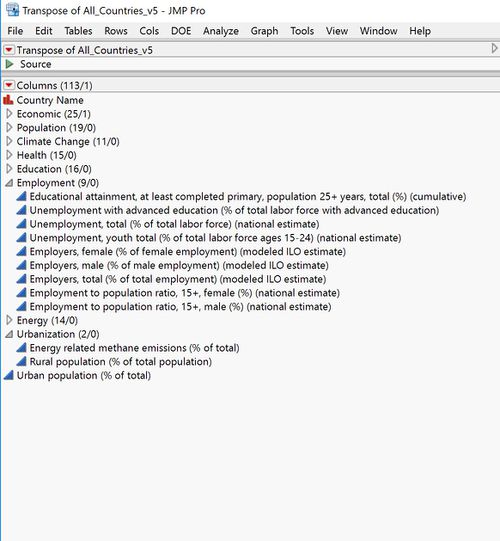
| − | # | + | # <span style="font-size:14px;"> We used JMP to add category. Each of these 227 in Phase 1 and then finally 58 in Phase 2, we created a broad buckets listed earlier: Population, Climate, Energy, Education, Employment, Economy, Debt, GDP and Health. We then placed each of those 58 columns transposed into a single column.</span><br/><br/>[[Image:samimage5.jpg|center|500px]] |
| − | # | + | # <span style="font-size:14px;">JMP was also used for Transposing the data sets from the existing columnar format to a single column for KPIs.</span><br/><br/> |
| − | == | + | ==Excel== |
| − | + | <span style="font-size:14px;"> Finally we cleaned up the final data set of ~700K records (201 X 58 X 58) and saved it as a Excel file. We then created regions, data type and category columns. Regions is a grouping of countries. Data type is either # or %. Category columns is a grouping of KPIs. So we have 7 columns in total:</span><br/><br/> | |
[[Image:samimage77.png|center|400px]] | [[Image:samimage77.png|center|400px]] | ||
| − | + | <span style="font-size:14px;">We save the final data as a CSV file.</span><br/><br/> | |
| + | <br/> | ||
| + | |||
| + | =Visual Design Framework= | ||
| + | ==R Shiny== | ||
| + | <span style="font-size:14px;">We then save the final file in csv format and loaded into R shiny application for generating the graphs. We have used dplyr library to use dataset containing values greater than zero.</span><br/> | ||
| + | <span style="font-size:14px;">We added interactive chart features using R Shiny.<br/> | ||
| + | Libraries used: </span><br/> | ||
| + | # <span style="font-size:14px;">Ltidyverse</span> | ||
| + | # <span style="font-size:14px;">sf</span> | ||
| + | # <span style="font-size:14px;">tmap</span> | ||
| + | # <span style="font-size:14px;">classInt</span> | ||
| + | # <span style="font-size:14px;">shiny</span> | ||
| + | # <span style="font-size:14px;">leaflet</span> | ||
| + | # <span style="font-size:14px;">ggplot2</span> | ||
| + | # <span style="font-size:14px;">shinydashboard</span> | ||
| + | # <span style="font-size:14px;">maps</span> | ||
| + | # <span style="font-size:14px;">plotly</span> | ||
| + | # <span style="font-size:14px;">dplyr</span> | ||
| + | # <span style="font-size:14px;">shinyWidgets</span> | ||
| + | # <span style="font-size:14px;">treemap</span> | ||
| + | # <span style="font-size:14px;">treemapify</span> | ||
| + | # <span style="font-size:14px;">gridBase</span> | ||
| + | # <span style="font-size:14px;">RColorBrewer</span> | ||
| + | <span style="font-size:14px;"> Trend charts, Treemaps and Geographical Map charts for each of the selected 9 categories to give a full perspective of the metrics.</span><br/> | ||
| + | <span style="font-size:14px;">The three main charts are: </span><br/> | ||
| − | + | ===<Line chart for showcasing time series trend based on years selected and country(ies) selected=== | |
| − | == | ||
| − | |||
| − | |||
| − | |||
| − | |||
| − | |||
| − | |||
| − | |||
| − | |||
| − | |||
| − | |||
| − | |||
| − | |||
| − | |||
| − | |||
| − | |||
| − | |||
| − | |||
| − | |||
| − | |||
| − | |||
| − | |||
| − | |||
[[Image:samimage7.png|center|600px]] | [[Image:samimage7.png|center|600px]] | ||
| − | + | <span style="font-size:14px;">The trend view is useful to see a time series analysis of a given metric for a given country(ies)</span><br/> | |
| − | + | <span style="font-size:14px;">Features of line chart: </span><br/> | |
| − | * | + | * <span style="font-size:14px;">Plotly used -</span><br/> |
| − | + | <span style="font-size:14px;">'''Date filter'''</span><br/> | |
| − | * | + | * <span style="font-size:14px;">Animated slider input. (with play & pause)</span><br/> |
| − | * | + | * <span style="font-size:14px;">Range of years selected.</span><br/> |
| − | * | + | * <span style="font-size:14px;">Default range is 15 years. (Can be decided by user)</span><br/> |
| − | + | <span style="font-size:14px;">'''Country filter'''</span><br/> | |
| − | * | + | * <span style="font-size:14px;">Singapore is the default country.</span><br/> |
| − | * | + | * <span style="font-size:14px;">Multiple country selection support.</span><br/> |
| − | * | + | * <span style="font-size:14px;">Support for removing countries via mouse click.</span><br/> |
| − | * | + | * <span style="font-size:14px;">Countries are colour coded.</span><br/> |
| − | * | + | * <span style="font-size:14px;">Each line corresponds different country.</span><br/> |
| − | * | + | * <span style="font-size:14px;">The first country selected will act as the comparison for other countries.</span><br/> |
| − | + | <span style="font-size:14px;">'''Measure filters (KPI)'''</span><br/> | |
| − | * | + | * <span style="font-size:14px;">Each measure will correspond to the year range and country selected.</span><br/> |
| − | * | + | * <span style="font-size:14px;">The data value for the measure will be displayed on the y-axis of the chart.</span><br/> |
| − | * | + | * <span style="font-size:14px;">Plotly function to compare values among different countries for the year.</span><br/> |
| − | * | + | * <span style="font-size:14px;">Hover function achieved through plotly.</span><br/> |
| − | + | <span style="font-size:14px;">'''Three Value boxes to highlight selection'''</span><br/> | |
| − | * | + | * <span style="font-size:14px;">The years being used.</span><br/> |
| − | * | + | * <span style="font-size:14px;">The KPI measure being used.</span><br/> |
| − | * | + | * <span style="font-size:14px;">The first country selected, on which other countries are being compared with.</span><br/><br/> |
| − | === | + | ===Treemap for viewing all the countries in globe or region based on the measures=== |
<br /> | <br /> | ||
[[Image:samimage8.png|center|500px]] | [[Image:samimage8.png|center|500px]] | ||
| Line 328: | Line 329: | ||
[[Image:samimage10.png|center|500px]] | [[Image:samimage10.png|center|500px]] | ||
| − | + | <span style="font-size:14px;">We have used the combination of leaflet and tmap to visualize the interactive globe map in r shiny. We used the global boundary shape file to execute the map.</span><br/><br/> | |
| − | === | + | ===Dashboard=== |
| − | + | <span style="font-size:14px;">We take a visual analytics approach to measure KPI's across different parameters to gauge the progress of all 201 countries over the last 58 years across a selected metrics using interactive charts and filters.</span><br/> | |
| − | + | <span style="font-size:14px;">Lines charts can be used for comparative feature across multiple countries and view a trend across a given KPI.</span><br/> | |
| − | + | <span style="font-size:14px;">Treemaps show a share of countries on a specific metric. This is very useful for comparing lots of countries in a single chart. We have three comparisons:</span><br/> | |
| − | * | + | * <span style="font-size:14px;">Grouped by Region </span><br/> |
| − | * | + | * <span style="font-size:14px;">Grouped by KPIs</span><br/> |
| − | * | + | * <span style="font-size:14px;">Grouped by Categories</span><br/> |
| − | + | <span style="font-size:14px;">We use Geographic Maps to visually showcase the country performance in positive or negative across last 10 years. The red and green is based on percentile, hence relative for that KPI for that period and hence very valid comparison. </span><br/> | |
| − | + | <span style="font-size:14px;">We have two visualizations in Geo Map: KPI and category. This shows a comparison of countries.</span><br/> | |
| − | === | + | |
| − | # | + | ===Filters=== |
| − | # | + | # <span style="font-size:14px;">Year filter is a slider/Dropdown, in some cases we have a start and end year in the slider. </span><br/> |
| − | # | + | # <span style="font-size:14px;">Region filter: this will be multi select for better interactivity. This will be a nested filter for countries. </span><br/> |
| − | # | + | # <span style="font-size:14px;">Country filter: this will be multi select for better interactivity. </span><br/> |
| − | # | + | # <span style="font-size:14px;">Categories filter: This will be a nested filter for KPIs. </span><br/> |
| − | + | # <span style="font-size:14px;">KPI filter: This is the key selection metric for all charts. </span><br/> | |
| + | <span style="font-size:14px;">For the filters to work, we used Reactive: </span><br/> | ||
[[Image:samimage11.png|center|500px]] | [[Image:samimage11.png|center|500px]] | ||
| − | + | <span style="font-size:14px;">Reactive subsets the data based on input parameters on which interactive filters are based. This was the most important function we used.</span><br/> | |
| + | <br/> | ||
| − | + | =Visualizations & Insights= | |
| − | + | ==Time Series Chart== | |
| + | <br/>[[Image:samimage12.png|center|500px]]<br/> | ||
| − | << | + | <span style="font-size:14px;">We analysed the trend between two developed port nations Singapore & Hong Kong. We observe that at 2003, their GDP per capita figure was near identical at USD 23K. As the years progressed, we find that Singapore saw a brief exponential growth resulting in a difference of almost USD 20K difference between their GDP per capita income values.</span><br/> |
| − | + | [[Image:samimage13.png|center|500px]]<br/> | |
| − | << | + | <span style="font-size:14px;">Next, we were curious about the employment percentage in the industry sector between Singapore and India. Surprisingly, we found a declining trend in Singapore’s employment metric from the year 2011.</span><br/> |
| + | <span style="font-size:14px;">We can select years along with multiple countries as a filter condition to compare the time series trend to evaluate many growth parameters.</span><br/> | ||
| − | + | ==Treemap Visualization== | |
| − | |||
| − | |||
| − | |||
| − | + | [[Image:samimage14.png|center|500px]]<br/> | |
| − | + | [[Image:samimage15.png|center|500px]]<br/> | |
| − | + | [[Image:samimage16.png|center|500px]]<br/> | |
| − | + | <span style="font-size:14px;">For the treemap, the application uses interactive features between category and year.</span><br/> | |
| − | |||
| − | + | ==Geographical Map Visualization== | |
| − | < | + | [[Image:samimage17.png|center|500px]]<br/> |
| + | [[Image:samimage18.png|center|500px]]<br/> | ||
| − | + | <span style="font-size:14px;">The geographical map uses interactive features between year, parameters and region.</span><br/> | |
| − | + | <br/> | |
| − | + | =Conclusion= | |
| − | + | <span style="font-size:14px;">While GDP provides an important point of reference for analysis of a country’s overall economic development, it does not reveal any specific information about sectoral composition and the different degrees of industrial development. Countries show profound structural differences which tend to relate to their stage of overall economic development and the difference contribution of the various sectors (agriculture, industry – and manufacturing as part of it – and services) their economic system is composed of. To capture the different levels of countries’ industrial development, we make use of cross-measure analysis of various domains to better investigate the progress of nations. Deep dive and drill down features further aids and measures the nations performance on all the 9 indicators developed & then a conclusion can be reached.</span><br/> | |
| + | <br/> | ||
| − | Challenges | + | =Project Challenges, Limitations and Future Work= |
| − | + | <span style="font-size:14px;">The application to visualize the World Development Indicators are currently having the following limitations:</span><br/> | |
| − | |||
| − | |||
| − | |||
| − | + | ==Challenges faced== | |
| − | + | # <span style="font-size:14px;">Nested filters implementation R shiny Dashboard.</span><br/> | |
| − | + | # <span style="font-size:14px;">Creation of Bubble Charts in R Shiny dashboard.</span><br/> | |
| − | + | # <span style="font-size:14px;">Integration of filters across all the tabs in R Shiny.</span><br/> | |
| − | + | # <span style="font-size:14px;">Treemap integration (conditional panel), we could not add tabs.</span><br/> | |
| − | + | ==Future work== | |
| + | # <span style="font-size:14px;">Reference lines (such as an industry benchmark or future targets) to compare the countries performance.</span><br/> | ||
| + | # <span style="font-size:14px;">Usage of a bubble chart and allow users to select 4 parameters to generate the graph: X axis, Y axis, Size of Bubble and Colour of bubble. This should be user generated or self creating chart.</span><br/> | ||
| + | # <span style="font-size:14px;">Stacked bar chart to show the trend of a group of components adding up to a 100% such as % contribution of energy production, or % GDP contribution between Services, Manufacturing, Industry and Agriculture.</span><br/> | ||
| + | # <span style="font-size:14px;">Reactive or Nested Filter support for Category and regions for KPIs and Countries respectively.Grouping of countries within Regions, along with Grouping of measures.</span><br/> | ||
| + | <br/> | ||
| − | + | ==Use cases and benefits of this dashboard== | |
| − | |||
| − | |||
| − | |||
| − | |||
| − | + | # <span style="font-size:14px;">Financial Aid organizations such as World Bank, IMF, International reconstruction bank for determining ROI of aid in a particular sector.</span><br/> | |
| − | The authors wish to thank Dr. Kam Tin Seong, Associate Professor of Singapore Management University, School Information Systems (Practice), for his mentorship and guidance in completion of this visualization project. | + | # <span style="font-size:14px;">To decide if a country needs financial aid to help development of a country.</span><br/> |
| + | # <span style="font-size:14px;">To slice and dice using the 58 KPIs in 9 categories.</span><br/> | ||
| + | # <span style="font-size:14px;">To compare Country performance against another country for any given measure.</span><br/> | ||
| + | # <span style="font-size:14px;">To compare historical performance within the same country.</span><br/> | ||
| + | <br/> | ||
| + | |||
| + | =Acknowledgement= | ||
| + | <span style="font-size:14px;">The authors wish to thank Dr. Kam Tin Seong, Associate Professor of Singapore Management University, School Information Systems (Practice), for his mentorship and guidance in completion of this visualization project.</span><br/> | ||
| + | <br/> | ||
| − | + | =References= | |
| − | + | # <span style="font-size:14px;">En.wikipedia.org. (2018). World Development Indicators. [online] available-at: https://en.wikipedia.org/wiki/World_Development_Indicators </span><br/> | |
| − | + | # <span style="font-size:14px;">Datatopics.worldbank.org. (2018). WDI: Sustainable Development Goals. [online] Available at: http://datatopics.worldbank.org/sdgs/ </span><br/> | |
| − | + | # <span style="font-size:14px;">Vallandingham, J. and Vallandingham, J. (2018). Getting Started with Shiny - data visualization - Bocoup. [online] Bocoup.com. Available at: https://bocoup.com/blog/getting-started-with-shiny</span><br/> | |
| − | + | # <span style="font-size:14px;">Rstudio.github.io. (2018). Shiny Dashboard Structure. [online] Available at: https://rstudio.github.io/shinydashboard/structure.html</span><br/> | |
| − | + | # <span style="font-size:14px;">Cyberhelp.sesync.org. (2018). Interactive Web Applications with Shiny. [online] Available at: http://cyberhelp.sesync.org/basic-Shiny-lesson/</span><br/> | |
| − | + | # <span style="font-size:14px;">Datascience-enthusiast.com. (2018). Interactive visualization with R-Shiny versus with Tableau: Treemaps. [online] Available at: https://datascience-enthusiast.com/R/R_shiny_Tableau_treemap.html</span><br/> | |
Latest revision as of 04:31, 15 August 2018
 Have the Nations really progressed ?
|
|
|
|
|
|
|
Contents
Introduction
World Development Indicators (WDI) is the primary World Bank collection of development indicators, compiled from officially recognized international sources. It presents the most current and accurate global development data available including national, regional and global estimates. It covers more than 7 million data points collected over the span of 58 years. This statistical reference includes over 1500 indicators covering more than 200 economies. The annual publication is released in April of each year.
The massive amount of world development data has by far exceeds the ability for students, policymakers, analysts and officials to transform the data into proper visualization for analysing and gaining insight of the global developmental landscape. Thus, creating an adverse impact on the financial and technical assistance World Bank is providing to the developing countries around the world.
Through our visualizations, we seek to utilize existing data to derive meaningful insights over how various socioeconomic factors have had an impact on development of different nations and to tell their story of growth and downfall across years. This dashboard also helps decide on various areas the countries need help on and has the aid provided earlier has any effect or not. The Key objective is to deep dive in a countries development across 9 parameters.
Motivation and Objective
Our main objective is to utilize visual and graphical techniques in R for preparation of a user-friendly dashboard. Countries requiring aid from various organizations would receive benefit from this analysis by their performances being gauged over the years from which they first received assistance. Furthermore, analysts get the option to switch between different forms of visualization to allow them to make better financial and technical decision in helping the developing countries. This application should enable financial aid providers to decide on funding future aid or ROI on existing aid given.
Previous Works
Sustainable Development Goals
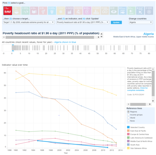
> World Bank website has a dashboard in place with respect to Sustainable Development goals, which contains more than 15 different goals to visualize for all the countries in view of different measures on a line chart covered over various regions. The dashboard is too complicated and requires an expert view of the exact goal to visualize.
CRAN Download Monitor
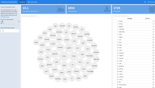
For our dashboard design, we were inspired by the CRAN Download monitor to perform reactive output based on input parameters.
Google Charts Demo

We attempted to create the charts with an easy interface for users to see the aesthetics in an appealing manner.
Dataset & Preparation
Raw Data
- We exported the World Development Index Data. from world bank database from their World Development Indicators and Sustainable Development Goals section with 1580 parameters across 58 years and 217 countries. The data set was very large (19.9 Million Rows) and many metrics did not make sense. We selectively filtered all the measures into 9 categories we thought are the most impactful. We then merged the data into a single file across 58 years and the UN recognized 201 countries.

- The series originally consisted of a conglomeration of all the demographic, education, finance, economic, public sector, health etc without any categories. Using JMP and Excel, the data was thoroughly organized and wrangled to make use for analysis. We reduced the key data points from 1580 to 58. We identified 9 main categories to spread out those 58 parameters we now call the KPIs. These KPIs (Key Performance Indicators) are the important measure of development across these 9 sectors/categories.
Main Categories

Each of these categories have 6-8 metrics we call as a KPI (Key Performance Indicator). Each of these KPIs indicate the well being of a nation when compared to each other for that category. These KPIs were carefully selected on the basis of their impact on the country’s development. A mapping is given below:
| Measures | Categories |
|---|---|
| Bird species, threatened | Climate |
| Forest area (% of land area) | Climate |
| Mammal species, threatened | Climate |
| Methane emissions (kt of CO2 equivalent) | Climate |
| Plant species (higher), threatened | Climate |
| PM2.5 air pollution, mean annual exposure (micrograms per cubic meter) | Climate |
| Central government debt, total (% of GDP) | Debt |
| Consumer price index (2010 = 100) | Debt |
| Inflation, consumer prices (annual %) | Debt |
| Multilateral debt (% of total external debt) | Debt |
| Net official aid received (current US$) | Debt |
| Short-term debt (% of total external debt) | Debt |
| Agriculture, value added (% of GDP) | Economy |
| Ease of doing business index (1=most business-friendly regulations) | Economy |
| Income share held by highest 10% | Economy |
| Income share held by lowest 10% | Economy |
| Industry, value added (% of GDP) | Economy |
| Manufacturing, value added (% of GDP) | Economy |
| Market capitalization of listed domestic companies (current US$) | Economy |
| Official exchange rate (LCU per US$, period average) | Economy |
| Services, etc., value added (% of GDP) | Economy |
| Educational attainment, at least Bachelor's, population 25+, total (%) | Education |
| Educational attainment, at least primary, population 25+ years, total (%) | Education |
| Government expenditure on education, total (% of GDP) | Education |
| Literacy rate, adult total (% of people ages 15 and above) | Education |
| Employment in agriculture (% of total employment) (modeled ILO estimate) | Employment |
| Employment in industry (% of total employment) (modeled ILO estimate) | Employment |
| Employment in services (% of total employment) (modeled ILO estimate) | Employment |
| Labor force participation rate, total (% of total population ages 15-64) | Employment |
| Labor force, female (% of total labor force) | Employment |
| Labor force, total | Employment |
| Listed domestic companies, total | Employment |
| Unemployment, total (% of total labor force) (national estimate) | Employment |
| Access to electricity (% of population) | Energy |
| Alternative and nuclear energy (% of total energy use) | Energy |
| Electric power consumption (kWh per capita) | Energy |
| Electricity production from renewable sources, excluding hydroelectric (% of total) | Energy |
| Pump price for gasoline (US$ per liter) | Energy |
| Renewable energy consumption (% of total final energy consumption) | Energy |
| Birth rate, crude (per 1,000 people) | Health |
| Current health expenditure (% of GDP) | Health |
| Death rate, crude (per 1,000 people) | Health |
| Hospital beds (per 1,000 people) | Health |
| Life expectancy at birth, total (years) | Health |
| Physicians (per 1,000 people) | Health |
| GDP (current US$) | KPI |
| GDP growth (annual %) | KPI |
| GDP per capita (current US$) | KPI |
| GDP per capita growth (annual %) | KPI |
| GDP, PPP (current international $) | KPI |
| Net migration | Population |
| Population ages 0-14, total | Population |
| Population ages 15-64, total | Population |
| Population ages 65 and above, total | Population |
| Population density (people per sq. km of land area) | Population |
| Population growth (annual %) | Population |
| Population, total | Population |
| Urban population (% of total) | Population |
JMP
- We used JMP to refine the measures from 1500 to 227 variables in Phase one of cleaning up. And then further eliminating the unimportant columns to arrive at 58 in phase 2.
- We used JMP to add category. Each of these 227 in Phase 1 and then finally 58 in Phase 2, we created a broad buckets listed earlier: Population, Climate, Energy, Education, Employment, Economy, Debt, GDP and Health. We then placed each of those 58 columns transposed into a single column.
- JMP was also used for Transposing the data sets from the existing columnar format to a single column for KPIs.

Excel
Finally we cleaned up the final data set of ~700K records (201 X 58 X 58) and saved it as a Excel file. We then created regions, data type and category columns. Regions is a grouping of countries. Data type is either # or %. Category columns is a grouping of KPIs. So we have 7 columns in total:

We save the final data as a CSV file.
Visual Design Framework
R Shiny
We then save the final file in csv format and loaded into R shiny application for generating the graphs. We have used dplyr library to use dataset containing values greater than zero.
We added interactive chart features using R Shiny.
Libraries used:
- Ltidyverse
- sf
- tmap
- classInt
- shiny
- leaflet
- ggplot2
- shinydashboard
- maps
- plotly
- dplyr
- shinyWidgets
- treemap
- treemapify
- gridBase
- RColorBrewer
Trend charts, Treemaps and Geographical Map charts for each of the selected 9 categories to give a full perspective of the metrics.
The three main charts are:
<Line chart for showcasing time series trend based on years selected and country(ies) selected

The trend view is useful to see a time series analysis of a given metric for a given country(ies)
Features of line chart:
- Plotly used -
Date filter
- Animated slider input. (with play & pause)
- Range of years selected.
- Default range is 15 years. (Can be decided by user)
Country filter
- Singapore is the default country.
- Multiple country selection support.
- Support for removing countries via mouse click.
- Countries are colour coded.
- Each line corresponds different country.
- The first country selected will act as the comparison for other countries.
Measure filters (KPI)
- Each measure will correspond to the year range and country selected.
- The data value for the measure will be displayed on the y-axis of the chart.
- Plotly function to compare values among different countries for the year.
- Hover function achieved through plotly.
Three Value boxes to highlight selection
- The years being used.
- The KPI measure being used.
- The first country selected, on which other countries are being compared with.
Treemap for viewing all the countries in globe or region based on the measures

Geo MAP with colour shaded for each country based on KPI selected


We have used the combination of leaflet and tmap to visualize the interactive globe map in r shiny. We used the global boundary shape file to execute the map.
Dashboard
We take a visual analytics approach to measure KPI's across different parameters to gauge the progress of all 201 countries over the last 58 years across a selected metrics using interactive charts and filters.
Lines charts can be used for comparative feature across multiple countries and view a trend across a given KPI.
Treemaps show a share of countries on a specific metric. This is very useful for comparing lots of countries in a single chart. We have three comparisons:
- Grouped by Region
- Grouped by KPIs
- Grouped by Categories
We use Geographic Maps to visually showcase the country performance in positive or negative across last 10 years. The red and green is based on percentile, hence relative for that KPI for that period and hence very valid comparison.
We have two visualizations in Geo Map: KPI and category. This shows a comparison of countries.
Filters
- Year filter is a slider/Dropdown, in some cases we have a start and end year in the slider.
- Region filter: this will be multi select for better interactivity. This will be a nested filter for countries.
- Country filter: this will be multi select for better interactivity.
- Categories filter: This will be a nested filter for KPIs.
- KPI filter: This is the key selection metric for all charts.
For the filters to work, we used Reactive:

Reactive subsets the data based on input parameters on which interactive filters are based. This was the most important function we used.
Visualizations & Insights
Time Series Chart

We analysed the trend between two developed port nations Singapore & Hong Kong. We observe that at 2003, their GDP per capita figure was near identical at USD 23K. As the years progressed, we find that Singapore saw a brief exponential growth resulting in a difference of almost USD 20K difference between their GDP per capita income values.

Next, we were curious about the employment percentage in the industry sector between Singapore and India. Surprisingly, we found a declining trend in Singapore’s employment metric from the year 2011.
We can select years along with multiple countries as a filter condition to compare the time series trend to evaluate many growth parameters.
Treemap Visualization


For the treemap, the application uses interactive features between category and year.
Geographical Map Visualization


The geographical map uses interactive features between year, parameters and region.
Conclusion
While GDP provides an important point of reference for analysis of a country’s overall economic development, it does not reveal any specific information about sectoral composition and the different degrees of industrial development. Countries show profound structural differences which tend to relate to their stage of overall economic development and the difference contribution of the various sectors (agriculture, industry – and manufacturing as part of it – and services) their economic system is composed of. To capture the different levels of countries’ industrial development, we make use of cross-measure analysis of various domains to better investigate the progress of nations. Deep dive and drill down features further aids and measures the nations performance on all the 9 indicators developed & then a conclusion can be reached.
Project Challenges, Limitations and Future Work
The application to visualize the World Development Indicators are currently having the following limitations:
Challenges faced
- Nested filters implementation R shiny Dashboard.
- Creation of Bubble Charts in R Shiny dashboard.
- Integration of filters across all the tabs in R Shiny.
- Treemap integration (conditional panel), we could not add tabs.
Future work
- Reference lines (such as an industry benchmark or future targets) to compare the countries performance.
- Usage of a bubble chart and allow users to select 4 parameters to generate the graph: X axis, Y axis, Size of Bubble and Colour of bubble. This should be user generated or self creating chart.
- Stacked bar chart to show the trend of a group of components adding up to a 100% such as % contribution of energy production, or % GDP contribution between Services, Manufacturing, Industry and Agriculture.
- Reactive or Nested Filter support for Category and regions for KPIs and Countries respectively.Grouping of countries within Regions, along with Grouping of measures.
Use cases and benefits of this dashboard
- Financial Aid organizations such as World Bank, IMF, International reconstruction bank for determining ROI of aid in a particular sector.
- To decide if a country needs financial aid to help development of a country.
- To slice and dice using the 58 KPIs in 9 categories.
- To compare Country performance against another country for any given measure.
- To compare historical performance within the same country.
Acknowledgement
The authors wish to thank Dr. Kam Tin Seong, Associate Professor of Singapore Management University, School Information Systems (Practice), for his mentorship and guidance in completion of this visualization project.
References
- En.wikipedia.org. (2018). World Development Indicators. [online] available-at: https://en.wikipedia.org/wiki/World_Development_Indicators
- Datatopics.worldbank.org. (2018). WDI: Sustainable Development Goals. [online] Available at: http://datatopics.worldbank.org/sdgs/
- Vallandingham, J. and Vallandingham, J. (2018). Getting Started with Shiny - data visualization - Bocoup. [online] Bocoup.com. Available at: https://bocoup.com/blog/getting-started-with-shiny
- Rstudio.github.io. (2018). Shiny Dashboard Structure. [online] Available at: https://rstudio.github.io/shinydashboard/structure.html
- Cyberhelp.sesync.org. (2018). Interactive Web Applications with Shiny. [online] Available at: http://cyberhelp.sesync.org/basic-Shiny-lesson/
- Datascience-enthusiast.com. (2018). Interactive visualization with R-Shiny versus with Tableau: Treemaps. [online] Available at: https://datascience-enthusiast.com/R/R_shiny_Tableau_treemap.html