Difference between revisions of "Group14 Report"
Kalaisr.2017 (talk | contribs) |
Kalaisr.2017 (talk | contribs) |
||
| (44 intermediate revisions by 2 users not shown) | |||
| Line 7: | Line 7: | ||
| style="font-family:Segoe UI; font-size:100%; solid #000000; background:#c2dfe3; text-align:center;" width="25%" | | | style="font-family:Segoe UI; font-size:100%; solid #000000; background:#c2dfe3; text-align:center;" width="25%" | | ||
; | ; | ||
| + | [[ISSS608_2017-Group14_Overview|<b><font size="2"><font color="#373f51">Overview</font></font></b>]] | ||
| + | |||
| + | | style="font-family:Segoe UI; font-size:100%; solid #1B338F; background:#c2dfe3; text-align:center;" width="25%" | | ||
| + | |||
[[ISSS608_2017-Group14_Proposal|<b><font size="2"><font color="#373f51">Proposal</font></font></b>]] | [[ISSS608_2017-Group14_Proposal|<b><font size="2"><font color="#373f51">Proposal</font></font></b>]] | ||
| Line 29: | Line 33: | ||
<!--OVERVIEW CONTENT --> | <!--OVERVIEW CONTENT --> | ||
==Overview== | ==Overview== | ||
| − | The | + | The arms trade is a global issue of concern because of its negative consequences related to armed conflict, wars, and human rights abuses [1]. It emerged as one of the main global issues in the post-Cold War era in addition to problems such as disease, poverty and gender inequality, as arms supplier countries recognized the effect of stockpiling weapon systems on the breakout of armed conflict. |
| − | The Stockholm International Peace Research Institute (SIPRI) conducts research on arms transfers between regions and states aimed at increasing the fundamental understanding of the impact of arms transfers and to support policymaking. SIPRI aims to contribute to greater transparency in the global arms trade to ensure responsible international arms transfers, hence helping to prevent violent conflict, alleviate tensions and warn about potentially destabilizing arms accumulations. Based on the latest publication by SIPRI in 2017, a rising trend is observed in the volume of international transfers of major weapons, with the highest volume of arm transfers recorded between 2013 to 2017, since 1990 [ | + | The Stockholm International Peace Research Institute (SIPRI) conducts research on arms transfers between regions and states aimed at increasing the fundamental understanding of the impact of arms transfers and to support policymaking. SIPRI aims to contribute to greater transparency in the global arms trade to ensure responsible international arms transfers, hence helping to prevent violent conflict, alleviate tensions and warn about potentially destabilizing arms accumulations. Based on the latest publication by SIPRI in 2017, a rising trend is observed in the volume of international transfers of major weapons, with the highest volume of arm transfers recorded between 2013 to 2017, since 1990 [2]. |
| + | |||
| + | The lack of significant improvement in managing the global arms trade, despite implemented global policies and publication of data, prompted our group to develop an alternative solution for the exploration and analysis of data published by SIPRI. Our group has developed an interactive application that allows users to visually explore and analyse the global arms trade. It is through this that we hope to offer an additional dimension of transparency and accountability that will invite greater scrutiny to this unabating global problem. | ||
| − | <!-- | + | <!--PAST WORKS--> |
| − | + | ||
| − | + | ==Review and Critique of Past Works== | |
| − | + | A number of applications exist for the visualization of arms trade data and most of the visualisations are mainly static. SIPRI has produced an [http://visuals.sipri.org/ interactive web platform] using data in their published database but the application was only focused on military expenditure instead of arms trade flows. There has also been no visualisations carried out based for countries with Low Global Peace Index ratings.<br> | |
| + | Our project aims to contribute an application featuring multiple visualizations of arms imports. The following sections describe our approach to the problem and how the application was designed and built. | ||
{| width="100%" cellspacing="0" cellpadding="0" valign="top" border="0" | | {| width="100%" cellspacing="0" cellpadding="0" valign="top" border="0" | | ||
| style="text-align:center;" | | | style="text-align:center;" | | ||
; | ; | ||
| − | [[File: | + | [[File:group14_1.png|border|600px]] |
; | ; | ||
|} | |} | ||
| − | + | ||
| − | |||
<!-- MOTIVATION---> | <!-- MOTIVATION---> | ||
==Motivation and Objectives== | ==Motivation and Objectives== | ||
| − | Based on the Global Peace Index 2018 published by the Institute for Economics and Peace, we have identified the countries with 'Low' and 'Very Low Peace' global peace index. [3] | + | Based on the Global Peace Index 2018 published by the Institute for Economics and Peace, we have identified the countries with 'Low' and 'Very Low Peace' global peace index ratings. [3] |
| − | Our project aims to identify the trends and patterns in the international arms transfers at the regional and country levels for these countries and | + | Our project aims to identify the trends and patterns in the international arms transfers at the regional and country levels for these Low Peace countries and explore the arms trade dependencies of these countries for the period 1993 to 2017. We also aim to explore the major importers and exporters of arms weapons and to find out the relationships between the global arm importers and exporters. Our team is motivated to design a dynamic and interactive dashboard to provide students and policymakers a better understanding and holistic view of the global arms trade for the Low Peace countries. |
| − | + | <!--DATA SOURCES --> | |
| + | ==Data Sources== | ||
| + | The table shows the data sources for our project. We use the Trend-Indicator-Value (TIV) published by SIPRI to visualise the trends and patterns of arms imports for the Low Peace Countries from 1993 to 2017.<br> | ||
| − | + | {| width="100%" cellspacing="0" cellpadding="0" valign="top" border="0" | | |
| − | + | | style="text-align:center;" | | |
| + | ; | ||
| + | [[File:group14_10.png|border|600px]] | ||
| + | ; | ||
| + | |} | ||
| − | + | <!--DESIGN FRAMEWORK --> | |
| − | + | ==Design Framework== | |
| − | + | <font size = 3><span style="font-family:Segoe UI;font-weight:500;padding-bottom:1px; border-bottom: solid 1px black;">1. Interface:</span></font> | |
| − | |||
| − | ''' | + | In this section, we will run through the dashboard visualizations. We used the '''flexdashboard''' package as we can easily create flexible and interactive dashboards with R. We included '''Shiny''' components for additional interactivity.<br> |
| − | + | There are multiple tabs to our dashboard and each tab focuses on a specific type of visualisation. By having separate tabs, the user does not need to scroll up and down and can instead toggle freely between tabs to access the different visualisations. The dashboard consists of interactive plots so that users may gain insight on trends of the global arms imports for the low peace countries and explore the arms imports trade relationships between countries, by changing the filter options and by hovering and highlighting over the charts.<br> | |
| + | The purpose of this dashboard is to provide an application interface which facilitates an interactive analysis arms imports trend and arms trade over time and also arms dependencies of the low peace countries. The application also includes visualisation the relationship of arms imports with the social and economic indicators of the low peace countries.<br> | ||
| + | In summary, the dashboard consists of the following 6 tabs for the visualisation of the above mentioned: | ||
| + | |||
| + | 1. 2018 Global Peace Index <br> | ||
| + | 2. Top 100 Importers from 1993 to 2017 <br> | ||
| + | 3. Visualization of Arms Dependencies <br> | ||
| + | 4. Visualization of Arms Trade Over Time <br> | ||
| + | 5. Visualization of Arms Import by FDI, GDP & Population Size, and <br> | ||
| + | 6. Visualization of Arms Trade Network. | ||
| − | |||
| − | |||
{| width="100%" cellspacing="0" cellpadding="0" valign="top" border="0" | | {| width="100%" cellspacing="0" cellpadding="0" valign="top" border="0" | | ||
| style="text-align:center;" | | | style="text-align:center;" | | ||
; | ; | ||
| − | [[File: | + | [[File:group14_11.JPG|border|1100px]] |
; | ; | ||
|} | |} | ||
| − | + | <br> | |
| + | |||
| + | <font size = 3><span style="font-family:Segoe UI;font-weight:500;padding-bottom:1px; border-bottom: solid 1px black;">2. Visualisations:</span></font> | ||
| + | |||
| + | '''2018 Global Peace Index'''<br> | ||
| + | |||
| + | We created a choropleth map to allow users to visualise geographically where the countries with low Global Peace Index (GPI) ratings are located. Countries are coloured by their Global Peace Index rankings with darker shades of red indicating a poor Global Peace ranking or countries considered to be least peaceful. We used the '''leaflet''' package in R as it is highly interactive and customizable. | ||
| + | |||
| + | <b><i>Features of the Choropleth map:</i></b> <br> | ||
| + | 1. Heat map of the world showing the 2018 Global Peace Index Ratings for all of the countries <br> | ||
| + | 2. Users can zoom in and out of the map <br> | ||
| + | 3. Users can drag the map <br> | ||
| + | 4. Users can hover over the country of interest to see the country name and its Global Peace Index ranking. <br> | ||
| + | 5. The countries that are grey here are countries that are not in the covered in the 2018 Global Peace Index Ratings <br> | ||
| + | |||
{| width="100%" cellspacing="0" cellpadding="0" valign="top" border="0" | | {| width="100%" cellspacing="0" cellpadding="0" valign="top" border="0" | | ||
| style="text-align:center;" | | | style="text-align:center;" | | ||
; | ; | ||
| − | [[File: | + | [[File:group14_9.JPG|border|800px]] |
; | ; | ||
| − | |} | + | |} <br> |
| − | + | '''Visualizing the Arms Dependencies'''<br> | |
| + | We use a treemap and chord diagram to visualize the arms dependencies for the 42 Low Peace selected countries. <br> | ||
| − | |||
| − | |||
| − | ''' | + | '''Chord Diagram''' <br> |
| − | + | The chord diagram shows the source of arms imports flows for the selected 42 countries, in a given five-year period. It is created using the '''chorddiag''' package in R, which allows the creation of interactive chord diagrams using the JavaScript visualization library D3 from within R using the htmlwidgets interfacing framework. <br> | |
| − | ''' | ||
| − | + | <b><i>Features of the Chord Diagram:</i></b> <br> | |
| + | 1. Users can filter by region, as well as five-year interval time periods to explore the total volume of arms imports for countries in the selected region and how much each country imports from the supplier countries. <br> | ||
| + | 2. Hovering over a band between two countries highlights the band and reveals the volume of arms imports to the importing country from its supplier. <br> | ||
| − | + | <div style="float:left;width:50%"> | |
| − | + | [[Image:group14_3.JPG|640px|center|border]]<br/> | |
| + | </div> | ||
| + | <div style="float:left;width:50%"> | ||
| + | [[Image:group14_4.png|500px|center|border]]<br/> | ||
| + | </div> <br> | ||
| − | |||
| − | |||
| − | |||
| − | ''' | + | '''Treemap'''<br> |
| − | + | The objective of the treemap is to show the regions and countries that specifically make up a selected country imports, over five-year periods. The hierarchy of the treemap is the five-year periods as the first hierarchy, followed by the region and then each specific country in the region. The treemap is created using the '''treemap''' package and the functionality of the treemap is combined with the interactivity of the '''d3.js''' treemaps though the d3treeR htmlwidget. <br> | |
| + | <b><i>Features of the Treemap:</i></b> <br> | ||
| + | 1. The total imports value is represented by the size of each treemap node as well as the colour. The darker the shade of red, the higher the import value. <br> | ||
| + | 2. Users can filter by the country (one of the 42 countries) to visualize the selected country’s dependencies on supplier countries for arms in five-year periods from 1993 to 2017. <br> | ||
| + | 3. Users can click on a region in the treemap to find out individual countries for the supplier region. <br> | ||
{| width="100%" cellspacing="0" cellpadding="0" valign="top" border="0" | | {| width="100%" cellspacing="0" cellpadding="0" valign="top" border="0" | | ||
| style="text-align:center;" | | | style="text-align:center;" | | ||
; | ; | ||
| − | [[File: | + | [[File:group14_5.JPG|border|500px]] |
| − | |||
| − | |||
| − | |||
| − | |||
| − | |||
| − | |||
; | ; | ||
| − | |} | + | |} <br> |
| − | |||
| − | |||
| − | |||
| − | ''' | + | '''Visualizing the Arms Trade Flows Over Time'''<br> |
| − | |||
| − | |||
| − | + | The ridgeline plots were incorporated to visualize changes in arms imports of the 42 countries over time. The '''ggplot2''' and '''ggridge''' packages were used to create the ridgeline plot.The ggridge plot is useful as it can compare the trends in the arms imports of several countries together. | |
| + | The facet_grid function is used to form a matrix of panels consisting of the export regions and the five-year time period. With the facetted diagram, users can explore the distribution of import values for countries of the selected region by five-year time periods and by export regions. <br> | ||
| − | ''' | + | <b><i>Features of the Ridgeline Plot:</i></b> <br> |
| − | + | 1. Users can filter by region to explore the distribution of import values for countries in the selected region over time.<br> | |
| + | 2. The '''facet_grid''' function is used to form a matrix of panels consisting of the export regions and the five-year time period. The columns of the facet grid represent export regions while the rows of facet grid represent five-year time periods. With the facetted diagram, users can explore the distribution of import values for countries of the selected region by five-year time periods and by export regions. <br> | ||
{| width="100%" cellspacing="0" cellpadding="0" valign="top" border="0" | | {| width="100%" cellspacing="0" cellpadding="0" valign="top" border="0" | | ||
| style="text-align:center;" | | | style="text-align:center;" | | ||
; | ; | ||
| − | [[File: | + | [[File:group14_6.JPG|border|1000px]] |
; | ; | ||
| − | |} | + | |}<br> |
| + | |||
| + | '''Visualizing the relationship between arms imports, foreign direct investment and GDP per capita''' <br> | ||
| + | The bubble plot visualises the relationship between arms imports of the 42 countries together with the countries social and economic indicators. To create the bubble plot, we use the '''plotly''' package as it is an interactive, browser-based charting library built on the open source JavaScript graphing library plotly.js. | ||
| − | + | <b><i>Features of the Bubble Plot:</i></b> <br> | |
| − | + | 1. x-axis represents the GDP per capita and y-axis represents the Foreign Direct Investment.<br> | |
| + | 2. The size of the bubble represents the Trend Indicator Value(TIV) of the arms imports for each country.<br> | ||
| + | 3. The colour of the bubble represents the population size for each country.<br> | ||
| + | 4. Users can use the slider to choose different years to explore how the arms imports change with the social and economic indicators for the selected country. <br> | ||
| − | + | {| width="100%" cellspacing="0" cellpadding="0" valign="top" border="0" | | |
| − | + | | style="text-align:center;" | | |
| + | ; | ||
| + | [[File:group14_7.png|border|700px]] | ||
| + | ; | ||
| + | |}<br> | ||
| + | |||
| + | '''Visualizing the Arms Trade Network''' <br> | ||
| − | + | The network diagram was created to visualise the links between the 42 importing countries and their suppliers as shown below. The network diagram is used as an additional dimension to arms import trade flows on top of the bilateral trade flows visualized using the chord diagram. We use the '''Visnetwork''' package as it highly customizable and interactive. <br> | |
| − | |||
| − | Users can | + | <b><i>Features of the Network Diagram:</i></b> <br> |
| + | 1. Users can filter by region and by five-year interval time periods to identify which are the exporter countries for the selected region of choice. <br> | ||
| + | 2. Hovering over a particular country of the selected region and time period results highlights the countries exporting arms to that particular country. <br> | ||
| + | 3. With a network diagram, users can not only see where the interested country is importing from, but users can also easily see at a glance which other countries in the same region are these exporters exporting to. | ||
| + | {| width="100%" cellspacing="0" cellpadding="0" valign="top" border="0" | | ||
| + | | style="text-align:center;" | | ||
| + | ; | ||
| + | [[File:group14_8.JPG|border|800px]] | ||
| + | ; | ||
| + | |}<br> | ||
| + | <!--DEMONSTRATION : SAMPLE TEST CASES--> | ||
| − | ''' | + | ==Demonstration : Sample Test Cases== |
| + | '''1. Increasing arm imports of India over the years'''<br> | ||
| + | India has been importing higher volume of arms over the past few years and we can also notice that the foreign direct investment into India has consistently grown as well. The increasing volume of FDI inflow could have resulted in greater arms being imported by India. | ||
| − | + | {| width="100%" cellspacing="0" cellpadding="0" valign="top" border="0" | | |
| − | + | | style="text-align:center;" | | |
| + | ; | ||
| + | [[File:group14_12.png|border|800px]] | ||
| + | ; | ||
| + | |}<br> | ||
| − | + | {| width="100%" cellspacing="0" cellpadding="0" valign="top" border="0" | | |
| − | + | | style="text-align:center;" | | |
| + | ; | ||
| + | [[File:group14_13.png|border|800px]] | ||
| + | ; | ||
| + | |}<br> | ||
| − | ''' | + | '''2.Arms Imports of Countries in Middle East and North Africa in 2013 to 2017'''<br> |
| − | + | The arms trade network diagram shows that in the last 5 years, countries in Middle East and North Africa mainly import arms from the Europe and Central Asia. We can see that Saudi Arabia imports from majority of the countries in Europe and Central Asia and also from China. | |
| − | |||
| − | + | {| width="100%" cellspacing="0" cellpadding="0" valign="top" border="0" | | |
| − | + | | style="text-align:center;" | | |
| − | + | ; | |
| − | + | [[File:group14_14.png|border|1100px]] | |
| − | + | ; | |
| − | + | |}<br> | |
| − | |||
| − | |||
| − | |||
| + | <!--DISCUSSION --> | ||
==Discussion== | ==Discussion== | ||
| − | + | Through our application, we were able to identify the trends in the arms imports of the Low Peace countries from 1993 to 2017 and we were able to explore the arms trade dependencies of these countries. We showed how the arms imports of countries changes with different suppliers (export regions) over time and the relationship of a selected country imports with its social and economic indicators. | |
| − | + | <!--FUTURE WORK --> | |
| − | |||
| − | == | + | ==Future Work== |
| − | + | 1. The application currently focuses on countries with Low and Very Low Peace index. It could to be enhanced to include more countries from the SIPRI arms imports database to provide a better coverage of the global arms imports trade.<br> | |
| + | 2. We could also include the military spending available in SIPRI database to explore the relationship between military spending and arms trade. <br> | ||
| + | 3. We could also extend our analysis to visualise the relationship between energy dependency and arms trade. <br> | ||
| − | + | <!--ACKNOWLEGDEMENT --> | |
| − | |||
| + | ==Acknowledgement== | ||
| + | We would like to thank our professor, Dr. Kam Tin Seong for his unwavering support and guidance throughout the journey of our project. | ||
<!--REFERENCES --> | <!--REFERENCES --> | ||
| Line 198: | Line 256: | ||
==References== | ==References== | ||
| − | [1] | + | [1] http://www.globalissues.org/issue/73/arms-trade-a-major-cause-of-suffering <br /> |
| − | [2] | + | [2] https://www.sipri.org/research/armament-and-disarmament/arms-transfers-and-military-spending/international-arms-transfers/<br /> |
| − | [3] | + | [3] http://visionofhumanity.org/app/uploads/2018/06/Global-Peace-Index-2018-2.pdf/ |
Latest revision as of 16:23, 14 August 2018
|
|
|
|
|
Contents
Overview
The arms trade is a global issue of concern because of its negative consequences related to armed conflict, wars, and human rights abuses [1]. It emerged as one of the main global issues in the post-Cold War era in addition to problems such as disease, poverty and gender inequality, as arms supplier countries recognized the effect of stockpiling weapon systems on the breakout of armed conflict. The Stockholm International Peace Research Institute (SIPRI) conducts research on arms transfers between regions and states aimed at increasing the fundamental understanding of the impact of arms transfers and to support policymaking. SIPRI aims to contribute to greater transparency in the global arms trade to ensure responsible international arms transfers, hence helping to prevent violent conflict, alleviate tensions and warn about potentially destabilizing arms accumulations. Based on the latest publication by SIPRI in 2017, a rising trend is observed in the volume of international transfers of major weapons, with the highest volume of arm transfers recorded between 2013 to 2017, since 1990 [2].
The lack of significant improvement in managing the global arms trade, despite implemented global policies and publication of data, prompted our group to develop an alternative solution for the exploration and analysis of data published by SIPRI. Our group has developed an interactive application that allows users to visually explore and analyse the global arms trade. It is through this that we hope to offer an additional dimension of transparency and accountability that will invite greater scrutiny to this unabating global problem.
Review and Critique of Past Works
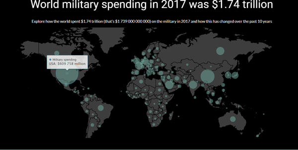
A number of applications exist for the visualization of arms trade data and most of the visualisations are mainly static. SIPRI has produced an interactive web platform using data in their published database but the application was only focused on military expenditure instead of arms trade flows. There has also been no visualisations carried out based for countries with Low Global Peace Index ratings.
Our project aims to contribute an application featuring multiple visualizations of arms imports. The following sections describe our approach to the problem and how the application was designed and built.
|
|
Motivation and Objectives
Based on the Global Peace Index 2018 published by the Institute for Economics and Peace, we have identified the countries with 'Low' and 'Very Low Peace' global peace index ratings. [3]
Our project aims to identify the trends and patterns in the international arms transfers at the regional and country levels for these Low Peace countries and explore the arms trade dependencies of these countries for the period 1993 to 2017. We also aim to explore the major importers and exporters of arms weapons and to find out the relationships between the global arm importers and exporters. Our team is motivated to design a dynamic and interactive dashboard to provide students and policymakers a better understanding and holistic view of the global arms trade for the Low Peace countries.
Data Sources
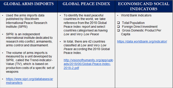
The table shows the data sources for our project. We use the Trend-Indicator-Value (TIV) published by SIPRI to visualise the trends and patterns of arms imports for the Low Peace Countries from 1993 to 2017.
|
|
Design Framework
1. Interface:
In this section, we will run through the dashboard visualizations. We used the flexdashboard package as we can easily create flexible and interactive dashboards with R. We included Shiny components for additional interactivity.
There are multiple tabs to our dashboard and each tab focuses on a specific type of visualisation. By having separate tabs, the user does not need to scroll up and down and can instead toggle freely between tabs to access the different visualisations. The dashboard consists of interactive plots so that users may gain insight on trends of the global arms imports for the low peace countries and explore the arms imports trade relationships between countries, by changing the filter options and by hovering and highlighting over the charts.
The purpose of this dashboard is to provide an application interface which facilitates an interactive analysis arms imports trend and arms trade over time and also arms dependencies of the low peace countries. The application also includes visualisation the relationship of arms imports with the social and economic indicators of the low peace countries.
In summary, the dashboard consists of the following 6 tabs for the visualisation of the above mentioned:
1. 2018 Global Peace Index
2. Top 100 Importers from 1993 to 2017
3. Visualization of Arms Dependencies
4. Visualization of Arms Trade Over Time
5. Visualization of Arms Import by FDI, GDP & Population Size, and
6. Visualization of Arms Trade Network.
|
|
2. Visualisations:
2018 Global Peace Index
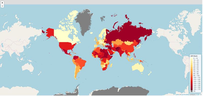
We created a choropleth map to allow users to visualise geographically where the countries with low Global Peace Index (GPI) ratings are located. Countries are coloured by their Global Peace Index rankings with darker shades of red indicating a poor Global Peace ranking or countries considered to be least peaceful. We used the leaflet package in R as it is highly interactive and customizable.
Features of the Choropleth map:
1. Heat map of the world showing the 2018 Global Peace Index Ratings for all of the countries
2. Users can zoom in and out of the map
3. Users can drag the map
4. Users can hover over the country of interest to see the country name and its Global Peace Index ranking.
5. The countries that are grey here are countries that are not in the covered in the 2018 Global Peace Index Ratings
|
|
Visualizing the Arms Dependencies
We use a treemap and chord diagram to visualize the arms dependencies for the 42 Low Peace selected countries.
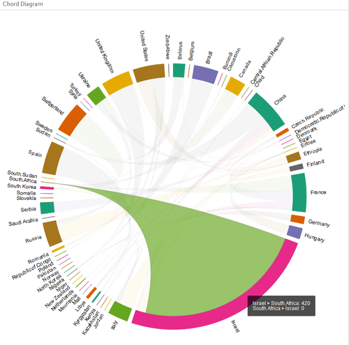
Chord Diagram
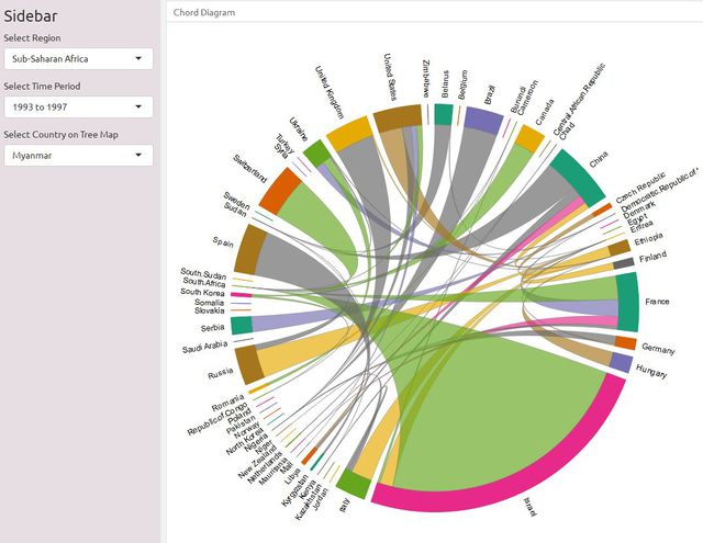
The chord diagram shows the source of arms imports flows for the selected 42 countries, in a given five-year period. It is created using the chorddiag package in R, which allows the creation of interactive chord diagrams using the JavaScript visualization library D3 from within R using the htmlwidgets interfacing framework.
Features of the Chord Diagram:
1. Users can filter by region, as well as five-year interval time periods to explore the total volume of arms imports for countries in the selected region and how much each country imports from the supplier countries.
2. Hovering over a band between two countries highlights the band and reveals the volume of arms imports to the importing country from its supplier.
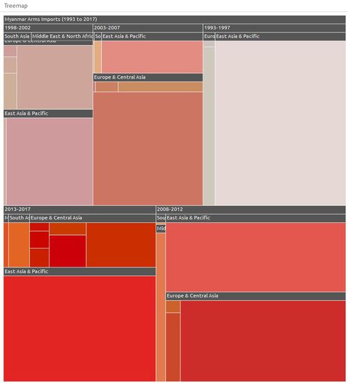
Treemap
The objective of the treemap is to show the regions and countries that specifically make up a selected country imports, over five-year periods. The hierarchy of the treemap is the five-year periods as the first hierarchy, followed by the region and then each specific country in the region. The treemap is created using the treemap package and the functionality of the treemap is combined with the interactivity of the d3.js treemaps though the d3treeR htmlwidget.
Features of the Treemap:
1. The total imports value is represented by the size of each treemap node as well as the colour. The darker the shade of red, the higher the import value.
2. Users can filter by the country (one of the 42 countries) to visualize the selected country’s dependencies on supplier countries for arms in five-year periods from 1993 to 2017.
3. Users can click on a region in the treemap to find out individual countries for the supplier region.
|
|
Visualizing the Arms Trade Flows Over Time
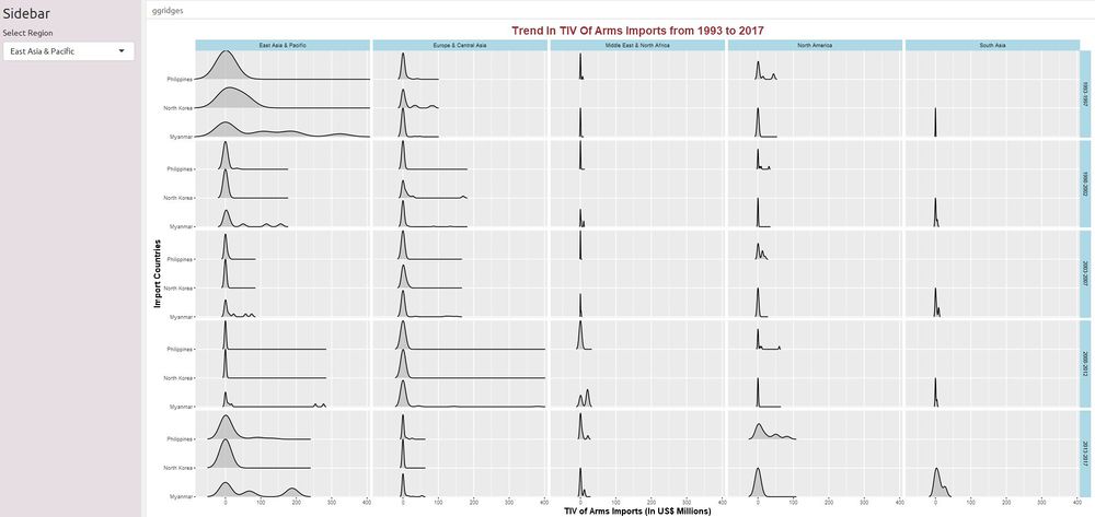
The ridgeline plots were incorporated to visualize changes in arms imports of the 42 countries over time. The ggplot2 and ggridge packages were used to create the ridgeline plot.The ggridge plot is useful as it can compare the trends in the arms imports of several countries together.
The facet_grid function is used to form a matrix of panels consisting of the export regions and the five-year time period. With the facetted diagram, users can explore the distribution of import values for countries of the selected region by five-year time periods and by export regions.
Features of the Ridgeline Plot:
1. Users can filter by region to explore the distribution of import values for countries in the selected region over time.
2. The facet_grid function is used to form a matrix of panels consisting of the export regions and the five-year time period. The columns of the facet grid represent export regions while the rows of facet grid represent five-year time periods. With the facetted diagram, users can explore the distribution of import values for countries of the selected region by five-year time periods and by export regions.
|
|
Visualizing the relationship between arms imports, foreign direct investment and GDP per capita
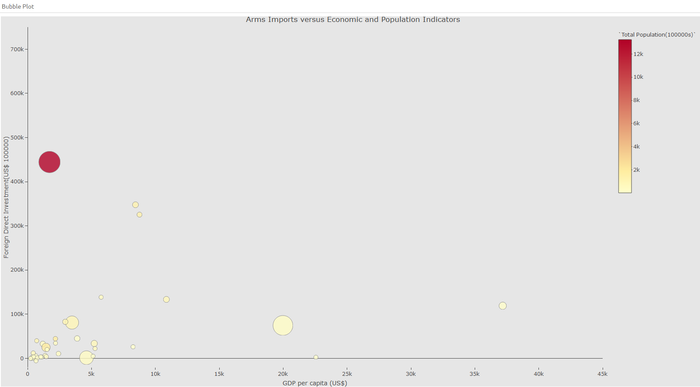
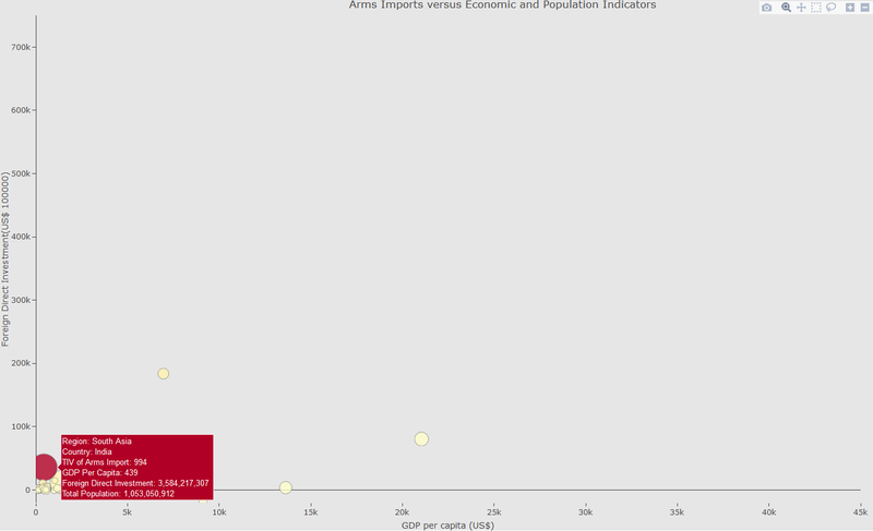
The bubble plot visualises the relationship between arms imports of the 42 countries together with the countries social and economic indicators. To create the bubble plot, we use the plotly package as it is an interactive, browser-based charting library built on the open source JavaScript graphing library plotly.js.
Features of the Bubble Plot:
1. x-axis represents the GDP per capita and y-axis represents the Foreign Direct Investment.
2. The size of the bubble represents the Trend Indicator Value(TIV) of the arms imports for each country.
3. The colour of the bubble represents the population size for each country.
4. Users can use the slider to choose different years to explore how the arms imports change with the social and economic indicators for the selected country.
|
|
Visualizing the Arms Trade Network
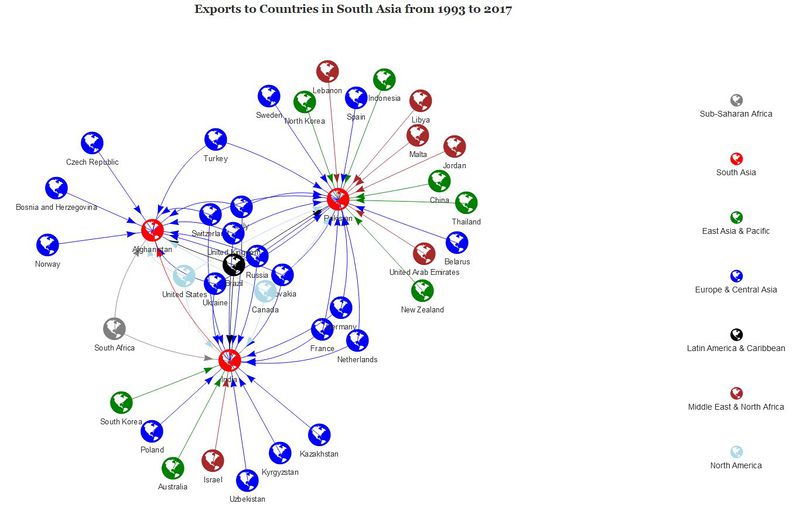
The network diagram was created to visualise the links between the 42 importing countries and their suppliers as shown below. The network diagram is used as an additional dimension to arms import trade flows on top of the bilateral trade flows visualized using the chord diagram. We use the Visnetwork package as it highly customizable and interactive.
Features of the Network Diagram:
1. Users can filter by region and by five-year interval time periods to identify which are the exporter countries for the selected region of choice.
2. Hovering over a particular country of the selected region and time period results highlights the countries exporting arms to that particular country.
3. With a network diagram, users can not only see where the interested country is importing from, but users can also easily see at a glance which other countries in the same region are these exporters exporting to.
|
|
Demonstration : Sample Test Cases
1. Increasing arm imports of India over the years
India has been importing higher volume of arms over the past few years and we can also notice that the foreign direct investment into India has consistently grown as well. The increasing volume of FDI inflow could have resulted in greater arms being imported by India.
|
|
|
|
2.Arms Imports of Countries in Middle East and North Africa in 2013 to 2017
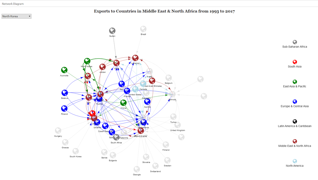
The arms trade network diagram shows that in the last 5 years, countries in Middle East and North Africa mainly import arms from the Europe and Central Asia. We can see that Saudi Arabia imports from majority of the countries in Europe and Central Asia and also from China.
|
|
Discussion
Through our application, we were able to identify the trends in the arms imports of the Low Peace countries from 1993 to 2017 and we were able to explore the arms trade dependencies of these countries. We showed how the arms imports of countries changes with different suppliers (export regions) over time and the relationship of a selected country imports with its social and economic indicators.
Future Work
1. The application currently focuses on countries with Low and Very Low Peace index. It could to be enhanced to include more countries from the SIPRI arms imports database to provide a better coverage of the global arms imports trade.
2. We could also include the military spending available in SIPRI database to explore the relationship between military spending and arms trade.
3. We could also extend our analysis to visualise the relationship between energy dependency and arms trade.
Acknowledgement
We would like to thank our professor, Dr. Kam Tin Seong for his unwavering support and guidance throughout the journey of our project.
References
[1] http://www.globalissues.org/issue/73/arms-trade-a-major-cause-of-suffering
[2] https://www.sipri.org/research/armament-and-disarmament/arms-transfers-and-military-spending/international-arms-transfers/
[3] http://visionofhumanity.org/app/uploads/2018/06/Global-Peace-Index-2018-2.pdf/

