Difference between revisions of "Group22 Report"
Jygao.2017 (talk | contribs) |
Jygao.2017 (talk | contribs) |
||
| (10 intermediate revisions by the same user not shown) | |||
| Line 32: | Line 32: | ||
Kiva is an international non-profit, founded in 2005 and based in San Francisco, with a mission to connect people through lending to alleviate poverty. By lending as little as $25 on Kiva, anyone can help a borrower start or grow a business, go to school, access clean energy or realize their potential. For some, it’s a matter of survival, for others it’s the fuel for a life-long ambition. And Kiva lenders have provided over $1 billion dollars in loans to over 2 million people in 87 countries. | Kiva is an international non-profit, founded in 2005 and based in San Francisco, with a mission to connect people through lending to alleviate poverty. By lending as little as $25 on Kiva, anyone can help a borrower start or grow a business, go to school, access clean energy or realize their potential. For some, it’s a matter of survival, for others it’s the fuel for a life-long ambition. And Kiva lenders have provided over $1 billion dollars in loans to over 2 million people in 87 countries. | ||
| − | + | The purpose of our application is to explore the reason why people loan from KIVA in different countries. The dataset contains 87 countries which are distributed around the world. It’s quite difficult to research the big size dataset directly. The application can help us understand the clear logic and find out some interesting insights relaxed. | |
| − | # | + | ==<font size="5"><font color = "#367c45">Review and Critic on Past Works</font></font>== |
| − | + | In some cases, self-selecting borrower groups screening according to reputation have proven to have lower default rates and the further away the geographic location of the borrower, the better the repayment. Sharma and Zeller (1997) indicate that self-selecting groups in Bangladesh had higher repayment rates. Inbothcases,thefocusisontheborrowergroups,andnot on cooperative crowd-sourced lending as on Kiva.org. | |
| − | |||
| − | + | Most of the literature about Kiva are talking about the operation mode and how micro-finance get successful. There is no such a specific application trying to visual the loan records and try to solve the poverty problem in the world. | |
==<font size="5"><font color = "#367c45">Design Framework</font></font>== | ==<font size="5"><font color = "#367c45">Design Framework</font></font>== | ||
| + | ==<font size="3"><font color = "#367c45">Introduction</font></font>== | ||
| + | The Kiva loan dataset contains more than 600,000 records which include all information about 87 countries. Exploring such a big size dataset to garner any significant meaning can be a daunting task. | ||
| + | The basic purpose of the project is to explore why people loan from KIVA. Because what people loan can represent what they lack or what they want to do in their countries. The result of the project can be the guide to help KIVA or government to understand the social deeper. | ||
| + | To achieve the target above, we design an application by R-shiny. The app contains 6 taps. | ||
| + | *User guide: A brief introduction about the app. | ||
| + | *Heatmap: To cluster the countries by different geographic level. | ||
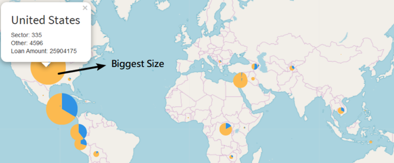
| + | *Global Map: To overview the distribution and loan purpose of all countries by special sector or loan amount. The pie chart shows you how many people loan for the selected sector in the country. The size of pie chare indicates how much people loan from KIVA. | ||
| + | *Tree Map: The first tree map can be used to overview how many people loan from KIVA in different countries. The second tree map can be used to compare the deeper purposes of people loan between two countries. | ||
| + | *Line Chart: Explore the change of loan amount and number of loans over three years. | ||
==<font size="3"><font color = "#367c45">Data Preparation</font></font>== | ==<font size="3"><font color = "#367c45">Data Preparation</font></font>== | ||
| − | The original dataset includes 671,205 observations and 20 variables. We | + | The original dataset includes 671,205 observations and 20 variables. We wrangled and cleaned data first to get a more essential dataset before we apply analysis which including deleting missing value, modifying data, extracting relative features and building new features. |
| − | # | + | #Delete Missing Value |
| − | |||
| − | |||
| − | |||
| − | |||
| − | |||
#Translate all the money amount to USD currency. Original data use the local currency for each loan application which is not useful for our analysis. | #Translate all the money amount to USD currency. Original data use the local currency for each loan application which is not useful for our analysis. | ||
#Create a new column named Continent. | #Create a new column named Continent. | ||
#Calculate the time. 'total_time' means how much time passes from the moment the loan is posted to the moment it's disbursed; and 'giving_time' means how long does a loan take to get funded. | #Calculate the time. 'total_time' means how much time passes from the moment the loan is posted to the moment it's disbursed; and 'giving_time' means how long does a loan take to get funded. | ||
#Calculate the time difference between loan amount and funded amount. | #Calculate the time difference between loan amount and funded amount. | ||
| + | #Converted “borrower_gender” variable. The original data is a gender list of the loan applicant. So we count the frequency of each list. | ||
| + | when female sum and length is 1, then conver to single_female | ||
| + | When female sum and length females_count is the same and different to zero, then mult_females | ||
| + | when female sum is zero and the count of individuals is 1, then “single_male | ||
| + | "mult_males" when female sum is zero and the count of individuals is greater than 1 | ||
| + | "mixed_genders" when the sum of females is different to the count of individual<br/> | ||
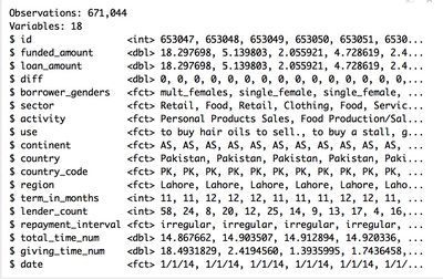
| + | The final dataset we used to do analytics includes 671,044 observations with 18 variables including basic loan information, geographic data, purpose explain and time distribution. And it looks like shown below: | ||
| + | |||
| + | [[Image:data.png|400px]] | ||
| + | ==<font size="3"><font color = "#367c45">Visualization</font></font>== | ||
| + | *Heat Map Mode | ||
| + | A heat map is a graphical representation of data where the individual values contained in a matrix are represented as colors. In addition, the results of hierarchical clustering are presented in a dendrogram. | ||
| + | The reason why we want to do the clustering is help us focus on similar countries at first. | ||
| + | Heat map is plotted by Plotly which is quite friendly tool. Users are allowed to zoom in the heat map and dedrogram. | ||
| + | |||
| + | [[Image:kiva heat.png|800px]] | ||
| + | |||
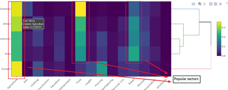
| + | The heat map mode is used to find out the cluster. The first control is used to select the geographic level user want to explore. For example, according to continent level. Africa, Asia and Americas are cluster into the same group. Overview the heat map, people loan for food, retail and Agriculture in these three continents. It seems that primary industry is more important in Africa, Asia and Americas. | ||
| + | |||
| + | [[Image:kiva heat2.png|800px]] | ||
| + | |||
| + | The interface of country is same with geographic level, but the row of heat map become countries now. For example, Cambodia, Lao and Afghanistan can be regarded as a group. They have high demand for personal use. | ||
| + | In addition, according to different algorithm, hierarchical clustering can show different result. All controls are shown above the heat map. | ||
| + | *Tree Map Mode | ||
| + | Tree map is a method for displaying hierarchical data using nested figures, usually rectangles. | ||
| + | Compare with bar chart, tree map can contain more information clearly. | ||
| + | The tree map is plotted by googleVis which allow users combine different levels of tree map together. In addition, it’s an interactive tool. | ||
| + | |||
| + | [[Image:kivatreemap1.png|800px]] | ||
| + | |||
| + | The first tree map is used to overview the development of KIVA in different countries. It’s easy to find out most users are coming from Philippines. | ||
| + | |||
| + | [[Image:kivatreemap2.png|800px]] | ||
| + | |||
| + | [[Image:kivatreemap3.png|800px]] | ||
| + | |||
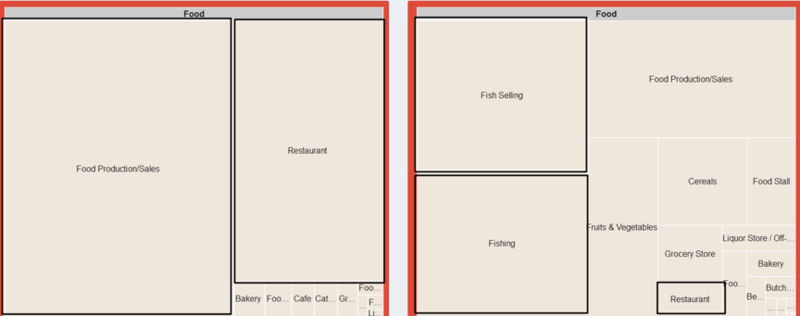
| + | The second tree map is more important. According to the cluster result of heat map mode, we can explore the details of different countries which are in the same group or different group. | ||
| + | *Time Series Mode | ||
| + | Lines charts were selected to display due to their suitability in representing time series data, especially when there was a need to display several time series in one plot. | ||
| + | The line chart is plotted by Plotly which is a friendly visualization tool. User can zoom in or select the information they care easily | ||
| + | |||
| + | [[Image:kivatime.png|800px]] | ||
| + | |||
| + | The y axis of line chart represents the loan amount. The unit of amount is American dollar. Users can control the countries, date range and attributes here. | ||
| + | *Map Mode | ||
| + | The KIVA dataset contains so many different countries. Map can be a good way to show all of them together. | ||
| + | There are two packages are used here. One is leaflet and the other one is leaflet minicharts. Because the original dataset doesn’t have completed information about latitude and longitude, we can’t use polygon directly. The leaflet can help us locate the countries easily. Although we have to use geocode to find out the latitude and longitude of all countries at first. | ||
| + | |||
| + | [[Image:kivamap123.png|800px]] | ||
==<font size="5"><font color = "#367c45">Demonstration</font></font>== | ==<font size="5"><font color = "#367c45">Demonstration</font></font>== | ||
==<font size="5"><font color = "#367c45">Discussion</font></font>== | ==<font size="5"><font color = "#367c45">Discussion</font></font>== | ||
| + | Some comments about the application. | ||
| + | *R shiny is a quite friendly application which can Seamless integrated many environment. Such as plotly and googleVis | ||
| + | *Interactive visualization can help users explore the dataset easily. | ||
| + | We had found out some interesting insights according to KIVA dataset. | ||
| + | |||
| + | [[Image:kiva9.png|800px]] | ||
| + | |||
| + | *The purpose of people loan from KIVA is quite different among all countries. But the agriculture, retail and food are the most important sectors among most countries. It seems that most people loan from KIVA for basic living needs. | ||
| + | |||
| + | [[Image:kiva10.png|800px]] | ||
| + | |||
| + | *The loan amount of Unite stats is the biggest one among all countries, but the number of loans is less than many countries. On the other hand, the number of loans of Philippines is the most one, but the loan amount is quite small. | ||
| + | |||
| + | [[Image:kiva11.png|800px]] | ||
| + | |||
| + | *When it comes to the same sector, the exact activities can be different between two countries. For example, most people in Unite States loan for opening restaurant and food production. However, most people loan for fishing selling in Philippines. | ||
| + | |||
==<font size="5"><font color = "#367c45">Future Work</font></font>== | ==<font size="5"><font color = "#367c45">Future Work</font></font>== | ||
| + | The application can be further developed with more model methods. | ||
| + | *From now on, we start the visualization with hierarchical clustering. However, there are many other methods can help us cluster countries. | ||
| + | *Are there any relationship between different sectors? We should develop a correction matrix about all sectors. We might find somethings interesting through this method. | ||
| + | |||
==<font size="5"><font color = "#367c45">Installation Guide</font></font>== | ==<font size="5"><font color = "#367c45">Installation Guide</font></font>== | ||
| + | ==<font size="3"><font color = "#367c45">System Requirement</font></font>== | ||
| + | R studio | ||
| + | |||
| + | R shiny | ||
| + | |||
| + | R libraries <br/> | ||
| + | |||
| + | ==<font size="3"><font color = "#367c45">Installation</font></font>== | ||
| + | Install R studio | ||
| + | |||
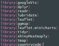
| + | Install all the necessary R packages<br/> | ||
| + | |||
| + | [[Image:kivapk.png|350px]] | ||
| + | |||
==<font size="5"><font color = "#367c45">User Guide</font></font>== | ==<font size="5"><font color = "#367c45">User Guide</font></font>== | ||
The Shiny application has 6 tabs: | The Shiny application has 6 tabs: | ||
| Line 66: | Line 153: | ||
#Fifth tab 'TreeMap_Compare' is used to compare the purpose of loan of two different countries. You can click the tree map and go deeper. | #Fifth tab 'TreeMap_Compare' is used to compare the purpose of loan of two different countries. You can click the tree map and go deeper. | ||
#Sixth tab 'Time_Series_Line' is used to explore the change of loan amount and number of records over three years. | #Sixth tab 'Time_Series_Line' is used to explore the change of loan amount and number of records over three years. | ||
| + | |||
| + | ==<font size="5"><font color = "#367c45">Reference</font></font>== | ||
| + | *http://www.cs.umd.edu/hcil/trs/2008-26/2008-26.pdf | ||
| + | *Data Source https://www.kaggle.com/kiva/data-science-for-good-kiva-crowdfunding | ||
| + | *Kiva’s introduction https://www.kiva.org | ||
| + | *Wikipedia https://en.wikipedia.org/wiki/Cambodia | ||
| + | *Wikipedia https://en.wikipedia.org/wiki/Philippines | ||
Latest revision as of 18:36, 13 August 2018
|
|
|
|
|
Contents
Motivation of the Application
Poverty is one of the biggest long-term issues confronting the world today. Millions of people struggle to maintain the most basic standard of living for themselves and their families, and face a daunting uncertainty in many parts in their lives. Microfinance is one strategy and it attempts to address the issue of poverty by providing small-scale loans to the poor so that they can either start or expand a small business to improve their income, thus helping to bring them out of poverty.
Kiva is an international non-profit, founded in 2005 and based in San Francisco, with a mission to connect people through lending to alleviate poverty. By lending as little as $25 on Kiva, anyone can help a borrower start or grow a business, go to school, access clean energy or realize their potential. For some, it’s a matter of survival, for others it’s the fuel for a life-long ambition. And Kiva lenders have provided over $1 billion dollars in loans to over 2 million people in 87 countries.
The purpose of our application is to explore the reason why people loan from KIVA in different countries. The dataset contains 87 countries which are distributed around the world. It’s quite difficult to research the big size dataset directly. The application can help us understand the clear logic and find out some interesting insights relaxed.
Review and Critic on Past Works
In some cases, self-selecting borrower groups screening according to reputation have proven to have lower default rates and the further away the geographic location of the borrower, the better the repayment. Sharma and Zeller (1997) indicate that self-selecting groups in Bangladesh had higher repayment rates. Inbothcases,thefocusisontheborrowergroups,andnot on cooperative crowd-sourced lending as on Kiva.org.
Most of the literature about Kiva are talking about the operation mode and how micro-finance get successful. There is no such a specific application trying to visual the loan records and try to solve the poverty problem in the world.
Design Framework
Introduction
The Kiva loan dataset contains more than 600,000 records which include all information about 87 countries. Exploring such a big size dataset to garner any significant meaning can be a daunting task. The basic purpose of the project is to explore why people loan from KIVA. Because what people loan can represent what they lack or what they want to do in their countries. The result of the project can be the guide to help KIVA or government to understand the social deeper. To achieve the target above, we design an application by R-shiny. The app contains 6 taps.
- User guide: A brief introduction about the app.
- Heatmap: To cluster the countries by different geographic level.
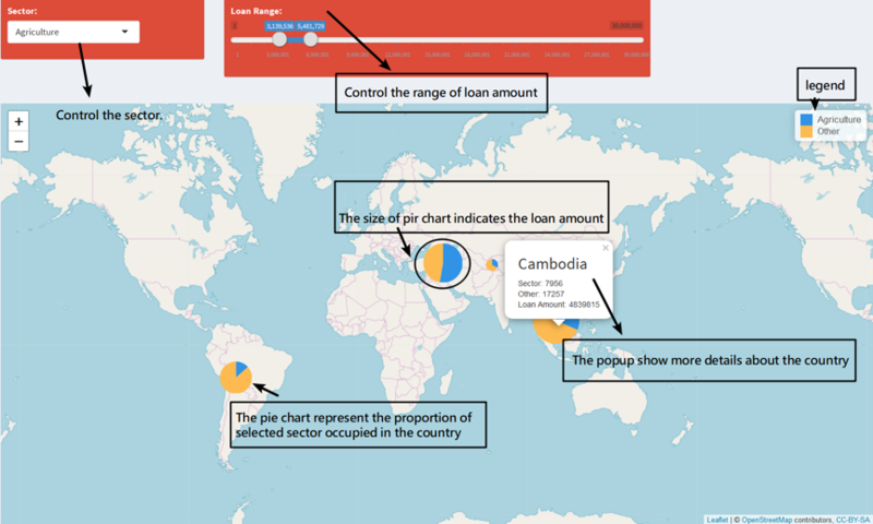
- Global Map: To overview the distribution and loan purpose of all countries by special sector or loan amount. The pie chart shows you how many people loan for the selected sector in the country. The size of pie chare indicates how much people loan from KIVA.
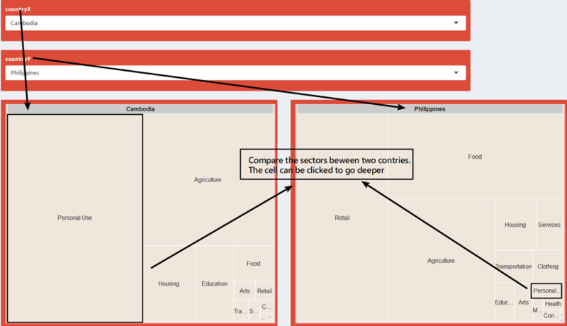
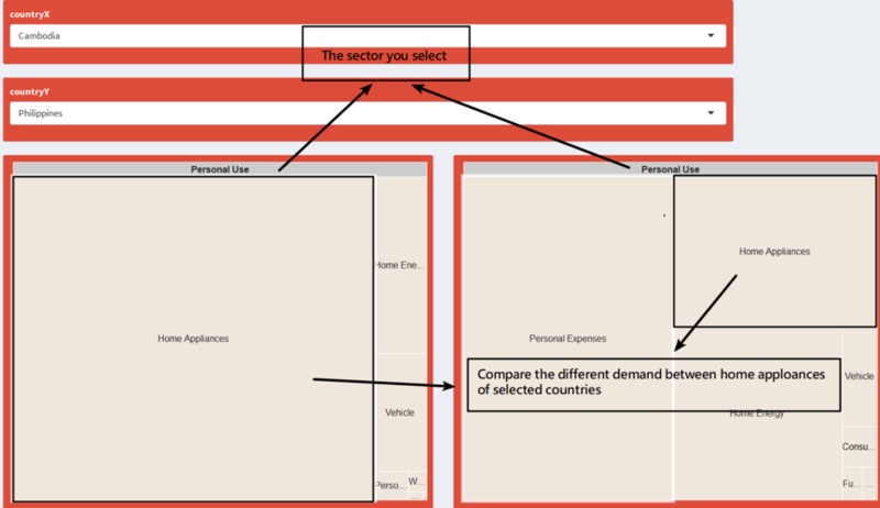
- Tree Map: The first tree map can be used to overview how many people loan from KIVA in different countries. The second tree map can be used to compare the deeper purposes of people loan between two countries.
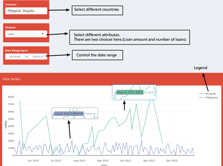
- Line Chart: Explore the change of loan amount and number of loans over three years.
Data Preparation
The original dataset includes 671,205 observations and 20 variables. We wrangled and cleaned data first to get a more essential dataset before we apply analysis which including deleting missing value, modifying data, extracting relative features and building new features.
- Delete Missing Value
- Translate all the money amount to USD currency. Original data use the local currency for each loan application which is not useful for our analysis.
- Create a new column named Continent.
- Calculate the time. 'total_time' means how much time passes from the moment the loan is posted to the moment it's disbursed; and 'giving_time' means how long does a loan take to get funded.
- Calculate the time difference between loan amount and funded amount.
- Converted “borrower_gender” variable. The original data is a gender list of the loan applicant. So we count the frequency of each list.
 when female sum and length is 1, then conver to single_female
 When female sum and length females_count is the same and different to zero, then mult_females
 when female sum is zero and the count of individuals is 1, then “single_male
 "mult_males" when female sum is zero and the count of individuals is greater than 1
 "mixed_genders" when the sum of females is different to the count of individual
The final dataset we used to do analytics includes 671,044 observations with 18 variables including basic loan information, geographic data, purpose explain and time distribution. And it looks like shown below:
Visualization
- Heat Map Mode
A heat map is a graphical representation of data where the individual values contained in a matrix are represented as colors. In addition, the results of hierarchical clustering are presented in a dendrogram. The reason why we want to do the clustering is help us focus on similar countries at first. Heat map is plotted by Plotly which is quite friendly tool. Users are allowed to zoom in the heat map and dedrogram.
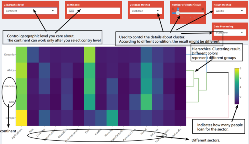
The heat map mode is used to find out the cluster. The first control is used to select the geographic level user want to explore. For example, according to continent level. Africa, Asia and Americas are cluster into the same group. Overview the heat map, people loan for food, retail and Agriculture in these three continents. It seems that primary industry is more important in Africa, Asia and Americas.
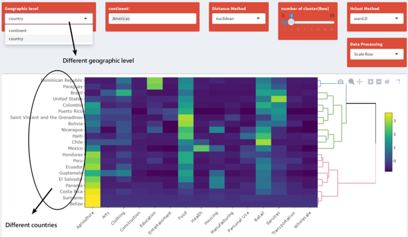
The interface of country is same with geographic level, but the row of heat map become countries now. For example, Cambodia, Lao and Afghanistan can be regarded as a group. They have high demand for personal use. In addition, according to different algorithm, hierarchical clustering can show different result. All controls are shown above the heat map.
- Tree Map Mode
Tree map is a method for displaying hierarchical data using nested figures, usually rectangles. Compare with bar chart, tree map can contain more information clearly. The tree map is plotted by googleVis which allow users combine different levels of tree map together. In addition, it’s an interactive tool.
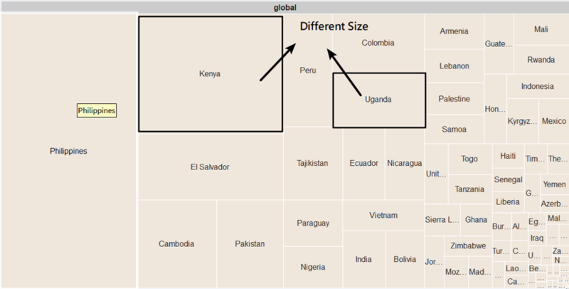
The first tree map is used to overview the development of KIVA in different countries. It’s easy to find out most users are coming from Philippines.
The second tree map is more important. According to the cluster result of heat map mode, we can explore the details of different countries which are in the same group or different group.
- Time Series Mode
Lines charts were selected to display due to their suitability in representing time series data, especially when there was a need to display several time series in one plot. The line chart is plotted by Plotly which is a friendly visualization tool. User can zoom in or select the information they care easily
The y axis of line chart represents the loan amount. The unit of amount is American dollar. Users can control the countries, date range and attributes here.
- Map Mode
The KIVA dataset contains so many different countries. Map can be a good way to show all of them together. There are two packages are used here. One is leaflet and the other one is leaflet minicharts. Because the original dataset doesn’t have completed information about latitude and longitude, we can’t use polygon directly. The leaflet can help us locate the countries easily. Although we have to use geocode to find out the latitude and longitude of all countries at first.
Demonstration
Discussion
Some comments about the application.
- R shiny is a quite friendly application which can Seamless integrated many environment. Such as plotly and googleVis
- Interactive visualization can help users explore the dataset easily.
We had found out some interesting insights according to KIVA dataset.
- The purpose of people loan from KIVA is quite different among all countries. But the agriculture, retail and food are the most important sectors among most countries. It seems that most people loan from KIVA for basic living needs.
- The loan amount of Unite stats is the biggest one among all countries, but the number of loans is less than many countries. On the other hand, the number of loans of Philippines is the most one, but the loan amount is quite small.
- When it comes to the same sector, the exact activities can be different between two countries. For example, most people in Unite States loan for opening restaurant and food production. However, most people loan for fishing selling in Philippines.
Future Work
The application can be further developed with more model methods.
- From now on, we start the visualization with hierarchical clustering. However, there are many other methods can help us cluster countries.
- Are there any relationship between different sectors? We should develop a correction matrix about all sectors. We might find somethings interesting through this method.
Installation Guide
System Requirement
R studio
R shiny
R libraries
Installation
Install R studio
Install all the necessary R packages
User Guide
The Shiny application has 6 tabs:
- First tab shows the work flow and the design logic of the shiny application.
- Second tab 'HeatMap_Cluster' can be used to cluster different country.
- Third tab 'Map' is used to overview what sectors the country care more. In addition, the size of pie chart indicates the amount of loan. You can focus on special country based on the result of cluster.
- Fourth tab 'TreeMap_Global' can overview how many loan records are recorded.
- Fifth tab 'TreeMap_Compare' is used to compare the purpose of loan of two different countries. You can click the tree map and go deeper.
- Sixth tab 'Time_Series_Line' is used to explore the change of loan amount and number of records over three years.
Reference
- http://www.cs.umd.edu/hcil/trs/2008-26/2008-26.pdf
- Data Source https://www.kaggle.com/kiva/data-science-for-good-kiva-crowdfunding
- Kiva’s introduction https://www.kiva.org
- Wikipedia https://en.wikipedia.org/wiki/Cambodia
- Wikipedia https://en.wikipedia.org/wiki/Philippines
