Difference between revisions of "Group16 Report"
| (53 intermediate revisions by 3 users not shown) | |||
| Line 1: | Line 1: | ||
<div style="background:#17202A; padding:22px; text-align:center;"> | <div style="background:#17202A; padding:22px; text-align:center;"> | ||
| − | <font size = 7; color="#FFC300"><span style="font-family: Calibri;">Urban Pulse: | + | <font size = 7; color="#FFC300"><span style="font-family: Calibri;">Urban Pulse: Visualization on Beijing's Traffic</span></font> |
</div> | </div> | ||
| Line 32: | Line 32: | ||
GPS-equipped taxis can be regarded as mobile sensors probing traffic flows on road surfaces, and taxi drivers are usually experienced in finding the fastest (quickest) route to a destination based on their knowledge. | GPS-equipped taxis can be regarded as mobile sensors probing traffic flows on road surfaces, and taxi drivers are usually experienced in finding the fastest (quickest) route to a destination based on their knowledge. | ||
| − | In previous work with this same dataset one can find the T-Drive Microsot project. This project was more analytical than visual. Students were tasked to find how efficient are taxi driver's routes compared to Google's Map suggestions. Our project we visualize Traffic and Driving behavior. For instance, we mine driving directions from the historical GPS trajectories of a large number of taxis in Beijing, China to derive insights of traffic conditions in one of the busiest capitals of the world. | + | In previous work with this same dataset one can find the T-Drive Microsot project. This project was more analytical than visual. Students were tasked to find how efficient are taxi driver's routes compared to Google's Map suggestions. Our project we visualize Traffic and Driving behavior. For instance, we mine driving directions from the historical GPS trajectories of a large number of taxis in Beijing, China to derive insights of traffic conditions in one of the busiest capitals of the world. |
| − | |||
| − | |||
| − | |||
| − | |||
==Data Preparation== | ==Data Preparation== | ||
| Line 54: | Line 50: | ||
==Design Framework and Visualization Methodology== | ==Design Framework and Visualization Methodology== | ||
Our project is mainly comprised of three parts, and design framework is shown in the figure. | Our project is mainly comprised of three parts, and design framework is shown in the figure. | ||
| − | + | ===Page 1 - Examine the traffic conditions by exploration=== | |
| − | * Find traffic patterns by statistical analysis | + | To get the user a general impression of Beijing's traffic pattern, we created this page for them to explore the data as much as they want. After the exploration, they'll find some interesting points and anomoly to dig deeper in the next two pages. |
| − | * Analyze the working pattern of Beijing taxi drivers | + | |
| + | <b>Package used:</b> Leaflet | ||
| + | |||
| + | <b>Details of design:</b> | ||
| + | |||
| + | * Set appropriate base map and zoom number (zoom = 8) as the base layer. Here we chose "Cardo.Dark" theme since it is more effective to form a strong color contrast with the plots and gives a better visualization effect. | ||
| + | |||
| + | * Plot data. There are two ways to plot trajectory data, one is by dot and the other by line. Though it is obvious that for this case the line plot is a better choice, we chose dots instead to avoid distortion of the trajectory caused by line plot. The reason that we think line plot is distortion is that when you plot by lines, you connect the dots by straight lines instead of the real routes which can involve some turnarounds. We did try to find ways to solve the distortion problem with Google API called Google direction. However, Google has a daily limitation of 2,500 request for users. On the other hand, our data has more 10,357 users, each of them has 5,000 GPS recordings, which means in total we have more than 50,000,000 routes to request for Google direction. It will literally takes us 2,000 days to get the routes and the RAM with definitely run out to processing so much routes.So we did not take Google direction to find the real routes. Thus the distortion for line plot is still unsolved, so we compromised to plot with dots to keep the data integrity and to get a better look on the map.In case of plot overlapping,set the opacity to 0.4 and weight to 2. | ||
| + | |||
| + | [[File:Base.PNG|800px|center|Base Map of Beijing]] | ||
| + | |||
| + | |||
| + | * Functions. The functions for the first page is mainly filters and coloring. The functions enable user to select specific district, date and time to observe the traffic. The user can also increase or decrease sample size with the slider. Last but not least, the user can color the plots with speed, with red color representing low speed, yellow representing medium, and green representing high speed. | ||
| + | |||
| + | [[File:Page 1 with functions.PNG|800px|center|Page 1 (with functions)]] | ||
| + | |||
| + | ===Page 2 - Find traffic patterns by statistical analysis=== | ||
| + | This page is mainly about the statistic analysis of traffic patterns in Beijing. We focus on the speed, number of taxis and distance which drivers traveled by district level and try to give our users more explicit idea about traffic in Beijing. | ||
| + | |||
| + | <b>Package used: </b>Leaflet, ggplot, plotly | ||
| + | |||
| + | <b>Details of design:</b> | ||
| + | * Layout: layout of this page is shown below. On the left side, we have a map of Beijing by district level. And on the right side, there are three line graphs showing the speed, number of taxis, and distance by hour and date. The reason why we show map and line graph together is that we want our users to have an intuitive idea about the how Beijing looks like and where is the specific district located. This may help them figure out why more taxi drivers would like to spend most of them time traveling in districts like Haidian but not like Fangshan. | ||
| + | [[File:Group 16 Page2.png|800px|center]] | ||
| + | |||
| + | * Plots: the map is plotted by leaflet and zoom is set to 8 so that the whole shape of Beijing can be shown in the map. We added polygons in very light color at the beginning. When user selects one or more specific districts, the districts he selected will be highlighted in the map. The three line graphs is plotted by ggplot and plotly, showing average speed, number of taxis and distance respectively. And the data we used for plot these line graph has already be derived and resaved from the raw data. Thus, it would not take a long time for response. | ||
| + | * Functions: | ||
| + | |||
| + | ===Page 3 - Analyze the working pattern of Beijing taxi drivers=== | ||
| + | This page focuses on finding the behaviour of the taxi drivers. | ||
| + | |||
| + | 1.The left interactive graph enables the user to select a taxi driver id and find where he lives and in which district he's driving at a specific time point. Take user 1000 as an example. ... After random sampling 20 drivers, we found that most drivers tend to drive near their living place and they like to drive around one district for 2-3 hours. | ||
| + | |||
| + | 2. The top right part is a heat map reflecting the distribution of drivers' living places. The redder the area is, the higher density it is for driver home. | ||
| + | 3. The bottom right part are two graphs giving statistics of the drivers' working days and working hour, including a comparison between normal working days (02-05) and lunar new year period(06-07). | ||
==Discussion== | ==Discussion== | ||
==== Visualization of Traffic patterns by hour of the day ==== | ==== Visualization of Traffic patterns by hour of the day ==== | ||
| − | The | + | <br>[[File:Figure216.png|800px|center]] |
| + | |||
| + | The graph shows the traffic of Guomao (a CBD area) of Beijing city in 24 hours of date 2008-02-04. | ||
| + | |||
| + | From the graph, it is quite obvious that the area is still busy at midnight time (from 0-2 o'clock). The traffic flow reduces from 3 o'clock, and reaches its lowest value at 5 o'clock. From 10am onwards, the peak of the day starts, and the trend remains until 11 pm. | ||
| − | |||
| − | ==== | + | ==== Statistics of traffic patterns by district ==== |
| − | |||
| + | Beijing is comprised of 16 urban and suburban districts. We have analyzed the traffic pattern for 9 urban districts including: Changping, Chaoyang, Daxing, Dongcheng, Fengtai, Haidian, Miyun, Shungyi, Xicheng for 5 days. We can derive from the visualizations that Shunyi district and Changping district are the least busy districts compared to the other 7 districts. Overally, the traffic decreases by 30% on Chinese New year and holidays. | ||
| − | + | [[File:Traffic pattern in 24 hours across days group.PNG|400px|center|Traffic statistics by hours across days (urban vs suburban)]] | |
| − | + | First, let's make a comparison between urban and suburban area. Urban area includes four central districts -- dongcheng, xicheng, chaoyang, and haidian districts. And the rest are grouped as suburban area, including fengtai, shunyi, daxing, miyun, changping. | |
| − | + | From the graph, it is easy to see that the traffic flow gets less and less heavy from Feb 3rd to Feb 7th (Lunar New Year's Eve). Possible reason behind this is that when it's approaching Chinese New Year, migrant workers and employees leave Beijing and come back to their hometowns, which will cause both decrease in taking taxis and supply of taxis since some taxi drivers also have to unite with their family. | |
| − | + | Another interesting point is that regardless of dates, the traffic flow always reach its first peak at 1 pm, decrease until 3 pm, and pick up again to reach the second peak at 5 pm. The logic behind this phenomenon is that people normally have their dinner at around 1 pm, and 5 pm is the common off work time. | |
| + | It is also quite intuitive that the speed is negatively correlated to number of taxis, and distance has a positive correlation with the number of taxis. However, the speed we calculated here is lower than actual speed since we compute the straight distance between two coordinates while in real life a taxi cannot drive across buildings and rivers, etc. | ||
| − | |||
| + | [[File:Traffic pattern in 24 hours across days district.PNG|1000px|center|Traffic statistics by hours across days (districts)]] | ||
| − | + | Similarly, the traffic display similar patterns when we look into specific districts, having two peaks at 1 pm and 5 pm respectively and reaches the lowest level at 6 am, which resonates with what we have found from page 1 -- that the peak of the city starts from 10am and the traffic slows down from 8pm, reaching its lowest level at 5-6am. | |
| − | |||
| − | + | ==== Heat Map of home addresses and starting points for taxis per day==== | |
| − | + | The plot below represents the specific locations of the 10357 taxis drivers' home in Beijing. Having no information of the drivers' profile, we derived their home location by computing the longest time period during which the car speed remains 0 km/h for each drive , and assume that specific location to be the driver's home. | |
| − | + | [[File:Heatmap_driverhome.PNG|400px|center]] | |
| + | Insights from this graph is that we the user zoom in, it is obvious that few drivers live at the central part of the city and most of them live around 3rd and 4th rings. This is because 3rd and 4th rings has lower housing and leasing price. | ||
| − | + | Some drivers live around the airport (top right corner), it is highly possible that these drivers focus on picking and sending passengers to the airport as their routine route. | |
| − | + | ====Insights on working patterns for taxi drivers in Beijing==== | |
| + | Finally, we derived number of working days and working hours for the 10357 taxi drivers. The statistics are plotted in bar charts. As we can see, over 6500 taxis or almost 63% of the taxi fleet works 7 days a week while 20% of the fleet in this data works 6 days a week. There’s a very small percentage of taxi drivers working 4 or less number of days in a week. | ||
| − | |||
| − | + | [[File:Distribution_of_driver_working_days.PNG|400px|center]] | |
| + | [[File:Distribution_of_driver_working_hours.PNG|400px|center]] | ||
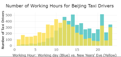
| − | + | Coming to the working hours distribution, most driver reduce their work time when it comes to Lunar New Year. | |
==Future work== | ==Future work== | ||
| Line 108: | Line 143: | ||
This data analysis could be useful for Beijing’s municipalities. It could also serve as a research paper and tool for new start-ups who want to understand the taxi patterns and locations in Beijing. | This data analysis could be useful for Beijing’s municipalities. It could also serve as a research paper and tool for new start-ups who want to understand the taxi patterns and locations in Beijing. | ||
| + | |||
| + | The data used for this analysis is dated 2008, however, it would be relevant to apply it to a more recent dataset and real time data. | ||
| + | |||
| + | Future work can consist of mapping a real time dataset with our application or doing further analysis on the efficiency of taxi driver's routes selection. | ||
Other uses of this research are: | Other uses of this research are: | ||
| − | |||
- For Government: Due to limited information for Beijing's city construction and road planning, we may only give suggestions based on our cognition. The suggestions may not be applicable in real world, but it gives a general direction of how to mitigate congestion by improving the traffic arrangements. | - For Government: Due to limited information for Beijing's city construction and road planning, we may only give suggestions based on our cognition. The suggestions may not be applicable in real world, but it gives a general direction of how to mitigate congestion by improving the traffic arrangements. | ||
- For Taxi Companoies: We will suggest taxi companies in Beijing how to allocate taxis in a more efficient way. | - For Taxi Companoies: We will suggest taxi companies in Beijing how to allocate taxis in a more efficient way. | ||
- For Commuters: Commuters may have a more clear view of the traffic condition at different time and site to make cleverer decisions on their transportation planning. | - For Commuters: Commuters may have a more clear view of the traffic condition at different time and site to make cleverer decisions on their transportation planning. | ||
| + | ==Installation Guide== | ||
| − | + | Here are the steps for the installation: | |
| − | + | *1. Download the server.R and Ui.R applications | |
| − | + | *2. Run the Application in R | |
| + | *3. make sure all libraries are installed in R including: | ||
| + | library(shiny) | ||
| + | library(shinythemes) | ||
| + | library(tidyverse) | ||
| + | library(sp) | ||
| + | library(ggplot2) | ||
| + | library(plotly) | ||
| + | library(leaflet) | ||
| + | library(leaflet.extras) | ||
| + | library(RColorBrewer) | ||
| + | library(processx) | ||
| + | ==User Guide== | ||
| + | The Shiny application has 4 tabs: | ||
| + | * [1] First tab shows the data set. User can take a look at the different variables including the ones derived during the project | ||
| + | * [2] Second tab shows an initial visualization for exploratory purposes. One can clearly see the map of beijing and the different traffic patters. This is only for visualization purposes | ||
| + | * [3] Third tab explores the different traffic patterns per district and per day and hour. | ||
| + | * [4] Fourth tab in our Shiny R app includes taxi driver behavior. One can select a specific taxi ID and understand where this taxi driver is at each point of the day. | ||
| + | Please refer to design framework in this wiki for more user guide details in each tab. | ||
==Acknowledgements== | ==Acknowledgements== | ||
| Line 134: | Line 191: | ||
*[6] Urban computing with Taxicabs, October 20th, 2011 | *[6] Urban computing with Taxicabs, October 20th, 2011 | ||
*[7] Analyzing 1.1Billion NYC Taxi and Uber trips by Todd Schneider, 2018 | *[7] Analyzing 1.1Billion NYC Taxi and Uber trips by Todd Schneider, 2018 | ||
| + | *[8] The Art of R Programming: A Tour of Statistical Software Design Book by Norman Matloff | ||
| + | *[9] R in a Nutshell Book by Joseph Adle | ||
| + | *[10] Using R for Introductory Statistics Textbook by John Verzani | ||
| + | *[11] R for Data Science Book by Garrett Grolemund and Hadley Wickham | ||
| + | *[12] Learning Shiny | R-bloggers | ||
| + | *[13] Web Application Development with R Using Shiny by Chris Beeley | ||
Latest revision as of 01:19, 14 August 2018
Urban Pulse: Visualization on Beijing's Traffic
Contents
Motivation
The increasing adoption of GPS and other location tracking technologies is leading to the colleaction of large spatio temporal datasets and this brings the opportunity for discovering of valuable knowledge of taxi fleet movement behavior which foresters new innovative applications and services that can be monetized. The main objective of this project is to find traffic patterns in Beijing. For this, we applied geospatial and statistical analysis on a Beijing Taxi fleet dataset from 2008. The user will be able to explore the data from various angles. Sophisticated graphs the group has see that were made in R inspired us to pursue this work but also two members of the team come from Beijing and we were all very interested in working out depth insights from a simple dataset of moving objects. Our methodology is comprised of two parts. First, we examine traffic conditions in different parts of Beijing during 1 day to find interesting patterns. Finally, we explore Beijing taxidrivers patterns and behaviour. For this we have used R. And we have also built an app for an easy visualization in Shiny R.
Review of past work
Beijing, formerly romanized as Peking, is the capital of the People's Republic of China, the world's third most populous city proper, and most populous capital city. The city, located in northern China, is governed as a direct-controlled municipality under the national government with 16 urban, suburban, and rural districts. According to the report from ChinaDaily in early 2018, Beijing comes as the second top traffic congested city in mainland China, right following Jinan, Shandong. Statistics form 2015 suggests that the rush hour delay index of Beijing reaches as 2.046, with the speed of rush hour reaching 21.91 Km/h. Given such severe situation, Chinese government has been working hard to trace the traffic situation in Beijing and come up with implementable suggestions.
GPS-equipped taxis can be regarded as mobile sensors probing traffic flows on road surfaces, and taxi drivers are usually experienced in finding the fastest (quickest) route to a destination based on their knowledge.
In previous work with this same dataset one can find the T-Drive Microsot project. This project was more analytical than visual. Students were tasked to find how efficient are taxi driver's routes compared to Google's Map suggestions. Our project we visualize Traffic and Driving behavior. For instance, we mine driving directions from the historical GPS trajectories of a large number of taxis in Beijing, China to derive insights of traffic conditions in one of the busiest capitals of the world.
Data Preparation
Our data sourse is a huge dataset downloaded from Microsoft T-Drive Beijing trajectory data sample, which comprises 10357 text files. Each text file is named with a taxi id, recording the GPS coordinates of that taxi in every 10 mins during the week from 2008-02-02 to 2008-02-08. After aggregating all the text files, we got a table consisting of 16 million rows and 4 columns (taxi id, date time, latitude and longitude).
One of the major challenge we faced is that this original dataset doesn't provide enough variables. In order to get deep insights of Traffic Patterns in Beijing, our team tried to derived more information from the existing variables. Four important variables are derived from the time, latitude and longitude:
- Time difference: calculation made from the Time variable which specifies what's the time difference between the previous sample and the current one. This was done by converting all date-time into numeric version directly applying minus to get the seconds. Most of the time difference are 600 seconds or 10 minutes, which is consistence with the description with Microsoft document. Moreover, the time difference helps us identify longer periods of time between rides. For instance, we can identify the last ride of the day and the first ride of next day.
- Distance: this calculation helps identify the distance between one point to the next one in meters. It is done by using Geosphere package. However, this package can only help us by calculating the straight-line difference between two coordinates of latitude and longitude, which leads to some inaccuracy. The reasons why we didn't call google api to find the real distance are: a) we have almost 16 million coordinates, and it takes quite long machine time to do calculation, and b) the data was record in 2008, and the street in Beijing nowadays might be quite different with 10 years ago.
- Speed: from the two previous new derived variables we can calculate the average speed for each sample. Also, we binned speed into 'low', 'medium', and 'high'. Firstly, This variable provides the traffic congestion information of different streets. Secondly, This variable has helped to understand when the taxi driver was not in movement. Combined with Time difference we could understand when the Taxi Driver arrived home in his last trip (time difference > 6 hours) for sleep. Therefore we could determine the location of each driver's home.
- District: label the coordinates into 16 districts of Beijing. Since Beijing is quite big, analyze and compare the traffic patterns of difference area can help us get some deep insights. There are two steps to get the district label: a)find shape file of Beijing in district level and convert coordinates of polygons into latitude and longitude pattern with the help of sp, and project4 package; and b)label each points into one district using sp package. Also, based on the location of districts, we binned district variable into 'urban' and 'suburban'.
Below is a sample of our dataset after data wrangling and cleaning.
Design Framework and Visualization Methodology
Our project is mainly comprised of three parts, and design framework is shown in the figure.
Page 1 - Examine the traffic conditions by exploration
To get the user a general impression of Beijing's traffic pattern, we created this page for them to explore the data as much as they want. After the exploration, they'll find some interesting points and anomoly to dig deeper in the next two pages.
Package used: Leaflet
Details of design:
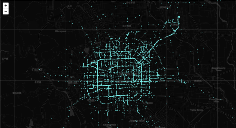
- Set appropriate base map and zoom number (zoom = 8) as the base layer. Here we chose "Cardo.Dark" theme since it is more effective to form a strong color contrast with the plots and gives a better visualization effect.
- Plot data. There are two ways to plot trajectory data, one is by dot and the other by line. Though it is obvious that for this case the line plot is a better choice, we chose dots instead to avoid distortion of the trajectory caused by line plot. The reason that we think line plot is distortion is that when you plot by lines, you connect the dots by straight lines instead of the real routes which can involve some turnarounds. We did try to find ways to solve the distortion problem with Google API called Google direction. However, Google has a daily limitation of 2,500 request for users. On the other hand, our data has more 10,357 users, each of them has 5,000 GPS recordings, which means in total we have more than 50,000,000 routes to request for Google direction. It will literally takes us 2,000 days to get the routes and the RAM with definitely run out to processing so much routes.So we did not take Google direction to find the real routes. Thus the distortion for line plot is still unsolved, so we compromised to plot with dots to keep the data integrity and to get a better look on the map.In case of plot overlapping,set the opacity to 0.4 and weight to 2.
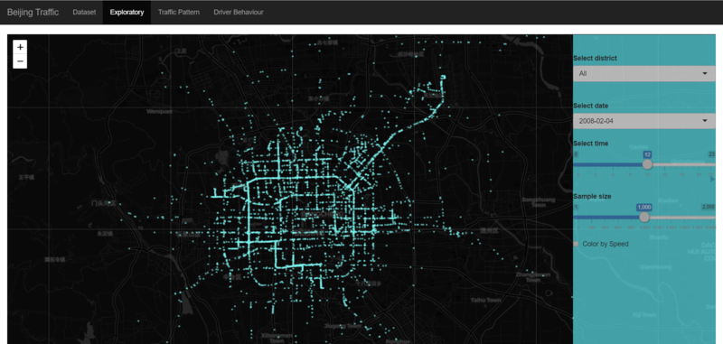
- Functions. The functions for the first page is mainly filters and coloring. The functions enable user to select specific district, date and time to observe the traffic. The user can also increase or decrease sample size with the slider. Last but not least, the user can color the plots with speed, with red color representing low speed, yellow representing medium, and green representing high speed.
Page 2 - Find traffic patterns by statistical analysis
This page is mainly about the statistic analysis of traffic patterns in Beijing. We focus on the speed, number of taxis and distance which drivers traveled by district level and try to give our users more explicit idea about traffic in Beijing.
Package used: Leaflet, ggplot, plotly
Details of design:
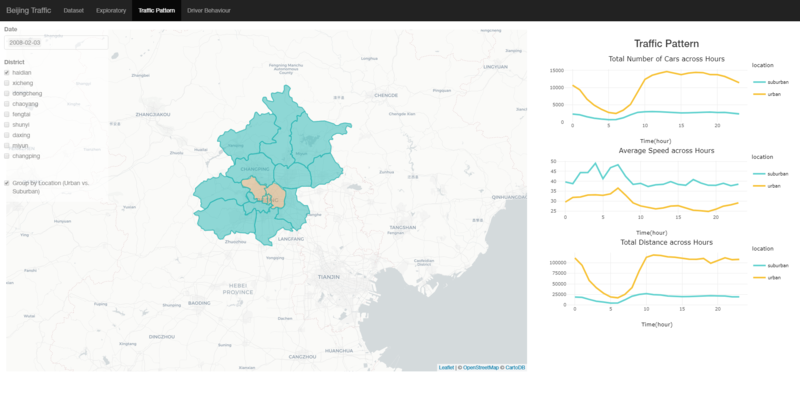
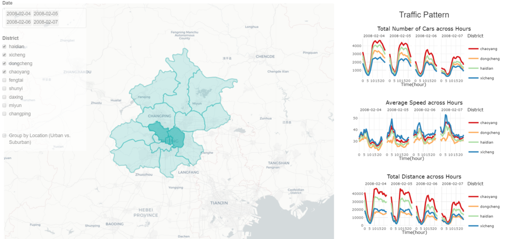
- Layout: layout of this page is shown below. On the left side, we have a map of Beijing by district level. And on the right side, there are three line graphs showing the speed, number of taxis, and distance by hour and date. The reason why we show map and line graph together is that we want our users to have an intuitive idea about the how Beijing looks like and where is the specific district located. This may help them figure out why more taxi drivers would like to spend most of them time traveling in districts like Haidian but not like Fangshan.
- Plots: the map is plotted by leaflet and zoom is set to 8 so that the whole shape of Beijing can be shown in the map. We added polygons in very light color at the beginning. When user selects one or more specific districts, the districts he selected will be highlighted in the map. The three line graphs is plotted by ggplot and plotly, showing average speed, number of taxis and distance respectively. And the data we used for plot these line graph has already be derived and resaved from the raw data. Thus, it would not take a long time for response.
- Functions:
Page 3 - Analyze the working pattern of Beijing taxi drivers
This page focuses on finding the behaviour of the taxi drivers.
1.The left interactive graph enables the user to select a taxi driver id and find where he lives and in which district he's driving at a specific time point. Take user 1000 as an example. ... After random sampling 20 drivers, we found that most drivers tend to drive near their living place and they like to drive around one district for 2-3 hours.
2. The top right part is a heat map reflecting the distribution of drivers' living places. The redder the area is, the higher density it is for driver home. 3. The bottom right part are two graphs giving statistics of the drivers' working days and working hour, including a comparison between normal working days (02-05) and lunar new year period(06-07).
Discussion
Visualization of Traffic patterns by hour of the day
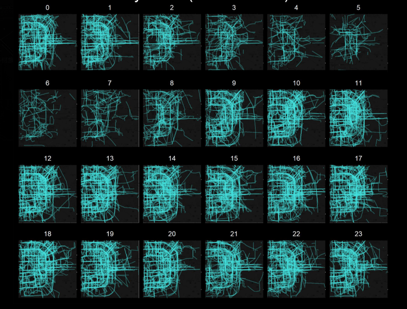
The graph shows the traffic of Guomao (a CBD area) of Beijing city in 24 hours of date 2008-02-04.
From the graph, it is quite obvious that the area is still busy at midnight time (from 0-2 o'clock). The traffic flow reduces from 3 o'clock, and reaches its lowest value at 5 o'clock. From 10am onwards, the peak of the day starts, and the trend remains until 11 pm.
Statistics of traffic patterns by district
Beijing is comprised of 16 urban and suburban districts. We have analyzed the traffic pattern for 9 urban districts including: Changping, Chaoyang, Daxing, Dongcheng, Fengtai, Haidian, Miyun, Shungyi, Xicheng for 5 days. We can derive from the visualizations that Shunyi district and Changping district are the least busy districts compared to the other 7 districts. Overally, the traffic decreases by 30% on Chinese New year and holidays.
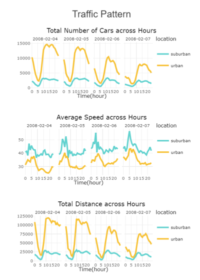
First, let's make a comparison between urban and suburban area. Urban area includes four central districts -- dongcheng, xicheng, chaoyang, and haidian districts. And the rest are grouped as suburban area, including fengtai, shunyi, daxing, miyun, changping.
From the graph, it is easy to see that the traffic flow gets less and less heavy from Feb 3rd to Feb 7th (Lunar New Year's Eve). Possible reason behind this is that when it's approaching Chinese New Year, migrant workers and employees leave Beijing and come back to their hometowns, which will cause both decrease in taking taxis and supply of taxis since some taxi drivers also have to unite with their family.
Another interesting point is that regardless of dates, the traffic flow always reach its first peak at 1 pm, decrease until 3 pm, and pick up again to reach the second peak at 5 pm. The logic behind this phenomenon is that people normally have their dinner at around 1 pm, and 5 pm is the common off work time.
It is also quite intuitive that the speed is negatively correlated to number of taxis, and distance has a positive correlation with the number of taxis. However, the speed we calculated here is lower than actual speed since we compute the straight distance between two coordinates while in real life a taxi cannot drive across buildings and rivers, etc.
Similarly, the traffic display similar patterns when we look into specific districts, having two peaks at 1 pm and 5 pm respectively and reaches the lowest level at 6 am, which resonates with what we have found from page 1 -- that the peak of the city starts from 10am and the traffic slows down from 8pm, reaching its lowest level at 5-6am.
Heat Map of home addresses and starting points for taxis per day
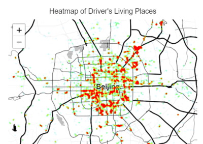
The plot below represents the specific locations of the 10357 taxis drivers' home in Beijing. Having no information of the drivers' profile, we derived their home location by computing the longest time period during which the car speed remains 0 km/h for each drive , and assume that specific location to be the driver's home.
Insights from this graph is that we the user zoom in, it is obvious that few drivers live at the central part of the city and most of them live around 3rd and 4th rings. This is because 3rd and 4th rings has lower housing and leasing price.
Some drivers live around the airport (top right corner), it is highly possible that these drivers focus on picking and sending passengers to the airport as their routine route.
Insights on working patterns for taxi drivers in Beijing
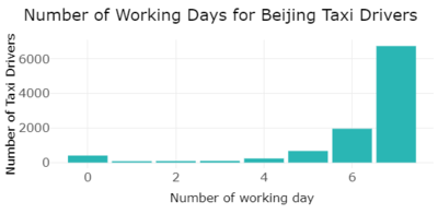
Finally, we derived number of working days and working hours for the 10357 taxi drivers. The statistics are plotted in bar charts. As we can see, over 6500 taxis or almost 63% of the taxi fleet works 7 days a week while 20% of the fleet in this data works 6 days a week. There’s a very small percentage of taxi drivers working 4 or less number of days in a week.
Coming to the working hours distribution, most driver reduce their work time when it comes to Lunar New Year.
Future work
Beijing is one of the busiest cities in the world. From a simple dataset of 4 variables: Taxi ID, Latitude, Longitude and Timestamp the team has managed to derive insights from different angles on Taxi driver behaviour, traffic patterns and other distributions.
This data analysis could be useful for Beijing’s municipalities. It could also serve as a research paper and tool for new start-ups who want to understand the taxi patterns and locations in Beijing.
The data used for this analysis is dated 2008, however, it would be relevant to apply it to a more recent dataset and real time data.
Future work can consist of mapping a real time dataset with our application or doing further analysis on the efficiency of taxi driver's routes selection.
Other uses of this research are: - For Government: Due to limited information for Beijing's city construction and road planning, we may only give suggestions based on our cognition. The suggestions may not be applicable in real world, but it gives a general direction of how to mitigate congestion by improving the traffic arrangements. - For Taxi Companoies: We will suggest taxi companies in Beijing how to allocate taxis in a more efficient way. - For Commuters: Commuters may have a more clear view of the traffic condition at different time and site to make cleverer decisions on their transportation planning.
Installation Guide
Here are the steps for the installation:
- 1. Download the server.R and Ui.R applications
- 2. Run the Application in R
- 3. make sure all libraries are installed in R including:
library(shiny) library(shinythemes) library(tidyverse) library(sp) library(ggplot2) library(plotly) library(leaflet) library(leaflet.extras) library(RColorBrewer) library(processx)
User Guide
The Shiny application has 4 tabs:
- [1] First tab shows the data set. User can take a look at the different variables including the ones derived during the project
- [2] Second tab shows an initial visualization for exploratory purposes. One can clearly see the map of beijing and the different traffic patters. This is only for visualization purposes
- [3] Third tab explores the different traffic patterns per district and per day and hour.
- [4] Fourth tab in our Shiny R app includes taxi driver behavior. One can select a specific taxi ID and understand where this taxi driver is at each point of the day.
Please refer to design framework in this wiki for more user guide details in each tab.
Acknowledgements
The authors wish to thank Ting Seong KAM, professor of Visual analytics in School of Information Systems, Singapore Management University for his ongoing support.
References
- [1] Introductory statistics with R. By Peter Dalgaard published in 2002.
- [2] Tutorials from Datacamp on R visualization and ShinyR
- [3] R Graphics cookbook by Winston Chang, 2012
- [4] Data Visualization with R: 100 examples by Thomas Rahlf, published in 2017.
- [5] T-Drive: Driving directions based on taxi trajectories pdf. By Microsoft November 1, 2010
- [6] Urban computing with Taxicabs, October 20th, 2011
- [7] Analyzing 1.1Billion NYC Taxi and Uber trips by Todd Schneider, 2018
- [8] The Art of R Programming: A Tour of Statistical Software Design Book by Norman Matloff
- [9] R in a Nutshell Book by Joseph Adle
- [10] Using R for Introductory Statistics Textbook by John Verzani
- [11] R for Data Science Book by Garrett Grolemund and Hadley Wickham
- [12] Learning Shiny | R-bloggers
- [13] Web Application Development with R Using Shiny by Chris Beeley

