|
|
| (18 intermediate revisions by the same user not shown) |
| Line 17: |
Line 17: |
| | | | |
| | | style="font-family: Calibri; font-size:120%; text-align:center;" width="25%" | | | | style="font-family: Calibri; font-size:120%; text-align:center;" width="25%" | |
| − | [[ISSS608_2017-18_T3_Assign_Kalai Selvi_Insights| <font color="#FFFFFF">Insights</font>]] | + | [[ISSS608_2017-18_T3_Assign_Kalai Selvi_Insights| <font color="#FFFFFF">Insights and Conclusions</font>]] |
| | | | |
| | | style="font-family: Calibri; font-size:120%; text-align:center;" width="25%" | | | | style="font-family: Calibri; font-size:120%; text-align:center;" width="25%" | |
| − | [[ISSS608_2017-18_T3_Assign_Kalai Selvi_Conclusion| <font color="#FFFFFF">Conclusion</font>]] | + | [[Assignment Dropbox G1|<font color="#FFFFFF">Back to Assignments</font>]] |
| | + | |
| | | | | | |
| − | |} | + | |} |
| − | | |
| − | <font size="4"><font color="#0c457d" face="Calibri">
| |
| − | =='''Question 1''': Characterize the past and most recent situation with respect to chemical contamination in the Boonsong Lekagul waterways. Do you see any trends of possible interest in this investigation?'''</font></font>==
| |
| − | | |
| − | <font size="3"><font face=""Calibri" color="#0e68ce">'''Cyclic Trend in Average Monthly Dissolved Oxygen and Water Temperature Readings observed across the years'''</font></font><br>
| |
| − | Average monthly dissolved oxygen levels in the waterways consistently declines from January to July/August each year and increasing trend is observed from August to December for each year. On the other hand, increasing trends in monthly average water temperature readings is observed from January to August and decreasing trend is observed from August to December for each year.
| |
| − | | |
| − | | |
| − | [[File:11.jpg|600 px]]
| |
| − | | |
| − | <font size="3"><font face=""Calibri" color="#0e68ce">'''Consistent Patterns for Petroleum Hydrocarbons Readings across locations '''</font></font><br>
| |
| − | There was increasing trend in the average monthly Petroleum hydrocarbons readings from November 2010 to around February 2012 for Busarakhan, Somchair and Tansanee and an upwards trend from November 2010 to May 2012 for Chai and Kannika locations. After the upward spike in 2012, a decreasing trend was seen in the average monthly Petroleum hydrocarbons readings for all 5 locations around the same period.
| |
| − | | |
| − |
| |
| − | [[File:12.JPG|600 px]]
| |
| − | | |
| − | <font size="3"><font face=""Calibri" color="#0e68ce">'''Consistent Patterns for Nickel Readings across locations '''</font></font><br>
| |
| − | Since 2011, the average monthly Nickel measure readings follows the same pattern for Busarakhan, Chai, Kannika, Sakda and Somchair locations and there was an sharp spike in the average monthly Nickel readings in the first half of 2016.
| |
| − |
| |
| − | [[File:13.JPG|600 px]]
| |
| − | | |
| − | <font size="3"><font face=""Calibri" color="#0e68ce">'''Decreasing Trends in Chlorodinine Readings'''</font></font><br>
| |
| − | The Chlorodinine levels has been consistent for 2014 and 2015. The Chlorodinine readings recorded in 2016 are much lower compared to 2014 and 2015 readings. The range of Chlorodinine values were wider in 2014 and 2015 as seen from the inter quartile range (IQR) of the boxplots in 2014 and 2015.
| |
| − | | |
| − | [[File:14.jpg|600 px]]
| |
| − | | |
| − | <font size="3"><font face=""Calibri" color="#0e68ce">'''Increasing Trends in Total Hardness levels'''</font></font><br>
| |
| − | Total hardness levels have been generally declining from 2009 to 2010, and the value of the readings are closer in range in 2010 as seen with the smaller IQR. The total hardness levels were lowest in 2011 and 2012. Increasing trends in the total hardness levels were observed for 2014 to 2016 and the first quartile (25th percentile) is also at a higher value in 2014 to 2016 compared to previous years. There were more highly skewed total hardness readings in 2014 to 2016.
| |
| − | | |
| − | [[File:15.jpg|600 px]]
| |
| − | | |
| − | | |
| − | <font size="4"><font color="#0c457d" face="Calibri">
| |
| − | =='''Question 2''': What anomalies do you find in the waterway samples dataset? How do these affect your analysis of potential problems to the environment? Is the Hydrology Department collecting sufficient data to understand the comprehensive situation across the Preserve? What changes would you propose to make in the sampling approach to best understand the situation?'''</font></font>==
| |
| − | | |
| − | <font size="3"><font face=""Calibri" color="#800000">'''Inconsistent Number of Measure Records'''</font></font><br>
| |
| − | The number of records for each locations is not consistent. Some years have higher number of records compared to others. In Boonsri, Busarak, Chai, Kannika, Kohsoom, Sakda and Somchair, the highest number of measurements were recorded in 2015 to 2017. Chemical measures were only recorded from 2009 for Achara, Decha and Tasanee locations. In comparison to previous years, the samples collected have reduced in recent years.
| |
| − | [[File:21.jpg|800 px]]
| |
| − | | |
| − | | |
| − | <font size="3"><font face=""Calibri" color="#800000">'''Spike in Methylosmoline levels in Somchair and Kohsoom '''</font></font><br>
| |
| − | While the average Methylosmoline monthly readings are gradually decreasing from 2015, there is a sudden steep spike in the average Methylosmoline monthly reading in Somchair to a average value of 130.5 in January 2016 from 4.5 in October 2015. Also, the average monthly Methylosmoline has remain constant throughout 2016. Even drilling at the day level readings, the daily Methylosmoline level has remained stagnant throughout 2016. This could be due to a sudden bust of Methylosmoline chemical around Somchair region. In Aug 2016, a sudden spike in average Methylosmoline level was also observed in Kohsoom.
| |
| − | [[File:22.jpg|700 px]]
| |
| − | | |
| | | | |
| − | <font size="3"><font face=""Calibri" color="#800000">'''Spike in Water Temparature readings in Chai'''</font></font><br>
| + | Link to Tableau Public Profile: [https://public.tableau.com/profile/kalaiselvi#!/] |
| − | The number of water temperature readings taken at Chai has been consistent since 1998 till end of 2015. A sharp increase in the number of water temperature readings can be seen from the line chart below in Chai for 2016. The number of temperature readings taken at other locations are more regular.
| |
| | | | |
| − | [[File:23.JPG|700 px]]
| + | The storyboard consists of 4 dashboards. |
| | | | |
| | | | |
| − | <font size="3"><font face=""Calibri" color="#800000">'''Trends in Biochemical and Chemical oxygen Demand (Cr) levels '''</font></font><br> | + | <font size="3"><font face=""Calibri" color="#0e68ce">'''1st Dashboard'''</font></font><br> |
| − | The trend in the biochemical levels has been consistent across the years, however there are sudden spikes in Mar 2015 and February 2016 in Tansanee location and these spikes are also observed for the Chemical oxygen Demand (Cr) chemical. The 2 spikes specifically occurred on the same day for both these chemicals (20 March 2015 and 17 February 2016).
| + | To identify the trends in the average chemical measure values and to analyse the distribution of the chemical measure values, by time and location. The filter options are Location, Year and Measure. Users can also further drill down at Year, Month or Day level for the line chart. |
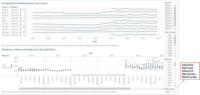
| | + | <br> |
| | + | [[File:41.jpg|800 px]] |
| | | | |
| − | [[File:24.jpg|700 px]]
| |
| | | | |
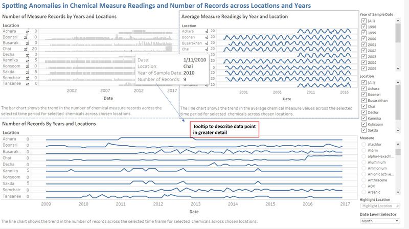
| | + | <font size="3"><font face=""Calibri" color="#0e68ce">'''2nd Dashboard'''</font></font><br> |
| | + | To spot anomalies and unusual trends in the chemical measure values over time and across locations. The filter options are Location, Year and Measure. Users can also further drill down by Year, Month or Day level to analyse the average chemical measure values. |
| | + | <br> |
| | + | [[File:42.jpg|800 px]] |
| | | | |
| − | <font size="3"><font face=""Calibri" color="#800000">'''Spike in Iron Levels across Locations'''</font></font><br>
| |
| − | For Iron chemical readings, the values recorded are very low and almost constant across the years for all locations. However, a unusual spike is recorded in August 2003. If we drill further at day level, this spike has occurred on 15 August 2003 in Busarakhan, Chai, Decha, Kanika, Kohsoom, Sakda ad Somchair locations.
| |
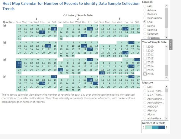
| | | | |
| − | [[File:25.JPG|700 px]] | + | <font size="3"><font face=""Calibri" color="#0e68ce">'''3rd Dashboard'''</font></font><br> |
| | + | The heatmap Calendar shows the number of records collected in each day across the years selected. The filter options are Location, Year and Measure. |
| | + | <br> |
| | + | [[File:43.jpg|600 px]] |
| | | | |
| | | | |
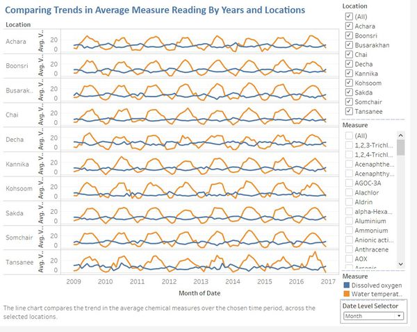
| − | <font size="4"><font color="#0c457d" face="Calibri"> | + | <font size="3"><font face=""Calibri" color="#0e68ce">'''4th Dashboard'''</font></font><br> |
| − | =='''Question 3''': After reviewing the data, do any of your findings cause particular concern for the Pipit or other wildlife? Would you suggest any changes in the sampling strategy to better understand the waterways situation in the Preserve?'''</font></font>==
| + | This dashboard allows users to compare the trends in Average Measure Readings across locations and by years. The filter options are Location, Year and Measure. Users can also further drill down by Year, Month or Day level to analyse the average chemical measure values. |
| | + | <br> |
| | + | [[File:44.jpg|600 px]] |
 VAST Challenge 2018 MC2: Like a Duck to Water
Link to Tableau Public Profile: [1]
The storyboard consists of 4 dashboards.
1st Dashboard
To identify the trends in the average chemical measure values and to analyse the distribution of the chemical measure values, by time and location. The filter options are Location, Year and Measure. Users can also further drill down at Year, Month or Day level for the line chart.
2nd Dashboard
To spot anomalies and unusual trends in the chemical measure values over time and across locations. The filter options are Location, Year and Measure. Users can also further drill down by Year, Month or Day level to analyse the average chemical measure values.
3rd Dashboard
The heatmap Calendar shows the number of records collected in each day across the years selected. The filter options are Location, Year and Measure.
4th Dashboard
This dashboard allows users to compare the trends in Average Measure Readings across locations and by years. The filter options are Location, Year and Measure. Users can also further drill down by Year, Month or Day level to analyse the average chemical measure values.
 VAST Challenge 2018 MC2: Like a Duck to Water


