Difference between revisions of "ISSS608 2017-18 T3 Assign Anthony Theodore Method"
(edit stuff) |
|||
| (12 intermediate revisions by the same user not shown) | |||
| Line 1: | Line 1: | ||
<div style=background:#DDA0DD border:#A3BFB1> | <div style=background:#DDA0DD border:#A3BFB1> | ||
| − | + | [[Image:American Pipit b57-13-007 V.jpg|300px]] | |
| − | <b><font size = 6; color="#3a2e29">Mysterious Disappearance at Wildlife Preserve</font></b> | + | <b><font size = 6; color="#3a2e29"; style="font-family:Century Gothic">Mysterious Disappearance at Wildlife Preserve</font></b> |
</div> | </div> | ||
<!--Navigation--> | <!--Navigation--> | ||
| − | {| style="background-color:#;" width="100%" cellspacing="0" cellpadding="0" valign="top" border="0" | | + | {|style="background-color:#0b3d53;" width="100%" cellspacing="0" cellpadding="0" valign="top" border="0" | |
| − | + | | style="font-family:Century Gothic; font-weight:bold; font-size:100%; solid #1B338F; background:#DDA0DD; text-align:center;" width="25%" | | |
| − | | style="font-family:Century Gothic; font-weight:bold; font-size:100%; background | ||
; | ; | ||
[[ISSS608_2017-18_T3_Assign_Anthony Theodore|<font color="#000000">Overview</font>]] | [[ISSS608_2017-18_T3_Assign_Anthony Theodore|<font color="#000000">Overview</font>]] | ||
| Line 12: | Line 11: | ||
| style="font-family:Century Gothic; font-weight:bold; font-size:100%; text-align:center; background-color:#eae5e4; width=25%" | | | style="font-family:Century Gothic; font-weight:bold; font-size:100%; text-align:center; background-color:#eae5e4; width=25%" | | ||
; | ; | ||
| − | [[ISSS608_2017-18_T3_Assign_Anthony Theodore_Method|<font color="#000000"> | + | [[ISSS608_2017-18_T3_Assign_Anthony Theodore_Method|<font color="#000000">Approach & Design</font>]] |
| style="font-family:Century Gothic; font-weight:bold; font-size:100%; text-align:center; background-color:#DDA0DD; width=25%" | | | style="font-family:Century Gothic; font-weight:bold; font-size:100%; text-align:center; background-color:#DDA0DD; width=25%" | | ||
| Line 21: | Line 20: | ||
; | ; | ||
[[ISSS608_2017-18_T3_Assign_Anthony Theodore_Conclusion|<font color="#000000">Conclusion</font>]] | [[ISSS608_2017-18_T3_Assign_Anthony Theodore_Conclusion|<font color="#000000">Conclusion</font>]] | ||
| + | |||
| + | | style="font-family:Century Gothic; font-weight:bold; font-size:100%; text-align:center; background-color:#DDA0DD; width=25%" | | ||
| + | ; | ||
| + | [[Assignment_Dropbox_G1|<font color="#000000">Back to Home Page</font>]] | ||
|} | |} | ||
<br><br> | <br><br> | ||
| − | + | ==<b>Tools & Approach</b>== | |
| + | <h4>Tools and Library Used</h4> | ||
| + | This assignment mainly use tableau for the dashboard creation and exploration analysis. SAS JMP Pro is also used for the initial data understanding part.<br> | ||
| + | Python is used for converting the audio file from .MP3 format to .WAV format, while R is used for the audio visualization and similarity analysis. The following list is the Python library used:<br> | ||
| + | <div style="margin:0px; padding: 2px; border-radius: 1px; text-align:left"> | ||
| + | {| class="wikitable" style="background-color:#FFFFFF;" width="100%" | ||
| + | |- | ||
| + | | | ||
| + | *<b>Python</b> | ||
| + | **os - listdir | ||
| + | **pydub - AudioSegment | ||
| + | ***Note: FFMPEG need to be installed before pydub can be installed. Tutorial on installing will be given in the detailed approach below. | ||
| + | **matplotlib.pyplot | ||
| + | **numpy | ||
| + | **wave | ||
| + | **sys | ||
| + | **glob | ||
| + | *<b>R</b> | ||
| + | **soundgen | ||
| + | **corrplot | ||
| + | **ggpubr | ||
| + | **GGally | ||
| + | **tidyverse | ||
| + | |} | ||
| + | </div> | ||
| + | <h3>Approach</h3> | ||
| + | The approach taken for this assignment consists of: | ||
| + | #Data understanding | ||
| + | #Geospatial visualization | ||
| + | #Creating Dashboard | ||
| + | #Audio processing | ||
| + | #Audio visualization | ||
| + | #Audio comparison | ||
| + | <div style="margin:0px; padding: 2px; border-radius: 1px; text-align:left"> | ||
| + | {| class="wikitable" style="background-color:#FFFFFF;" width="100%" | ||
| + | |- | ||
| + | | | ||
| + | <b>No.</b> | ||
| + | || | ||
| + | <b>Approach</b> | ||
| + | || | ||
| + | <b>Description</b> | ||
| + | |- | ||
| + | | | ||
| + | 1. | ||
| + | || | ||
| + | Data Understanding | ||
| + | || | ||
| + | #Use SAS JMP Pro to open the metadata and check the validity of the data. | ||
| + | #*Since the data is relatively clean, there is no need to perform data cleaning. | ||
| + | #Insert the coordinate of the dumping site into the Kasios's test bird metadata. | ||
| + | #*As mention in the assignment description, the coordinate for the dumping site is in <b>(148,159)</b>. | ||
| + | #Import both metadata into Tableau. | ||
| + | #*Set both relationship to union. This way, all data will be accessible from the same sheets. | ||
| + | |- | ||
| + | | | ||
| + | 2. | ||
| + | || | ||
| + | Geospatial Visualization | ||
| + | || | ||
| + | #Using the Lekagul Preserve Map image, load the image in Tableau as a background image.<br> | ||
| + | #Plot in tableau using <i>X</i> and ''Y'' from both birds metadata into Rows and Columns. | ||
| + | #Using <b>Size</b> Parameter and <b>Colour</b> parameter, add the <i>English Name</i> from sensor bird metadata and <i>Table Source</i> from union relationship | ||
| + | #*This resulted in distribution of all the birds inside Lekagul Preserve along with Kasios test bird coordinate. | ||
| + | #Use the filter to differentiate birds position. | ||
| + | |- | ||
| + | | | ||
| + | 3. | ||
| + | || | ||
| + | Dashboard Creation | ||
| + | || | ||
| + | #Create 3 new sheet. This 3 sheets will be used for mapping individual year. | ||
| + | #*Put <i>Date</i> into the Column along with <i>X</i> and <i>Y</i> into the Rows for all sheets. | ||
| + | #*Because we only use year 2006 - 2017, divide those year with all 3 sheets by using filter | ||
| + | #**In this case, sheet 1 use year 2006-2009. Sheet 2 use year 2010-2013 and sheet 3 use year 2014-2017. | ||
| + | #Using another new sheet, add the line graph for <i>Vocalization Type</i> into Rows and year into column. | ||
| + | #*Filter other visualization type and use only Call and Song. This is to give user better depth for comparison between sound and call. | ||
| + | #Create another sheet to add the line graph for total of sound detected by year. | ||
| + | #Put all the sheet into a dashboard. The finalize design will be shown in next section. | ||
| + | |- | ||
| + | | | ||
| + | 4 | ||
| + | || | ||
| + | Audio Processing | ||
| + | || | ||
| + | #Converting all 2081 Sensor bird sound and 15 Kasios test bird sound from .MP3 format into .WAV format. | ||
| + | #*We use Python library ''pydub'' to do this task Pydub is a package that allow audio manipulation. Detail about pydub: https://github.com/jiaaro/pydub | ||
| + | #**Note that ffmpeg need to be installed first before pydub can be used. Tutorial of installing ffmepg: https://github.com/adaptlearning/adapt_authoring/wiki/Installing-FFmpeg | ||
| + | #Using R library ''soundgen'' and analyzeFolder() function, we extract the information hidden in the audio files. | ||
| + | #*soundgen only detect .WAV file, so we used the file that already converted using Python. | ||
| + | |- | ||
| + | | | ||
| + | 5 | ||
| + | || | ||
| + | Audio Visualization | ||
| + | || | ||
| + | #Using library ''matplotlib.pyplot'' in Python, we visualize the sound wave with oscillogram. | ||
| + | #*Note that the duration for all the audio is different. | ||
| + | #Using library ''wave'' , we can include the amplitude and the duration of the audio files. | ||
| + | #*Audio visualization will be explained in Findings tab. | ||
| + | |- | ||
| + | | | ||
| + | 6 | ||
| + | || | ||
| + | Audio Comparison | ||
| + | || | ||
| + | #Using the tableau, we check on the position of the Test bird from Kasios to check the validity of the data. | ||
| + | #Use the Oscillogram to detect anomaly in the recording inside the test bird file from Kasios. | ||
| + | #Using R, we create Correlation Plot to figure out the difference between Kasios test data with the sensor data. | ||
| + | |} | ||
| + | </div> | ||
| + | |||
| + | ==<b>Dashboard Design</b>== | ||
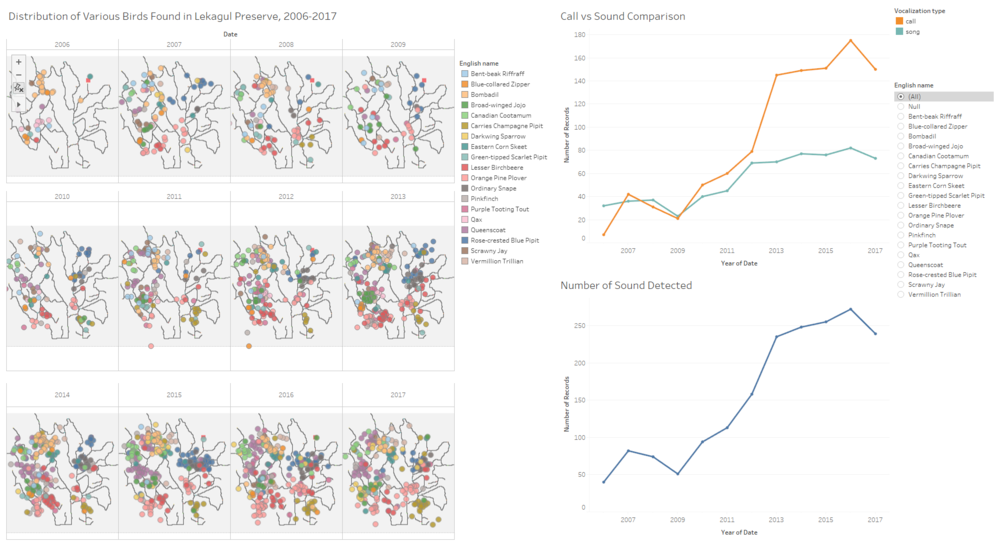
| + | The following image is the finalized dashboard that will be uploaded into tableau public:<br> | ||
| + | [[Image:Tableaudash atheodore.png|1000px]] | ||
| + | <br> | ||
| + | The dashboard has 2 feature. It will enable user to see the distribution of each bird per year by 3 map panel on the left, and will enable user to know the total number of sound detected for all bird or for a particular bird. It can also allow user to check the comparison between song and call. On the right, user can click on the bullet point to select which bird they want to see. | ||
| + | <br> | ||
| + | <b>Link for the dashboard:</b> https://public.tableau.com/profile/anthony.theodore#!/vizhome/BirdsDistributionDashboard/FinalDashboard?publish=yes | ||
Latest revision as of 22:41, 8 July 2018
|
|
|
|
|
|
Tools & Approach
Tools and Library Used
This assignment mainly use tableau for the dashboard creation and exploration analysis. SAS JMP Pro is also used for the initial data understanding part.
Python is used for converting the audio file from .MP3 format to .WAV format, while R is used for the audio visualization and similarity analysis. The following list is the Python library used:
|
Approach
The approach taken for this assignment consists of:
- Data understanding
- Geospatial visualization
- Creating Dashboard
- Audio processing
- Audio visualization
- Audio comparison
|
No. |
Approach |
Description |
|
1. |
Data Understanding |
|
|
2. |
Geospatial Visualization |
|
|
3. |
Dashboard Creation |
|
|
4 |
Audio Processing |
|
|
5 |
Audio Visualization |
|
|
6 |
Audio Comparison |
|
Dashboard Design
The following image is the finalized dashboard that will be uploaded into tableau public:

The dashboard has 2 feature. It will enable user to see the distribution of each bird per year by 3 map panel on the left, and will enable user to know the total number of sound detected for all bird or for a particular bird. It can also allow user to check the comparison between song and call. On the right, user can click on the bullet point to select which bird they want to see.
Link for the dashboard: https://public.tableau.com/profile/anthony.theodore#!/vizhome/BirdsDistributionDashboard/FinalDashboard?publish=yes
