Difference between revisions of "ISSS608 2017-18-T3-Lokesh-Data Exploration"
Lokeshv.2017 (talk | contribs) (Blanked the page) |
Lokeshv.2017 (talk | contribs) |
||
| (6 intermediate revisions by the same user not shown) | |||
| Line 1: | Line 1: | ||
| + | <div style=background:#2b3856 border:#A3BFB1> | ||
| + | [[Image:Home screen image.jpg|250px]] | ||
| + | <font size = 5.2;font-family: Arial Narrow; color="#FFFFFF">Vast Challenge 2018 Mini-Challenge 2 : Like a Duck to Water</font> | ||
| + | </div> | ||
| + | <!--MAIN HEADER --> | ||
| + | {|style="background-color:#fcca05 ;" width="100%" cellspacing="0" cellpadding="0" valign="top" border="0" | | ||
| + | | style="font-family:Century Gothic; font-size:100%; solid #1B338F; background:#2b3856; text-align:center;" width="14.29%" | | ||
| + | ; | ||
| + | [[ISSS608 2017-18-T3 Assignment-Lokesh Vairamuthu| <font color="#FFFFFF">Main Page</font>]] | ||
| + | | style="font-family:Century Gothic; font-size:100%; solid #1B338F; background:#2b3856; text-align:center;" width="14.29%" | | ||
| + | ; | ||
| + | [[ISSS608 2017-18-T3-Lokesh-Data Exploration| <font color="#FFFFFF">Data Exploration</font>]] | ||
| + | | style="font-family:Century Gothic; font-size:100%; solid #1B338F; background:#2b3856; text-align:center;" width="14.29%" | | ||
| + | ; | ||
| + | |||
| + | [[ISSS608 2017-18-T3-Lokesh-Visualization| <font color="#FFFFFF">Visualizations</font>]] | ||
| + | |||
| + | | style="font-family:Century Gothic; font-size:100%; solid #1B338F; background:#2b3856; text-align:center;" width="14.29%" | | ||
| + | ; | ||
| + | [[ISSS608 2017-18-T3-Lokesh-Insights| <font color="#FFFFFF">Insights</font>]] | ||
| + | |||
| + | | style="font-family:Century Gothic; font-size:100%; solid #1B338F; background:#2b3856; text-align:center;" width="14.29%" | | ||
| + | ; | ||
| + | [[ISSS608 2017-18-T3-Lokesh-Conclusion| <font color="#FFFFFF">Conclusion</font>]] | ||
| + | |||
| + | | style="font-family:Century Gothic; font-size:100%; solid #1B338F; background:#2b3856; text-align:center;" width="14.29%" | | ||
| + | ; | ||
| + | [[ISSS608 2017-18-T3-Lokesh-References| <font color="#FFFFFF">References</font>]] | ||
| + | |||
| + | | style="font-family:Century Gothic; font-size:100%; solid #1B338F; background:#2b3856; text-align:center;" width="14.29%" | | ||
| + | ; | ||
| + | [[Assignment_Dropbox_G2| <font color="#FFFFFF">Dropbox_G2</font>]] | ||
| + | | | ||
| + | |} | ||
| + | ==<font size = 4.5>Data Preparation</font>== | ||
| + | We are given with 3 data files, two of which are a csv file and one image of Mistford waterways. The Boonsong Lekagul waterways CSV file has the following columns in it.<br /> | ||
| + | [[File:1 1.PNG|500px|centre]] | ||
| + | <br /> | ||
| + | While the chemicals units of measure CSV file has the following columns. | ||
| + | <br /> | ||
| + | [[File:2 2.PNG|200px|centre]] | ||
| + | <br /> | ||
| + | The waterways geo_image has the route of all the waterways flowing in the Mistford, along with the chemical dumping area. There are a total of 10 locations given in the image from where the chemical readings samples have been recorded over the years<br /> | ||
| + | [[File:3 3.PNG|500px|centre]] | ||
| + | <br /> | ||
| + | The chemicals units of measure file gives us the measurement of chemical composition in 4 different units “mg/l” , “μg/l” , “C” and “no unit”. As too much units of measurements complicates the visualization, we combine the weight units (“mg/l” , “μg/l”) to one unit. We have taken the analysis to have same unit of weight measurement as “μg/l”, because there are values for different measures in “μg/l” with very minuscule value, if they are converted to “mg/l” it would be very less. So the “mb/l” values are multiplied by 1000 and as a result we have a total of 98.2% of the total measurements are in “μg/l” and “C” and “no unit” of 0.9% each. <br /> | ||
| + | {| class="wikitable" style="background-color:#FFFFFF;" width="100%" | ||
| + | |- | ||
| + | | | ||
| + | <b>[[File:4 4.1.PNG|650px|centre]]</b> | ||
| + | || | ||
| + | <b>[[File:5 4.2.PNG|400px|centre]]</b> | ||
| + | |} | ||
| + | <br /> | ||
| + | The total chemical measurements in the Mini Challenge 2 is 106, all of which cannot be used individually over the time to get the visual insights, so we need to group all the elements to the basic unreducible categories to use those groups for analysis. | ||
| + | After analyzing all the chemical measurements using the application, the effluents base of the industry of each measure, its finally grouped into 13 groups, in which the “Hydrocarbon” category has the highest group members of 18%, followed by the organic matters of 15% then by Herbicide, Insecticide and Pesticide of 13% and then Salt of 10%, while the rest are less than 10% each. | ||
| + | <br /> | ||
| + | [[File:6 5.PNG|450px|centre]] | ||
| + | <br /> | ||
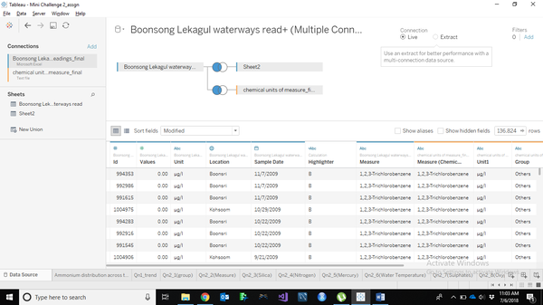
| + | The water measurement dataset and the measures dataset have now been made ready for understanding the visualization using the Tableau software. We import the “Boonsong Lekagul waterways measurement dataset” and opened in the data source and checked for unit correctness and values cohesivity with the original dataset. Then the “chemical measurement dataset” is added onto the “Boonsong Lekagul waterways measurement dataset” with a left outer join method. This is the final dataset that we would use for the analysis. We open the worksheet and as a first step we change the location category into geographic type to get the location’s latitude and longitude.<br /> | ||
| + | {| class="wikitable" style="background-color:#FFFFFF;" width="100%" | ||
| + | |- | ||
| + | | | ||
| + | <b>[[File:7 6.1.PNG|500px|centre]]</b> | ||
| + | || | ||
| + | <b>[[File:8 6.2.PNG|500px|centre]]</b> | ||
| + | |} | ||
| + | <br> | ||
| + | Following it, as a first step we install the waterways map into the Tableau. At each point we right click and annotate the points to get the location as X and Y. | ||
| + | <br /> | ||
| + | [[File:9 7.1.PNG|600px|centre]] | ||
| + | <br /> | ||
| + | In the similar way, the coordinates all the location in the region is located. All the X and Y are plotted against the 10 locations and saved as a separate sheet. Then, the sheet is added along with the main data set. Now, each place is given with the latitude and longitude and they are used for pointing to specific analysis later. | ||
| + | To validate the points are mapped exactly at the point of location given, the chemicals measure which has values across all the places is plotted. This gives us the proper position of all the points on the waterway map. The validation plot is given below. | ||
| + | <br /> | ||
| + | [[File:10 7.2.PNG|500px|centre]] | ||
| + | <br /> | ||
| + | Once the validation of map is over. Then the values of each location as X and Y is saved onto a separate sheet and that file is imported into the Tableau data source, connected by a left outer join with the “Boonsong Lekagul waterways measurement dataset” using the location as the common variable. From now on we use this X and Y as the latitude and longitude of the locations. <br /> | ||
| + | <br/> | ||
| + | [[File:11 8.1.PNG|600px|centre]] | ||
| + | <br /> | ||
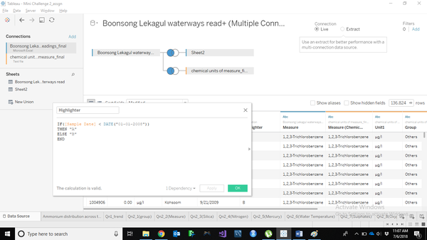
| + | To analyze the given dataset as in time series analysis and compare the trend before and after a standard time, we need to incorporate another variable which differentiates the first half of the trend values with the latter. As a first step we consider 2008 as the mid-point for split up, as it splits the data into two exact period. With this being initiated, the new variable called the “Highlighter” is introduced and given a formula to differentiate the total period into two. The formula used is given below.<br /> | ||
| + | <br/> | ||
| + | [[File:12 9.PNG|600px|centre]] | ||
Latest revision as of 18:12, 8 July 2018
|
|
|
|
|
|
|
|
Data Preparation
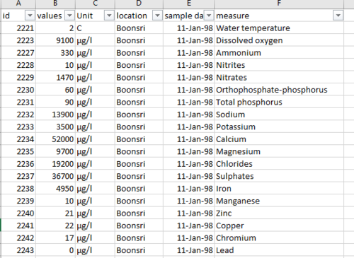
We are given with 3 data files, two of which are a csv file and one image of Mistford waterways. The Boonsong Lekagul waterways CSV file has the following columns in it.
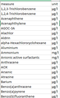
While the chemicals units of measure CSV file has the following columns.
The waterways geo_image has the route of all the waterways flowing in the Mistford, along with the chemical dumping area. There are a total of 10 locations given in the image from where the chemical readings samples have been recorded over the years
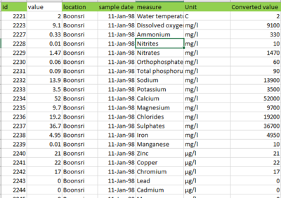
The chemicals units of measure file gives us the measurement of chemical composition in 4 different units “mg/l” , “μg/l” , “C” and “no unit”. As too much units of measurements complicates the visualization, we combine the weight units (“mg/l” , “μg/l”) to one unit. We have taken the analysis to have same unit of weight measurement as “μg/l”, because there are values for different measures in “μg/l” with very minuscule value, if they are converted to “mg/l” it would be very less. So the “mb/l” values are multiplied by 1000 and as a result we have a total of 98.2% of the total measurements are in “μg/l” and “C” and “no unit” of 0.9% each.
The total chemical measurements in the Mini Challenge 2 is 106, all of which cannot be used individually over the time to get the visual insights, so we need to group all the elements to the basic unreducible categories to use those groups for analysis.
After analyzing all the chemical measurements using the application, the effluents base of the industry of each measure, its finally grouped into 13 groups, in which the “Hydrocarbon” category has the highest group members of 18%, followed by the organic matters of 15% then by Herbicide, Insecticide and Pesticide of 13% and then Salt of 10%, while the rest are less than 10% each.
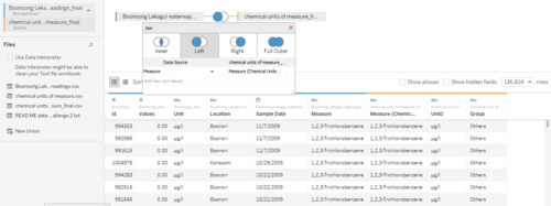
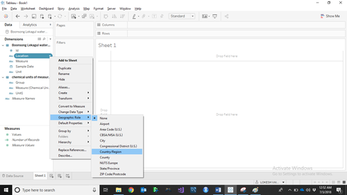
The water measurement dataset and the measures dataset have now been made ready for understanding the visualization using the Tableau software. We import the “Boonsong Lekagul waterways measurement dataset” and opened in the data source and checked for unit correctness and values cohesivity with the original dataset. Then the “chemical measurement dataset” is added onto the “Boonsong Lekagul waterways measurement dataset” with a left outer join method. This is the final dataset that we would use for the analysis. We open the worksheet and as a first step we change the location category into geographic type to get the location’s latitude and longitude.
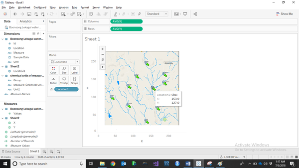
Following it, as a first step we install the waterways map into the Tableau. At each point we right click and annotate the points to get the location as X and Y.
In the similar way, the coordinates all the location in the region is located. All the X and Y are plotted against the 10 locations and saved as a separate sheet. Then, the sheet is added along with the main data set. Now, each place is given with the latitude and longitude and they are used for pointing to specific analysis later.
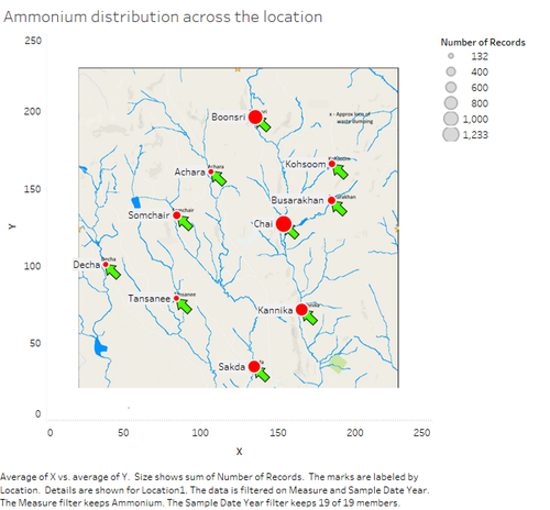
To validate the points are mapped exactly at the point of location given, the chemicals measure which has values across all the places is plotted. This gives us the proper position of all the points on the waterway map. The validation plot is given below.
Once the validation of map is over. Then the values of each location as X and Y is saved onto a separate sheet and that file is imported into the Tableau data source, connected by a left outer join with the “Boonsong Lekagul waterways measurement dataset” using the location as the common variable. From now on we use this X and Y as the latitude and longitude of the locations.
To analyze the given dataset as in time series analysis and compare the trend before and after a standard time, we need to incorporate another variable which differentiates the first half of the trend values with the latter. As a first step we consider 2008 as the mid-point for split up, as it splits the data into two exact period. With this being initiated, the new variable called the “Highlighter” is introduced and given a formula to differentiate the total period into two. The formula used is given below.
