Difference between revisions of "ISSS608 2016-17 T3 Assign Jan Patrick Mabilangan Gosioco Data Prep"
| (4 intermediate revisions by the same user not shown) | |||
| Line 8: | Line 8: | ||
<br>[[ISSS608_2016-17_T3_Assign_Jan_Patrick_Mabilangan_Insight|<b><font size="2">Insights</font></b>]] | <br>[[ISSS608_2016-17_T3_Assign_Jan_Patrick_Mabilangan_Insight|<b><font size="2">Insights</font></b>]] | ||
<br>[[ISSS608_2016-17_T3_Assign_Jan_Patrick_Mabilangan_Conclusion|<b><font size="2">Conclusion</font></b>]] | <br>[[ISSS608_2016-17_T3_Assign_Jan_Patrick_Mabilangan_Conclusion|<b><font size="2">Conclusion</font></b>]] | ||
| − | |||
<font size="5">'''Data Preparation & Dashboard Design'''</font> | <font size="5">'''Data Preparation & Dashboard Design'''</font> | ||
| Line 33: | Line 32: | ||
==Dashboard Design== | ==Dashboard Design== | ||
| + | View the interactive Tableau design here: [https://public.tableau.com/profile/jan.patrick.mabilangan.gosioco#!/vizhome/VAST2018-MC2/Storyboard Link to tableau dashboard] | ||
| + | |||
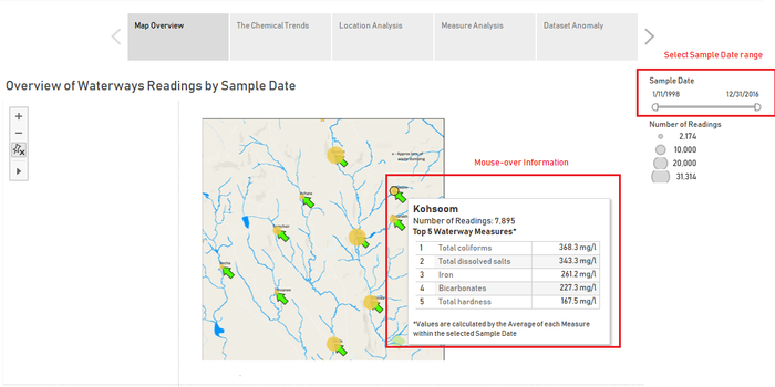
| + | 1. Map Overview | ||
| + | Shows the Map of the Boonsong Lekagul Waterways with the water sensor locations marked | ||
| + | : - The size of the mark indicates the number of readings collected for the location | ||
| + | : - The user may set the Sample Date to focus on a range of dates that he/she wishes to investigate | ||
| + | : - Mouse-over of the marks shows the Top 5 measures calculated by the average of their values within the selected Sample Date range | ||
| + | <p>[[File:DD1.png|700px|center]]</p> | ||
| + | |||
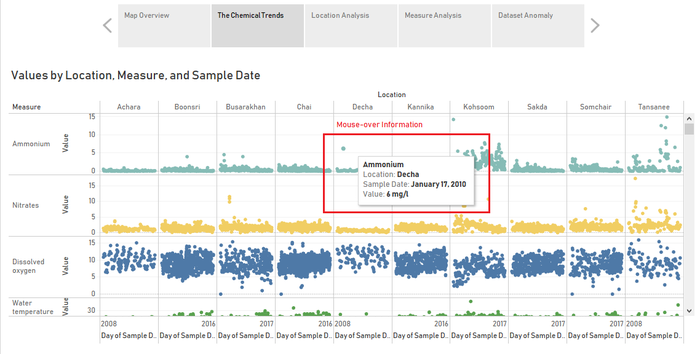
| + | 2. The Chemical Trends | ||
| + | Shows individual water sensor readings for all the Measures and Locations across the whole time period of the data. | ||
| + | : - The dashboard aims to allow the user to determine the overall patterns and trends of the readings and see whether similarities exist between Measure values or Location Values | ||
| + | <p>[[File:DD2.png|700px|center]]</p> | ||
| + | |||
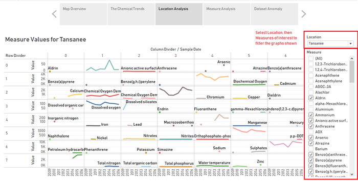
| + | 3. Location Analysis | ||
| + | Shows yearly water sensor readings for the Measures within a given location. | ||
| + | : - The user sets the Location and then ticks the measures he/she wishes to view on the graph for analysis of trends for the particular location | ||
| + | <p>[[File:DD3.png|700px|center]]</p> | ||
| + | |||
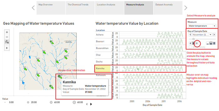
| + | 4. Measure Analysis | ||
| + | Shows Map of Boonsong Lekagul Waterways with the water sensor locations marked on the left, and individual water sensor readings for the given measure on the right | ||
| + | : - With the dashboard, the user may to in-depth analysis of the data as it has been drilled-down to individual sensor level and one singular measure | ||
| + | : - The user selects the measure to be investigated and both graphs filter to the measure | ||
| + | : - The user can then click the play button on the page-by slider to animate the presence of the measure throughout the Reserve | ||
| + | : - Mouse-over of the marks on the map will highlight the individual reading on the dotplot to the right. | ||
| + | <p>[[File:DD4.png|700px|center]]</p> | ||
| + | |||
| + | 5. Dataset Anomaly | ||
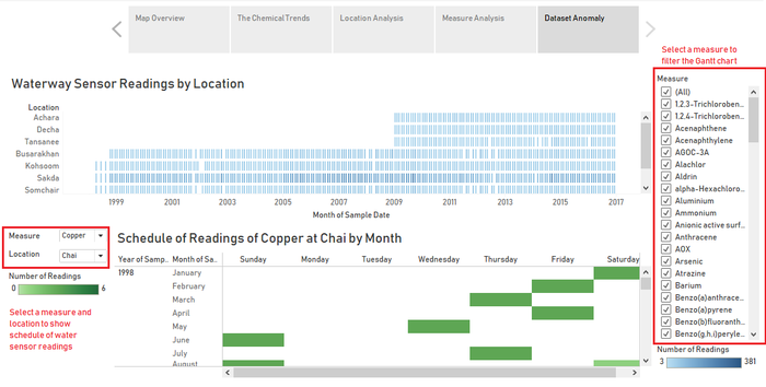
| + | Shows the Gantt chart of water sensor readings throughout the whole duration of data collection above, and a heatmap of the schedule of water readings by Month Year below. | ||
| + | : - With the dashboard, the user may investigate instances of missing data as well as the schedule for when the water sensors are collecting data among the days of the week | ||
| + | : - The user may select measure/s of interest on the right to filter the Gantt chart | ||
| + | : - The user selects both the measure and location on the left to filter the heatmap and determine the schedule of readings for the selection made. | ||
| + | <p>[[File:DD5.png|700px|center]]</p> | ||
Latest revision as of 17:47, 8 July 2018
Background
Data Preparation & Dashboard Design
Insights
Conclusion
Data Preparation & Dashboard Design
Data Preparation
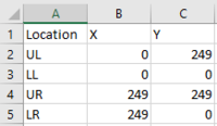
1. Create a Location.csv with the following fields and input starting values for the map borders LL, LR, UR, and UL. location: location of the water sensor reading X: x coordinate of the location with respect to the waterways map Y: y coordinate of the location with respect to the waterways map
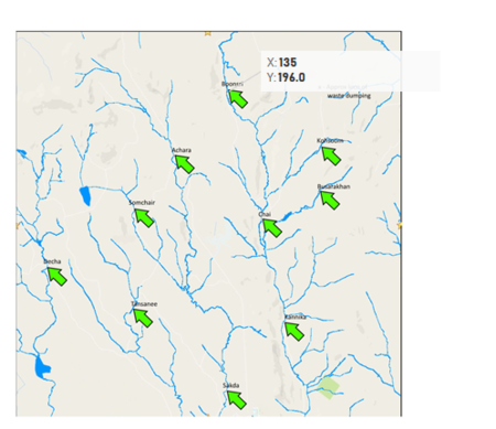
2. Derive the X and Y coordinates of the locations by loading the map into Tableau and annotating the points.
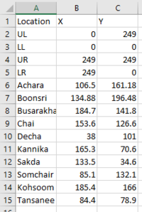
3. Update Location.csv with the derived coordinates
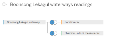
4. Import the Location.csv, Boonsong Lekagul waterways readings.csv, and chemical units of measure.csv files to Tableau, performing the join as follows:
- - Join on equal location fields for Location.csv
- - Join on equal measure fields for chemical units of measure.csv
Dashboard Design
View the interactive Tableau design here: Link to tableau dashboard
1. Map Overview Shows the Map of the Boonsong Lekagul Waterways with the water sensor locations marked
- - The size of the mark indicates the number of readings collected for the location
- - The user may set the Sample Date to focus on a range of dates that he/she wishes to investigate
- - Mouse-over of the marks shows the Top 5 measures calculated by the average of their values within the selected Sample Date range
2. The Chemical Trends Shows individual water sensor readings for all the Measures and Locations across the whole time period of the data.
- - The dashboard aims to allow the user to determine the overall patterns and trends of the readings and see whether similarities exist between Measure values or Location Values
3. Location Analysis Shows yearly water sensor readings for the Measures within a given location.
- - The user sets the Location and then ticks the measures he/she wishes to view on the graph for analysis of trends for the particular location
4. Measure Analysis Shows Map of Boonsong Lekagul Waterways with the water sensor locations marked on the left, and individual water sensor readings for the given measure on the right
- - With the dashboard, the user may to in-depth analysis of the data as it has been drilled-down to individual sensor level and one singular measure
- - The user selects the measure to be investigated and both graphs filter to the measure
- - The user can then click the play button on the page-by slider to animate the presence of the measure throughout the Reserve
- - Mouse-over of the marks on the map will highlight the individual reading on the dotplot to the right.
5. Dataset Anomaly Shows the Gantt chart of water sensor readings throughout the whole duration of data collection above, and a heatmap of the schedule of water readings by Month Year below.
- - With the dashboard, the user may investigate instances of missing data as well as the schedule for when the water sensors are collecting data among the days of the week
- - The user may select measure/s of interest on the right to filter the Gantt chart
- - The user selects both the measure and location on the left to filter the heatmap and determine the schedule of readings for the selection made.

