Difference between revisions of "ISSS608 2017-18 T3 Assign Pooja Manohar Sawant Methodology Dashboard Design"
Poojams.2017 (talk | contribs) |
Poojams.2017 (talk | contribs) |
||
| Line 90: | Line 90: | ||
#Madeline Nindorf | #Madeline Nindorf | ||
#Jaunita Westen | #Jaunita Westen | ||
| + | |||
| + | [[File:Filter_bet.png|400px|center|]] | ||
| + | <div style="float:center;text-align:center;font-size:12px;"> <u>''close network within suspicious group- based on Betweenness Centrality''</u> </div> | ||
Revision as of 11:04, 8 July 2018
|
|
|
|
|
|
Contents
Analysis
Question 1 - Analysis of Entire organization
Communication and Purchasing patterns from Yr 2015 to Yr 2017
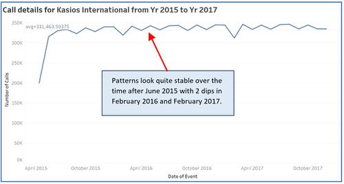
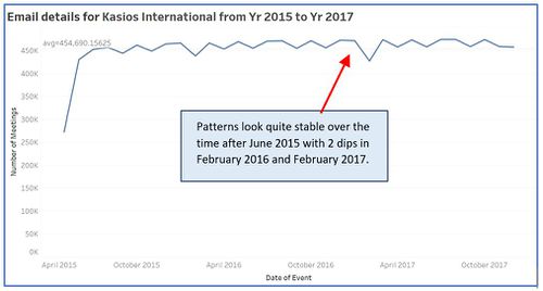
As provided by the insider, we have entire organization’s email, calls, meetings and purchasing details from May 2015 to December 2017. I have tried to analyze how these 4 ways of interactions are changing over the period and how organization is growing/ changing over the 2 years of period. I analyzed each communication mode (i.e. calls, emails, meetings and purchase) individually as well as combined.
- Calls pattern emerging over 2 years of period.
- Emails pattern emerging over 2 years of period.
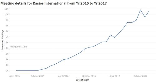
- Meetings pattern emerging over 2 years of period. Meeting pattern shows overall increasing trend over the period of two years after October 2015 onward. Highest number of meetings (10,821) happened in October 2017. We can say that the organization is having more formal meetings from Oct 2015 onward. Organization structure becoming more formal including more group meetings probably because of the change in higher management or CEO.
- Purchases pattern for 2 years of period are also similar to that of calls and emails. Pattern looks quite stable over the time after June 2015 with 2 dips in February 2016 and February 2017. Highest number of purchases (25,064) are made in Dec 2016.
- Also, the combined data of all the communication and purchases shows similar pattern as that of calls, emails and purchases.
After observing past data, we can say that this company is quite stable from June 2015 onward based on its communication and purchasing behaviors. It is getting more organized in terms of formal meetings as number of meetings shows increasing trend over the period of 2 years specially after October 2015 which can be an indicator of changes in higher management for the organization.
Communication and Purchasing patterns over a week
I have created a calendar view with the given organization's data in Tableau to analyse how communication and purchases are distributed over a week for 2 and a half year - <image>
I observed that highest number of purchases of 887 are made in week 18 of year 2016 (i.e. in April) and surprisingly on Sunday. This can be because its an international organization and operates all 7 days. Visualization shows the equal distribution of communication and purchasing pattern over all 7 days.
Question 2 - Demystifying the suspicious network
As per the question 2, we need to analyze communication and purchases that are identified as suspicious by the insider and identify if anyone else from the organization appear to be closely associated with this group. Graph visualization tool, Gephi is used to analyze the connections among the suspicious group and to locate this group in the large organization data set to find out if there are any else is involved in suspicious activity. As detailed in the data preparation, I have already created workspace1 (with suspicious employee names as nodes and communication details as edge) and workspace2 (with suspicious employees and other employees connected with them by any mode of communication as nodes and communication details as edges).
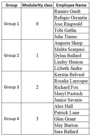
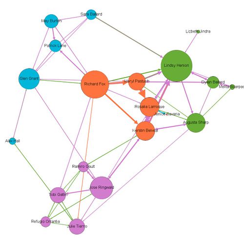
To create network graph for suspicious group, I have selected layout– Force Atlas 2 with “LinLog mode” and “Prevent Overlap” options on and let it run for some time. Based on the modularity class, I found out 4 segments within suspicious group.
Below is the network graph for suspicious employees showing how they are connected with each other. In the graph, node size is determined by the "degree centrality", nodes color is determined by "modularity class" and edge color is determined by "type of communication among the employees".
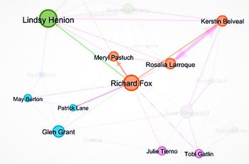
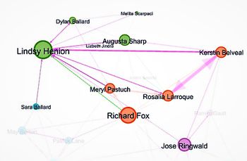
Based on the degree of interactions we can interpret 2 of these employees are very prominent - Richard Fox and Lindsy Henion
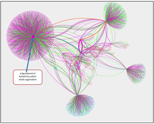
To create a extended network graph for suspicious group, I have selected layout– Yifan Hu.
As we can see suspicious group of people have a very well-established connections and big network, not all of these transactions will be suspicious. We will try to filter out some of the nodes and edges to get more accurate suspicious transactions.
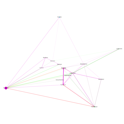
- Filter based on Node Betweenness Centrality - it measures how often a node appears on shortest paths between nodes in the network. I chose Betweenness Centrality > 6000.00, I determined, below employees are more often interact with suspicious employees -
- Sheilah Stachniw
- Terrilyn Overkamp
- Corinne Veatch
- Madeline Nindorf
- Jaunita Westen
