Difference between revisions of "ISSS608 2017-18 T3 Assign Jyoti Bukkapatil Methodology & Dashboard Design"
| Line 14: | Line 14: | ||
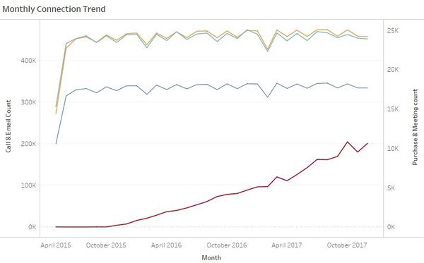
Time series graph was created for four big data files to visualize monthly and hourly pattern of the company's communication and purchase habits. | Time series graph was created for four big data files to visualize monthly and hourly pattern of the company's communication and purchase habits. | ||
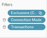
| − | I have used Tableau to create time series patterns. To make the above plot, the fields added to Tableau rows | + | I have used Tableau to create time series patterns. To make the above plot, the fields added to Tableau rows , columns and the filters applied are shown below : |
| − | <div style="float:left;;width: | + | <div style="float:left;;width:40%;"><br/><br/> |
[[Image:ISSS608_2018_Jyoti_Bukkapatil_Methodology_3.jpg|500px|center|border]]<br/> | [[Image:ISSS608_2018_Jyoti_Bukkapatil_Methodology_3.jpg|500px|center|border]]<br/> | ||
<center style="font-size:13px;"> <u>Figure 2</u> </center> | <center style="font-size:13px;"> <u>Figure 2</u> </center> | ||
</div> | </div> | ||
| − | <div style="float:left;;width: | + | <div style="float:left;;width:60%;> |
[[Image:ISSS608_2018_Jyoti_Bukkapatil_Methodology_2.jpg|150px|center|border]]<br/> | [[Image:ISSS608_2018_Jyoti_Bukkapatil_Methodology_2.jpg|150px|center|border]]<br/> | ||
<center style="font-size:13px;"> <u> Figure 3</u> </center> | <center style="font-size:13px;"> <u> Figure 3</u> </center> | ||
</div> | </div> | ||
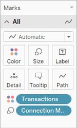
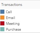
| − | + | Below are fields used added to tableau Marks and colour legend used for graph . Same color legends are also used for hourly timeseries plot . | |
| + | <div style="float:left;;width:60%;"><br/><br/> | ||
| + | [[Image:ISSS608_2018_Jyoti_Bukkapatil_Methodology_8.jpg|150px|center|border]]<br/> | ||
| + | <center style="font-size:13px;"> <u>Figure 4</u> </center> | ||
| + | </div> | ||
| + | <div style="float:left;;width:60%;> | ||
| + | [[Image:ISSS608_2018_Jyoti_Bukkapatil_Methodology_7.jpg|200px|center|border]]<br/> | ||
| + | <center style="font-size:13px;"> <u> Figure 5</u> </center> | ||
| + | </div> | ||
| + | <div style="float:left;;width:100%;"><br/><br/> | ||
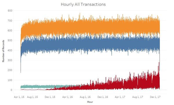
Hourly Time series was created to with single vertical axis. This was later added to the tooltip of the calendar view. Below is the combined hourly graph for all four transactions. | Hourly Time series was created to with single vertical axis. This was later added to the tooltip of the calendar view. Below is the combined hourly graph for all four transactions. | ||
[[Image:ISSS608_2018_Jyoti_Bukkapatil_Methodology_4.jpg|600px|center|border]] | [[Image:ISSS608_2018_Jyoti_Bukkapatil_Methodology_4.jpg|600px|center|border]] | ||
| − | <center style="font-size:13px;"> <u>Figure | + | <center style="font-size:13px;"> <u>Figure 6</u> </center> |
To make the above plot, the fields added to Tableau rows and columns and the filters applied are shown below: | To make the above plot, the fields added to Tableau rows and columns and the filters applied are shown below: | ||
<div style="float:left;;width:60%;"><br/><br/> | <div style="float:left;;width:60%;"><br/><br/> | ||
[[Image:ISSS608_2018_Jyoti_Bukkapatil_Methodology_5.jpg|500px|center|border]]<br/> | [[Image:ISSS608_2018_Jyoti_Bukkapatil_Methodology_5.jpg|500px|center|border]]<br/> | ||
| − | <center style="font-size:13px;"> <u>Figure | + | <center style="font-size:13px;"> <u>Figure 7</u> </center> |
</div> | </div> | ||
<div style="float:left;;width:40%;> | <div style="float:left;;width:40%;> | ||
[[Image:ISSS608_2018_Jyoti_Bukkapatil_Methodology_6.jpg|150px|center|border]]<br/> | [[Image:ISSS608_2018_Jyoti_Bukkapatil_Methodology_6.jpg|150px|center|border]]<br/> | ||
| − | <center style="font-size:13px;"> <u> Figure | + | <center style="font-size:13px;"> <u> Figure 8</u> </center> |
</div> | </div> | ||
| − | + | ||
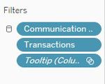
| − | Tooltip filter in Figer | + | Tooltip filter in Figer 8 is automatically generated tooltip because this graph is used in the tooltip of the calendar view.Below are color legends used for both monthly and hourly time series graph. |
Revision as of 10:46, 8 July 2018
Tools Used
I have used below four tools for data analysis and visualization.
- JMP Pro 13 - Used for Data Preparation
- Tableau 2018.1 - Used to create a Calendar View and Timer Series Graph for All transactions in company
- Gephi 0.9.2 - Used to create Network Graph
- Microsoft Excel - Used to map Employee ID with Name
Methodology
- Time Series Graph :
Time series graph was created for four big data files to visualize monthly and hourly pattern of the company's communication and purchase habits. I have used Tableau to create time series patterns. To make the above plot, the fields added to Tableau rows , columns and the filters applied are shown below :
Below are fields used added to tableau Marks and colour legend used for graph . Same color legends are also used for hourly timeseries plot .
Hourly Time series was created to with single vertical axis. This was later added to the tooltip of the calendar view. Below is the combined hourly graph for all four transactions.
To make the above plot, the fields added to Tableau rows and columns and the filters applied are shown below:
Tooltip filter in Figer 8 is automatically generated tooltip because this graph is used in the tooltip of the calendar view.Below are color legends used for both monthly and hourly time series graph.
