Difference between revisions of "ISSS608 2017-18 T3 Assign Hasanli Orkhan Methodology"
Orkhanh.2017 (talk | contribs) |
Orkhanh.2017 (talk | contribs) |
||
| Line 95: | Line 95: | ||
<font size = 3; color="#FFFFFF"><span style="font-family:Century Gothic;">Using Gephi parameters to visualize network</span></font> | <font size = 3; color="#FFFFFF"><span style="font-family:Century Gothic;">Using Gephi parameters to visualize network</span></font> | ||
</div> | </div> | ||
| − | By combining all the suspicious four data sets provided by insider we might detect people who mostly communicate and also changing settings of Nodes Ranking by size to Degree, In-Degree and Out-Degree we can see which people mostly getting calls, emails, invitations and which people sending the most respectively. By hovering on the images we can see the details. | + | By combining all the suspicious four data sets provided by insider we might detect people who mostly communicate and also changing settings of Nodes Ranking by size to Degree, In-Degree and Out-Degree we can see which people mostly getting calls, emails, invitations and which people sending the most respectively. Layout for network used in this case is Frutcherman Reingold layout. By hovering on the images we can see the details. |
<br><br> | <br><br> | ||
<gallery mode="packed-hover" heights="100" > | <gallery mode="packed-hover" heights="100" > | ||
Revision as of 01:22, 8 July 2018
 Detecting Suspicious Individuals
|
|
|
|
|
Data Preparation
In all the data sets provided in this mini case, we need to create a new column for timestamp. I have used SAS JMP to create a new column by starting from May 11, 2015 14:00. By taking the seconds value of 5/11/2015 and 14:00, we can add up by given seconds value with created new columns values to get the actual date and time.


Same formulas were applied for creating similar columns for other datasets. Consequently, we check for duplicates in the data, duplicates from Calls, Purchases data set were removed.
Firstly, I remove May and June months from 2015 because are incomplete, as well as, if we look at quarterly data later in our analysis we cannot get quarterly information with that two months. By keeping them, I would make some noise in my data.
Methodology for Question 1
In order to create a single picture of the company, characterize changes in the company over time and to see the patterns whether the company is growing or not I am going to use Tableau for demonstrating calls, emails, meetings and purchases pattern over time.
I have created two dashboards in Tableau, where one of them shows overall trend of calls, emails, meetings and purchases by months of 2015, 2016, 2017. Some months were filtered out to get better picture of the trend and for each line graph the range of Y axis which is the number of records was altered to see clearly the trend.

After filtering individually I put calls, emails, meetings and purchase line graphs together in the dashboard.

For both of the dashboards and plots individually reference line was drawn in order to easily detect which months are higher, lower or around the average value.

In another dashboard I demonstrated the cycle plot where we can see in which months of all the given years there is upward or downward trend.

Methodology for Question 2
Gephi Data Preparation
To prepare our data for being ready to dump into Gephi, firstly I concatenate all the 4 suspicious data sets and create new day, week, month and year columns for easy filtering in Gephi.

Next, we need to join the Suspicious_Final dataset with CompanyIndex dataset to get the labels and prepare our new created data set for Node and Edge data sets.
In order to Join data tables, first I match Source = ID and then Destination=ID, subsequently I will add two columns (First and Last) from Destination Labelled to Source Labelled data table. Before adding them, I will concatenate two columns (First and Last) into one named Label.

For running in Gephi Node data we need to keep only unique ID and Label. Thus, from Summary I take only unique ID and corresponding labels. The following is my Node dataset, where I have only 20 unique suspicious people.
c
For the Edge data which contains 137 rows I have created two more columns Quarter and Time of the day in case I am going to investigate on quarterly or hourly basis.
Using Gephi parameters to visualize network
By combining all the suspicious four data sets provided by insider we might detect people who mostly communicate and also changing settings of Nodes Ranking by size to Degree, In-Degree and Out-Degree we can see which people mostly getting calls, emails, invitations and which people sending the most respectively. Layout for network used in this case is Frutcherman Reingold layout. By hovering on the images we can see the details.

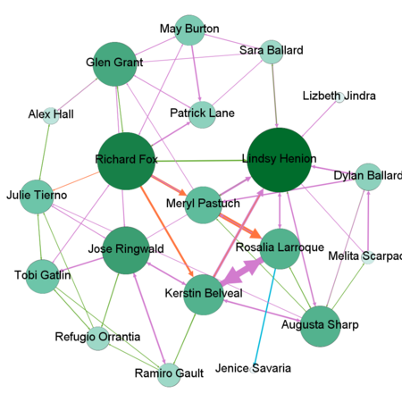
Degree
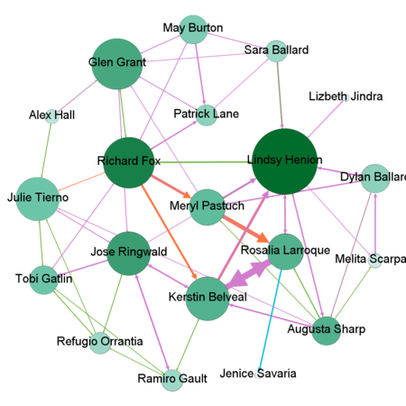
In-Degree
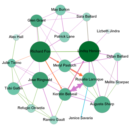
Out-Degree


By using Filter feature we might find out by which exact communication type individuals connected to each other. To find out which employees making suspicious purchases we will use Filter -> Attributes -> Partition -> c-type(Edge)
</gallery>
