Difference between revisions of "Group04 Report"
Poojams.2017 (talk | contribs) |
|||
| (33 intermediate revisions by 3 users not shown) | |||
| Line 8: | Line 8: | ||
</div> | </div> | ||
<div style="background:#003366; border:#002060; padding-left:15px; text-align:center;"> | <div style="background:#003366; border:#002060; padding-left:15px; text-align:center;"> | ||
| − | <font size = 5; color="#FFFFFF"><span style="font-family:Century Gothic;">Water For Life: India's | + | <font size = 5; color="#FFFFFF"><span style="font-family:Century Gothic;">Water For Life: Effect Of Rainfall On India's Crop Productivity |
</span></font> | </span></font> | ||
</div> | </div> | ||
| Line 14: | Line 14: | ||
<!--MAIN HEADER --> | <!--MAIN HEADER --> | ||
{|style="background-color:#003366;" width="100%" cellspacing="0" cellpadding="0" valign="top" border="0" | | {|style="background-color:#003366;" width="100%" cellspacing="0" cellpadding="0" valign="top" border="0" | | ||
| − | | style="font-family:Century Gothic; font-size:100%; solid #000000; background:#003366; color: #ffffff; text-align:center;" width=" | + | | style="font-family:Century Gothic; font-size:100%; solid #000000; background:#003366; color: #ffffff; text-align:center;" width="16%" | |
; | ; | ||
[[Group04_Overview| <font color="#FFFFFF">Overview</font>]] | [[Group04_Overview| <font color="#FFFFFF">Overview</font>]] | ||
| − | | style="font-family:Century Gothic; font-size:100%; solid #1B338F; background:#003366; text-align:center;" width=" | + | | style="font-family:Century Gothic; font-size:100%; solid #1B338F; background:#003366; text-align:center;" width="16%" | |
; | ; | ||
[[Group04_Proposal| <font color="#FFFFFF">Proposal</font>]] | [[Group04_Proposal| <font color="#FFFFFF">Proposal</font>]] | ||
| − | | style="font-family:Century Gothic; font-size:100%; solid #1B338F; background:#778899; text-align:center;" width=" | + | | style="font-family:Century Gothic; font-size:100%; solid #1B338F; background:#778899; text-align:center;" width="16%" | |
; | ; | ||
[[Group04_Report| <font color="#FFFFFF">Analysis Report</font>]] | [[Group04_Report| <font color="#FFFFFF">Analysis Report</font>]] | ||
| − | | style="font-family:Century Gothic; font-size:100%; solid #1B338F; background:#003366; text-align:center;" width=" | + | | style="font-family:Century Gothic; font-size:100%; solid #1B338F; background:#003366; text-align:center;" width="16%" | |
; | ; | ||
[[Group04_Poster| <font color="#FFFFFF">Poster</font>]] | [[Group04_Poster| <font color="#FFFFFF">Poster</font>]] | ||
| − | | style="font-family:Century Gothic; font-size:100%; solid #1B338F; background:#003366; text-align:center;" width=" | + | | style="font-family:Century Gothic; font-size:100%; solid #1B338F; background:#003366; text-align:center;" width="16%" | |
; | ; | ||
[[Group04_Application| <font color="#FFFFFF">Application</font>]] | [[Group04_Application| <font color="#FFFFFF">Application</font>]] | ||
| − | | | + | | style="font-family:Century Gothic; font-size:100%; solid #1B338F; background:#003366; text-align:center;" width="20%" | |
| + | ; | ||
| + | [[Project_Groups| <font color="#FFFFFF">Back To All Projects</font>]] | ||
| + | |||
| + | | | ||
|} | |} | ||
<!--MAIN HEADER --> | <!--MAIN HEADER --> | ||
| Line 63: | Line 67: | ||
<!--Objective And Motivation--> | <!--Objective And Motivation--> | ||
| − | == Objective | + | == Objective & Motivation == |
{| class="wikitable" | {| class="wikitable" | ||
|- | |- | ||
| Line 80: | Line 84: | ||
<!--About Data Source--> | <!--About Data Source--> | ||
| − | == | + | ==Data Sources== |
| + | {| class="wikitable" | ||
| + | |- | ||
| + | | <div style="font-family:Century Gothic; border-radius: 1px "> | ||
| + | <font size =3><b><u>1. Rainfall Data:</u></b></font> [[File:Group4_rainfall_symbol.jpg|50px]] | ||
| + | |||
| + | Rainfall data was obtained from “IITM Indian subdivision Monthly Rainfall data set” available on http://www.tropmet.res.in/. Data set consists of monthly, season wise and annual rainfall (in mm) for 36 meteorological subdivisions of India from year 1871 to 2016. Our research only used monthly data from year 2000 to 2014 for 34 subdivisions. This data set is chosen based on available crop production data. | ||
| + | |||
| + | |||
| + | |||
| + | <font size =3><b><u>2. Crop Production Data:</u></b></font> [[File:Group4_crop_symbol.jpg|50px]] | ||
| + | |||
| + | Crop Production data is obtained from “State-wise, season-wise crop production statistics from 1997” available on https://data.gov.in/. Data set contains season wise crop production data for 646 districts from 1997 to 2015 for 113 different crops. For this research, only those crops are selected for which districtwise data is available for more than 10 years. So final selected subset contains data for 56 crops for 595 districts. Crop productivity is calculated using below formula – | ||
| + | |||
| + | [[File:Group4_formula.png|Left|300px]] | ||
| + | |||
| + | |||
| + | |||
| + | <font size =3><b><u>3. Subdivision - District Mapping data:</u></b></font> [[File:Group4_mapping_symbol.jpg|50px]] | ||
| + | |||
| + | List of meteorological subdivisions and districts covered under these subdivisions is obtained from India Meteorological Department’s website (http://www.imd.gov.in). This data is used to map subdivision wise rainfall data and district wise crop production data. Grid file for Geo facet graph is prepared based on geographic location of every subdivisions in India. | ||
| + | <br><br> | ||
| + | </div> | ||
| + | |} | ||
| + | <!--Data Source--> | ||
| + | |||
| + | ==Data Preparation== | ||
{| class="wikitable" | {| class="wikitable" | ||
|- | |- | ||
| <div style="font-family:Century Gothic; border-radius: 1px "> | | <div style="font-family:Century Gothic; border-radius: 1px "> | ||
| + | Taking closer look at the input data: | ||
| + | [[File:Group4_Data_Prep1.JPG|centre|1000px]] | ||
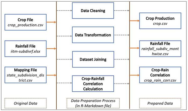
| + | Input data files are read, analyzed and transformed in R markdown file and output files generated are used for visualization. Below is the illustration of data transformation process: | ||
| + | [[File:Group4_Data_Prep.JPG|centre|600px]] | ||
| + | <div style="float:center;text-align:center;"><Font size =2><u><b>''Data Preparation''</b></u></font></div> | ||
| + | |||
| + | <br><br> | ||
</div> | </div> | ||
|} | |} | ||
| − | <!-- | + | <!--Data Preparation--> |
| + | |||
| + | <!--Critique of Existing Visualization--> | ||
| − | + | ==Past Work and Critique== | |
| − | ==Critique | ||
{| class="wikitable" | {| class="wikitable" | ||
|- | |- | ||
| <div style="font-family:Century Gothic; border-radius: 1px "> | | <div style="font-family:Century Gothic; border-radius: 1px "> | ||
| + | There has been wide range of analysis for India’s rainfall pattern changes and its effect on Crop productivity. One of these papers is “The Impact of Climate Change on Crop Yields in India from 1961 to 2010 by Aravind Moorthy, Wolfgang Buermann, and Deepak Rajagopal June 12, 2012(http://hpccc.gov.in/PDF/Agriculture/Climate%20Change%20and%20Crop%20Yields%20in%20India.pdf). | ||
| + | |||
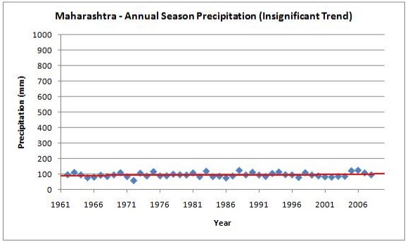
| + | Most of these studies are focused on seasonal or yearly rainfall pattern and its effect on crop productivity. However, there has been limited analysis for monthly rainfall effect on crop productivity which is more important. Visualization provided is static and limited to line graphs as shown below: | ||
| + | [[File:Group4_image1.jpg|centre]] | ||
| + | <div style="float:center;text-align:center;"><Font size =2><u><b>''Figure 1: Charts available for Precipitation Analysis''</b></u></font></div> | ||
| + | <br><br> | ||
</div> | </div> | ||
|} | |} | ||
| − | <!--Critique | + | <!--Past Work and Critique--> |
| − | <!--Dashboard Design--> | + | <!--Dashboard Design and Visualization Methodology--> |
| − | ==Dashboard Design== | + | ==Dashboard Design & Visualization Methodology== |
{| class="wikitable" | {| class="wikitable" | ||
|- | |- | ||
| <div style="font-family:Century Gothic; border-radius: 1px "> | | <div style="font-family:Century Gothic; border-radius: 1px "> | ||
| + | <font size = 4><b><u>1. Rainfall Analysis</u></b></font> | ||
| + | |||
| + | Separate visualization for only rainfall analysis has been provided by Rainfall-geo facet and Rainfall-cyclic plot. | ||
| + | |||
| + | |||
| + | <font size = 3><b><i>Visualization of Rainfall Time Trend through Geom_Facet plot</i></b></font> | ||
| + | |||
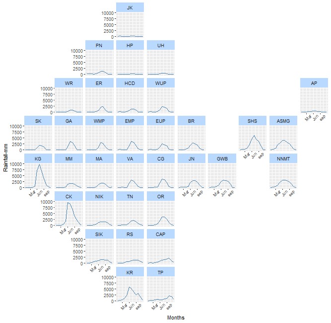
| + | Geo Facet plot provides single view to analyse variations in rainfall pattern across different meteorological subdivisions in India for selected year. From plot it can be observed that South East Costal subdivisions such as Konkan & Goa (KG), Coastal Karnataka (CK) get highest rainfall in year. This is because of South East monsoon wind which flows mostly during June to Sep (Monsoon Period). Likewise, North East subdivisions (Assam & Meghalaya (ASMG), Sub-Himalaya West Bengal & Sikkim (SHS)) get rain over wide range of time in a year i.e. from March till October this might be effect of both South-East and North- West (Post Monsoon) wind flow. North West Subdivisions (West Rajasthan (WR), Sourashtra & Kutch (SK)) receive least rainfall. Wide variations in rainfall in different geographic area might have different effect on Crops grown in these regions.. | ||
| + | |||
| + | [[File:Group4_image2.jpg|centre]] | ||
| + | <div style="float:center;text-align:center;"><Font size =2><u><b>''Figure 2: Geo Facet Plot for Monthly Rainfall Pattern for One Year ''</b></u></font></div> | ||
| + | |||
| + | |||
| + | |||
| + | <font size = 3><b><i>Visualizing Variability of Monthly Rainfall through Cyclic Plot</i></b></font> | ||
| + | |||
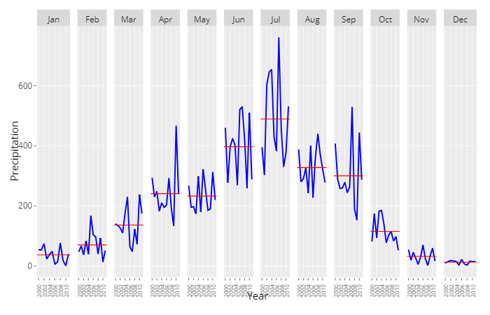
| + | From Cyclic plot rainfall, monthly rainfall fluctuations for last 15 years can be visualized. Below cyclic plot is for Assam and Meghalaya subdivisions. Yearly rainfall season spans over 8 to 10 months. These wide variations in monthly rainfall especially during the harvesting period of any crop i.e. during Sep-Oct can damage crop for that season. This makes it obvious to focus more on monthly rainfall pattern than average seasonal and annual rainfall pattern for studying the effect of rainfall pattern change on crop productivity. | ||
| + | Also, it becomes obvious from the observations to study Rainfall effect on crop productivity separately for each crop season and subdivision. | ||
| + | |||
| + | [[File:Group4_image3.jpg|800px|centre]] | ||
| + | <div style="float:center;text-align:center;"><Font size =2><u><b>''Figure 3: Cyclic plot for Monthly Rainfall Pattern''</b></u></font></div> | ||
| + | |||
| + | |||
| + | <br> | ||
| + | <font size = 4><b><u>2. Crop Productivity Analysis</u></b></font> | ||
| + | |||
| + | In this section, we analyze how crop production is distributed across various subdivisions and districts in India from year 2000 to 2014. As India’s crop cultivation is highly dependent on various seasons, we are also analyzing crop’s productivity over various seasons. In the crop data set, details for Crop’s total production and cultivation area are provided. Using these two fields we have calculated Crop Productivity as a ratio of crop’s production over cultivation area and used this parameter for our analysis. | ||
| + | |||
| + | |||
| + | <font size =3><b><i>Multivariate Analysis using Parallel Coordinates Plot</i></b></font> | ||
| + | |||
| + | Parallel coordinate plot allows user to view high dimensional data with a facility to visualize categorical and numerical variables together. The plot is created using R ''parcoords'' package. Parallel coordinate plot shows how crop productivity is distributed for various crops over various season for particular subdivision. User can select one or multiple subdivisions as well as one or multiple years to make a fair comparison among different subdivisions over the years. | ||
| + | |||
| + | |||
| + | [[File:Group4_image4.jpg|800px|centre]] | ||
| + | <div style="float:center;text-align:center;"><Font size =2><u><b>''Figure 4: Parallel Coordinate Plot showing high level Crop Productivity Distribution''</b></u></font></div> | ||
| + | |||
| + | |||
| + | |||
| + | Parallel coordinate plot gives user high level view of crop productivity distribution but cannot give very detailed level information. Assembly of Tree map and Bar plot is the very good visualization to give detailed crop productivity details at various hierarchical levels. | ||
| + | |||
| + | |||
| + | <font size =3><b><i>Hierarchical Data Visualization using Treemap and Barchart</i></b></font> | ||
| + | |||
| + | As given crop data has a prominent subdivision and district hierarchy, Treemap is the first choice for visualization as treemap gives the hierarchical view of data to user and user can drill down or up in the data. | ||
| + | |||
| + | We have used ''treemap'' and ''d3treeR'' packages to create interactive treemap where user can hover and click on the subdivision to drill down and show various district inside that subdivision. ''Clicks'' from the treemap are used as input to bar plot which shows the high yielding crops arranged in descending order of their productivity for that subdivision or district. | ||
| + | |||
| + | {| class="wikitable" | ||
| + | |- | ||
| + | | [[File:Group4_image5a.jpg|480px]] || [[File:Group4_image5b.jpg|480px]] | ||
| + | |} | ||
| + | <div style="float:center;text-align:center;"><Font size =2><u><b>''Figure 5: Tree Map & Bar Chart for detailed Crop Productivity Analysis''</b></u></font></div> | ||
| + | |||
| + | |||
| + | |||
| + | <br> | ||
| + | <font size = 4><b><u>3. Rainfall’s Effect on Crop Productivity</u></b></font> | ||
| + | |||
| + | After exploring the rainfall and crop data individually for better understanding of the data, we advance further to analyze the interrelationship between precipitation and crop productivity, if there exists any. For our application, we especially focus on discovering correlation between monthly variations in the rainfall precipitation with crop productivity. We have created a separate page in our application for viewing these graphs. We created two visualizations to facilitate the user to gain deeper understanding of the interdependence of these variables. | ||
| + | |||
| + | |||
| + | <font size =3><b><i>Rainfall-Crop Productivity Patterns using Geo-Spatial and Diverging Lollipop Plots</i></b></font> | ||
| + | |||
| + | The first tab on this page showcases geo-spatial visualization of India’s map on left side of the page and corresponding crop productivity values for subdivisions on right side of the page. Users can select the year and crop for configuring the graphs as per their requirement. We utilized ''leaflet'' package to plot an interactive ''chloropleth'' allowing the end user to view the distribution of annual rainfall precipitation across the 34 subdivisions of interest. For plotting the subdivisions, we obtained the shapefile to add those polygons to the map. The map also provides interactivity wherein on hover on individual subdivisions, a tooltip appears showing the value for the precipitation for that subdivision. | ||
| + | |||
| + | [[File:Group4_image6.jpg|500px|centre]] | ||
| + | <div style="float:center;text-align:center;"><Font size =2><u><b>''Figure 6: Geospatial Plot for Annual Rainfall Across Subdivisions''</b></u></font></div> | ||
| + | |||
| + | |||
| + | |||
| + | To visualize crop productivity, a diverging lollipop plot was created using ''ggplot'' with ''ggplot_segment'' function. This plot displays crop productivity values above and below an average reference line of crop productivity. The user can instantly see which subdivisions have higher production (in Tonnes) compared to the cultivated land (in Hectares) in that subdivision for the selected crop. | ||
| + | |||
| + | [[File:Group4_image7.jpg|centre]] | ||
| + | <div style="float:center;text-align:center;"><Font size =2><u><b>''Figure 7: Diverging Lollipop Plot for Annual Average Crop Productivity Across Subdivisions''</b></u></font></div> | ||
| + | |||
| + | |||
| + | <font size =3><b><i>Rainfall-Crop Productivity Correlation using Heatmap and Dual Axis Plot (Bar & Line)</i></b></font> | ||
| + | |||
| + | On the second tab, we create graphs to visualize the correlation between monthly rainfall and crop productivity. The application provides filters for subdivision and year to the user so that he/she can interactively select specific subdivisions/years for which he/she wishes to view the plots. | ||
| + | |||
| + | As correlation can be better viewed with a diverging scale ranging from negative to positive values, we used heatmap function form ''plotly'' package to create a correlation plot as shown. We used the ''viridis'' color scheme which is available by default with plotly package. This heatmap plots negative values as hues of dark blue color transitioning to the lighter yellow hue for positive values of the correlation. Such diverging color scheme provides instant insight on how crop productivity moves with respect to rainfall and which months have adverse effect on crop productivity | ||
| + | |||
| + | [[File:Group4_image8.jpg|centre]] | ||
| + | <div style="float:center;text-align:center;"><Font size =2><u><b>''Figure 8: Heat Map for correlation between Monthly rainfall and Crop Productivity''</b></u></font></div> | ||
| + | |||
| + | |||
| + | |||
| + | We used plotly’s coupled functions for hover and click events to enable further interactivity by capturing this data and passing it onto another graph. As correlation is derived using 15 data points for respective months and crop productivity for selected year and subdivision, we provide an interactive plot to the user which displays those data points for monthly rainfall precipitation and crop productivity. We used bar chart to plot precipitation and line chart to plot crop productivity. This plot provides further granular view through which the correlation can be understood better. | ||
| + | |||
| + | [[File:Group4_image9.jpg|centre]] | ||
| + | <div style="float:center;text-align:center;"><Font size =2><u><b>''Figure 9: Yearly Variation of crop productivity Vs rainfall''</b></u></font></div> | ||
| + | |||
| + | |||
| + | |||
| + | <b>''Online users would be able to find our application on our application page:''</b> | ||
| + | https://wiki.smu.edu.sg/1718t3isss608/Group04_Application | ||
| + | <br><br> | ||
</div> | </div> | ||
|} | |} | ||
| − | <!--Dashboard Design--> | + | <!--Dashboard Design and Visualization Methodology--> |
| Line 118: | Line 260: | ||
|- | |- | ||
| <div style="font-family:Century Gothic; border-radius: 1px "> | | <div style="font-family:Century Gothic; border-radius: 1px "> | ||
| + | Some of the key insights are as follows: | ||
| + | # Geo Facet plot provides single view to analyse variations in rainfall pattern across different meteorological subdivisions in India for selected year. From plot it can be observed that South East Coastal subdivisions such as Konkan & Goa (KG), Coastal Karnataka (CK) get highest rainfall in year. This is because of South East monsoon wind which flows mostly during June to Sep (Monsoon Period). Likewise, North East subdivisions (Assam & Meghalaya (ASMG), Sub-Himalaya West Bengal & Sikkim (SHS)) get rain over wide range of time in a year i.e. from March till October this might be effect of both South-East and North- West (Post Monsoon) wind flow. North West Subdivisions (West Rajasthan (WR), Sourashtra & Kutch (SK)) receive least rainfall. Wide variations in rainfall in different geographic area might have different effect on Crops grown in these regions. <br><br> | ||
| + | # Cyclic plot has been used for visualization of variation in monthly rainfall over 15 years for different meteorological subdivisions. Below plot shows monthly rainfall pattern for Arunachala Pradesh from year 2000 to 2015.<br> | ||
| + | |||
| + | [[File:Group4_image10.jpg|centre]] | ||
| + | <div style="float:center;text-align:center;"><Font size =2><u><b>''Key insights obtained from Cyclic Plot''</b></u></font></div> | ||
| + | |||
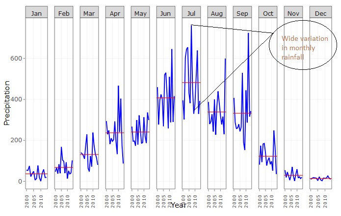
| + | ::Plot shows wide variation in monthly rainfall in Arunachal Pradesh. Yearly rainfall season spans over 8 to 10 months. These wide variations in monthly rainfall specially during harvesting period of any crop (i.e. during Sep – Oct) can damage crop. <br> | ||
| + | ::This makes it obvious to focus more on monthly rainfall pattern than average seasonal and annual rainfall pattern for studying effect of rainfall pattern change on crop productivity. <br> | ||
| + | ::Also it become obvious from above observations to study Rainfall effect on crop productivity separately for each crop season and subdivision. <br> | ||
| + | |||
</div> | </div> | ||
| Line 125: | Line 278: | ||
<!--Conclusion/Future Work--> | <!--Conclusion/Future Work--> | ||
| + | |||
== Conclusion/Future Work == | == Conclusion/Future Work == | ||
{| class="wikitable" | {| class="wikitable" | ||
| Line 158: | Line 312: | ||
We have used the following R packages to come up with our visualizations:<br><br> | We have used the following R packages to come up with our visualizations:<br><br> | ||
| − | <b>dplyr</b>: A Grammar of Data Manipulation. It is a fast, consistent tool for working with data frame like objects, both in memory and out of memory. | + | |
| − | <b>tidyr</b>:It's designed specifically for data tidying (not general reshaping or aggregating) and works well with 'dplyr' data pipelines | + | <Font size =3><b><u>R Packages for Data Preparation and Exploration:</u></b></Font> <br> |
| − | <b> | + | *<b>dplyr</b>: A Grammar of Data Manipulation. It is a fast, consistent tool for working with data frame like objects, both in memory and out of memory.<br> |
| − | <b>readr </b>:The goal of 'readr' is to provide a fast and friendly way to read rectangular data (like 'csv', 'tsv', and 'fwf'). It is designed to flexibly parse many types of data found in the wild, while still cleanly failing when data unexpectedly changes <br><br> | + | *<b>tidyr</b>: It's designed specifically for data tidying (not general reshaping or aggregating) and works well with 'dplyr' data pipelines <br> |
| − | <b> | + | *<b>reshape2</b>: Casts a molten data frame into the reshaped or aggregated form you want <br> |
| − | and it takes care of the details | + | *<b>rgdal</b>: Bindings for the 'Geospatial' Data Abstraction Library<br> |
| − | <b>Plotly</b>:Easily translate 'ggplot2' graphs to an interactive web-based version and/or create custom web-based visualizations directly from R | + | *<b>lubridate</b>: Functions to work with date-times and time-spans: fast and user friendly parsing of date-time data <br> |
| − | + | *<b>RColorBrewer</b>: Provides color schemes for maps (and other graphics) <br> | |
| − | + | *<b>readr </b>: The goal of 'readr' is to provide a fast and friendly way to read rectangular data (like 'csv', 'tsv', and 'fwf'). It is designed to flexibly parse many types of data found in the wild, while still cleanly failing when data unexpectedly changes <br><br> | |
| − | <b>Geofacet</b>:Provides geofaceting functionality for 'ggplot2'. Geofaceting arranges a sequence of plots of data for different geographical entities into a grid that preserves some of the geographical orientation<br><br> | + | |
| − | <b> | + | <Font size =3><b><u>R Packages for Data Visualization:</u></b></Font> <br> |
| − | <b>leaflet</b>: Library to create Interactive Web Maps with the JavaScript 'Leaflet'<br><br> | + | *<b>ggplot2</b>: A system for 'declaratively' creating graphics. You provide the data, tell 'ggplot2' how to map variables to aesthetics, what graphical primitives to use, and it takes care of the details <br> |
| − | <b> | + | *<b>Plotly</b>: Easily translate 'ggplot2' graphs to an interactive web-based version and/or create custom web-based visualizations directly from R <br> |
| − | <b> | + | *<b>Geofacet</b>: Provides geofaceting functionality for 'ggplot2'. Geofaceting arranges a sequence of plots of data for different geographical entities into a grid that preserves some of the geographical orientation<br> |
| − | <b>shinydashboard</b>: Create dashboards with 'Shiny'. This package provides a theme on top of 'Shiny', making it easy to create attractive dashboards<br><br> | + | *<b>parcoords</b>: Parallel Coordinate Plot is created in R <br> |
| + | *<b>treemap</b>: A treemap is a space-filling visualization of hierarchical structures. This package offers great flexibility to draw treemaps<br> | ||
| + | *<b>d3treeR</b>: Make interactive d3.js treemaps in R with the convenience and infrastructure of an htmlwidget <br> | ||
| + | *<b>leaflet</b>: Library to create Interactive Web Maps with the JavaScript 'Leaflet'<br><br> | ||
| + | |||
| + | <Font size =3><b><u>R Packages for Shiny Application:</u></b></Font> <br> | ||
| + | *<b>shiny</b>: Web Application Framework for R<br> | ||
| + | *<b>shinydashboard</b>: Create dashboards with 'Shiny'. This package provides a theme on top of 'Shiny', making it easy to create attractive dashboards<br> | ||
| + | *<b>shinyjs</b>: Perform common useful JavaScript operations in Shiny apps that will greatly improve the apps without having to know any JavaScript<br> | ||
| + | |||
</div> | </div> | ||
|} | |} | ||
| Line 179: | Line 342: | ||
<!--References--> | <!--References--> | ||
| + | |||
== References == | == References == | ||
{| class="wikitable" | {| class="wikitable" | ||
Latest revision as of 16:57, 20 August 2018
Water For Life: Effect Of Rainfall On India's Crop Productivity
|
|
|
|
|
|
|
Contents
Introduction
This study focuses on exploratory analysis of rainfall pattern, crop productivity and effect of rainfall pattern changes on crop productivity across different meteorological subdivisions of India. Considering a wide range of weather conditions across a vast geographic scale and varied topography, it won’t be wise to generalise climate changes and its effect on crop productivity in varied regions of India, that is why we decided to explore and visualise rainfall pattern changes and its effect on crop productivity for every meteorological subdivision.
Our research focuses on 34 out of 36 meteorological subdivisions rainfall and crop productivity. Two subdivision excluded are Lakshadweep and Andaman & Nicobar subdivisions. Rainfall data used for research is at meteorological subdivisions level however crop data used is at administrative district level. We have maintained same granularity level for visualisation of separate data. For analysing effect of rainfall over crop productivity, district data is aggregated to subdivision level based on mapping of subdivisions and districts.
Crop growing season in India is classified into two main seasons – (i) Kharif and (ii) Rabi based on monsoon. The Kharif cropping season if from July- Oct during south– west monsoon and Rabi cropping season is from October- March (Winter). Crop grown between March- June are Summer Crops. Apart from these seasonal crops there are few crops which are grown throughout year and are classified as Whole year crops. So, we have considered total Four seasons as Kharif, Rabi, Summer and Whole Year for analysis.
We have used multiple visualisation technics such as Time series, Heat Map, Tree Map, Parallel Coordinate Plot, Geo Facet and Bar charts for easy visualisation of varying rainfall pattern and changing crop productivity for 15 years across different subdivisions of India. R is used for data visualisation and application as it offers satisfactory set of inbuilt functions and libraries for both data mining and visualisation.
|
Objective & Motivation
Climate plays a significant role in economic development of India. Because large population of India depends on climate sensitive sectors like agriculture and forestry for livelihood. Climate change could lower the farmer’s income by up to 25% (Economic Survey 2018: http://mofapp.nic.in:8080/economicsurvey/pdf/082-101_Chapter_06_ENGLISH_Vol_01_2017-18.pdf).This is because agriculture in India is vulnerable to the vagaries of whether as close to 52% farm land is still unirrigated and depends on rainfall. This project is honest endeavor in gaining deeper knowledge into the impact of increasingly changing rainfall patterns, so that we can be prepared to mitigate the risk of these uncontrollable factors and seek remedies that would help sustain such drastic natural phenomenon.
Considering crops cultivation period and water requirement for crop during different stages of its lifecycle, it is important to analyse effect of monthly rainfall on crop productivity during cultivation period rather than simply considering yearly/seasonal average rainfall. Our objective is to provide single view to analyse monthly rainfall pattern changes, crop productivity changes and correlation between every month’s rainfall and crop productivity.
|
Data Sources
Rainfall data was obtained from “IITM Indian subdivision Monthly Rainfall data set” available on http://www.tropmet.res.in/. Data set consists of monthly, season wise and annual rainfall (in mm) for 36 meteorological subdivisions of India from year 1871 to 2016. Our research only used monthly data from year 2000 to 2014 for 34 subdivisions. This data set is chosen based on available crop production data.
Crop Production data is obtained from “State-wise, season-wise crop production statistics from 1997” available on https://data.gov.in/. Data set contains season wise crop production data for 646 districts from 1997 to 2015 for 113 different crops. For this research, only those crops are selected for which districtwise data is available for more than 10 years. So final selected subset contains data for 56 crops for 595 districts. Crop productivity is calculated using below formula –
3. Subdivision - District Mapping data: List of meteorological subdivisions and districts covered under these subdivisions is obtained from India Meteorological Department’s website (http://www.imd.gov.in). This data is used to map subdivision wise rainfall data and district wise crop production data. Grid file for Geo facet graph is prepared based on geographic location of every subdivisions in India.
|
Data Preparation
Past Work and Critique
There has been wide range of analysis for India’s rainfall pattern changes and its effect on Crop productivity. One of these papers is “The Impact of Climate Change on Crop Yields in India from 1961 to 2010 by Aravind Moorthy, Wolfgang Buermann, and Deepak Rajagopal June 12, 2012(http://hpccc.gov.in/PDF/Agriculture/Climate%20Change%20and%20Crop%20Yields%20in%20India.pdf). Most of these studies are focused on seasonal or yearly rainfall pattern and its effect on crop productivity. However, there has been limited analysis for monthly rainfall effect on crop productivity which is more important. Visualization provided is static and limited to line graphs as shown below: Figure 1: Charts available for Precipitation Analysis
|
Dashboard Design & Visualization Methodology
1. Rainfall Analysis Separate visualization for only rainfall analysis has been provided by Rainfall-geo facet and Rainfall-cyclic plot.
Geo Facet plot provides single view to analyse variations in rainfall pattern across different meteorological subdivisions in India for selected year. From plot it can be observed that South East Costal subdivisions such as Konkan & Goa (KG), Coastal Karnataka (CK) get highest rainfall in year. This is because of South East monsoon wind which flows mostly during June to Sep (Monsoon Period). Likewise, North East subdivisions (Assam & Meghalaya (ASMG), Sub-Himalaya West Bengal & Sikkim (SHS)) get rain over wide range of time in a year i.e. from March till October this might be effect of both South-East and North- West (Post Monsoon) wind flow. North West Subdivisions (West Rajasthan (WR), Sourashtra & Kutch (SK)) receive least rainfall. Wide variations in rainfall in different geographic area might have different effect on Crops grown in these regions.. Figure 2: Geo Facet Plot for Monthly Rainfall Pattern for One Year
Visualizing Variability of Monthly Rainfall through Cyclic Plot From Cyclic plot rainfall, monthly rainfall fluctuations for last 15 years can be visualized. Below cyclic plot is for Assam and Meghalaya subdivisions. Yearly rainfall season spans over 8 to 10 months. These wide variations in monthly rainfall especially during the harvesting period of any crop i.e. during Sep-Oct can damage crop for that season. This makes it obvious to focus more on monthly rainfall pattern than average seasonal and annual rainfall pattern for studying the effect of rainfall pattern change on crop productivity. Also, it becomes obvious from the observations to study Rainfall effect on crop productivity separately for each crop season and subdivision. Figure 3: Cyclic plot for Monthly Rainfall Pattern
In this section, we analyze how crop production is distributed across various subdivisions and districts in India from year 2000 to 2014. As India’s crop cultivation is highly dependent on various seasons, we are also analyzing crop’s productivity over various seasons. In the crop data set, details for Crop’s total production and cultivation area are provided. Using these two fields we have calculated Crop Productivity as a ratio of crop’s production over cultivation area and used this parameter for our analysis.
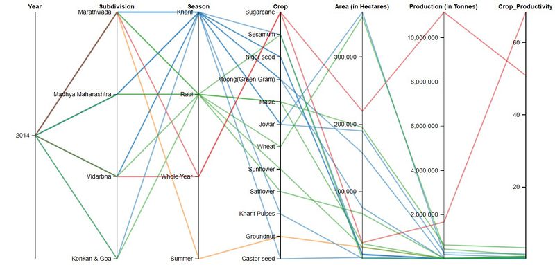
Parallel coordinate plot allows user to view high dimensional data with a facility to visualize categorical and numerical variables together. The plot is created using R parcoords package. Parallel coordinate plot shows how crop productivity is distributed for various crops over various season for particular subdivision. User can select one or multiple subdivisions as well as one or multiple years to make a fair comparison among different subdivisions over the years.
Figure 4: Parallel Coordinate Plot showing high level Crop Productivity Distribution
Parallel coordinate plot gives user high level view of crop productivity distribution but cannot give very detailed level information. Assembly of Tree map and Bar plot is the very good visualization to give detailed crop productivity details at various hierarchical levels.
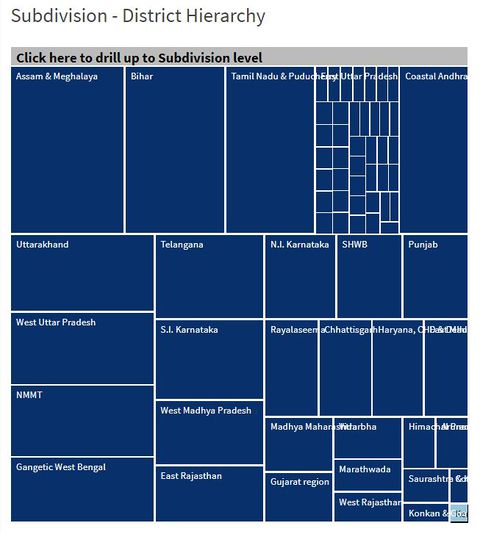
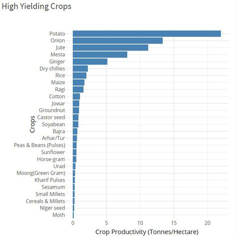
As given crop data has a prominent subdivision and district hierarchy, Treemap is the first choice for visualization as treemap gives the hierarchical view of data to user and user can drill down or up in the data. We have used treemap and d3treeR packages to create interactive treemap where user can hover and click on the subdivision to drill down and show various district inside that subdivision. Clicks from the treemap are used as input to bar plot which shows the high yielding crops arranged in descending order of their productivity for that subdivision or district.
Figure 5: Tree Map & Bar Chart for detailed Crop Productivity Analysis
After exploring the rainfall and crop data individually for better understanding of the data, we advance further to analyze the interrelationship between precipitation and crop productivity, if there exists any. For our application, we especially focus on discovering correlation between monthly variations in the rainfall precipitation with crop productivity. We have created a separate page in our application for viewing these graphs. We created two visualizations to facilitate the user to gain deeper understanding of the interdependence of these variables.
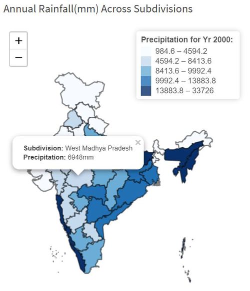
The first tab on this page showcases geo-spatial visualization of India’s map on left side of the page and corresponding crop productivity values for subdivisions on right side of the page. Users can select the year and crop for configuring the graphs as per their requirement. We utilized leaflet package to plot an interactive chloropleth allowing the end user to view the distribution of annual rainfall precipitation across the 34 subdivisions of interest. For plotting the subdivisions, we obtained the shapefile to add those polygons to the map. The map also provides interactivity wherein on hover on individual subdivisions, a tooltip appears showing the value for the precipitation for that subdivision. Figure 6: Geospatial Plot for Annual Rainfall Across Subdivisions
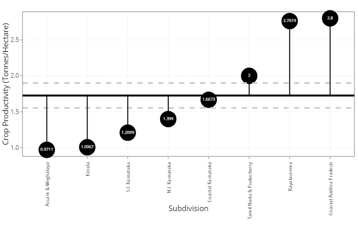
To visualize crop productivity, a diverging lollipop plot was created using ggplot with ggplot_segment function. This plot displays crop productivity values above and below an average reference line of crop productivity. The user can instantly see which subdivisions have higher production (in Tonnes) compared to the cultivated land (in Hectares) in that subdivision for the selected crop. Figure 7: Diverging Lollipop Plot for Annual Average Crop Productivity Across Subdivisions
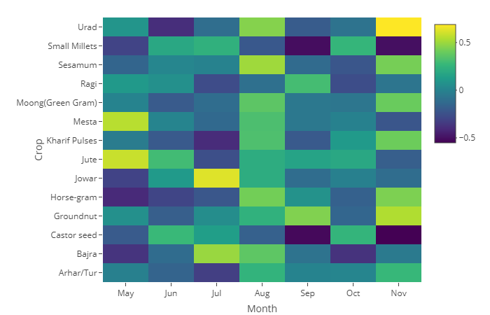
On the second tab, we create graphs to visualize the correlation between monthly rainfall and crop productivity. The application provides filters for subdivision and year to the user so that he/she can interactively select specific subdivisions/years for which he/she wishes to view the plots. As correlation can be better viewed with a diverging scale ranging from negative to positive values, we used heatmap function form plotly package to create a correlation plot as shown. We used the viridis color scheme which is available by default with plotly package. This heatmap plots negative values as hues of dark blue color transitioning to the lighter yellow hue for positive values of the correlation. Such diverging color scheme provides instant insight on how crop productivity moves with respect to rainfall and which months have adverse effect on crop productivity Figure 8: Heat Map for correlation between Monthly rainfall and Crop Productivity
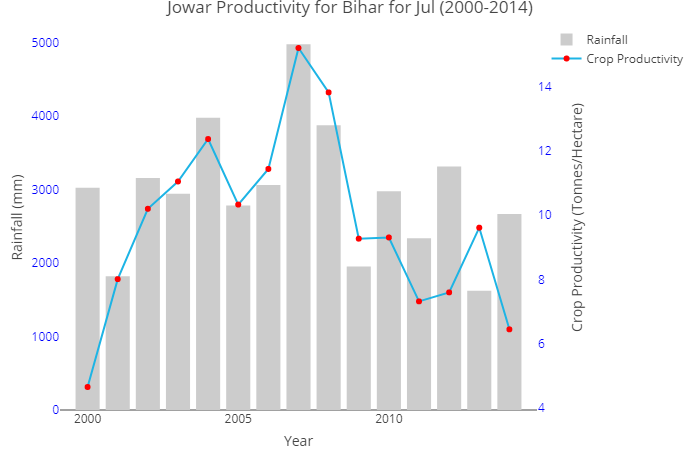
We used plotly’s coupled functions for hover and click events to enable further interactivity by capturing this data and passing it onto another graph. As correlation is derived using 15 data points for respective months and crop productivity for selected year and subdivision, we provide an interactive plot to the user which displays those data points for monthly rainfall precipitation and crop productivity. We used bar chart to plot precipitation and line chart to plot crop productivity. This plot provides further granular view through which the correlation can be understood better. Figure 9: Yearly Variation of crop productivity Vs rainfall
Online users would be able to find our application on our application page: https://wiki.smu.edu.sg/1718t3isss608/Group04_Application
|
Key Insights
Some of the key insights are as follows:
Key insights obtained from Cyclic Plot
|
Conclusion/Future Work
Given time constraints and the nature of data we gathered, this application is only limited to show the correlation between crop productivity and rainfall pattern changes. We cannot conclude rainfall pattern change is the causation for crop productivity change in Indian agricultural sector, as there are several other factors impacting the cultivation and harvesting of various crops in different regions of India such as temperature, wind, soil as well as capital and government support.
|
Acknowledgement
We would like to extend our gratitude towards Dr Kam Tin Seong (Singapore Management University) for his guidance on analytical techniques and R packages that may be used and feedback on visualisation techniques. Without his encouragement and technical assistance, this project would not be as it is today.
|
R Packages Used
We have used the following R packages to come up with our visualizations: R Packages for Data Preparation and Exploration:
R Packages for Data Visualization:
R Packages for Shiny Application:
|


