Difference between revisions of "Group10 Application"
Xjsong.2017 (talk | contribs) |
|||
| Line 59: | Line 59: | ||
For R enthusiasts and fellow-coders who are interested in downloading the source code of the application, all relevant code files for the GRIT application are available on <b>GitHub</b>. | For R enthusiasts and fellow-coders who are interested in downloading the source code of the application, all relevant code files for the GRIT application are available on <b>GitHub</b>. | ||
| − | [ | + | [Click here] to view and download the application code files. |
After downloading the source files, open the <b>app.R</b> file in RStudio to explore the source code. Click the <i>Run App</i> button to run the application on your local machine. | After downloading the source files, open the <b>app.R</b> file in RStudio to explore the source code. Click the <i>Run App</i> button to run the application on your local machine. | ||
Revision as of 19:21, 14 August 2018
Voice Driven Visual Analysis of Global Migration
|
|
|
|
|
|
|
Contents
Application Link
<Insert Link Here>
Installation Guide
1. Installation Process:
1.1. System Requirements
Your local system should have R Studio installed. Due to the packages used in this application, the minimum version for RStudio is 'Version 1.0.143'.
Click here to download the latest version of RStudio.
1.2. Download the Source Code
For R enthusiasts and fellow-coders who are interested in downloading the source code of the application, all relevant code files for the GRIT application are available on GitHub.
[Click here] to view and download the application code files.
After downloading the source files, open the app.R file in RStudio to explore the source code. Click the Run App button to run the application on your local machine.
2. Deployment Process
After downloading the Source files as explained in the previous section, you can host the R Shiny application on your own server. A free server to host this application is provided by shinyapps.io. Steps to deploy the application on shinyapps.io are as follows:
- Visit Shiny Apps and sign up for a free account, which allows you to host up to 5 applications.
- Based on the personal token and secret number provided by Shiny Apps after signing up, the application can then be deployed to your server.
- In Rstudio, execute the following code snippet:
install.packages('devtools')
devtools::install_github('rstudio/shinyapps')
devtools::install_github('rstudio/rsconnect')
library(shinyapps)
library(rsconnect)
rsconnect::setAccountInfo(name="Your account name", token="Your Personal Token", secret="Your Secret Number")
- Click on the Publish icon in RStudio to upload and deploy the application to the Shiny Apps Server.
- After entering an appropriate name for your application, the GRIT application will be deployed and hosted to your Shiny Apps server.
User Guide
Steps for voice integration in RShiny:
1. Create the Annyang JavaScript file with the voice recognition commands and include the Annyang and SpeechKITT libraries in R.
2. Speak to the app to change the input to visual model.
3. Capture the change in speech by using the voice trigger variable inside a reactive function in R.
4. Use an observe function to look out for the change in the reactive voice variable and update the inputs in visual model accordingly.
5. Also, observe the voice input getting displayed in the SpeechKITT GUI.
Content Tab
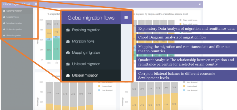
This tab provides users the scope of this application, users can switch different tabs to see the whole analysis process. This application including below 5 tabs:
- Exploring migration: Exploratory Data Analysis of migration and remittance data
- Migration flows: Chord Diagram, analysis of migration flow
- Mapping migration: Mapping the migration and remittance data and filter out the top countries
- Unilateral migration: Quadrant Analysis, the relationship between migration and remittance percentile for a selected origin country.
- Bilateral migration: Corrplot, bilateral balance in different economic development levels
Notes: For better visualization experience, click on the sidebar minimize button to show the full page of the tab.
Exploring migration
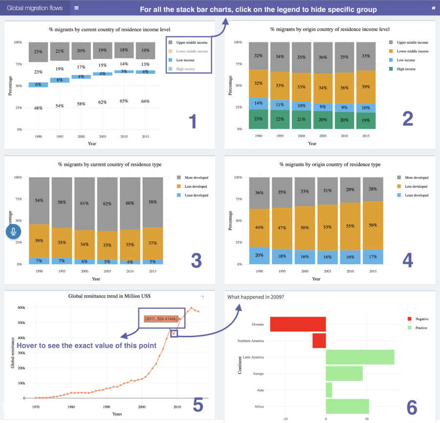
There are 6 charts showing the basic exploration of our dataset:
1: This is a 100% stacked bar chart showing the migrant stock percentage in the current country of residence (Destination country) by the countries income levels as classified by the World Bank over years.
2: This is a 100% stacked bar chart showing the migrant stock percentage in the origin country of residence (Origin country) by the countries income levels as classified by the World Bank over years.
3: This is a 100% stacked bar chart showing the migrant stock percentage in the current country of residence (Destination country) by the countries of residence type as classified by the World Bank over years.
4: This is a 100% stacked bar chart showing the migrant stock percentage in the origin country of residence (Origin country) by the countries of residence type as classified by the World Bank over years.
5: The line chart shows the trend of remittance in million US dollars sent by the migrants to their respective origin countries.
6: Investigation of the dip in 2009 from Plot 5, and analyse which continent contribute to it.
Migration Flow
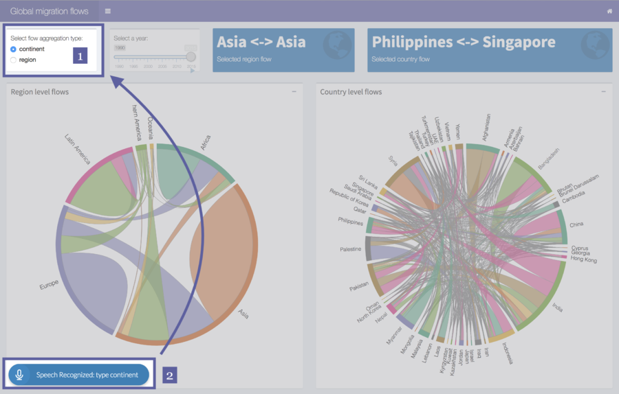
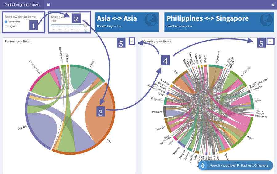
In this tab, we are using voice visualization to control certain input by using voice command below.
Command:
Speak: “type: <region/continent>”
The radio button [1] will switch to “region/continent”.
E.G
Speak: “type: continent”
The radio button [1] will switch back to “continent”.
Then, the microphone [2] will display the recorded sentence.
Also, we can manual select the inputs to update the chord diagram.
1. Click on the radio button to select flow aggregation type
2. Drag to select a year for migration flow
3. Click on the certain continent field on the plot
4. The country level will change with the click, and then click on the line or field on the country level chord diagram
5. Click on the “-“and then the chord plot will collapse
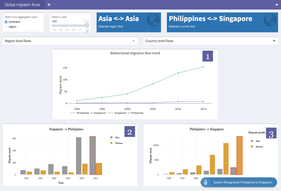
6. After clicking on the collapse, there will be three different charts showing below:
1. This line chart showing that bidirectional migration flow trend from 1990 to 2015 with the selection from country level chord diagram.
2. & 3. These two bar charts showing the migration stock by different genders from 1990 to 2015 with the selection from country level chord diagram.
Mapping migration
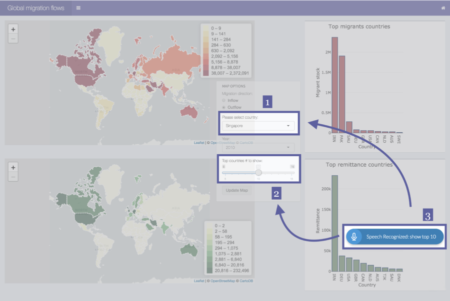
We can also control the bar charts in this tab with voice. Once select the migration direction and year, to make it easier for user to select the country from long list, users can use voice command to change the selections:
After selection of inputs for map, click on the Update Map button, so the map will change. Also, two bar charts showing the top migrant countries and top remittance countries will show. Furthermore, users can change the top countries number to show by using below command:
Command:
Speak: “show top <5/10/15>”
The slider will select the specific number.
E.G
Speak: “show top 5”
The slider will select the top 5 countries for each bar charts.
Unilateral migration
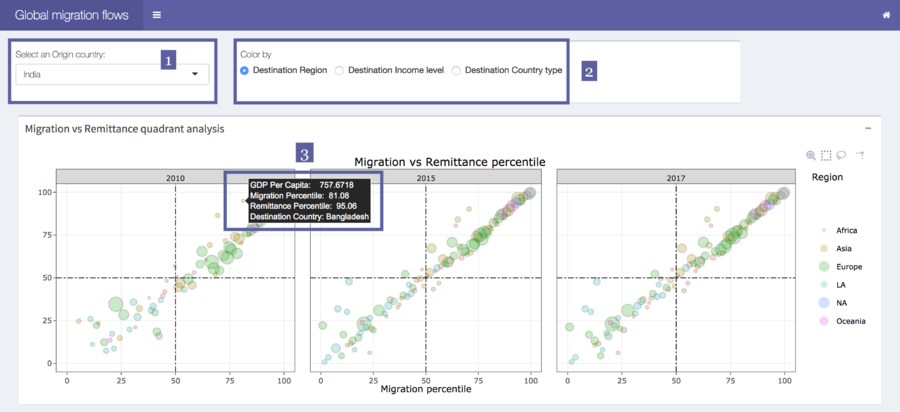
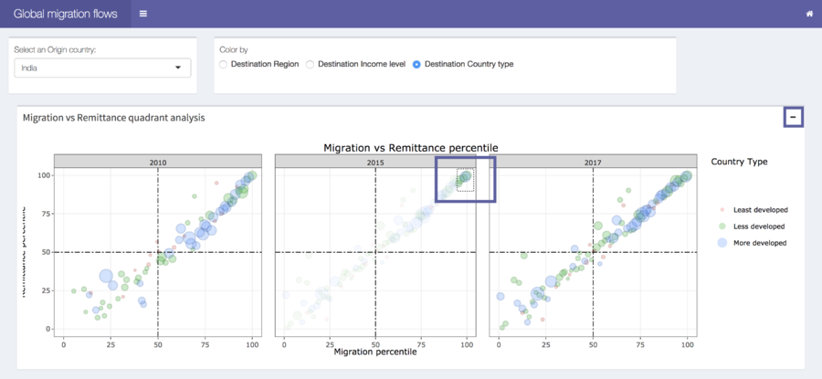
In this tab, we can see the quadrant analysis for the relationship between migration and remittance percentile for a selected origin country.
There are below features for this tab:
1. After select the country and color, it will show the migration versus remittance quadrant analysis for selected country from 2010 to 2017. Also, hover on each point will show the GDP Per Capita, migration percentile, remittance percentile, and destination country name. Also, select country name from a long list is not convenient, users can use below voice command to control it:
Speak: “origin: <country name>”
The country select input will change to the selected country.
E.G
Speak: “country: India”
The country select input will change to India.
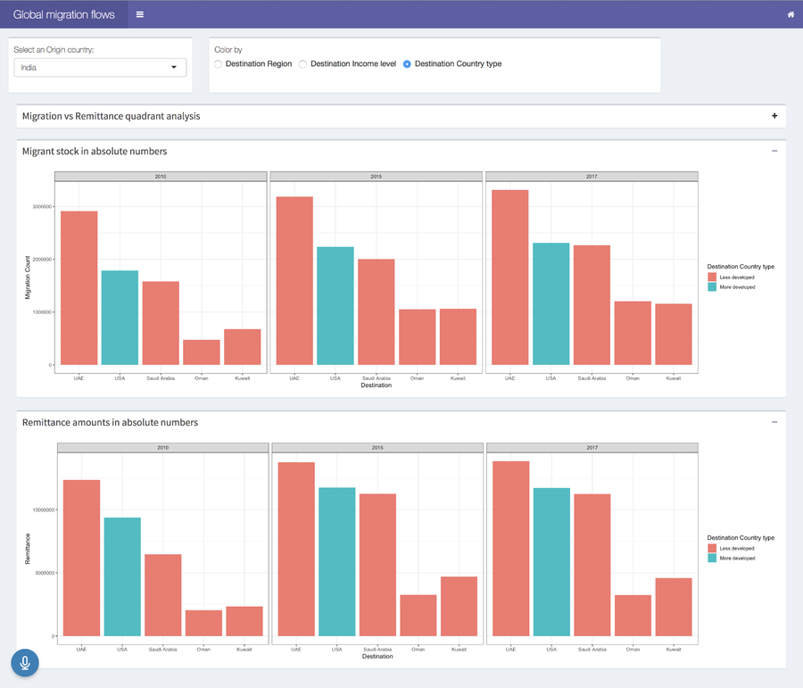
2. Using the box select function from Plotly, users can zoom in to see the detail of selected countries. After box selection, click on the collapse to show bar charts below.
Bilateral migration
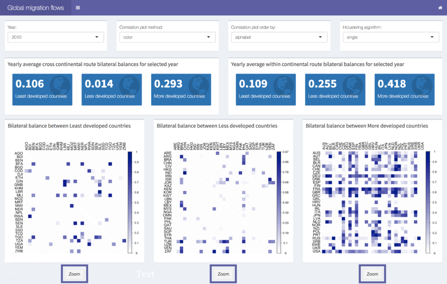
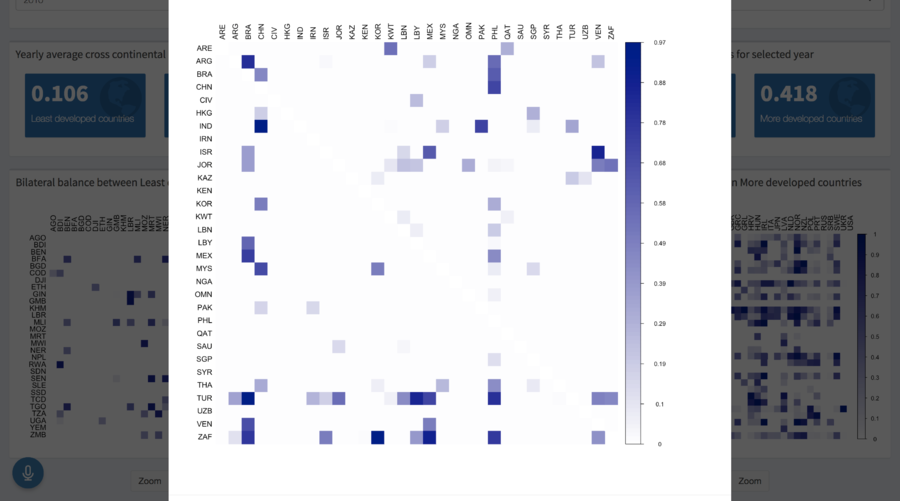
Users can select the year, correlation plot method, correlation plot order, and hierarchy clustering algorithm to decide how to plot the bilateral migration between different country type. Furthermore, user can click on the zoom button to see the plot clearly.
