Difference between revisions of "Group10 Analysis Report"
Xjsong.2017 (talk | contribs) |
Xjsong.2017 (talk | contribs) |
||
| Line 39: | Line 39: | ||
:)) | :)) | ||
</font></div></div> | </font></div></div> | ||
| + | |||
| + | <!-- Voice Integration Methodology --> | ||
| + | == Voice Integration Methodology == | ||
| + | <div style="font-family:Georgia; font-size:100%; padding: 0px 0px 0px 10px;"> | ||
| + | <div style="font-family:Georgia;"> | ||
| + | <font size = 3; color ="#000000 | ||
| + | "> | ||
| + | :)) | ||
| + | </font></div></div> | ||
| + | |||
Revision as of 21:48, 13 August 2018
Voice Driven Visual Analysis of Global Migration
|
|
|
|
|
|
|
Contents
Data Preparation
- ))
Voice Integration Methodology
- ))
Visualization Methodology
1. Chord Diagram
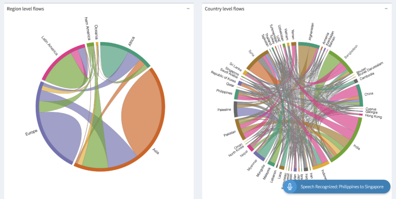
The chord diagram visualises the inter-relationships between entities. The connections between entities are used to display that they share something in common. This makes Chord Diagrams ideal for comparing the similarities within a dataset or between different groups of data. Nodes are arranged along a circle, with the relationships between points connected to each other either using arcs or Bezier curves. Values are assigned to each connection, which is represented proportionally by the size of each arc. Colour can be used to group the data into different categories, which aids in making comparisons and distinguishing groups.
The ‘chorddiag’ package allows to create interactive chord diagrams using the JavaScript visualization library D3 from within R using the html widgets interfacing framework.
The above figure has 2 connected chord diagrams. The chord diagram on the left visualizes migration flows on a continent or a sub region level. Once a flow is selected, the second chord diagram reacts to the change and displays countries accordingly. The country flow migration flow can then be visualized.
2. Choropleth Map
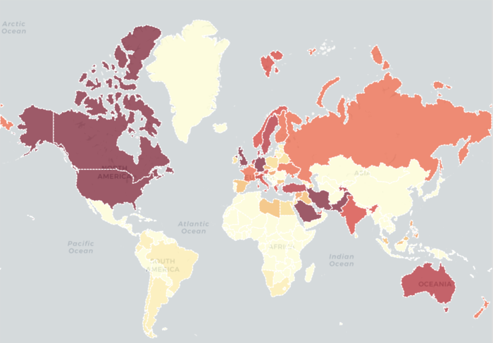
A choropleth map is a thematic map in which areas are shaded or patterned in proportion to the measurement of the statistical variable being displayed on the map, such as population density or per-capita income. Choropleth maps provide an easy way to visualize how a measurement varies across a geographic area or show the level of variability within a region. A heat map is similar but does not use geographic boundaries.
Leaflet is one of the most popular open-source JavaScript libraries for interactive maps. 'leaflet' package makes it easy to integrate and control Leaflet maps in R. Choropleth Maps display divided geographical regions that are coloured in relation to a data variable. This provides a way to visualise values over a geographical area, which can show variation across the displayed location.
In this case, we use choropleth map to display the migration and remittance data and filtering out the top 10 migrants/remittance countries after selecting the origin country using select input. When compared to chord diagram, which can only show the value of the migrants, in this map, we can also see the location of each country to investigate the detail of why people migrate. In this map, the darker the colour the higher the value. Therefore, we can find out the countries with large number of migrants, but with small amount of remittance.
3. Correlation Plot
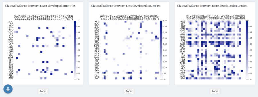
Corrplot contains algorithms to do matrix reordering and is good at details, including choosing colour, text labels, colour labels, layout. The corrplot package is a graphical display of a correlation matrix, confidence interval.
Bilateral balance index is a measure of strength of balance in a bi-directional flow data. It ranges from 0 to 1, with 1 indicating an equally strong flow in both directions.
For any country pair i-j, the bilateral balance is calculated as:
Mij = Migrant stock in j from i in a time period
Mji = Migrant stock in i from j in a time period
The corr plot is used to study the bilateral balance in the migration between countries of same development types. Darker cells in the matrix indicate higher bilateral balance between two countries.
4. Quadrant Plot
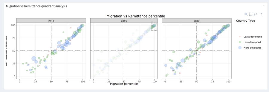
Quadrant Analysis is used to see the relationship between two data variables analysed on four quadrants.
Plotly's R graphing library makes interactive, publication-quality graphs online. Plotly allows users to Zoom, Pan, and Hover Controls in Plotly Graphs. Also, when the user hovers over a point on a scatter plot, the tooltip shows information about this point.
This plot investigates the relationship between migration and remittance percentile for a selected origin country. The bubbles are coloured by region or income level or development type and sized by the GDP Per Capita of the destination country.
Application Design In Detail
- ))
Future Work
- ))
Reference
- ))


