Difference between revisions of "Group03 Report"
Wklim.2017 (talk | contribs) |
Wklim.2017 (talk | contribs) |
||
| (One intermediate revision by the same user not shown) | |||
| Line 203: | Line 203: | ||
This is not a conclusive study as it considers only several aspects of the World Bank data. Other data from subjects such as the environment, rural / urban divide could give valuable insights as well. | This is not a conclusive study as it considers only several aspects of the World Bank data. Other data from subjects such as the environment, rural / urban divide could give valuable insights as well. | ||
| + | |||
| + | =References= | ||
| + | |||
| + | * [1] E.V., T. I. (n.d.). Transparency International. Retrieved from https://www.transparency.org/research/cpi | ||
| + | * [2] World Bank Open Data. (n.d.). Retrieved from https://data.worldbank.org/ | ||
| + | * [3] (n.d.). Retrieved from http://staging.interactive.columnfivemedia.com/world-bank/world-bank-dist/lending.html?_ga=2.186771562.358193220.1533955663-1684441466.1533955663 | ||
| + | * [4] Stream Graph. (n.d.). Retrieved from https://datavizcatalogue.com/methods/stream_graph.html | ||
| + | * [5] (n.d.). Retrieved from http://www.torre.nl/remittances/#?direction=sent | ||
| + | * [6] E.V., T. I. (n.d.). Explanation of how individual country scores of the Corruption Perceptions Index are calculated. Retrieved from https://www.transparency.org/news/pressrelease/explanation_of_how_individual_country_scores_of_the_corruption_perceptions | ||
| + | * [7] Hampdatavisualization, /. (2016, February 26). Schneiderman's Mantra. Retrieved from https://hampdatavisualization.wordpress.com/2016/02/26/schneidermans-mantra/ | ||
| + | * [8] “7 Techniques to Visualize Geospatial Data.” SocialCops, 11 Sept. 2017, blog.socialcops.com/academy/resources/7-techniques-to-visualize-geospatial-data/. | ||
| + | * [9] Kaffenberger, M. (2012). The effect of educational attainment on corruption participation in sub-Saharan Africa (Doctoral dissertation, Vanderbilt University). | ||
| + | * [10] The Link Between Corruption and Gender Inequality: A Heavy Burden for Development and Democracy. (2018, July 13). Retrieved from https://www.wilsoncenter.org/publication/the-link-between-corruption-and-gender-inequality-heavy-burden-for-development-and | ||
| + | * [11] Lučić, D., Radišić, M., & Dobromirov, D. (2016). Causality between corruption and the level of GDP. Economic research-Ekonomska istraživanja, 29(1), 360-379. | ||
Back to Project Group Page | Back to Project Group Page | ||
[[File:Go back.png|40px|frameless|left|link=Project_Groups]] | [[File:Go back.png|40px|frameless|left|link=Project_Groups]] | ||
Latest revision as of 23:57, 12 August 2018
Perceiving Evil: The Study of the Corruption Perception Index
|
|
|
|
|
|
|
Contents
- 1 Issues and Problems
- 2 Motivations and Objectives
- 3 Review and Critic on Past Works
- 4 Visual Design Framework
- 5 Data Table
- 6 Visualization Methodology
- 6.1 User Interface
- 6.2 Geo-Spatial Data Visualization for CPI Overview
- 6.3 Multi-Variate Data Visualization using SlopeGraphs and Parallel Plots for CPI Years and Survey Breakdowns
- 6.4 Multi-Variate Data Visualization using Facet-Wrap Graph and Scatterplots for Gender Equality / Education Graphs
- 6.5 Scatterplot Visualization for Economy Graphs
- 6.6 Grouping Data Visualizations by Topics
- 6.7 The R Packages Used
- 7 Insights from the Topics Studied
- 8 References
Issues and Problems
First launched in 1995, the Corruption Perceptions Index (CPI) has been widely credited with putting the issue of corruption on the forefront of the international policy agenda. Transparency International (TI), is an international non-governmental organization based in Berlin, Germany which acts to combat global corruption and prevent criminal activities arising from corruption.
TI publishes the CPI, annually ranking countries "by their perceived levels of corruption, as determined by expert assessments and opinion surveys. The CPI generally defines corruption as "the misuse of public power for private benefit".
However, it has been a challenge to validate whether CPI is an accurate index to represent corruption. For instance, there is criticism in the usage of CPI’s methodology. Some flaws pointed out included: (1) it is too simplistic to capture CPI by a single score, (2) by measuring perceptions and not actual corruption itself, CPI will probably be reinforcing clichés and stereotypes and lastly (3) CPI measures the public and not private sectors.
Motivations and Objectives
The team’s motivation for this project is two-fold, firstly to understand if the CPI methodology is indeed too simplistic by looking at the underlying data that forms the final CPI for each country. Secondly, the team will like to observe if certain stereotypes that the public may have for different countries and / or regions are justified.
The CPI currently ranks 176 countries on a scale from 100 (very clean) to 0 (highly corrupt). Denmark is the least corrupt country in the world, ranking consistently high among international financial transparency, while the most corrupt country in the world is North Korea, remaining on 8 out of 100 since 2012.
To verify the trends and patterns the CPI has with world statistics, the team referenced the World Bank Open Data website and married the World Development Indicators (WDI) with the CPI data set from Transparency International (from 2012 – 2016).
Our study aims to create an exploratory data visualization app that provides an overarching view of a country’s CPI with its underlying WDI, with emphasis on several aspects:
- Understanding the underlying survey results and metrics which form the final CPI numbers
- Find out if there are correlations between CPI and the 3 Es:
- Equality for Gender (e.g. labour participation rates)
- Economy (e.g. GDP, income gap)
- Education (education attainment, government expenditure on education), through looking at the relevant WDIs.
The reason these 3 topics were selected was that there were previous studies that touched on the relationships between CPI and education [ref 9], equality [ref 10] and economy [ref 11]. In this way, we hope to debunk any stereotypes and myths that the public has for each country.
Review and Critic on Past Works
Visualizing World Bank data is not a novel effort and there has been extensive work done to show the data in an easy-to-understand format, and the team sought to emulate such efforts.
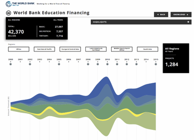
Stream Graph from Column Five
Column Five, a media company that helps to conceptualize and design visualization for other organisations came up with a stream graph implementation of educational financing data for the World Bank.
The Stream Graph is a form of stacked area graph that has values displaced around a varying central baseline. It is most useful to display changes in data over time of different categories through a graph that resembles a flowing stream. The team tried implementing this visualization over multiple categories but due to the number of countries involved, even filtering did not provide a suitable visualization for the data. When the stream graph is implemented on a singular data field, e.g. CPI, it looked like a stacked area graph and did not provide additional useful knowledge.
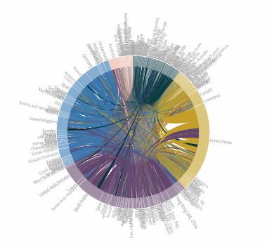
Circular Graph
Circular graphs such as the chord diagrams are popular as they are useful to represent complex information, specifically information that spans numerous categories and if the data set consist of a long axis to show the relationships between the categories. Previous groups (e.g. Group 1 from the 2017/18 Term 1 cohort) have did a commendable job representing complicated data such as the World Bank data set through Circlize in R.
Having said that, there are still limitations to this visualization. For example, as the field of view is limited to 360 degrees, there is a limit to how many variables can be shown at once. Also, it gets hard to compare the different countries’ values as there are over 150 countries. Each country’s values could be accessed through zooming into the visualization, but there are limitations in comparing data region to region or countries within a region. It is an aesthetically pleasing and comprehensive data visualization, but its practicality could be improved. The example below is a Remittance Flow for countries under the United Nations. Again, the countries seem to be clustered together and its readability is affected.
Visual Design Framework
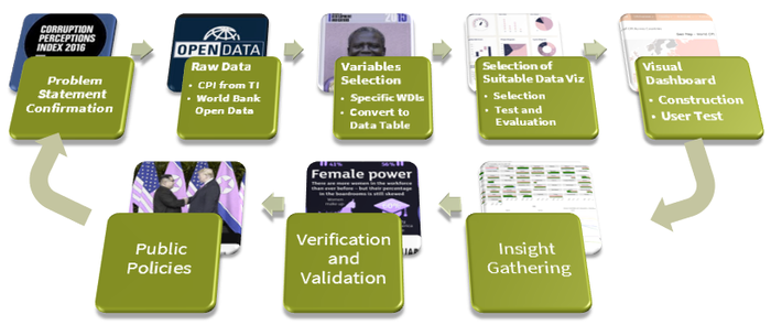
The general approach by the team is to provide a user-friendly interface for data visualization, scalability for future expansion of more fields and self-initiative enough for first-time users to garner insights from. There is a trade-off between aesthetics and usefulness, but the team choose the most appropriate visualizations through an iterative process of acceptance and rejection, before deciding on which techniques and packages are used in the final product. The process below shows our framework (which will be explained in detail in the following sections):
Data Table
Corruption Perception Index (CPI)
As the CPI data is simplistic (a single number to represent the corruption of a country), a further analysis of the underlying measures to derive the index is required. CPI is a composite index which combines 13 international surveys and assessments of corruption, collected by a variety of reputable institutions. The independent institutions specialize in governance and business climate analysis, while none of them are specifically commissioned by Transparency International. The data sources are standardized to a scale of 0 to 100 through conversion to z-scores. A minimum of three sources are required to assess the countries. A country’s CPI score is calculated as the average of all standardized scores available for that country. Examples of survey sources include the Economist Intelligence Unit Country Risk Ratings which assess the credit risk and operational risk. The Economist Group is the research and analysis division, the data analytics arm of the Economist publication.
This data set contained the following columns:
- CPI for 2012 – 2016
- Country and their Annual Rank
- Country Code and its region
- Total population of each country
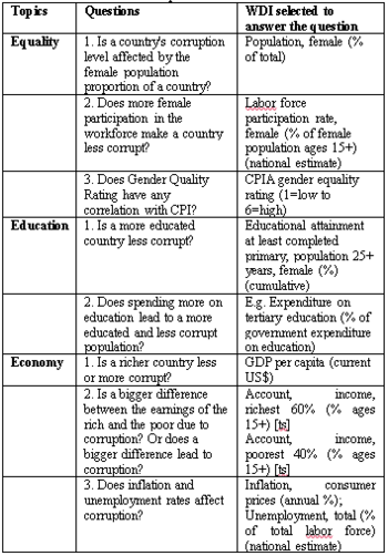
Questions to Ask Using World Development Indicators (WDI)
To find the correlations between CPI and the extensive World Bank data, the team decided to condense the scope of the world bank data set to a few topics by asking some questions, and select the relevant WDI to seek to answer these questions:
The original World Bank Open Data Set we used contained 259,750 rows of data for across 171 countries, which were reduced to approximately 800 rows after pivoting the data.
Visualization Methodology
To design the application we had, we tried to simulate our ideas in Tableau and attempt to emulate them in R, the programming language used for this project. There were things that worked better and things the team tried but did not achieve fully, which formed part of our learning experience.
User Interface
The team followed Schneiderman’s mantra whenever possible, which is to (1) overview first (2) zoom and filter and (3) details on demand. The aspect of details on demand are still a work in progress while we seek to improve our data visualization.
Our colour scheme for the app is blue, putting less strain on the eyes. The top tabs contain 4 section: CPI overview, Equality, Education and Economy, and more sub-tabs depending on the user’s interest. Common and consistent UI elements are used uniformly through the app, with filtering controls for Regions, Axis and/or Years on the right, and visualization and tooltip (if applicable) on the left.
Geo-Spatial Data Visualization for CPI Overview
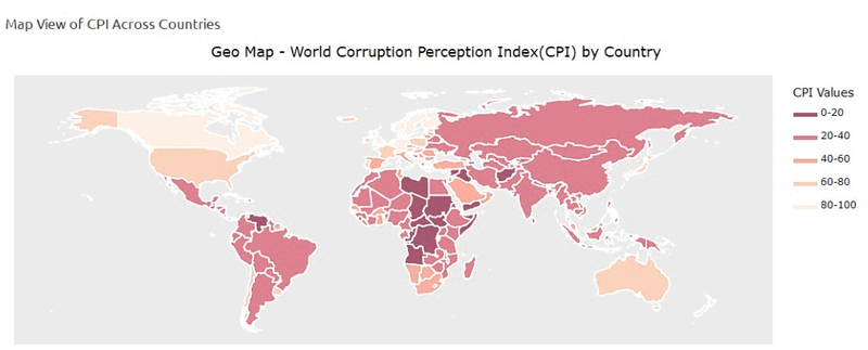
Using a combination of ggmap, ggplot2 and plotly, the team was able to create an interactive map of the entire world and indicate the CPI values of each country based on the intensity of the shaded red. The world map is obtained from ggmap and it was combined with the CPI data into an integrated data frame. With plotly, the user can zoom into different regions of the map, and mousing over the country will show its corresponding CPI value. The right filter allows the users to filter the CPI values by year.
Multi-Variate Data Visualization using SlopeGraphs and Parallel Plots for CPI Years and Survey Breakdowns
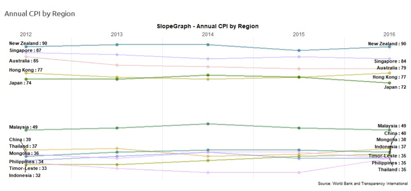
While the map provides a nice aesthetics and interactivity, it does not show the changes in CPI over years for the various countries, and through the amp we can only see the specific CPI for one country at a time. A useful plot to see the CPI index changes over the years would be the SlopeGraph.
From the SlopeGraph, the changes of CPI over the years for each country in a filtered region can be seen. Instead of continents, the data from World Bank was divided into regions, such as East Asia & Pacific, South Asia, Middle East, North America, etc, which is a more initiative division. This is because the countries in each region here tend to more homogeneous and share more common characteristics.
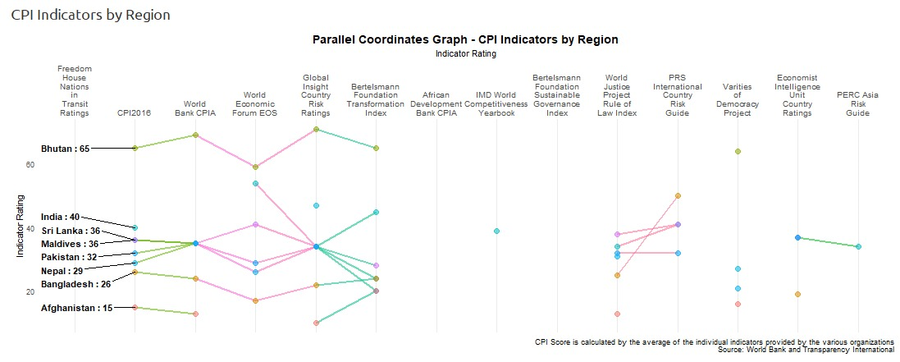
Another visualization for multi-variate data would be the Parallel Coordinates plot. From the previous discussion in section 5.1, the CPI’s underlying measures are 13 international surveys. By using the Parallel Coordinates plot, we can see the correlations between the CPI of the country with the various surveys.
There is a drawback as there are some missing data, since on average, each country used approximately 6 – 8 surveys out of 13 to derive the final CPI. These still gives a relatively good overview of how the individual surveys affect the final CPI.
Multi-Variate Data Visualization using Facet-Wrap Graph and Scatterplots for Gender Equality / Education Graphs
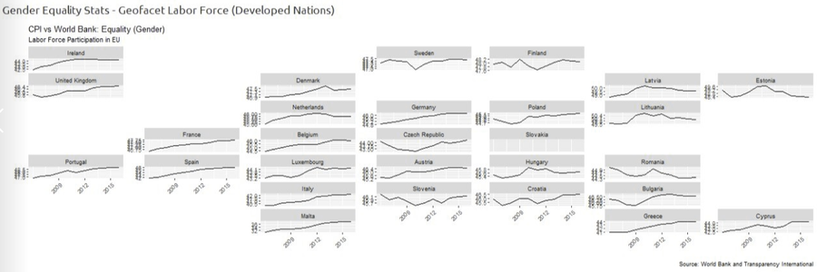
Another useful feature in R will be the multi-facet graphs. There were two versions used in our app. The first version was the GeoFacet package, which provides a flexible way to visualize data for different geographical regions through facet_geo(), a grid that mimics the original geographic topology. A test visualization was done (below) but it was not useful in our case, as the filters are in World Bank-defined regions which is different from the original grids created through GeoFacet.
After several iterations, one possible option made was to stick to the original ggplot2’s built-in faceting. The visualization was informative as it allows the user to have an overview of the variable, e.g. female labour force participation at country level for filtered regions. The team added a selection filter for the y-axis (either free scale or fixed scale) to further understand the trends over the years.
However, it does not adequately show the correlations between CPI and another variable. The final decision was to use scatterplots to show the trends between CPI between any variables. The implementation is further discussed in Section 6.5 below.
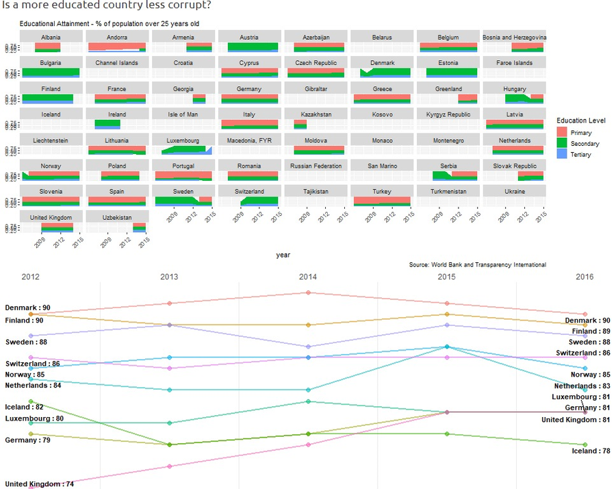
For education attainment, instead of line graphs, the stacked bar graphs are better at conveying information. A thicker pink bar will mean the countries has more people (> 25 years old) with primary school attainment while thicker green and blue bars will mean secondary and tertiary attainment respectively.
Scatterplot Visualization for Economy Graphs
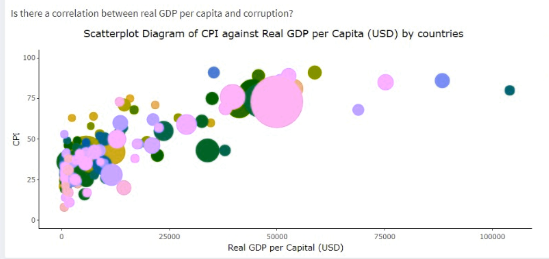
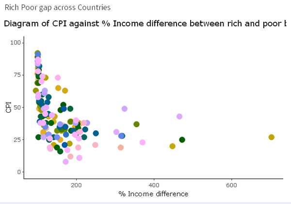
For economic data, the team used scatterplots to see the correlations between CPI and a few metrics, i.e. real GDP per capita, inflation, and income difference. Income difference is an interesting metric as the team took 2 fields: the average income of the richest 60% of the population and the poorest 40% of the population and found the percentage difference to obtain the average income difference. This is an alternate computation to replace the Gini Coefficient, which is the official metric to represent the income / wealth distribution of a country. Below is an example of the economy scatterplot:
Grouping Data Visualizations by Topics
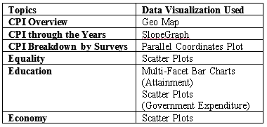
The topics the team investigated, and the corresponding visualizations are summarized in the table below:
The R Packages Used
R, being very flexible and versatile, contained numerous open source packages, which we used.
Insights from the Topics Studied
In 2012, the methodology for computing CPI has been updated to include the 13 survey results. However, in the 5 years of analysis (2012 – 2016), the relative CPI and rank across most countries did not fluctuate.
Equality (for Gender)
Most countries have relatively equal numbers of females and males, and increasing rates of labour participation by the females, which is an encouraging sign for gender equality. In the middle east region, however, two countries stood out for very low proportion of females: United Arab Emirates (UAE) and Qatar, close to 30% for both.
But when we compare it to their CPI, they have the highest CPI as compared to the other countries. These two countries did not follow the typical trends, where gender equality seems to be an indicator of the country’s development, and in turn leads to higher CPI values.
Education
From the European countries’ data, there are strong correlations between educational attainment and CPI. Three of the top four countries in Europe with highest secondary and tertiary attainment: Denmark, Sweden and Switzerland have the highest CPI as well. To confirm whether this is the correct hypothesis, a similar example was shown in another plot.
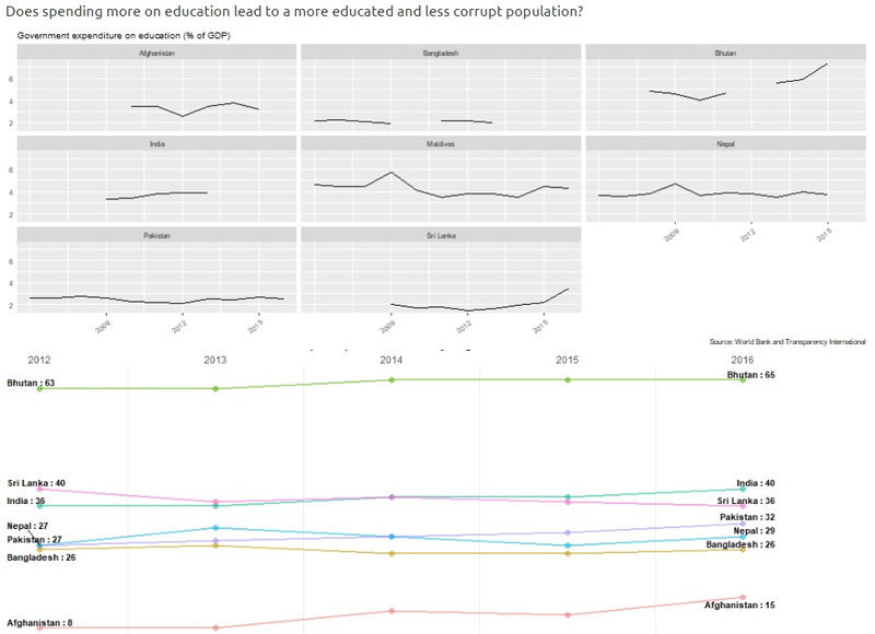
For the government expenditure plot, the team found that in a poorer region such as South Asia where the expenditure on education is approximately 4% across the board, increased percentage by a country like Bhutan (almost 8%) showed a marked difference in CPI. Investment in the education of a population seems to have a positive impact on a country’s propensity to corrupt, by making it less likely for them to corrupt.
Economy
There seems to be a logarithmic normal relationship between the income difference and the CPI across all the countries, as seen from the scatterplot.
It seems that the bigger the difference in the income between the rich and the poor, the lower the CPI. On the other hand, equality in income tends to lead to higher CPI. There are countries that do not follow this norm, such as Rwanda, Senegal and Guinea from the African region.
Preliminary Summary of Observations
We were able to find correlations between several WDIs and CPI, which could also be because the WDIs are representative of how developed a country is. In general, the more developed a country is, the more probable it has gender equality, it is typically richer, and the citizens are more highly educated. This could then lead to a higher CPI.
This is not a conclusive study as it considers only several aspects of the World Bank data. Other data from subjects such as the environment, rural / urban divide could give valuable insights as well.
References
- [1] E.V., T. I. (n.d.). Transparency International. Retrieved from https://www.transparency.org/research/cpi
- [2] World Bank Open Data. (n.d.). Retrieved from https://data.worldbank.org/
- [3] (n.d.). Retrieved from http://staging.interactive.columnfivemedia.com/world-bank/world-bank-dist/lending.html?_ga=2.186771562.358193220.1533955663-1684441466.1533955663
- [4] Stream Graph. (n.d.). Retrieved from https://datavizcatalogue.com/methods/stream_graph.html
- [5] (n.d.). Retrieved from http://www.torre.nl/remittances/#?direction=sent
- [6] E.V., T. I. (n.d.). Explanation of how individual country scores of the Corruption Perceptions Index are calculated. Retrieved from https://www.transparency.org/news/pressrelease/explanation_of_how_individual_country_scores_of_the_corruption_perceptions
- [7] Hampdatavisualization, /. (2016, February 26). Schneiderman's Mantra. Retrieved from https://hampdatavisualization.wordpress.com/2016/02/26/schneidermans-mantra/
- [8] “7 Techniques to Visualize Geospatial Data.” SocialCops, 11 Sept. 2017, blog.socialcops.com/academy/resources/7-techniques-to-visualize-geospatial-data/.
- [9] Kaffenberger, M. (2012). The effect of educational attainment on corruption participation in sub-Saharan Africa (Doctoral dissertation, Vanderbilt University).
- [10] The Link Between Corruption and Gender Inequality: A Heavy Burden for Development and Democracy. (2018, July 13). Retrieved from https://www.wilsoncenter.org/publication/the-link-between-corruption-and-gender-inequality-heavy-burden-for-development-and
- [11] Lučić, D., Radišić, M., & Dobromirov, D. (2016). Causality between corruption and the level of GDP. Economic research-Ekonomska istraživanja, 29(1), 360-379.
Back to Project Group Page

