Difference between revisions of "ISSS608 2017-18 T3 Assign Jyoti Bukkapatil Methodology & Dashboard Design"
| (27 intermediate revisions by the same user not shown) | |||
| Line 1: | Line 1: | ||
| + | |||
| + | <div style=background:#2B3856 border:#A3BFB1> | ||
| + | [[Image:MC3_2018.jpg |200px]] | ||
| + | <b><font size = 5; color="#FFFFFF"> VAST Challenge 2018 MC3 </font></b> | ||
| + | </div> | ||
| + | <!--MAIN HEADER --> | ||
| + | {|style="background-color:#1B338F;" width="100%" cellspacing="0" cellpadding="0" valign="top" border="0" | | ||
| + | | style="font-family:Century Gothic; font-size:100%; solid #000000; background:#2B3856; text-align:center;" width="20%" | | ||
| + | ; | ||
| + | [[ISSS608_2017-18_T3_Assign_Jyoti_Bukkapatil| <font color="#FFFFFF">Background</font>]] | ||
| + | |||
| + | | style="font-family:Century Gothic; font-size:100%; solid #1B338F; background:#2B3856; text-align:center;" width="20%" | | ||
| + | ; | ||
| + | [[ISSS608_2017-18_T3_Assign_Jyoti_Bukkapatil_Data_Preparation| <font color="#FFFFFF">Data Preparation</font>]] | ||
| + | |||
| + | | style="font-family:Century Gothic; font-size:100%; solid #1B338F; background:#2B3856; text-align:center;" width="20%" | | ||
| + | ; | ||
| + | [[ISSS608_2017-18_T3_Assign_Jyoti_Bukkapatil_Methodology_&_Dashboard_Design| <font color="#FFFFFF">Methodology & Dashboard Design </font>]] | ||
| + | |||
| + | | style="font-family:Century Gothic; font-size:100%; solid #1B338F; background:#2B3856; text-align:center;" width="20%" | | ||
| + | ; | ||
| + | [[ISSS608_2017-18_T3_Assign_Jyoti_Bukkapatil_Observations & Insights| <font color="#FFFFFF">Observations & Insights</font>]] | ||
| + | |||
| + | | style="font-family:Century Gothic; font-size:100%; solid #1B338F; background:#2B3856; text-align:center;" width="20%" | | ||
| + | ; | ||
| + | [[ISSS608_2017-18_T3_Assign_Jyoti_Bukkapatil_Conclusion| <font color="#FFFFFF">Conclusion</font>]] | ||
| + | |||
| + | |style="font-family:Century Gothic; font-size:100%; solid #1B338F; background:#2B3856; text-align:center;" width="20%" | | ||
| + | ; | ||
| + | [[Assignment_Dropbox_G1| <font color="#FFFFFF">Back to Dropbox</font>]] | ||
| + | |||
| + | | | ||
| + | |} | ||
| + | |||
| + | |||
| + | |||
| + | |||
==Tools Used == | ==Tools Used == | ||
I have used below four tools for data analysis and visualization. | I have used below four tools for data analysis and visualization. | ||
| Line 8: | Line 45: | ||
== Methodology == | == Methodology == | ||
| − | * | + | Three different Methods of visualisation was used to analyse and visualise provided data by insider . |
| + | *Time Series Plot | ||
| + | *Calender Plot | ||
| + | *Network Graph | ||
| + | |||
| + | ==Time Series Graph == | ||
[[Image:ISSS608_2018_Jyoti_Bukkapatil_Methodology_1.jpg|600px|center|border]] | [[Image:ISSS608_2018_Jyoti_Bukkapatil_Methodology_1.jpg|600px|center|border]] | ||
| Line 14: | Line 56: | ||
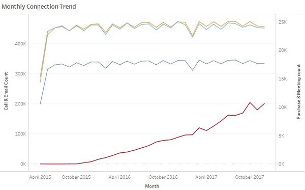
Time series graph was created for four big data files to visualize monthly and hourly pattern of the company's communication and purchase habits. | Time series graph was created for four big data files to visualize monthly and hourly pattern of the company's communication and purchase habits. | ||
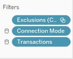
| − | I have used Tableau to create time series patterns. To make the above plot, the fields added to Tableau rows | + | I have used Tableau to create time series patterns. To make the above plot, the fields added to Tableau rows , columns and the filters applied are shown below : |
| − | <div style="float:left;;width: | + | <div style="float:left;;width:40%;"><br/><br/> |
[[Image:ISSS608_2018_Jyoti_Bukkapatil_Methodology_3.jpg|500px|center|border]]<br/> | [[Image:ISSS608_2018_Jyoti_Bukkapatil_Methodology_3.jpg|500px|center|border]]<br/> | ||
<center style="font-size:13px;"> <u>Figure 2</u> </center> | <center style="font-size:13px;"> <u>Figure 2</u> </center> | ||
</div> | </div> | ||
| − | <div style="float:left;;width: | + | <div style="float:left;;width:60%;> |
[[Image:ISSS608_2018_Jyoti_Bukkapatil_Methodology_2.jpg|150px|center|border]]<br/> | [[Image:ISSS608_2018_Jyoti_Bukkapatil_Methodology_2.jpg|150px|center|border]]<br/> | ||
<center style="font-size:13px;"> <u> Figure 3</u> </center> | <center style="font-size:13px;"> <u> Figure 3</u> </center> | ||
</div> | </div> | ||
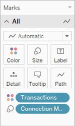
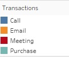
| − | + | Below are fields used added to tableau Marks and colour legend used for graph . Same color legends are also used for hourly timeseries plot . | |
| + | <div style="float:left;;width:60%;"><br/><br/> | ||
| + | [[Image:ISSS608_2018_Jyoti_Bukkapatil_Methodology_8.jpg|150px|center|border]]<br/> | ||
| + | <center style="font-size:13px;"> <u>Figure 4</u> </center> | ||
| + | </div> | ||
| + | <div style="float:right;;width:40%;> | ||
| + | [[Image:ISSS608_2018_Jyoti_Bukkapatil_Methodology_7.jpg|200px|center|border]]<br/> | ||
| + | <center style="font-size:13px;"> <u> Figure 5</u> </center> | ||
| + | </div> | ||
| + | <div style="float:left;;width:100%;"><br/><br/> | ||
Hourly Time series was created to with single vertical axis. This was later added to the tooltip of the calendar view. Below is the combined hourly graph for all four transactions. | Hourly Time series was created to with single vertical axis. This was later added to the tooltip of the calendar view. Below is the combined hourly graph for all four transactions. | ||
[[Image:ISSS608_2018_Jyoti_Bukkapatil_Methodology_4.jpg|600px|center|border]] | [[Image:ISSS608_2018_Jyoti_Bukkapatil_Methodology_4.jpg|600px|center|border]] | ||
| − | <center style="font-size:13px;"> <u>Figure | + | <center style="font-size:13px;"> <u>Figure 6</u> </center> |
To make the above plot, the fields added to Tableau rows and columns and the filters applied are shown below: | To make the above plot, the fields added to Tableau rows and columns and the filters applied are shown below: | ||
<div style="float:left;;width:60%;"><br/><br/> | <div style="float:left;;width:60%;"><br/><br/> | ||
[[Image:ISSS608_2018_Jyoti_Bukkapatil_Methodology_5.jpg|500px|center|border]]<br/> | [[Image:ISSS608_2018_Jyoti_Bukkapatil_Methodology_5.jpg|500px|center|border]]<br/> | ||
| − | <center style="font-size:13px;"> <u>Figure | + | <center style="font-size:13px;"> <u>Figure 7</u> </center> |
</div> | </div> | ||
| − | <div style="float: | + | <div style="float:right;;width:40%;> |
[[Image:ISSS608_2018_Jyoti_Bukkapatil_Methodology_6.jpg|150px|center|border]]<br/> | [[Image:ISSS608_2018_Jyoti_Bukkapatil_Methodology_6.jpg|150px|center|border]]<br/> | ||
| − | <center style="font-size:13px;"> <u> Figure 3</u> </center> | + | <center style="font-size:13px;"> <u> Figure 8</u> </center> |
| + | </div> | ||
| + | |||
| + | Tooltip filter in Figer 8 is automatically generated tooltip because this graph is used in the tooltip of the calendar plot. Below are color legends used for both monthly and hourly time series graph. | ||
| + | |||
| + | ==Calendar Plot== | ||
| + | |||
| + | [[Image:ISSS608_2018_Jyoti_Bukkapatil_Methodology_10.jpg|600px|center|border]] | ||
| + | <center style="font-size:13px;"> <u>Figure 10</u> </center> | ||
| + | |||
| + | The Calendar plot is a representation of monthly calendar to show the number of interactions on daily basis. Date from May 2015 till Oct 2015 was excluded for better visualization of the trend for next two year and two months. So calendar view is actually from the Year 2015 Q4 till 2017 Q4. | ||
| + | |||
| + | To make the above plot, the fields added to Tableau rows and columns and the filters applied are shown below: | ||
| + | <div style="float:left;;width:60%;"><br/><br/> | ||
| + | [[Image:ISSS608_2018_Jyoti_Bukkapatil_Methodology_11.jpg|500px|center|border]]<br/> | ||
| + | <center style="font-size:13px;"> <u>Figure 11</u> </center> | ||
| + | </div> | ||
| + | <div style="float:right;;width:40%;> | ||
| + | [[Image:ISSS608_2018_Jyoti_Bukkapatil_Methodology_13.jpg|150px|center|border]]<br/> | ||
| + | <center style="font-size:13px;"> <u> Figure 12</u> </center> | ||
| + | </div> | ||
| + | |||
| + | As shown above, the DateTime field was modified to show the month, week and weekdays in the respective columns and rows. The Marks card and Tooltip configuration in Tableau for this chart is shown below: | ||
| + | |||
| + | <div style="float:left;;width:40%;"><br/><br/> | ||
| + | [[Image:ISSS608_2018_Jyoti_Bukkapatil_Methodology_12.jpg|150px|center|border]]<br/> | ||
| + | <center style="font-size:13px;"> <u>Figure 13</u> </center> | ||
| + | </div> | ||
| + | <div style="float:center;;width:60%;> | ||
| + | [[Image:ISSS608_2018_Jyoti_Bukkapatil_Methodology_14.jpg|400px|center|border]]<br/> | ||
| + | <center style="font-size:13px;"> <u> Figure 14</u> </center> | ||
| + | </div> | ||
| + | |||
| + | ==Network Graph== | ||
| + | |||
| + | The network graph is the representation of communications and Purchases took place among suspicious employees and other employees in the company. | ||
| + | The tool used to create network graph is Gephi 0.9.2. Below are the steps to load Edge and node files to the tool. Two different workspaces created in Gephi. | ||
| + | |||
| + | #To create Workspace"Suspicious Only", Suspicious_All.csv file was loaded as Edge file. Node list for Suspicious employees was created by mapping IDs with Names from CompanyIndex.csv file provided in data sources. Name for node file is “Suspicious_Node list.csv” Total 20 nodes and 137 Edges (Suspicious Connections) were loaded. This network Graph is the representation of Suspicious interactions between 20 suspicious employees. | ||
| + | I have used colors for Suspicious nodes same as modularity class which represents the group which they belong to in the organization. | ||
| + | |||
| + | <div style="float:left;;width:40%;"><br/><br/> | ||
| + | [[Image:ISSS608_2018_Jyoti_Bukkapatil_Methodology_15.jpg|500px|center|border]]<br/> | ||
| + | <center style="font-size:13px;"> <u>Figure 15</u> </center> | ||
| + | </div> | ||
| + | <div style="float:right;;width:60%;> | ||
| + | [[Image:ISSS608_2018_Jyoti_Bukkapatil_Methodology_16.jpg|500px|center|border]]<br/> | ||
| + | <center style="font-size:13px;"> <u> Figure 16</u> </center> | ||
| + | </div> | ||
| + | |||
| + | 2. Workspace was created for Total interactions of suspicious employees with other employees from the company. Edge file Suspicious Association Total.csv was used for this graph. Node list for Suspicious employees was created by mapping IDs with Names from CompanyIndex.csv file provided in data sources. Name of node file is “Suspicious Association Node list.csv”. Size for all suspicious Nodes was fixed at max for range (500) to show them in bigger group interactions. | ||
| + | |||
| + | <div style="float:left;;width:40%;"><br/><br/> | ||
| + | [[Image:ISSS608_2018_Jyoti_Bukkapatil_Methodology_19.jpg|400px|center|border]]<br/> | ||
| + | <center style="font-size:13px;"> <u>Figure 17</u> </center> | ||
| + | </div> | ||
| + | <div style="float:right;;width:60%;> | ||
| + | [[Image:ISSS608_2018_Jyoti_Bukkapatil_Methodology_20.jpg|500px|center|border]]<br/> | ||
| + | <center style="font-size:13px;"> <u> Figure 18</u> </center> | ||
| + | </div> | ||
| + | |||
| + | |||
| + | 3. For finding our other employees which might have been closely associated with 20 suspicious employees, Network graph in figure 18 was filtered based on Betweenness centrality and data was copied to the new workspace for further analysis. Details of these findings are described in [https://wiki.smu.edu.sg/1718t3isss608/index.php?title=ISSS608_2017-18_T3_Assign_Jyoti_Bukkapatil_Observations_%26_Insights&action=edit&redlink=1 The "Observations and Insight"] section. | ||
| + | Throughout network graph analysis fixed color legends are used. Node color legends are based on modularity class of Suspicious Employees organizational group in a company ( from network graph figure 18) and Edge color legends represents communication mode. | ||
| + | |||
| + | <div style="float:left;;width:40%;"> | ||
| + | [[Image:ISSS608_2018_Jyoti_Bukkapatil_Methodology_17.jpg|200px|center|border]]<br/> | ||
| + | <center style="font-size:13px;"> <u>Figure 19</u> </center> | ||
| + | </div> | ||
| + | <div style="float:right;;width:60%;> | ||
| + | [[Image:ISSS608_2018_Jyoti_Bukkapatil_Methodology_18.jpg|200px|center|border]]<br/> | ||
| + | <center style="font-size:13px;"> <u> Figure 20</u> </center> | ||
</div> | </div> | ||
| − | + | ||
| − | + | ||
| + | 4. To analyze data over the time interval, I grouped interactions for every month in one group and created start and end date . for example, for all interactions happened in Nov 2015 end date will be 1st Dec 2015. | ||
| + | 5. For analyzing data over time I used two filters, One Dynamic time interval filter and after filtering edges for particular time interval calculated degree again and added degree in subfilter to filter out all those nodes with 0 degrees / those who don't have any connections. | ||
| + | |||
| + | ==<big>Dashboard Design</big>== | ||
| + | *Tableau Dashboard : | ||
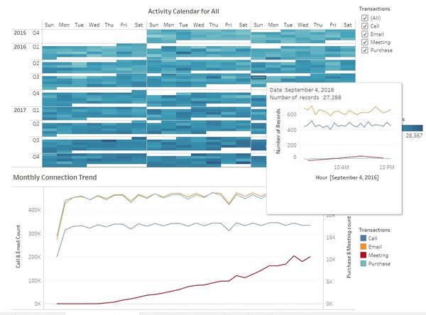
| + | Tableau dashboard was designed to give one picture view of communications and purchase patterns for 2 & half years time period. The view will provide patterns based on monthly, daily and hourly transactions. | ||
| + | |||
| + | [[Image:ISSS608_2018_Jyoti_Bukkapatil_Methodology_21.jpg|600px|center|border]] | ||
| + | <center style="font-size:13px;"> <u>Figure 21</u> | ||
| + | |||
| + | *Interactive Network graphs were extracted using SigmaExporter plugin of Gephi. | ||
Latest revision as of 08:15, 12 July 2018
|
|
|
|
|
|
|
Contents
Tools Used
I have used below four tools for data analysis and visualization.
- JMP Pro 13 - Used for Data Preparation
- Tableau 2018.1 - Used to create a Calendar View and Timer Series Graph for All transactions in company
- Gephi 0.9.2 - Used to create Network Graph
- Microsoft Excel - Used to map Employee ID with Name
Methodology
Three different Methods of visualisation was used to analyse and visualise provided data by insider .
- Time Series Plot
- Calender Plot
- Network Graph
Time Series Graph
Time series graph was created for four big data files to visualize monthly and hourly pattern of the company's communication and purchase habits. I have used Tableau to create time series patterns. To make the above plot, the fields added to Tableau rows , columns and the filters applied are shown below :
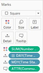
Below are fields used added to tableau Marks and colour legend used for graph . Same color legends are also used for hourly timeseries plot .
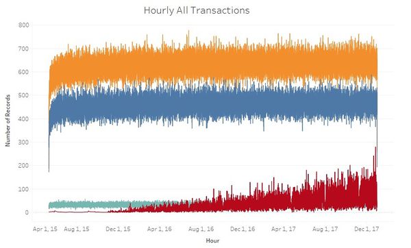
Hourly Time series was created to with single vertical axis. This was later added to the tooltip of the calendar view. Below is the combined hourly graph for all four transactions.
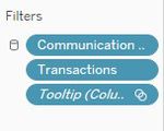
To make the above plot, the fields added to Tableau rows and columns and the filters applied are shown below:
Tooltip filter in Figer 8 is automatically generated tooltip because this graph is used in the tooltip of the calendar plot. Below are color legends used for both monthly and hourly time series graph.
Calendar Plot
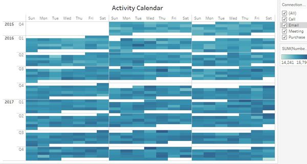
The Calendar plot is a representation of monthly calendar to show the number of interactions on daily basis. Date from May 2015 till Oct 2015 was excluded for better visualization of the trend for next two year and two months. So calendar view is actually from the Year 2015 Q4 till 2017 Q4.
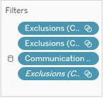
To make the above plot, the fields added to Tableau rows and columns and the filters applied are shown below:
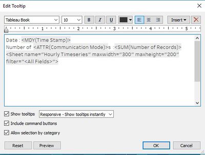
As shown above, the DateTime field was modified to show the month, week and weekdays in the respective columns and rows. The Marks card and Tooltip configuration in Tableau for this chart is shown below:
Network Graph
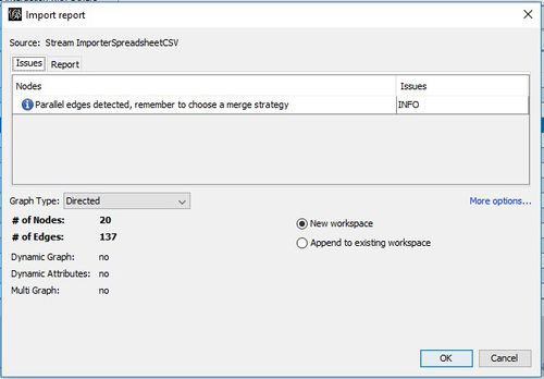
The network graph is the representation of communications and Purchases took place among suspicious employees and other employees in the company. The tool used to create network graph is Gephi 0.9.2. Below are the steps to load Edge and node files to the tool. Two different workspaces created in Gephi.
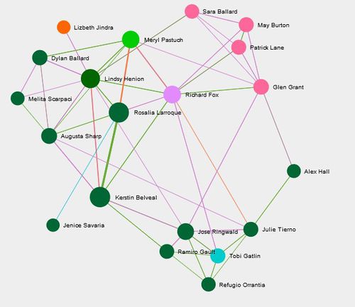
- To create Workspace"Suspicious Only", Suspicious_All.csv file was loaded as Edge file. Node list for Suspicious employees was created by mapping IDs with Names from CompanyIndex.csv file provided in data sources. Name for node file is “Suspicious_Node list.csv” Total 20 nodes and 137 Edges (Suspicious Connections) were loaded. This network Graph is the representation of Suspicious interactions between 20 suspicious employees.
I have used colors for Suspicious nodes same as modularity class which represents the group which they belong to in the organization.
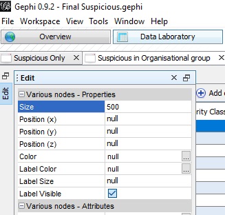
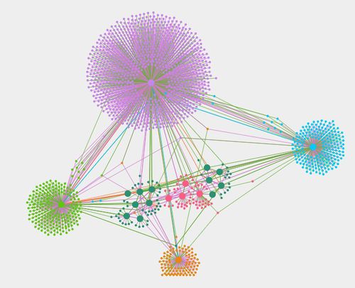
2. Workspace was created for Total interactions of suspicious employees with other employees from the company. Edge file Suspicious Association Total.csv was used for this graph. Node list for Suspicious employees was created by mapping IDs with Names from CompanyIndex.csv file provided in data sources. Name of node file is “Suspicious Association Node list.csv”. Size for all suspicious Nodes was fixed at max for range (500) to show them in bigger group interactions.
3. For finding our other employees which might have been closely associated with 20 suspicious employees, Network graph in figure 18 was filtered based on Betweenness centrality and data was copied to the new workspace for further analysis. Details of these findings are described in The "Observations and Insight" section.
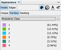
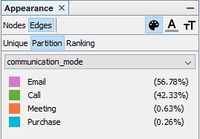
Throughout network graph analysis fixed color legends are used. Node color legends are based on modularity class of Suspicious Employees organizational group in a company ( from network graph figure 18) and Edge color legends represents communication mode.
4. To analyze data over the time interval, I grouped interactions for every month in one group and created start and end date . for example, for all interactions happened in Nov 2015 end date will be 1st Dec 2015. 5. For analyzing data over time I used two filters, One Dynamic time interval filter and after filtering edges for particular time interval calculated degree again and added degree in subfilter to filter out all those nodes with 0 degrees / those who don't have any connections.
Dashboard Design
- Tableau Dashboard :
Tableau dashboard was designed to give one picture view of communications and purchase patterns for 2 & half years time period. The view will provide patterns based on monthly, daily and hourly transactions.
- Interactive Network graphs were extracted using SigmaExporter plugin of Gephi.

