Difference between revisions of "1718t2is415T2 G3 MyHawker ProjectDetails"
| Line 84: | Line 84: | ||
<div style="border-left: #C0C0C0 solid 10px;font-family: Helvetica; padding: 0px 30px 0px 18px; "> | <div style="border-left: #C0C0C0 solid 10px;font-family: Helvetica; padding: 0px 30px 0px 18px; "> | ||
<br/> | <br/> | ||
| + | ===Overview of functions=== | ||
[[File:AppFunctions.png|940px|center]]<br/> | [[File:AppFunctions.png|940px|center]]<br/> | ||
| + | |||
| + | {| class="wikitable" | ||
| + | |- | ||
| + | ! Image !! Explanation | ||
| + | |- | ||
| + | | [[File:Multiple dates.png|100px|frameless|center|Select more than one dates as input]] || By choosing the dates and hours in the sidebar, user can view the commuters flow under different time periods and make a comparison. The user can also choose multiple dates, as the application will display the map based on the average flow. Shown as the picture, the map will show the average number of flows at 7am of both 2016-02-20 and 2016-02-21. | ||
| + | |- | ||
| + | | [[File:Segment.png|150px|frameless|center|Flow between two areas]] [[File:Inflow.png|100px|frameless|center|In-flow of an area]] || | ||
| + | As the legend of the map indicates, the three different colours of the circles represent the status of the flow of each area. The segment represents the in-flow between two areas, where the width of the segments indicates the flow size. The flow is always pointing towards the dominant area, namely the area with larger circle. | ||
| + | |- | ||
| + | | [[File:Internal.png|150px|frameless|center|Internal flow within one area]] [[File:Total.png|100px|frameless|center|The total flow]] [[File:Control.png|100px|frameless|center|The control panel of the map]] || By choosing different layer in the control panel, user can view the internal and total flows as well. The size of circles also indicates the size of the flow. | ||
| + | |- | ||
| + | | [[File:K.png|150px|frameless|center|K value]] || By choosing the k value using the slide bar, user can view the flows which are at least k% of the sum of outgoing flows for each urban area. | ||
| + | |} | ||
| + | |||
</div> | </div> | ||
| + | |||
| + | |||
<!-- END OF APPLICATION FUNCTIONS---> | <!-- END OF APPLICATION FUNCTIONS---> | ||
Revision as of 20:35, 10 April 2018
Visualizing The Accessibility of Hawker Centres
Motivation
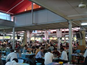
Hawker centres are a unique aspect of Singaporean culture, where people from all walks of life are able to enjoy local food. Besides offering delicacies from different cultures and having a clean and hygienic environment for the comfort of everyone, it is important for hawker centres to be situated at accessible locations. Furthermore, with the ageing population in Singapore, ensuring that hawker centres are accessible (i.e. is within walkable distance and is connected to public transport) is even more beneficial to them. With NEA being the main regulator our hawker centres, they have announced plans to build 20 new hawker centres in Singapore[1]. With this in mind, we thought about how we could provide value to their planning through analysis and evaluations of current and future developments.
Current GIS software tools are only able to provide basic analytics capability, our team believes that we are able to develop a better solution that is able to provide more insights for urban planners to make better decisions. Our team will be using R to develop a customized web tool using and Hansen Accessibility Index to help achieve our objectives.
Objectives
We set out to achieve three simple objectives by assisting urban planners to:
- Measure accessibility of hawker centres in Singapore by analyzing current locations of Hawker centres, residential areas and enable easy visualization of the accessibility on the map
- Find out if there is a shortage or surplus of hawker centres in certain areas
- Propose possible areas for future hawker centre developments
Data Sources
Sources
- Subzone planning zone with population data, taken from (https://data.gov.sg/dataset/singapore-residents-by-subzone-and-type-of-dwelling-june-2016)
- Location of public hawker centres, taken from (https://data.gov.sg/dataset/hawker-centres)
- Location of private hawker centres, taken from (http://www.kopitiam.biz/search-results/; https://www.foodjunction.com/outlets/; http://www.koufu.com.sg/casual-dining/koufu-singapore)br/>
- Location of private and public residential homes, taken from (http://download.bbbike.org/osm/bbbike/Singapore/)
- Location of bus stops, taken from (https://www.mytransport.sg/content/mytransport/home/dataMall/static-data.html)
Cleaning and Processing:
- 42 data points of private hawker centres automatically scrapped (http://webscraper.io/), geocoded from a website (https://www.doogal.co.uk/BatchGeocoding.php), converted to SVY21 (http://dominoc925.blogspot.com/p/svy21-coordinate-converter.html), included column of point of interest and seating capacity.
- 115 data points of public hawker centres obtained from shapefile, geocoded to SVY21 using QGIS, included column of point of interest and seating capacity in csv.
- 4,861 data points of bus stops obtained from shapefile, geocoded to SVY21 using QGIS, included column of subzone name using subzone planning with population data.
- 12,578 data points of residential obtained from shapefile, included centroid and geocoded to SVY21 using QGIS, included column of subzone name and population using subzone planning zone with population data.
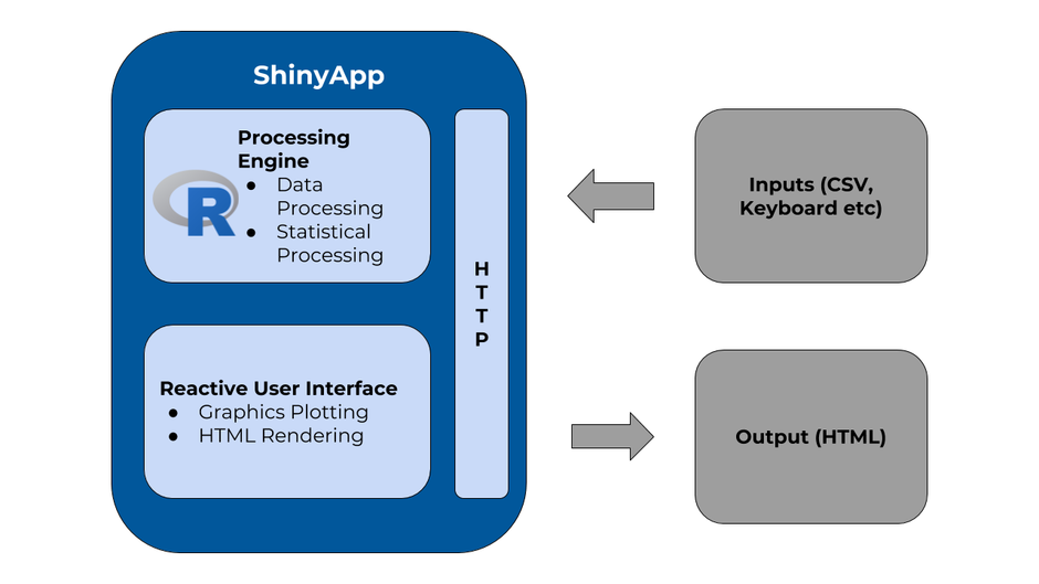
System Architecture
Application Functions
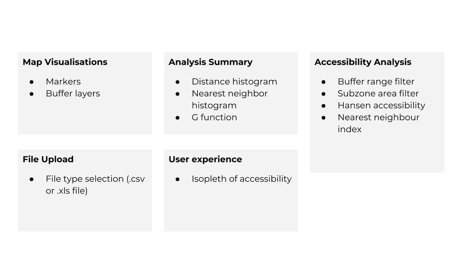
Overview of functions
| Image | Explanation |
|---|---|
| By choosing the dates and hours in the sidebar, user can view the commuters flow under different time periods and make a comparison. The user can also choose multiple dates, as the application will display the map based on the average flow. Shown as the picture, the map will show the average number of flows at 7am of both 2016-02-20 and 2016-02-21. | |
|
As the legend of the map indicates, the three different colours of the circles represent the status of the flow of each area. The segment represents the in-flow between two areas, where the width of the segments indicates the flow size. The flow is always pointing towards the dominant area, namely the area with larger circle. | |
| By choosing different layer in the control panel, user can view the internal and total flows as well. The size of circles also indicates the size of the flow. | |
| By choosing the k value using the slide bar, user can view the flows which are at least k% of the sum of outgoing flows for each urban area. |
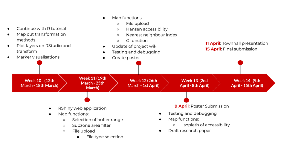
Timeline and Milestones
Key Challenges
- The residential address taken from Open Street Map was not a recent version and it is not an exhaustive list
- As a result, the lack of all the residential addresses could affect the results of the accessibility analysis.
- As a result, the lack of all the residential addresses could affect the results of the accessibility analysis.
- Our team was unfamiliar with R and we needed to learn it in a short span of time
- It is because R uses a different syntax and sometimes we have the expectation to work like other programming languages we have learnt.
Tools and Technologies
- QGIS
- R Studio
- R Shiny
- Leaflet
- R libraries
- shiny
- leaflet
- rgdal
- dplyr
- plyr
- maptools
- shinydashboard
- REAT
- SpatialAcc
- ggmap
- SpatialPosition
- sp
- maptools
- shinyBS
- shinyJS
Future Works
- Combine data demo more public places e.g. schools, office buildings, transport routes
- Currently the projects focuses on the accessibility off residential areas and bus stops to hawker centre. Expanding out data set will give us a new insight and allow for a more comprehensive analysis of accessibility.
- Highlight the data points that are being analyzed for accessibility
- Doing so would allow users to visualise the data points the analysis is abased on and enhance their understanding of the Hasen Accessibility Model
References
Comments
|
No. |
Name |
Date |
Comments |
|
1. |
Insert your Name here |
Insert Date here |
Insert Comment here |
|
2. |
Insert your Name here |
Insert Date here |
Insert Comment here |
|
3. |
Insert your Name here |
Insert Date here |
Insert Comment here |


