G7 Report
|
|
|
|
|
Contents
Objective and Motivation
Pronto Cycle Share was a public bicycle sharing system in Seattle, that operated from 2014 to 2017. The system, owned initially by a non-profit and later by the Seattle Department of Transportation, included 58 stations in the city's central neighbourhoods and above 500 bicycles.
Bike-sharing is a short distance transportation for people to make their life more convenient. When people use shared-bike, they can borrow and return bikes at any service stations. Some stations have too many incoming bike and get jammed without enough docks for upcoming bikes, while some other stations get empty quickly and lack enough bikes for people to check out.
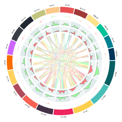
Based on this problem, we want to measure the popularity of each station by calculating the degree, so that we can know which station people usually go to pick up or drop bike. And we also want to use different time ranges to monitor the degree difference for each station, so we can find what time the station will have lots of bike to pick up, or what time that there is no bike is available. Finally, we want to use the above information to provide company a route to re-dispatch bike among all the stations at a lower cost.
Data Preparation
Dataset
Our datasets are from Kaggle, there are three datasets named “Station”, “Trip” and “Weather” respectively. Station dataset records the information related to each station, we can get station id, station position and other useful data from here. Trip dataset is the most dataset in our project, from it we can get the date information of a trip to support us to do time series analysis, and the start and end station information to calculate the degree for each station. Weather dataset records the weather and temperature information of each day. However, this time, we didn’t use this dataset.
Handle with date data
R packages used
Circlize
This package can help us to plot any graph like bar chart, line chart or histogram, into a circle region. We use this package is because it is useful, can plot beautiful graph, and what the most important is it’s friendly to beginners. We can easily to plot a basic graph after reading an example. In addition, this package also can help us to make some fantastic graph and to do some special analysis like Genomics. However, it also has some shortages, in my opinion, I think it cannot provide too many interactive functions as plotly.
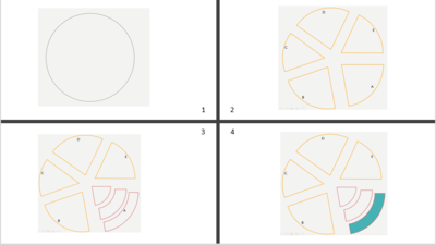
Here is the basic concept of this package. For example, assume that we have a circle, the package firstly will divide the circle into some factors sectors based on how many factors you have. Then, for each factor sector, the package will divide it again into different tracks. So, after that, we can get lots of circle regions which we call them cell. The cell is the place that allow us to plot graph inside. And usually, the plotting order is from outside to inside, the direction is from “A” to “E”. So, this is how the circlize package works.


