Group06 Report
|
|
|
|
|
Contents
MOTIVATION
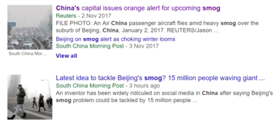
On Nov 4th, Beijing Environmental Protection Agency released the news, owing to the adverse weather conditions and early winter heating as well as other factors, it is expected that there will be a continuous 4-day regional heavily polluted air quality in Beijing-Tianjin-Hebei and surrounding areas on November 4th, in addition, the air quality in some cities may reach serious pollution level….
“Why is China’s smog so bad now?”, a lot of people from overseas want to explore. With the rapid development of economy in China, news from China is more frequently commented in the globe. China’s air pollution has been a serious issue for more than 10 years, with the problem appealing more attention worldwide, the Chinese government has make big efforts to solve it.
China's capital Beijing is under pressure to bring average PM2.5 readings to 60 micrograms per cubic meter this year, which has decreased from 73 micrograms since last year. Nonetheless, the index is still higher than the official air quality standard value in China Mainland.
Along with the increasing escalation of air pollution, most people who are working and living in Beijing are faced with the tracheitis, pneumoconiosis, asthma, to name just a few. Nowadays, current air quality fails to meet people's expectation. Gradually, a lot of people are terrified with living and working in Beijing.
In our project, we mean to apply the visual analytics tools to better visualize the changes of air quality according its existing indicators. We will show the fluctuation of the historical AQI (Air Quality Index), the pollutant concentrations and trend charts by pollutants in the different view point in Beijing. We hope that we can try our best to show the weather condition, make people clearly know more about the surroundings they are living in as well as raise the public awareness of environmental protection.
REVIEW AND CRITIQUE OF PRIOR WORK
DATA PREPARATION
1.Dataset Introduction
- Beijing air quality dataset was collected from Beijing Municipal Environmental Monitor Center
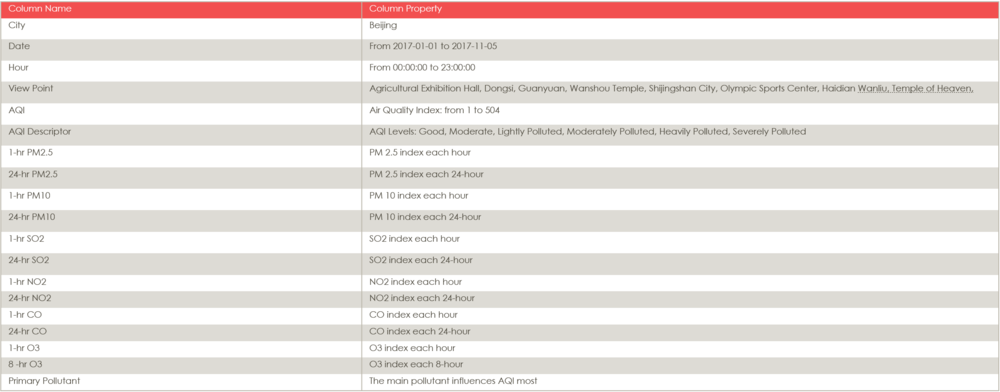
- This data contains 7 kinds of air quality indexes: AQI (Air Quality Index), PM2.5, PM10, SO2, NO2, CO, O3.
- We only choose data from 2017-01-01 to 2017-11-05 as our target dataset.
- The selected data contains 87,361 record rows.
- The columns including:
* AQI Tips *
- AQI, which is named Air Quality Index, acts as the criteria of the air quality measurement tool.
- AQI is calculated by 4 major air pollutants: ground level ozone, particle pollution, carbon monoxide, and sulfur dioxide.
- An individual score (IAQI) is assigned to the level of each pollutant and the final AQI is the highest of those 6 scores. The pollutants can be measured quite differently. PM2.5、PM10 concentration are measured as average per 24h. SO2, NO2, O3, CO are measured as average per hour. The final API value is calculated per hour according to a formula published by the MEP.[Introduction to AQI]
- The following table shows the AQI category, pollutants and health breakpoints:
2.Data Pre-processing
Main Steps:
- Missing data interpretation
- Missing values (NAs) are replaced by linear interpolation via approx
- Six pollutants scoring
We assigned a score from one to six to each pollutant (PM10, PM2.5, NO2, SO2, CO, O3)
DESIGNED FRAMEWORK
1.Interface
1.1 Page 1:
1.2 Page 2:
1.3 Page 3:
1.4 Page 4:
2.Analytical Visualizations
2.1 Line Chart:
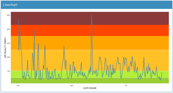
Fluctuation of Beijing AQI
- Description: In this line chart, we visualize the changes of AQI levels and AQI index within the specific range. Here, we select the date range from Jan 1st, 2017 to Aug 31st, 2017 to display the fluctuation of AQI. From this chart, it can be noticeable that there is a peak of AQI in the month of May, which has reached the severely polluted level of air quality.
- R Packages: ggplot2
2.2 Bar Chart:
Frequency of Beijing AQI Levels
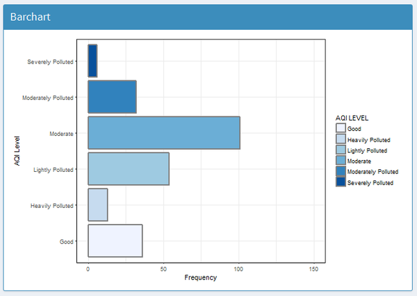
- Description: in this bar chart, we mainly tend to display the frequency of AQI levels within selected date range. As you can see from the above paragraph, there are 6 official AQI levels for us to confirm the condition of air pollution. It can be observed that "Moderate" level of air quality accounts for highest frequency from Jan 1st to Aug 31st, 2017.
- R Packages: ggplot2
2.3 Spider Chart:
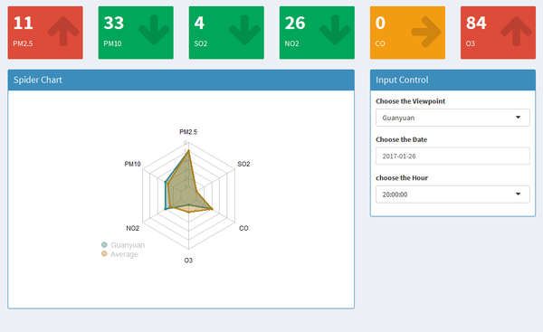
- Description: The spider chart shows the severity of each pollutant. The larger the score is, more sever the pollutants are. The blue shade shows the pollutant levels under selected date, hour and area and yellow shade represents the average level for all the areas under selected date and hour. The box above the graph indicates the exact pollutant index. Compared with index in one hour before selected hour, the red, yellow, green represents increase, maintain and decrease separately.
- R Packages: fmsb
fmsb: radarchart() in 'fmsb' package offer a plotting function that draws radar/spider chart, similar to stars() in base package.
2.4 Raster Map:
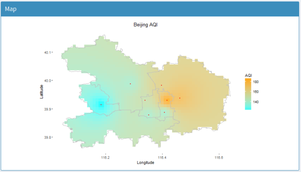
- Description: Since the dataset only have 8 view points, in order to predict values at locations where no measurements have been made, we used “inverse distance weighted” method to interpolate air quality indexes of all main urban areas in Beijing.
- R Packages: ggplot2,maptools, gstat, raster
maptools:Tools for Reading and Handling Spatial Objects.
gstat: Spatial and Spatio-Temporal Geostatistical Modelling, Prediction and Simulation.
raster: Reading, writing, manipulating, analyzing and modeling of gridded spatial data
2.5 Geofacet Line Graphs:
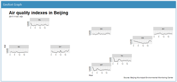
- Description: Geofaceting arranges a sequence of plots of data for different geographical entities into a grid that preserves some of the geographical orientation. It can be seen from the picture that the location of those line graphs just fit their corresponding geographical coordinates.
- R Packages: ggplot2, geofacet
Geofacet: This R package provides geofaceting functionality for ggplot2. Geofaceting arranges a sequence of plots of data for different geographical entities into a grid that strives to preserve some of the original geographical orientation of the entities.
DISCUSSION
FUTURE SCOPE
Although we make big efforts to realize the optimal visualization for our project, we still have some steps for the further analysis:
Realizing the predictive analysis for forecasting the future volatility of main air quality indicators according to the historical dataset.
Combining data about weather condition and traffic movement to better understand the origin of the air pollution.
Exploring more view points in Beijing to better visualize the raster map.
Providing more suggestion on how to deal with haze days according to the professional health advisories.
