Group01 Report
STUDY OF WORLD DEVELOPMENT INDICATORS
A web-based analytics application to visualize country development across the globe
|
|
|
|
|
|
Contents
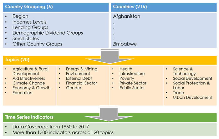
Visual Design Framework
Raw Data
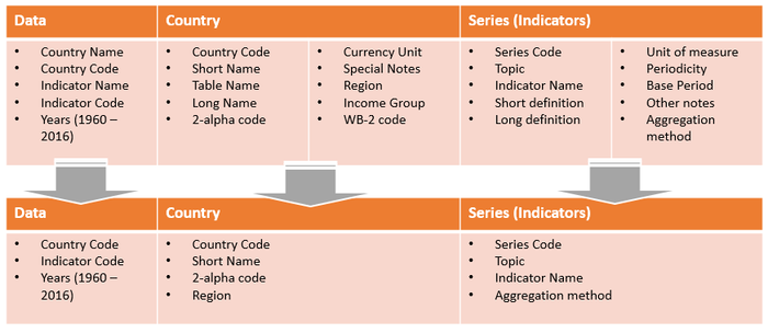
Data Tables
Visual Structure
Circlize
For development of the visual application, R will be used as the base code with the focus on using Circlize package to create the graphical visualization for WDI data.
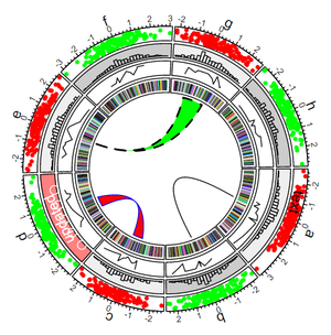
The reason for selecting the Circlize package is that Circular layout is an efficient way for the visualization of massive amounts of information. This package provides an implementation of circular layout generation in R and provide the flexibility the use low-level and high-level graphics functions as defined by users for specific purposes. Together with the seamless connection between the powerful computational and visual environment in R, it gives users more convenience and freedom to design figures for better understanding complex patterns behind multiple dimensional data.
Circular visualization is popular in Genomics and related omics fields. It is efficient in revealing associations in high dimensional genomic data. Other used case includes visualizing for the movement of Global migration where movement can be plotted using Chord diagram within a circular plot.
This project will be the very first known project to use circular plot represent the multi-dimensional WDI data to create a whole new graphical visualization to the user.
Data Mapping
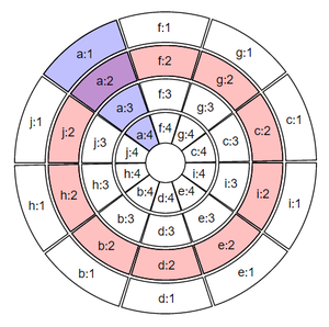
A circular layout is composed of sectors, tracks and cells.
As illustrated in the figure below, the red circle is one track, the blue represents one sector and the intersection of a sector and a track is called a cell.
WDI data will be mapped into the circular plot in 3 visual representation:
- Circular Plot #1 (Filtered by Topic and Indicator)
- Sector: Country
- Track: Years
- Circular Plot #2 (Filtered by Country)
- Sector: Indicators
- Track: Years
- Circular Plot #3 (Filtered by Year)
- Sector: Countries
- Track: Indicators
Visual Representation
Circular Plot
Observation and Insights
Use case using Health Topic


