ISSS608 2017-18 T1 Assign CHEN ZHENGJIAN
Contents
Executive Summary
Tableau Public workbook URL: https://public.tableau.com/profile/chen.zhengjian1259#!/vizhome/zjchenassignment/Dashboard1?publish=yes
2011 May, a noticeable epidemic spread took place in Smartpolis, and thousands of cases were reported in this area. Provided with the dataset with more than 100,000 Microblog records posted in this area, I will start to find out the source and spreading progress of this awful disease.
In this report, I will use MS Excel and SAS JMP for data pre-processing and visualize the data by Tableau.As an descriptive analysis, I will show a grid heatmap to indicate the severity of infection in each area. Animation function will also be utilized to display the epidemic spreading patterns and typical symptoms of the disease. In the conclusion part, I will also try to explore the possibility of improving local healthcare infrastructure.
Data description
(1)Overview
This raw data (Microblogs.csv) includes 4 columns: ID, tweet created date, location of author and text content. The monitoring period is from 4.30 to 5.20. The text content from microblogs includes miscellaneous issues like political events, entertainment news and so on.
There are 100,000 records in total, posted by 73928 users. On average each user posted 13.8 mentions during the period. The maximum post number from each user is 18 and minimum number is 3.
(2)Buzz trend of posts
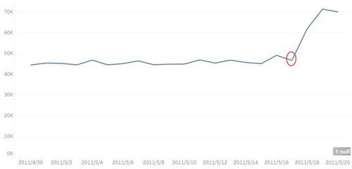
The buzz trend below (y-axis: count of records, x-axis: day of date) displays a massive growth in mention number since 5/18. This day is likely to be the start of the epidemic outbreak.
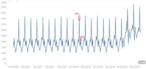
Another interesting finding is that after drilling down to hours, the mention buzz shows a very cyclic pattern: 8-10pm is normally the highest volume period, and 9pm is always the peak in each day. It is also surprising to find that in 3pm the mention volume level was quite high.
This tells us that absolute mention number cannot be compared with different time period in a day (which means we cannot simply compare the volume of 1am and 9pm).
(3)Geographic Data
The dataset has provided GPS information (measurement of N and W)
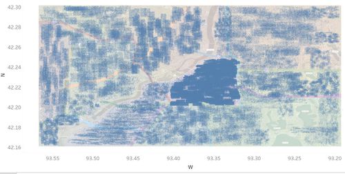
Below is the chart for distribution of each post during the monitoring period. We can see the density for downtown is extremely high.
(4)Challenges
Now we have a general understanding of the outbreak, but to get details, we need to solve 2 problems of raw data.
The first thing is data cleansing issue. We need to distinguish the flu-related records from a mixed dataset. I will use text mining to pick out the epidemic-related keywords.
Second thing is the data visualization issue. Since we are trying to find out the epidemic spreading pattern, the severity of illness in each area should be properly visualized. This scatter plot can give us a general impression of the distribution, but since the population density is imbalanced, if we use absolute number of dots to display severity, we can hardly compare the changes in severity between different areas, because human eyes are not good at managing so many dots. So, I am going to build a heatmap: grid the map and then use infected proportion in each area instead of volume as key measurement.
Data preparation
(1)Text mining
The first step is to pick out the flu mentions.
We have seen a sudden increase in volume after 5.18. My understanding is that the sudden increase was mainly due to the flu. If it is true, after data cleansing, the flu mentions should be able to explain the huge gap between and after 5.18.
Using JMP text explorer we can get a list of frequent keywords in post. The first keyword is “flu”, with the frequency of 7613.
Besides, I drilled down the word list and picked out the following keywords/phrases that are highly-related with the illness. (These keywords all have appeared more than 1000 times, and I also did some random check of the original text to get such conclusion.)
 Chill

 Fever

 Cough

 Muscle

 Headache

 Short breath

 Chest pain

 Neck and back pain

 Ab pain

 Pneumonia

 Fatigue

 Sweats

 Diarrhea

 Problems breathing

 Shortness of breath

 Temp

 Aching muscle
My understanding is that when people got flu, they normally have no idea of what is the exact disease, so before they gain the knowledge, they won’t mention “flu” but just simply describe the symptom (fever, pain or something else) on twitter. So it is necessary to keep these symptom keywords, although they will include in some noise.
To record these keywords, I used “—ISNUMBER(SEARCH(“”))” function in EXCEL to check their existence in posts and store them in new columns as binary values. Below is an example:
After that, I am going to create a column that contains binary value to judge whether the author is likely to be infected. In this case I will use an IF function, if the sum of these symptom columns >=1, then this post is likely to refer to flu.
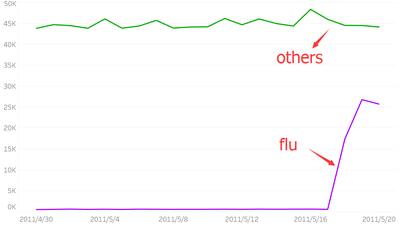
After cleaning the data and categorizing the flu/non flu posts, the buzz trend shows up like bellows. The level for “others” is stable over this month while “Flu” suddenly rose at 5.18, which is able to explain the mention volume gap.
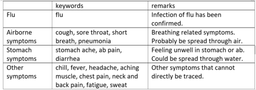
I also found that among the keyword list, symptoms can be somehow categorized. Since weather and water flow information has been provided, I’m also curious to explore the different ways of epidemic spreading. So I added few columns to label “airborne” (related with keywords “cough”, “sore throat” …) “stomach symptom” (like “ab pain” and “stomach ache” …) and others.
(2)Map gridding
My target is to build a heatmap for infected people in each area. So, after identifying the infected group, the next step is to divide the areas.
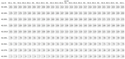
I manually separated the map into 225 even districts, and using “Index(match())” so that each post will be categorized to these districts based on its geographic location. [this also can be achieved by creating bins in Tableau.]
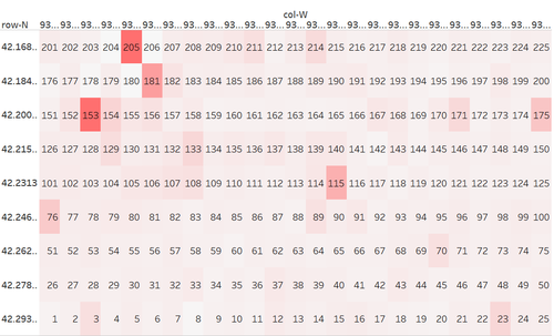
After a series of processing, the heatmap in Tableau shows up like this:
(The labels are district name, ranges from 1 to 225. The y and x axis shows the geographic location.)
Then I created a calculation field “Flu Density” (flu volume divided by total volume) and dragged this field to “Colors”. So now the color will identify the severity of each district.
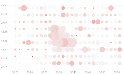
I changed the shape and opacity. Then I use size to indicate total volume of posts in each area. In the end it looks like this:
Visualization & exploration of virus spreading
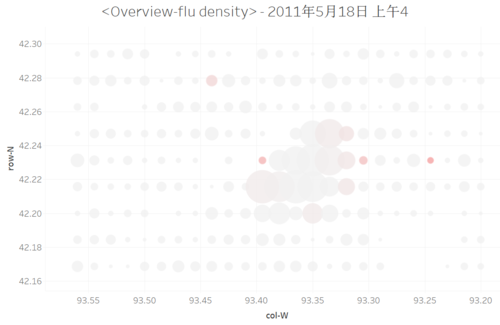
1st outbreak stage (5.18)
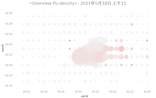
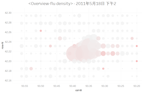
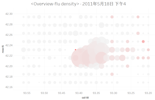
Using an animation to visualize the flu density changes will give us an impression of the epidemic spread.
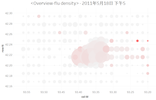
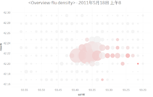
The screenshot above is in the morning of 5.18, the beginning of the outbreak. The high-intensity segments focused on the mid-east part of map (Eastside).
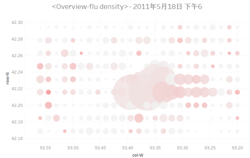
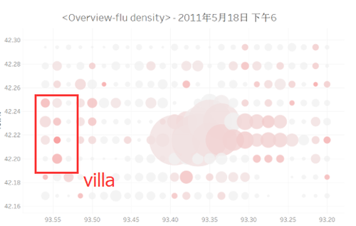
6 pm experienced an outbreak all over the city. Especially the west part (Villa & Westside), northeast (Suburia) and south (Southvile) experienced a quite significant increase in flu density.
Besides, the outside part of Lakeside also started to be infected. The least infected area is Plainvile.
The timestamp of outbreak (6pm) implies that flu is spread by person-to-person touch: In the morning people from Eastside carried the virus to downtown, then everyone working at downtown got infected. And these people took the virus back to home, causing the city-wide outbreak.
To confirm this assumption, I checked the population dataset and found that several areas are typical residential areas (daytime population < residentials): Eastside, Lakeside, Northville, Plainville. Most of the “residential areas” experienced outbreak at 6pm probably because of the commuting.
But we also noticed that Villa (the very west area) also experienced a significant outbreak at 6pm. The thing is that Villa is not a quite typical residential area. Its daytime density (173214) is basically the same as its population (178571), which means the effects from commuting might be very small.
Weather could be another reason of the outbreak in west area. The wind direction was west, blowing at 9 miles/hour, which means the virus could be spread from east end to west end in just 2 hours. The very beginning of outbreak in eastside was at 4am, so it has enough time to spread the virus to westside and shows up such symptoms at 6pm.
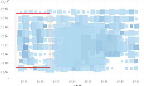
This heatmap shows the airborne symptoms (cough, sore throat…) in each area. We can see that Villa and Westside has a higher proportion of airborne symptoms. (I will discuss the airborne issues in detail in next part)
So, for the outbreak in 5.18 evening, the outbreak was due to a combined effect from person-to-person touch and airborne.
2nd outbreak (5.19)
The first outbreak was not so serious because when we move forward to the early morning of next day, not quite many new infections were reported.
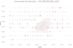
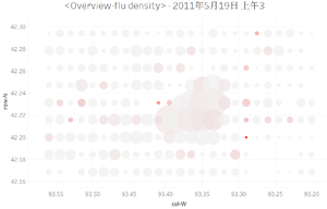
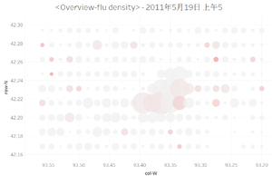
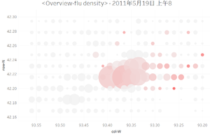
8 am, there was a similar outbreak in eastside as in the previous day, and the density is even worse. Besides, some new cases were reported in Suburbia (northeast). Because the wind direction was a little bit north (WNW) in this day, if the assumption (flu is airborne) is right, then the source of virus is likely to be in the east of the city.
After 8am, the infection pattern was just like the previous day: virus was carried to downtown and spread widely in the evening.
3rd outbreak in 5.20
The outbreak in 5.20 was quite different with previous 2 days: from 1am to 9am, there were continuous new reports from all over the city. According to the Tableau animation, there was no obvious outbreak source and pattern in this day. Flu was spread in every part of the city.
My understanding is that the virus volume in Smartpolis has increased and matured to a certain level that it has already become a “flu source”. The outbreak no longer needs to be supported from external sources (somewhere in the east) through the air, it can spread flu by itself. Person-to-person touch is likely to be the major reason for outbreak in this day.
Visualization & exploration of symptoms
In the last part we get an impression of the epidemic spread and outbreak pattern over the period. In this part I will drill down to research the detailed symptoms.
Instead of using “flu or not” variable to calculate the flu density, I divide it into 4 categories: “flu”, “airborne symptoms”, “stomach symptoms” and “other symptoms”.
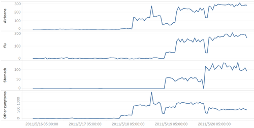
This line chart shows us the outbreak timestamps of symptoms. In the very beginning of the outbreak, fever, headache, and airborne symptoms are the initial symptoms. There were not quite much flu & stomach issues until 5.19.
I also made the geographical heatmap for to display the symptom spread issues. Basically, the airborne symptoms reports were moving horizontally from east to west, in line with the wind direction.
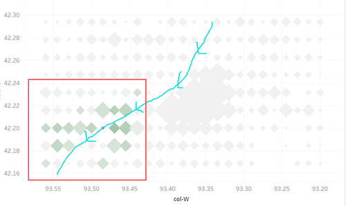
Another interesting finding is the stomach related issues. Start from 5.19 morning, the reported cases of stomach symptoms focus on the southwest part, near the lower part of Vast River.
This epidemic pattern seems quite relevant water source. Perhaps there were some water pollution issues in the middle part of river.
There were continuous epidemic reports in this area, but the volume and infected area are basically the same after outbreak. This means this stomach-related symptom is not quite infectious as other symptoms.
Conclusions & limitations
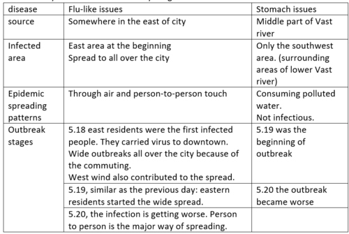
Below is my conclusion based on my insights from the data.
Recommendations:
1. We need to wisely allocate the healthcare resource based on the epidemic spreading pattern. For example, using weather forecast to predict the next outbreak point. Increase the frequency of public transportation (because crowded bus will probably increase the infection).
2. Water pollution is likely to cause the outbreak of stomach symptoms in south-west area. Need to currently cut the water supply, find the pollution source and take measures to control the water pollution in the lower part of river.
Limitations:
1.Some userIDs have multiple mentions related with epidemic issues. In this case, I did not drill down to find out whether it is a “new symptom report” or “duplicate symptom report from each user” because I was just trying to monitor the infected population based on the posts.
2.I didn’t exclude the “reporters”, which means these red dots include those authors who are not infected, but just reporting others’ infection cases. This might requires advanced text mining techniques like entity identifications.
