The Spread
|
|
|
|
|
|
|
How the bug move?
From Ground Zero analysis, we have establisehd the following:
- High density of microblogs in Uptown and Downtown, specifically the following Grid 229, 231, 206.
- These grids corresopnds to 3 places on the map namely, Convention centre, Vastapolis Dome and Vastapolis Hospital
- Spike in number of microblogs from 18th to 20th
Uptown and Downtown have high population per km^2. It can only be imagined that Convention Centre and Vastapolis Dome are crowded areas where events and entertainments are held.
Thus, we are making a hypothesis here that the disease spread through human to human interaction. We will explore further in the following paragraphs
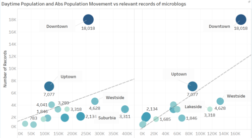
From the data set provided, we have information on population between daytime (ie when people get to work) vs population density (ie when people get back home). We calculated the difference and plotted against two graphs. One against Population density and the other against Abs population movement. Please note in tableau, this additional visualisation can be found in tab "Other Visualisation".
Image 1
The graph on the left are number of plots (records of microblog) against Daytime Population and the one on the right is against Abs Population Movement.
The size of the circle and tone of the color in each graph is a representation of number of population/ area size. The darker the color and the larger the circle, the higher number of population per km2.
The graph on the left almost shows little relationship between daytime population against Number of Records. While the graph on the right, a more positive correlation is observed between people movement in an Area and number of microblog records.
Also unlike Uptown and Downtown, Lakeside and Westside doesn’t show signs of extreme records of microblog, although both have similar high number of population movement. This anomaly can be explained by the higher number of people occupying per km^2 area (darker blue).
Conclusion for this hypothesis: The higher the population movement AND higher population per size area, the higher number of microblogs recorded. In this case, Uptown and Downtown. This supports our idea of human to human spread of disease.
Can the bug fly or swim?
Here we explore the possibility of other elements on how the disease spread, namely water and weather. We have a few bodies of water in the map. Going back to our AreaHeatMap, we explore area by area. The density as shown by the shades will readjust and weighted based on the selected Area only.
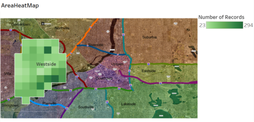
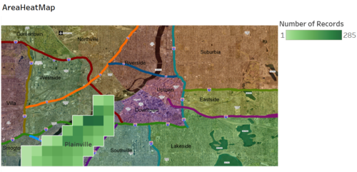
We noticed Westside (Image 2) and Plainville (Image 3)has a few grids close to the river which shows a higher density of messages compared to other parts of Westside and Plainville respectively. We also noted that there is a stadium in Westside and based on our earlier Hypothesis, this could explain the higher density of messages for Westside.
Whereas for Plainville, no landmarks such as convention centre and stadium that could help explain the higher density of messages near the river. We will explain this observation at the bottom of this segment, geographic influence.
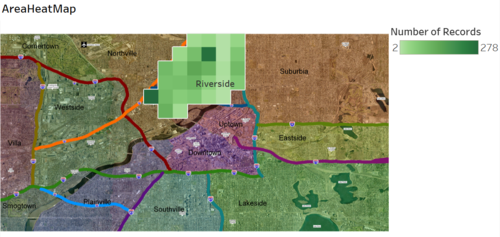
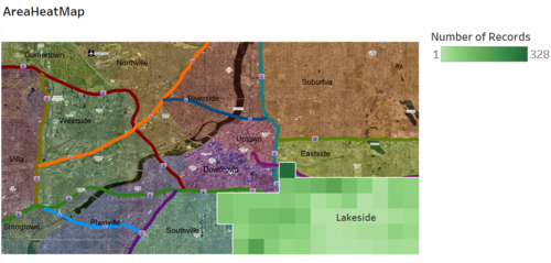
Exploring other areas along the river doesn’t show similar result as Westside and Plainville. An example is Riverside (Image 4). Another area which has large bodies of water is Lakeside (Image 5). This area however doesn’t show any concentrated group of people complaining feeling unwell around the lake.
Image 2 - Westside
Image 3 – Plainville
Image 4 – Riverside
Image 5 – Lakeside
Conclusion from the above, there isn’t any strong evidence to suggest that the disease spread through water.
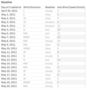
Another interesting exploration is the weather. Image 6 cluster the peaks of messages into groups of weather. While image 7 shows the wind direction
Observing the wind data vs the heat map, hardly we see any potential influence of weather on the spread of disease. The wind direction is either towards the north or the west. Had the disease been carried by the wind, we should see more microblogs on the west side of the heatmap. Based on the clustering of weather at the bottom most chart, there is no unusual spike for any particular weather type.
Thus, non conclusive that weather nor wind has any effect on the spread of disease
Image 6
Image 7
Geographic Shape Influence
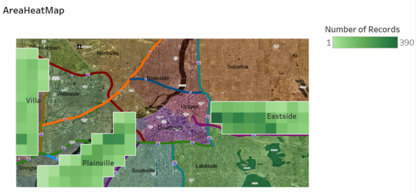
This segment here seeks to explain the observation that we have noted above, where Plainville situated beside a river is showing some signs of higher than usual density of messages. The "long" shape of Plainville is similar to Eastside and Villa. Pulling out data for these 2 areas and compare, we noticed that Eastside share quite a similar shading to Plainville. Refer to Image 8. Villa on the other hand doesn't quite fit in and this could be explained by Image 9, where Villa has a lower population movement compared to Plainville and Eastside.
Thus, there is no evidence from this observation to change our conclusion that we have made above, ie the disease spread through human to human interaction.
Image 8
Image 9

