ISSS608 2017-18 T1 Assign WANG SHANG
Contents
Background
Smartpolis is a major metropolitan area with a population of approximately two million residents. During the last few days, health professionals at local hospitals have noticed a dramatic increase in reported illnesses.
I want to mine some valuable insights to track the trend of spread of illness by using visualization analysis tools, and help government to let them know what they can do for a better illness spread control.
Data Description
I have three datasets and one Smartpolis map for analysis. In the three datasets, the first one contains microblog messages collected from various devices with GPS capabilities. These devices include laptop computers, handheld computers, and cellular phones, another two are about population statistics and observed weather data. I am also supported some additional information in a Words file.
Data Preparation
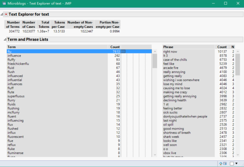
In the microblog dataset, there is a column that records the text that is published to social platform by different persons, and this dataset also supports the created time and location to me. I import this dataset to JMP, using word function split the location data into two columns, latitude and longitude. Then I use text explore analysis to split each text record into words and phrases with no stemming. Because I think if someone is ill, he/she usually sends a blog message about his/her illness. So that if I can find a word that can represent a symptom or illness in a text, it probability means this blog creator has gotten this illness. Hence, I can just extract a key symptom to represent the current status of a person.
Here is an example, I use flulike, fever, chills,sweats, aches and pains, fatigue, coughing, breathing difficulty, nausea, vomiting, diarrhea, and enlarged lymph nodes, which is provided in the overview part of assignment introduction page, as my illness word list. And I find each word from this list in JMP text explore analysis to collect related text records and put them into a new table. In this new table, I create a new column called Key_Symptom using the particular words as the value.
After finishing the same process on the all words in my illness word list, I concentrate them together to generate my visualize-used table. Before I import them into Tableau, I also create a new column named DayNight based on Created_at column. In this column, value "1" means Day, because the hour of created time between 6 and 17. and value "2" means Night, because the hour of created time less than 6 or larger than 17. So far, the data preparation has been finished. I will use it and weather and population data to do a visualization analysis.
Tasks & Solutions
Task 1: Origin and Epidemic Spread
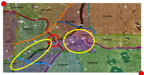
As the below picture showed, in my opinion, the zero ground location is around the place in the red circle, and there are two affected region, they are the two yellow circle regions next to the red circle.
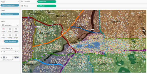
After data preparation, I input the new microblog data into Tableau. First of all, in DayNight column, I recode the value "1" to Day, and value "2" to Night. Then, I insert the map image based on latitude and longitude columns, using different colors to identify different symptoms.
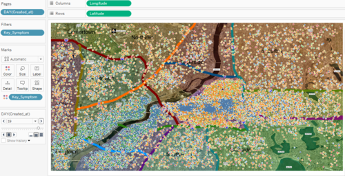
I think if I want to know where is the zero ground and affected place, I need to find a place that has much more points than before showed on map. I use Day of Created_at column as my filter and put it into Pages part to show the distribution of points for each day. The situation is normal before 18th May, and on 18th, there are a lot of points suddenly showed on the downtown and uptown region. And just one day later, there are a lots of points suddenly showed again on another region, the downstream of the river.
So, the two affected places is around downtown and uptown region and the banks of downstream of river.
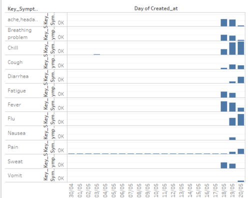
I also want to know what exact kind of symptom that people got. So I count the number of each symptom and get the below graph.
I find that headache, breathing problem, chill, cough, fatigue, fever and sweat outbreak on 18th. Diarrhea, flu, nausea and pain outbreak on 19th. Vomit outbreaks on 20th. I also visualize the distribution of point for each symptom, and find that headache, breathing problem, chill, cough, fatigue, fever, sweat and flu are major in the center region (where is downtown and uptown region). That means most of people who had the symptoms that outbreak on 18th got flu on next day. So the illness in this region possible is flulike illness.
And Diarrhea, nausea, and vomit are major in the banks of downstream of river. Same as flu, I think outbreak of vomit symptom just delays because of the reaction time of human body. And based on the words of two region's symptom, they are obviously two different illness. Flulike illness outbreaks in center region and stomach related problem outbreaks in the banks of downstream of river. (Below is the picture of point distribution for each symptom)

