The Spread
|
|
|
|
|
|
|
How the bug move?
From Ground Zero analysis, we have establisehd the following:
- High density of microblogs in Uptown and Downtown, specifically the following Grid 229, 231, 206.
- These grids corresopnds to 3 places on the map namely, Convention centre, Vastapolis Dome and Vastapolis Hospital
- Spike in number of microblogs from 18th to 20th
Uptown and Downtown have high population per km^2. It can only be imagined that Convention Centre and Vastapolis Dome are crowded areas where events and entertainments are held.
Thus, we are making a hypothesis here that the disease spread through human to human interaction.
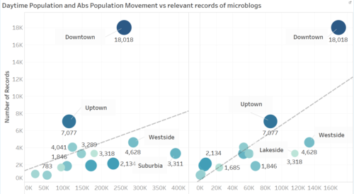
We were provided with information of population between daytime (ie when people get to work) vs population density, ie when people get back home. We calculated the difference and plotted against two graphs. One against Population density and the other against Abs population movement.
Image 1
The graph on the left are number of plots (records of microblog) against Daytime Population and the one on the right is against Abs Population Movement.
The size of the circle and tone of the color in each graph is a representation of number of population/ area size. The darker the color and the larger the circle, the higher number of population per km2.
The graph on the left almost shows little relationship between daytime population against Number of Records. While the graph on the right, a more positive correlation is observed between people movement in an Area and number of microblog records.
Also unlike Uptown and Downtown, Lakeside and Westside doesn’t show signs of extreme records of microblog, although both have similar high number of population movement. This anomaly can be explained by the higher number of people occupying per km^2 area.
Conclusion for this hypothesis: The higher the population movement AND higher population per size area, the higher number of microblogs recorded. In this case, Uptown and Downtown. This supports our idea of human to human spread of disease.

