Difference between revisions of "Group12 Report"
Ziwenhe.2016 (talk | contribs) |
Kh.kim.2016 (talk | contribs) |
||
| Line 193: | Line 193: | ||
There are Nodes and Edges in the raw data. | There are Nodes and Edges in the raw data. | ||
| − | |||
== Discussion & Future Work == | == Discussion & Future Work == | ||
| Line 205: | Line 204: | ||
*Visualize complex company structure in Samsung Group | *Visualize complex company structure in Samsung Group | ||
*Visualize changes in ownership and elaborate potential impact and interesting facts | *Visualize changes in ownership and elaborate potential impact and interesting facts | ||
| + | |||
| + | *JYLee's equity increase on 2015 Q3 <br/> | ||
| + | [[File:JYLee.png|400px]] <br/> | ||
| + | |||
| + | We looked at JYLee's equity increase very interesting because JYLee is known to be the successor of Samsung Group. | ||
| + | |||
| + | |||
| + | [[File:Before_merger.png|300px]] [[File:After_merger.png|300px]] | ||
| + | |||
| + | Above 2 graph shows change in company structure from 2015 Q2 to 2015 Q3. Using our model, there was a merger between Samsung Everland and Samsung C&T, which allows Samsung C&T to control over Samsung Group by increasing its ownership over Samsung Life Insurance and Samsung Electronics. | ||
| + | |||
=== Future Work === | === Future Work === | ||
Latest revision as of 00:03, 4 December 2017
|
|
|
|
|
Contents
Motivation of the application
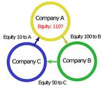
Cross shareholding is a situation in which a corporation owns stock in another company. So, technically, corporations own securities issued by other corporations. The good thing about cross shareholding is it allows the owner to set up a new company to start any business easily. The newly created entity will be backed by strong equity from existing companies and it gives a massive advantage. However, cross shareholding can lead to double counting, whereby the equity of each company is counted twice when determining value. When double counting occurs, the security's value is counted twice, which can result in estimating the wrong value of the two companies.
Cross shareholding is very common in the corporate world. Sometimes, there can be more than 10 companies involved and it is very difficult for investors and regulators to track who owns how much.
In this project, our group choose 1 or 2 big groups of companies from Korea and China with heavy cross shareholding between each other and conduct visualization and relationship analysis on their networks using R-Shiny so that people can have a better picture of these companies’ network and easier to understand the relationship between companies.
Background
The stock markets are not the same across the countries. There is only one stock market in Korea. However, in China, there are three stock markets, one is in Shanghai, one is in Shenzhen and Hong Kong. Our group was inspired by one of a lecture on network visualization and decided to do the visualization analysis for the top stocks listed in Korea and China. We choose Samsung group in Korea.
For Korea, why our group choose Samsung group as the analysed target. There are four major reasons to choose Samsung group as our final selection.
1. Samsung group is the largest company group controlled by single owner family in Korea
2. Samsung group has 62 companies, 16 listed companies, and 46 unlisted companies, these companies are holding each other
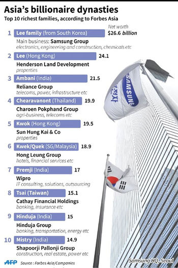
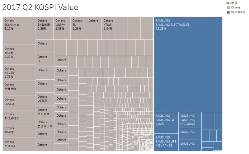
3. Samsung Electronics in Samsung group reached the market value of USD 200 billion, which is about 22% of KOSPI capital in 2017 Q2
4. Samsung Group takes around 32% of KOSPI capital in 2017 Q2
For China stock market, our group decided to use the top 5 companies listed in the stock market which are Industrial and Commercial Bank, PetroChina, Agricultural Bank, Bank of China, and PingAn insurance.
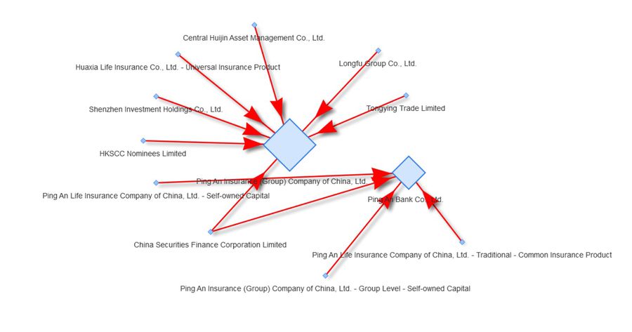
However, after going through all the data, our group found that the company network in China is very straightforward with most of the groups comprise of two level. Several big national companies hold the share of the top 5 companies. In contrast, Samsung group has more complex network due to its large number of listed companies, as well as many loops between several stocks.
In addition, our group also had done the graphs for top 5 companies in China. There are only two levels of the whole view. The shareholders and the stock. We can't find any loop. Only several big companies hold many stocks in the market. Such as China security finance, Central Huijin Asset and so on.
Finally, our group will only focus on the Samsung group visualization.
Chaebol
A chaebol (from Korean jaebeol) is a large industrial conglomerate that is run and controlled by an owner or family in South Korea. A chaebol often consists of a large number of diversified affiliates, controlled by an owner whose power over the group often exceeds legal authority. The term is often used in a context similar to that of the English word "conglomerate". The term was first used in 1984. There are several dozen large Korean family-controlled corporate groups which fall under this definition.
Motivation
Cross shareholding is very important when understanding market behavior. It gets more important when a lot of companies are owned each other which may cause an event on one company result in the others. Due to its market nature in South Korea with Chaebol, it often gets very difficult to understand ownership connection between company groups. Samsung, Hyundai, LG, Lotte, and Hanjin are the biggest company group run by Chaebol family. Also, our group is interested in company structure difference between South Korea and China.
Objectives
With help of visualization tool in this module, our group will focus company network of one of the biggest company group in Korea, Samsung as well as 5 top companies in China. The objectives are as follows:
1. Introduce company structure in Korea where most of the information is available in Korean only
2. Visualize complex company structure in Samsung Group and some Groups in China
3. Visualize changes in ownership and elaborate potential impact and interesting facts
Review and critic on past works
Hyundai
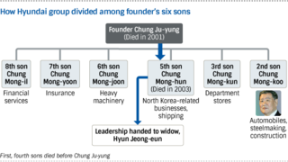
Nikkei Asian Review posted research on Hyundai Group. Although it contains a general overview of Hyundai’s company structure, show much shares, percentage and historical relationship are not defined. [1]
Samsung
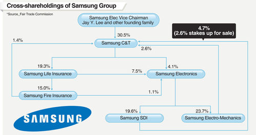
Post by Korean media, published in English translated article on Samsung network at the time straight after merger in 2015. It gives ownership but it would be nice to show before and after diagram with historical relationship. [2]
Lotte
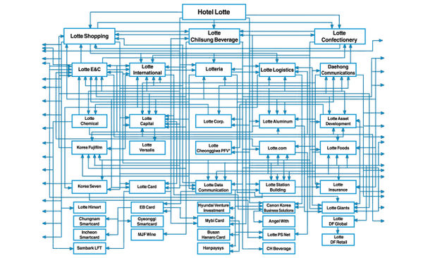
Lotte also has very complicated structure. Lotte’s network by Korea Herald. It shows network at single given time. Again, ownership and historical relationship is missing. [3]
Data Preparation
Samsung Group
Data on Korean companies are usually only available in the Korean language in DART. Dart is an official Korean website where all Korean listed companies' announcements are. It is compulsory for Korean companies to announce proportions of their shareholdings in the quarterly financial statement. We used python to crawl our target data using Python. Below codes shows code we used to pull data from the financial statement in HTML code.
Once crawled, data is translated into English with Company, Stockholder, proportion, and equity value.
Then the data need to be cleaned, the final data need to be from the following datasets.
- Raw Node Data
- Raw Edge Data
- Samsung Group Stock Value in KOSPI
In the above diagram, the blue ones are the companies in Samsung group, the grey ones are the other companies. it can easily find the top three companies in Samsung group, SAMSUNG ELECTRONICS, SAMSUNG C&T and Samsung Life Insurance. Especially, SAMSUNG ELECTRONICS takes almost 22% of KOSPI capital. And also the Samsung Group takes 32% of KOSPI capital.
- Trend of the KOSPI
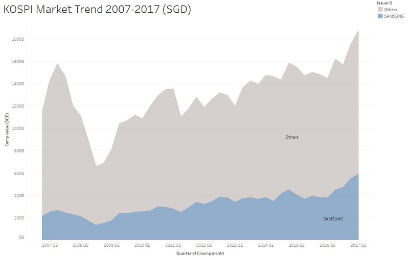
In the above diagram, the blue color is the trend of market value for Samsung group and the grey color is the trend of market value for other companies in KOSPI. Comparing the Samsung with other companies, it can easily find that the market value is more stable for Samsung group. You can also find a sharp drop in 2008 that was mainly caused by the global economic crisis in 2008.
China Top 10 Companies Data Preparation
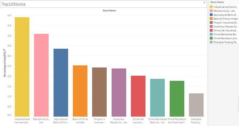
There are more than one hundred thousands of stocks list in China Stock Market. For the analysis purpose, our group just do the top 5 companies in China. The distribution of the top 10 stocks in China displayed as below screenshot. The top five stocks list in China are Industrial and Commercial Bank, PetroChina, Agricultural Bank, Bank of China, and PingAn insurance. Three out of five are banks(ICBC, ABC, BOC). The other two is insurance and petrol. The proportions of these five companies are around 17% out of all China stock market values. The top 10 companies proportion is around 25% out of all China stock market value.
- Top 10 companies proportion in China stock market
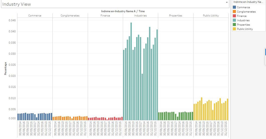
- Industries trend in China stock market
For the data preparation of the China stock, we got the datasets from OneDriver in SMU library. We download the stock profiles, shareholders, equity, and other datasets and the time period is about 20 years. In the dataset, we joint all the table together and make the final sheet like the following table.
Overview of the Samsung Group in the application
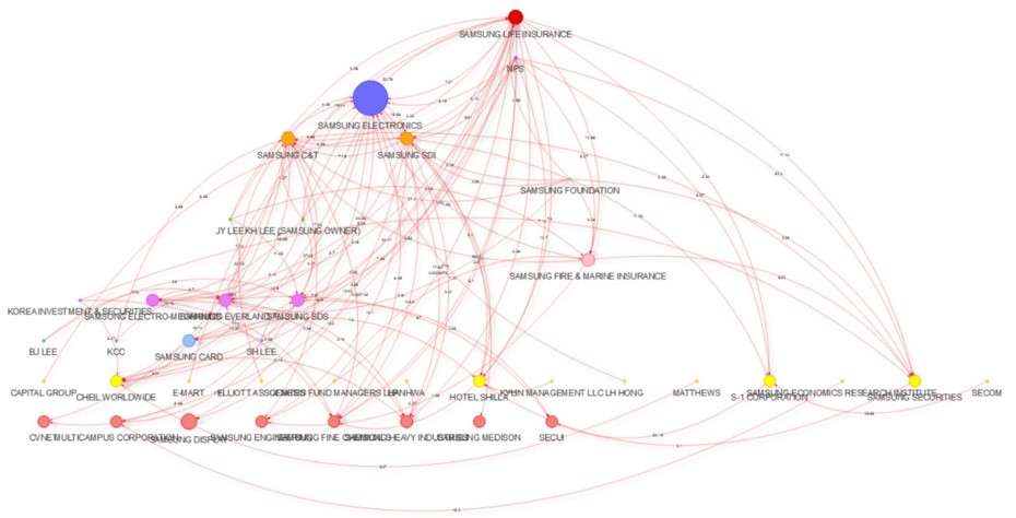
The following diagram is the overview of Samsung group network diagram.
R Packages
Our group uses several R shiny packages. And also we use Tableau and JMP to do the cleaning for the datasets. The following packages are the R packages used in the coding part.
- igraph : Fundamental package allowing us to convert network data to ‘graph’ and then to perform Centrality-based network analysis.
- visNetwork : Provides an interactive visualization of networks and offering very granular configurations,such as Node Size,Node Selection,Edge Color,Shadow etc. for making our graph neater and prettier.
- dplyr : massging data using left_join
- data.table : get data frame from graph for further enrichment
- Shinydashboard : Create dashboards with 'Shiny'.
Application Overview
There are three layers and two levels of the application, the first level contains Data Manipulation Layer, Filter Interactive Layer, and Graph Render Layer.
The second level is the Shiny Dashboard.

Application Workflow
For the different layers in the first level, the features are different. Please refer to the following diagram to understand the functions of each layer.
Application Features
There are many toolbars in the application. Such as zoom in/out, sliders, text input and so on. Please refer to the following table to get the knowledge of the functions in the toolbar.

Shiny Dashboard
The following is the design features of the dashboard.
- Dashboard Page
The color of the Skin of the dashboard is blue, and the header is the fixed title "CrossHolding Dashboard"
- SideBar
The sliders are the filter which can filter data by Year and Quarter. The Text can use to filter data by Holder and Stock names. The select input can filter data Centrality Type. The radio button can filter data PreAssignedLevel Or All.
- Body
The tableItem is Graph, the fluidRow is network graph and the tableItem you can refer to the Raw data.
- rawData
There are Nodes and Edges in the raw data.
Discussion & Future Work
Although the application can display the overview of the whole Samsung group and the shareholders between the companies in the Samsung group. But there are several things need to be discussed, and also there are a few improvement for future work.
Discussion
The following details you can get from the application.
- Introduce company structure in Korea where most of the information is available in Korean only
- Visualize complex company structure in Samsung Group
- Visualize changes in ownership and elaborate potential impact and interesting facts
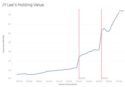
- JYLee's equity increase on 2015 Q3
We looked at JYLee's equity increase very interesting because JYLee is known to be the successor of Samsung Group.
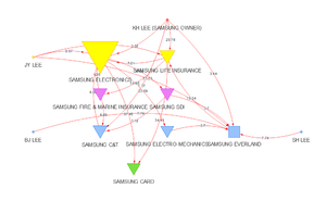
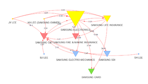
Above 2 graph shows change in company structure from 2015 Q2 to 2015 Q3. Using our model, there was a merger between Samsung Everland and Samsung C&T, which allows Samsung C&T to control over Samsung Group by increasing its ownership over Samsung Life Insurance and Samsung Electronics.
Future Work
- Share ownership line to show indirect holdings
- Able to calculate actual value of ownership
- Able to highlight and detect loop ownership
Installation guide
For online user:
- Recommend using Chrome
- User just needs to launch the application from [4] without the need to install anything locally.
For local user or developer:
1.Hardware Configuration:
- Minimum 4GB RAM
- Intel® Core™ i5-7500 Processor
- 10GB free space
- Microsoft Windows 10 Home,64-bit Operating System
2.R : R version 3.4.2 or later shall be installed
3.R Studio : R Studio Version 1.0.153 or later shall be installed from [5] (At the point of the project, R Studio 1.0.153 is used for creating this application)
4.R Packages: The following R packages are required, hence need to be installed in R Studio ->Tools -> Install Packages...
- shiny dashboard
- igraph
- visNetwork
- data.table
- dplyr
5.R source code file & Data files: the source code file : <<V_Group12_CrossHolding_ShinyDashboard.R>> shall be saved in an individual folder,for example : CrossHoldingAnalytics,and the following two data files <<Final_Samsung_connection.csv>> <<Final_Samsung_holdinglevel_withht.csv>> shall be saved into the subfolder : data, for example : CrossHoldingAnalytics\data folder.
6.After the packages have finished installing, open the project files and click on "Run App".
User Guide
Users can use the application freely by clicking the url:[6]. you’ll see in the ‘Graph’ tab, a default graph based on data from 2017 Quarter 1. Then you can refer to the following steps to change what you want in the application.
The overview of the application is as below screenshot.
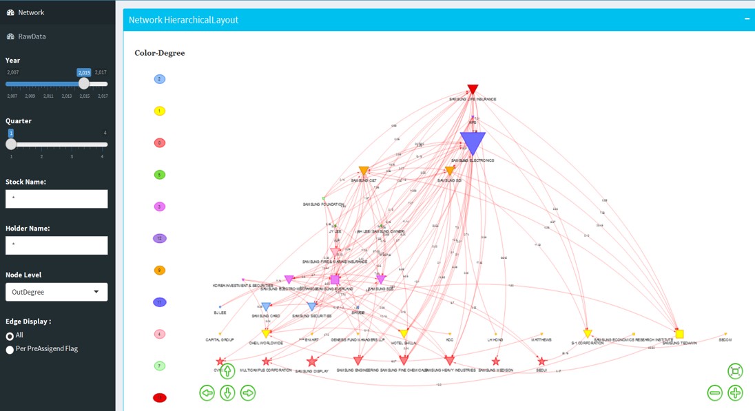
- Step 1
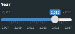
Set Year Filter: Move the slider
- Step 2
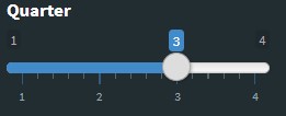
Set Quarter Filter: Move the slider
- Step 3
Search by Stock Name :
Type full or partial Stock name, for example, SAMSUNG, will render the graph with any Stock containing SAMSUNG in the name and the direct links

you can search multiple Stock Names delimited by |, for instance, LIFE|ELEC will filter out any Stock containing ‘LIFE’ or ‘ELEC’ in the name, and all the direct links from the filtered nodes

- Step 4
Search by Holder Name :
Type full or partial Holder name, for example, NPS, will render the graph with any Holder containing NPS in the name and the direct links

Similarly, you can also search by multiple Holder Names delimited by |, for instance, LIFE|ELEC will filter out any Stock containing ‘LIFE’ or ‘ELEC’ in the name, and all the direct links from the filtered nodes

- Step 5
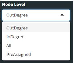
Render graph by NodeLevel: NodeLevel in the Hierarchy is determined by Centrality degree per different types(out, in, all), or determined by PreAssigned Level in Edge table.
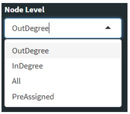 Swtich NodeLevel, you’ll see the graph redraw and nodes re-positioned to a different level based on their centrality degree.
- Step 6
Render graph by ‘EdgeDisplay’: Default ‘EdgeDisplay’ is ‘All’ that means Edges are drawn solely as per the actual ownership between filtered Holders and Stocks.
 If select ‘Per PreAssignedFlag’, some Edges will be hidden from the graph per Data providers intention.
- Step 7
‘Color-Degree’ legend: At the left side of the graph, you’ll see an auto-generated legend, which shows you the actual Centrality Degree value per different colors:

- Step 8
“RawData’ tab: This tab just lists all raw Edge and Node data from Korea Stock market data source.
Special Thanks
Our group members would like to thank Prof. Kam Tin Seong for his patience, his kindness, and knowledge to offer the team his consultation advice. And also appreciate for the Prof's great help during the whole course.
