Difference between revisions of "Group02 Report"
| Line 138: | Line 138: | ||
==Future Works== | ==Future Works== | ||
| + | Due to technical constraints, the xgboost predictive modelling function based on user selected inputs was not built into our application. The maximum number of packages allowed in RStudio was exceeded with the incorporation of real-time prediction and it caused the application to cease its run. Due to time constraints, we were unable to find a workaround to resolve this issue, but believe in the possibility of a resolution in future works. | ||
| + | <br/> <br/> | ||
| + | The sheer volume of the original dataset had also caused certain technical issues for us, forcing us to work with a small sample of approximately 3 years of data – while analysis of such data in this application would be able to provide a reasonable understanding of the data in the short term, a high level view would require a view of the analysis of a larger time period – this would also be able to facilitate policy decisions if the application was deployed for use in an enforcement agency. For this to be possible, functionality to save the results of the analysis from the application could be provided, such that the output of the analysis of several consecutive samples of data could then be put together to provide the higher level view required. | ||
==Installation and User Guide== | ==Installation and User Guide== | ||
Revision as of 23:28, 3 December 2017
| Overview | Proposal | Poster | Application | Report |
Contents
Introduction
Environmental criminology focuses on the relations between crime (including aspects such as victim characteristics and criminality) and spatial and behavioural factors. As crime data becomes increasingly available to the public, geo-spatial and temporal analysis of crime occurrence matures to provide better insights. This increased understanding will potentially contribute to enhanced law enforcement efforts and even urban management.
In our research, we take a step in this direction by examining how geographic and date-time variables interact with other variables to better understand crime occurrences in the city of Los Angeles (LA). Crime data coupled with population by zip code were obtained from the LA city official data repository for analysis and visualization. The research culminates in an interactive application built on R Shiny that allows a casual user to explore, analyse and model data to derive insights. R is used as the tool of choice in creating the web application due to its rich library of packages for statistical analysis and data visualization. With the data visualizations and intuitive user interface in this application, the user can easily filter and transform crime data to derive the insights he or she requires. R’s status as a free software environment for statistical computing and graphics allows for availability for use by many, which would further encourage the spread of such visual analytics initiatives across more fields.
This paper provides information on our analytical development efforts for the application and consists of 8 sections. The introduction is followed by the motivation and objectives of this research. Section 3 provides a review on previous works in the field. Section 4 describes the dataset and its preparation for modelling. Section 5 describes the design framework as well as visualization methodologies whereas section 6 provides insights we have derived in the process of the development of the application. Future works are stated in section 7 and finally, an installation and user guide in section 8.
Motivation and Objectives
Governmental agencies in Singapore such as data.gov and Ministry of Home Affairs provide crime data reports on a bi-annual and annual basis that displays trend for instance by crime type and across year. Even so, these data only provide an overview of crimes and there is no information on crime details (e.g. location, time), victim profiles and possible associations between the different crime variables. Our research aims to incorporate geo-spatial and temporal analytics for better insights on crime occurrence modelled using the rich data of crime occurrences in Los Angeles that may be replicated with increased availability of similar data in Singapore.
This research aims to:
(a) Create a user-friendly and interactive visualization platform for data exploration that supports both macro and micro views that can be potentially used by members of the public and law enforcement agencies alike
(b) Provide statistical analysis on crime occurrences with data on population and location spatial area
(c) Build a predictive model of crime occurrence based on geo-spatial temporal data, crime details and victim profiles
Previous Works
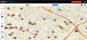
Due to the large set of variables available in the Los Angeles crimes dataset, it was expected that a wide range of analysis and visualisations would be available for it. An example of this can be found at CrimeMapping.com (https://www.crimemapping.com/Share/dd1a50e5fa4d4da4a41c8989c6ee791d), which plots crimes across the city in LA on a map, with options to filter the input dataset by the type of crime, as well as certain location and search radius, or by date of occurrence. The feature plots will then drop pins of type of crimes selected on the map based on the user input criteria (Figure 1).
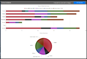
The same website also features a link to relevant plot summarizing the data shown above; where crimes displayed in the map are aggregated in the forms of a stacked bar chart and a pie chart (Figure 2). Such plots are typically not ideal for representation of data, as they do not allow for quick and easy deduction of which crime type is the most prevalent during the period, which we have surmised to be the aim of the plots in this section. Also, while the map with the built-in filers is highly useful, it does not make use of the whole dataset for statistical analysis, but focuses only on the frequency of occurrence. As such, through our project, we aim to build in a more holistic view of the crimes occurring in LA through incorporation of more features of each crime (such as victim profile, premise description) that are modelled with select statistical analytical methodologies and visualized with more effective charts.
The same website also features a link to access the plot shown above, which are an aggregate of the crimes displayed in the map being represented in the forms of a stacked bar chart and a pie chart. Such plots are typically not ideal for representation of data, as they do not allow for quick and easy deduction of which crime type is the most prevalent during the period, which we have surmised to be the aim of the plots in this section. Also, while the map with the built-in filers is highly useful, it does not make use of the whole dataset for statistical analysis, but focuses only on the frequency of occurrence. As such, through our project, we aim to build in a more holistic view of the crimes occurring in LA through incorporation of more features of each crime (such as victim profile, premise description) that are modeled with select statistical analytical methodologies and visualized with more effective charts.
Nolan III (2004) [1] established the relationship between crime rate and population size based on crime data and population of the state of California. In his research, the author calculated the observed crime rate and the expected crime rate of each jurisdiction in California, weighted by the population within each jurisdiction. The crime rates are expressed as the frequency of crime per 100,000 inhabitants in the population. Meanwhile, there has been extensive research on disease mapping through Empirical Bayes Estimate of relative risk (Clayton & Kaldor, 1987 [2]; Leyland & Davies, 2005[3]). Our research amalgamated these by performing an Empirical Bayes Estimate of posterior relative risk of crime occurrence in each Los Angeles Police Department (LAPD) reporting district by incorporating the population data in each district.
Meanwhile, Kernel Density Estimation has been used extensively in many research to identify hotspots of certain occurrences. Xie and Yan (2008) [4] used kernel density estimation for traffic accidents in the Bowling Green, Kentucky Area over a 2-D geographic space. Yano and Nakaya (2010) [5] incorporated the element of time in their Kernel Density Estimation of crime occurrence in Kyoto to identify crime clusters. Our research also utilizes the Kernel Density Estimation to analyse crime hotspots in LA, with functions for the user to choose date range for comparison in a 2-D geographic map, location of interest and area of interest surrounding that location.
Market basket analysis through association rule mining is typically used by retailers to understanding the purchase behaviours of their customers. However, Siti Azirah Asmai, Nur Izzatul Abidah Roslin, Rosmiza Wahida Abdullah & Sabrina Ahmad (2014) [6] developed a model based on association rule mining to map crime based on geographical and demographic variables to evaluate crime occurrence at specific locations. Our research also implements association rule mining to assess crime occurrence, but our model was expanded beyond the variables in that research to include crime type, weapon, premise and temporal data such as date occurred and day of the week.
Ozkan (2017) [7] built prediction models based on machine learning algorithms for the tendency of a convicted criminal to reoffend. In his research, Ozkan (2017) compared the accuracy of the models built using logistic regression against the machine learning algorithms that include random forests, support vector machines, XGBoost, neural networks and Search algorithm. XGBoost and neural networks outperformed the other predictive models. Our research thus implements the XGBoost algorithm to predict crime occurrence based on time category, reporting district area, premise, crime type, day of the week, gender, and age group of a person
Dataset and Data Preparation
Both the LA crime and population data were obtained from #dataLA (https://data.lacity.org/).
LA City Crime Data
The full dataset consists of 1.6 million observations of crime occurrences between year 2010 to year 2017, with 26 variables defined for each occurrence of crime (Full list of variables and descriptions available in Appendix A), which includes variables such as the dates and times of the crime occurrences, victim profiles, as well as areas and locations of crimes occurrences. Our research only utilised data ranging from 1 January 2014 to 30 September 2017.
Due to the granularity of certain fields in the data such as the crime description, premise description, victim age, victim descent and time of crime occurrence, reclassification of these variables had to be done before meaningful analysis or visualization could be carried out. Categorical variables such as crime descriptions, premise descriptions and victim descent were hence manually regrouped to a smaller number of segments with crime descriptions based on the convention as suggested in the draft International Classification of Crimes for Statistical Purposes by the United Nations Office on Drugs and Crime (Aug 2014). Interval variables such as the victim age and time of crime occurrence were binned – the binning of the time of crime occurrence was based loosely on the shift times of the LAPD should they be using the application for their deployment purposes.
LA City Population
The LA city population obtained was according to zip codes from 2010 census data. The individual zip codes were matched to the respective LAPD reporting districts and aggregated them to obtain the population in each reporting district.
Design Framework and Visualisation Methodologies
In designing the framework and visualisation, we followed Schneiderman’s mantra [8] of overview, zoom, and filter details on demand. Thus, we have opted to take a three-tiered approach to our application, with the first being time-aggregate plots, the second feature association plots, and the last, geo-spatial plots.
The first level will follow the direction of analysis of the CrimeMapping.com website in aggregation of data for a user-selected time period. Instead of the visuals in the website, small multiples of choropleth plots would be used for the display of such aggregates, and more levels of details (month-year, day levels) would be available on user demand to allow the user to be able to carry out a more thorough exploration of the crime data. Supplementary radar charts would also be used to offer details about the crimes in user-defined categories of interest. A calendar plot allows the user to compare crime occurrence daily and even to an hourly basis. Lastly, an Empirical Bayes Estimation would be used to estimate the relative risk of crime occurrence in each police reporting district area, with the user being able to select which time periods to compare. The relative risk in each reporting district is also compared using a choropleth.
At the second level, association rule mining will be carried out to look for any patterns of association between different features of each crime. To cater to the different interests of each end user, these categories can be selected by the end-user, which will result in the output of a network graph of the association rules mined.
At the third level, users would be able to define a search radius on a map based on a starting point, after which a kernel density plot would illustrate the density of crimes in the city of LA within the search radius indicated. To further supplement this, a predictive model has also been built for likelihood of crime occurrence and the results will be plotted as a heatmap.
Time-Aggregate
The time-aggregate plots serve to provide the user with an overview of the geospatial-temporal distribution of historical crime cases with the capability to compare crime occurrences across time periods and reporting districts based on crime type and other variables.
Year, Month-Year Aggregate and Moving Time Window through Choropleths/Small Multiples of Choropleths
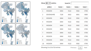
Choropleths were used to display the time-aggregate values for comparing observed crime occurrences across different LAPD reporting districts (Figure 3). The user can select which years as well as month-years to compare against. For the creation of these plots, 3 different packages were used. The tmaps package provided user-friendliness in working with shape files, ease of interpretation of colour hues for each reporting area and the ability to incorporate informative elements such as compass and scalebar. The ggplot2 package allowed building of choropleth maps with the reporting district labels for a more comprehensive view of the plot. Lastly, the rgdal/maptools package were used for reading in the shapefiles. The rgdal package has leverage over maptools as it can write projection information.
A summary table of crime occurrence of each reporting district is supplemented using the DT package for the user to obtain the actual values of crime occurrence at each reporting district.
The relative risk of crime occurrence was calculated for each area across time using the for Empirical Bayes Estimate eBayes function in the SpatialEpi package, given the observed and expected frequency of the crime occurrence. The observed frequency (O) of crime rate for each reporting district (r) area is calculated as follows:
The expected frequency (E) of crime occurrence at each day of the week (d) and hourly time period (h) for each area is calculated as follows:
The calculated relative risk estimates are displayed on a choropleth for ease of comparison by the user across each reporting district. Furthermore, the user can select the date range, day of the week and hourly time-period of interest.
Year and Month-Year Aggregate through Radar Chart
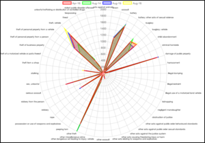
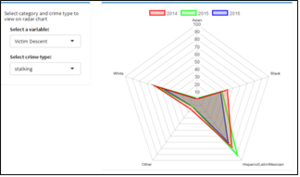
The radar charts served to provide an additional level of detail that complements the choropleth small multiples time aggregate plots. These plots would take the same set of years or month-years selected by the user and can thus be compared with each other to look for any possible trends in the data. With the radar chart, the user can compare multiple variables based on two versions.
The first version provides an overall view by different crime types (Figure 4) while the second radar chart allows the user to drill down further into different categories and crime types using the drop-down menu (Figure 5).
The radarchart package was used for the plot, as its interactivity supports tooltips which display the data labels on hover, while at the same time supporting the overlay of multiple plots on the same set of axes to show different years or month-years on the same chart.
Day-Aggregate through Calendar Plot
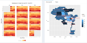
¬The calendar plot will be used in conjunction with the day level choropleth (Figure 6) to give a view of the crime distribution in the city of LA over the span of a day by hour. Due to our requirement of splitting each day into 24 hours, typical calendarplot packages available in CRAN could not be used. Instead, a customised calendarplot was built with ggplot2 which allows the manipulation of data into the required form of plot by mapping the appropriate variables at different levels (base plot, geom_tile etc). The crime occurrences were binned due to the skewness of crime occurrence occurring during the New Year’s Eve period. To provide interactivity, ggiraph was used as a wrapper over the ggplot2 object, which allowed selection of the hourly cells on the calendar plot. Once a date and the hour of that date is selected, the distribution of crime occurrence across reporting districts is displayed on the choropleth placed next to it
Feature Association Analysis
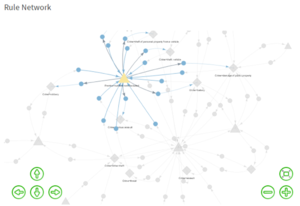
The arules package was used to mine the association rules based on a dropdown menu of a variable each for the antecedent and consequent. Once the antecedent and consequent are selected by the user, results of the pattern mining are displayed on a multimodal network graph (Figure 7).
This graph was created with the visNetwork package, which was chosen for its interactive mode as it allows users to zoom in on areas of interest, especially useful when the analysis creates numerous rules and thus a large network. The ability to modify the symbols depicting each mode in the network graph, as well as its display of tooltip allows the user to obtain more information about each rule upon hovering on the node. In our graph, we differentiated the antecedent as diamond shapes, the consequent as triangles and the rules linking them as circles. When a node is selected, the node becomes bold while the rest of the graph becomes greyed out. The user can view all rules mined in the datatable built using the DT package and sort the rules by ascending or descending order according to its lift, support and confidence.
Geo-Spatial Analysis
This section of the analysis examines crime occurrence with consideration of spatial and date-time variable so the crime occurrences.
Kernel Density Plot
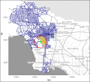
The kernel density plot (Figure 8) allows the user to view the density of crimes in the selected search radius based on a stating latitude and longitude location. The plot was created with the ggmaps package, as it allowed the overlay of multiple layers. The base layer is an OpenStreet Map of the starting location (confined to the LA city area). The other layers built upon that consist of the polygon outlines of the LAPD reporting districts, search circle circumference and finally the density plot.
In creating this plot, the geosphere package was used to calculate the shortest distance between two points according to the ‘Vincenty (ellipsoid)’ method for the search radius. The ellipsoid method of WGS84 was used for the calculation. The user interface also provided a parameter through which the zoom level could be specified. This would be useful in cases where the search radius defined is small, as users would then be able to get a clearer view of the difference in colour hues over the small area by zooming in.
Heat Map for Extreme Gradient Boosting
Prediction of crime occurrence with the extreme gradient boosting machine learning algorithm was achieved using the xgboost package. The xgboost package was used to build the model for this prediction, and was selected for its relatively efficient implementation among gradient boosting algorithms [11] and tree learning algorithm based on categorical variables, of which our dataset comprised largely of. Only select categories within the variables selected were used. These are the top 3 age groups of victims (youth, adult and middle-aged), 2 premise types (outdoor secluded and outdoor non-secluded), and 2 days of the week (Friday and Saturday) due to limitation in computing speed. All categories within variables of the reporting district and victim descent were included.
Results from the prediction model is plotted on a heatmap for ease of comparison of the likelihood of crime occurrence across areas and crime types. The user can select his or her gender, the time of day, the day of the week, his or her descent and the premise type he is visiting to view the likelihood of crime occurrences.
The heatmap was plotted with the ggplot2 package, as its geom_tile function allowed preparation of the grids, while the colour hues can be specified illustrate the range of likelihood, with darkest being higher likelihood for crime occurrence.
Insights and Its Implication
In the time-aggregate plots, it was noticed that crimes such as theft, burglary, damage of public property, assault and battery saw the highest occurrences for all three years for the year aggregate plots. When drilled down to the month-year level, the same trend was still prevalent. The distribution of crimes across years in different areas also seemed to be similar – Areas such as Newton, 77th Street and the South-East districts had the highest crime occurrences in 2014, 2015 and 2016.
In the feature association analysis, crimes were observed to occur mostly in non-secluded premises and places of residences. Crimes that occurred in non-secluded places were highly varied, ranging from theft and burglary to damage of public property, assault and battery. This, taken into consideration with the high crime rate observed in all years and the spikes in number of thefts, assaults and battery (present in the association rules with non-secluded premises) for both year aggregates and month-year aggregates, suggest that these criminals committing theft, assaults and battery have no qualms committing such crimes in the open. Thus, the law enforcement agency should consider whether there are enough patrolling officers to address it. More investigation needs to be done into the exact areas where such trends ring true, so that either patrols can be stepped up in these areas or other mitigating measures be put in place.
In the day view aggregate, a trend is noticed in the number of crimes occurring each day as shown in Figure 6 of the calendar plot. The crime rates are highest at night to 12-1am before tapering down in the late morning, after which a spike is observed at the noon period, and the number of crimes picks up yet again. It is noticed that Mondays and Fridays see a sharper increase in number of crimes, while the start of every month usually has more crimes than any other day of the month, with the dubious honour of having the most crime occurrences going to New Year’s Day for all three full years in our dataset.
Future Works
Due to technical constraints, the xgboost predictive modelling function based on user selected inputs was not built into our application. The maximum number of packages allowed in RStudio was exceeded with the incorporation of real-time prediction and it caused the application to cease its run. Due to time constraints, we were unable to find a workaround to resolve this issue, but believe in the possibility of a resolution in future works.
The sheer volume of the original dataset had also caused certain technical issues for us, forcing us to work with a small sample of approximately 3 years of data – while analysis of such data in this application would be able to provide a reasonable understanding of the data in the short term, a high level view would require a view of the analysis of a larger time period – this would also be able to facilitate policy decisions if the application was deployed for use in an enforcement agency. For this to be possible, functionality to save the results of the analysis from the application could be provided, such that the output of the analysis of several consecutive samples of data could then be put together to provide the higher level view required.
