Difference between revisions of "Ground Zero"
| Line 41: | Line 41: | ||
Through visual exploration, we noted that “Downtown” and “Uptown” have the highest number of individuals which posted microblogs of them feeling unwell. Drilling further down to the individual grids, most of the concentrated area were '''Grid 229, 231, 206'''. There are a few landmarks noted on these grids namely: "Convention Centre", "Vastapolis Hospital" and "Vastapolis Dome" | Through visual exploration, we noted that “Downtown” and “Uptown” have the highest number of individuals which posted microblogs of them feeling unwell. Drilling further down to the individual grids, most of the concentrated area were '''Grid 229, 231, 206'''. There are a few landmarks noted on these grids namely: "Convention Centre", "Vastapolis Hospital" and "Vastapolis Dome" | ||
| − | '''Image below''' is how the visualization was done. Treemap grid with the darkest green was selected. Finally the corresponding grid highlighted in AreaHeatMap | + | '''Image below''' is how the visualization was done. Treemap grid with the darkest green was selected. Finally the corresponding grid will be auto highlighted in AreaHeatMap. To enlarge the map, double click on the map. |
[[Image:GZTreemap.PNG|500px]] | [[Image:GZTreemap.PNG|500px]] | ||
| Line 58: | Line 58: | ||
We removed these 3 dates on the slider to observe any other trends we have not been aware of. Now refer to image 4 for the result on the viz. What we noticed are: | We removed these 3 dates on the slider to observe any other trends we have not been aware of. Now refer to image 4 for the result on the viz. What we noticed are: | ||
| − | *Downtown and Uptown were higher than average | + | *Downtown and Uptown were higher than average for entire Smartpolis |
*No outright trend noticed. However every area seems to fluctuate a lot around their average. | *No outright trend noticed. However every area seems to fluctuate a lot around their average. | ||
| Line 68: | Line 68: | ||
==Findings 3== | ==Findings 3== | ||
| − | Following to Findings 1, we went back to our microblog and with the help of JMP, we filtered for messages that contain “Convention” or “Vastapolis Dome”. There were quite a number of messages on Conventions. Plotting these on the timeline, there indeed was events happening around the day when spike in microblog messages. Image 5 below for reference | + | Following to Findings 1, we went back to our microblog and with the help of JMP, we filtered for messages that contain “Convention” or “Vastapolis Dome”. There were quite a number of messages on Conventions. Plotting these on the timeline, there indeed was events happening around the day when spike in microblog messages. Image 5 below for reference. This can be found on "Other Visualisation" on Tableau |
'''Image 5''' | '''Image 5''' | ||
Latest revision as of 23:16, 15 October 2017
|
|
|
|
|
|
|
Findings 1
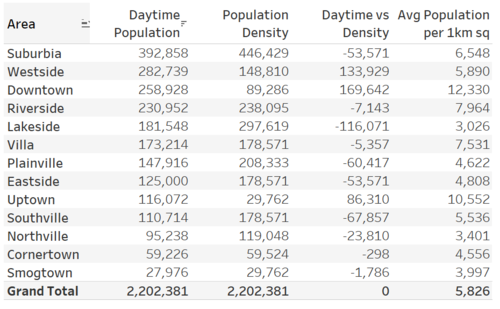
Each square (grid) on the treemap and Area Heat Map represents approximately 1km^2. This is made possible by adding a calculation in Tableau where the population for each area is divided by the total number of grid. Table shown in Image 1 below.
Image1
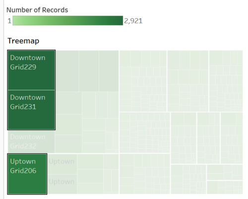
Through visual exploration, we noted that “Downtown” and “Uptown” have the highest number of individuals which posted microblogs of them feeling unwell. Drilling further down to the individual grids, most of the concentrated area were Grid 229, 231, 206. There are a few landmarks noted on these grids namely: "Convention Centre", "Vastapolis Hospital" and "Vastapolis Dome"
Image below is how the visualization was done. Treemap grid with the darkest green was selected. Finally the corresponding grid will be auto highlighted in AreaHeatMap. To enlarge the map, double click on the map.
Findings 2
We then move on to time viz. The question that we want to try to get an answer to is, the high concentration of messages in these 2 areas was it due to accumulation over time? Or was there a particular day which resulted in these large number of messages. Please refer to Image 3. On the overall, we noticed a spike on 18th to 20th.
Image 3
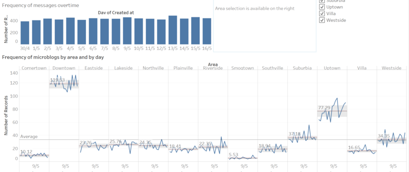
We removed these 3 dates on the slider to observe any other trends we have not been aware of. Now refer to image 4 for the result on the viz. What we noticed are:
- Downtown and Uptown were higher than average for entire Smartpolis
- No outright trend noticed. However every area seems to fluctuate a lot around their average.
Image 4
Findings 3
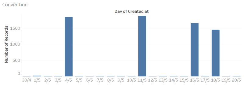
Following to Findings 1, we went back to our microblog and with the help of JMP, we filtered for messages that contain “Convention” or “Vastapolis Dome”. There were quite a number of messages on Conventions. Plotting these on the timeline, there indeed was events happening around the day when spike in microblog messages. Image 5 below for reference. This can be found on "Other Visualisation" on Tableau
Image 5
Conclusion for Ground Zero
In terms of area, it will definitely be Downtown and Uptown. Zooming into the nearest KM^2, it will be approximately on Grid 229, 231, 206. And landmarks around these area are "Convention Centre", "Vastapolis Hospital" and "Vastapolis Dome".
Hospital would naturally have a high density of these messages due to people visiting the hospital after they fall sick. Thus, wouldn’t constitute to a ground zero area. That will leave us with the highly likely Convention Centre and Vastapolis Dome.


