Difference between revisions of "Group 10 Report"
Cldeng.2016 (talk | contribs) |
|||
| (9 intermediate revisions by 2 users not shown) | |||
| Line 28: | Line 28: | ||
Especially, many economic data and macro economic data have a lot of scope statistically to be analysed and give major indications on the economy and other influenced markets. Even if they could be built they do not have easy access and usability to such application. So the people are loss are economists and financiars who lacks the access to applications that can easily and quickly analyse the required data in the advanced model through efficient visualuatization tools. | Especially, many economic data and macro economic data have a lot of scope statistically to be analysed and give major indications on the economy and other influenced markets. Even if they could be built they do not have easy access and usability to such application. So the people are loss are economists and financiars who lacks the access to applications that can easily and quickly analyse the required data in the advanced model through efficient visualuatization tools. | ||
| − | [[File:Picture101.png| | + | [[File:Picture101.png|400px|center]] |
=== Solution === | === Solution === | ||
| Line 41: | Line 41: | ||
Different caliberations of the data was done for using them for different analysis. | Different caliberations of the data was done for using them for different analysis. | ||
| − | To build the grid in geaofacet the the geographic location of these cities were also required. This grid was then | + | To build the grid in geaofacet the the geographic location of these cities were also required. This grid was then custom made by placing each city in the specific location on a china map that up there in github. |
=== R Packages Used === | === R Packages Used === | ||
| Line 54: | Line 54: | ||
<center>'''Dtwclust'''</center> | <center>'''Dtwclust'''</center> | ||
| | | | ||
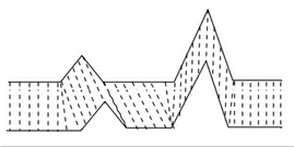
| − | Tool used for Sate of the Art time series clustering that is based on Distance Measure between two variables, thereby providing a more accurate clustering. | + | Tool used for Sate of the Art time series clustering that is based on Distance Measure between two variables, thereby providing a more accurate clustering.DTW is a dynamic programming algorithm that tries to find the optimum warping path between two series.The calculation of the DTW distance involves a dynamic programming algorithm that tries to find the optimum warping path between two |
| + | series under certain constraints. This statitical R package provides such functionality, and includes implementations of recently developed time-series clustering algorithms and optimizations. It serves as a bridge between classical clustering algorithms and time-series data, additionally providing visualization and evaluation routines that can handle time-series. | ||
| | | | ||
|- | |- | ||
| − | |[[File:Picture105 | + | |[[File:Picture105.png|500px|centre]] |
<center>'''Timetk''' </center> | <center>'''Timetk''' </center> | ||
| | | | ||
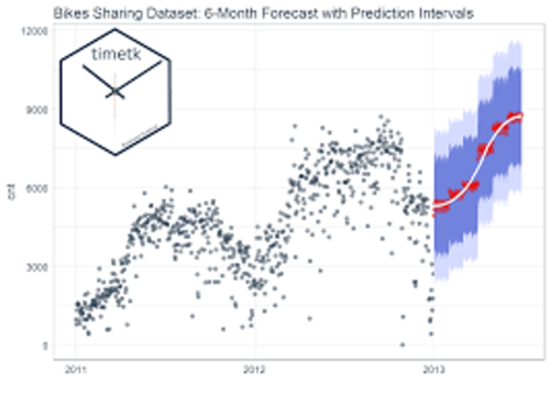
| − | The timetk package was used to out together the forcasted time series of all cities together | + | The timetk package was used to out together the forcasted time series of all cities together. The forecast function that forecasts by arima model is used behind the timetk package and it help in combing different forecasted outcomes. |
| | | | ||
|- | |- | ||
| Line 66: | Line 67: | ||
<center>'''Corrplot''' </center> | <center>'''Corrplot''' </center> | ||
| | | | ||
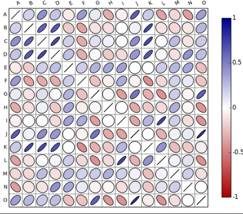
| − | The corrplot is used to build the correlation plot.This indicates the correlation of the distance measure between two cities. | + | The corrplot is used to build the correlation plot.This indicates the correlation of the distance measure between two cities. It is good at details Thus the darker blue shade it is means they are highly correlated where as the more they are towards the red colour measn they are more negatively correlated |
|- | |- | ||
|[[File:Picture103.png|500px]]<br/> | |[[File:Picture103.png|500px]]<br/> | ||
<center>'''Geofacet''' </center> | <center>'''Geofacet''' </center> | ||
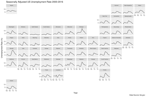
| − | |Geofacet is the package used to represent the cities in their geographic location | + | |Geofacet is the package used to represent the cities in their geographic location. The grid for China was not part of the package and was built separately.It arranges a sequence of plots of data for different geographical entities into a grid that preserves the geographical orientation. |
|} | |} | ||
| Line 82: | Line 83: | ||
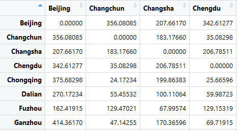
Initially the distance measure between the cities are computed. This is represented in the correlation plot. Each city can be compared against the other city. The darker the shade of the box the more correlated theya re than if they are closer towards dark red which states that theya re negatively correlated. Based on this distance measure algorith is the clustering based on. | Initially the distance measure between the cities are computed. This is represented in the correlation plot. Each city can be compared against the other city. The darker the shade of the box the more correlated theya re than if they are closer towards dark red which states that theya re negatively correlated. Based on this distance measure algorith is the clustering based on. | ||
The clustering has been presented based on the users choice of the clustering details. The user get to input the number of clusters, the type of clustering and the distance measure behind the clustering. This way t allowing the users to have detailed analysis based on their optimum configuration.The clusters are representted together with their underlying cities trends. The appliciation changes as per the users requirements. Apart from the charts together, they clusters have also been depcted in the maps. The cities are clustered based in a colour. Thre by with the shades at different cities in the map, the users can understand where exactly are the clusters majorly location and if there are any outliers. | The clustering has been presented based on the users choice of the clustering details. The user get to input the number of clusters, the type of clustering and the distance measure behind the clustering. This way t allowing the users to have detailed analysis based on their optimum configuration.The clusters are representted together with their underlying cities trends. The appliciation changes as per the users requirements. Apart from the charts together, they clusters have also been depcted in the maps. The cities are clustered based in a colour. Thre by with the shades at different cities in the map, the users can understand where exactly are the clusters majorly location and if there are any outliers. | ||
| + | ==== Mathematics of DTW Clustering ==== | ||
| + | DTW means Dynamic Time Wrapping, which is a popular method to do the time series clustering. | ||
| + | In time series clustering analysis, the length of the time series which need to be compared might not be the same, besides, they might only have the difference in Displacement on the timeline, which means that if the displacement is reductant, the time series which be used to compare might be the same. In these complex cases, the distance or similarity between the two-time sequences that is not effectively sought by the traditional Euclidean distance. DTW calculates the similarity between two-time series by extending and shortening the time series. | ||
| + | There are three components necessary to most clustering approaches, The DTW is a way to measure the distance between the time series. It uses the DTW distance to calculate the similarity and then use the usual clustering method like partitional, to do the clustering. In this application, it doesn’t provide the method to evaluate the clusters, which will be one direction for our future work. | ||
| + | 1. A measure of similarity or dissimilarity, i.e. a distance measure | ||
| + | 2. A clustering algorithm | ||
| + | 3. A method to evaluate clusters. | ||
| − | == | + | In R package, there is a package named ‘dtwclust’ which is use the dynamic time warping distance to do the time series clustering. Besides, it provides many choices of distance calculation method and clustering method, which can be choose by users. In these analysis, we choose 4 distance method and 3 clustering method to discuss. |
| − | + | Similarity calculation description | |
| + | {| class="wikitable" | ||
| + | |- | ||
| + | ! Similarity method !! Description | ||
| + | |- | ||
| + | | Dtw_basic || Basic dtw distance. A custom version of DTW with less functionality, but faster. | ||
| + | |- | ||
| + | | Dtw || Optionally with a Sakoe-Chiba/Slanted-band constraint. | ||
| + | |- | ||
| + | | gak || Fast global alignment kernels: Distance based on (triangular) global alignment kernels | ||
| + | |- | ||
| + | | ibk || Keogh’s lower bound for DTW with either L1 or L2 norm for the Sakoe-Chiba constraint | ||
| + | |} | ||
| + | |||
| + | Clustering method description | ||
| + | {| class="wikitable" | ||
| + | |- | ||
| + | ! Clustering method !! Description | ||
| + | |- | ||
| + | | Fuzzy || Fuzzy clustering creates a fuzzy or soft partition in which each member belongs to each cluster to a certain degree | ||
| + | |- | ||
| + | | Partitional || In this case, the data is explicitly assigned to one and only one cluster out of k total clusters. The total number of desired clusters must be specified beforehand, which can be a limiting factor, although this can be ameliorated by using validity indices. | ||
| + | |- | ||
| + | | Hierarchical || An algorithm that tries to create a hierarchy of groups in which, as the level in the hierarchy increases, clusters are created by merging the clusters from the next lower level, such that an ordered sequence of groupings is obtained. | ||
| + | |} | ||
| + | Compare this application with SAS and other tools, which are also inbuilt the function to do the time series clustering but only has use the Euclidean distance calculation to calculate the distance, this application is more flexible, convenient, besides, it can be alternative to expensive software. | ||
| + | Let’s use ‘dtw_basic’ distance and partitional clustering method to describe the time series clustering progress. | ||
| + | |||
| + | ==== Clustering Progress ==== | ||
| + | In this case, we use the first step in DTW (X, Y) involves creating a local cost matrix (LCM or lcm), which has n × m Dimensions and stores all pairwise distance from X_t1to〖 Y〗_t1. | ||
| + | Then, step through the matrix from 〖LCM〗_11to 〖LCM〗_TT, either diagonally add the costs of each step. At each step, the aim is to find the direction which increases the cost the least. For each direction, a pre-specified step pattern assigns a weight for them. For an optimum path a={(1,1),…,(T, T)}, the DTW distance is computed as:<br> | ||
| + | [[File:Clustering function.png|center]]<br> | ||
| + | Demo of DTW distance between cities <br> | ||
| + | [[File:Demo of DTW distance between cities.png|center]]<br> | ||
| + | Then it uses the partitional clustering to do the clusters. Firstly, it needs to set the number of clusters. Then we choose the projects randomly and compute the k centroids for each cluster. A prototyping function is applied to each cluster to update the corresponding centroid. Then, distances and centroids are updated iteratively until a certain number of iterations have elapsed, or no object changes clusters anymore. Then we can get the cluster results. | ||
| + | |||
| + | ==== Clustering with geographic ==== | ||
| + | Because this data is about the cities’ property price index, so we can further think about that if the location of cities which in the same cluster are near to each other or not. So, we label the city with clusters and put it into the China map which are built by the ‘rechart’ package. | ||
| + | |||
| + | ==== Insight from the advanced clustering ==== | ||
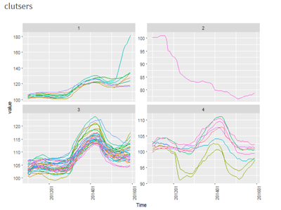
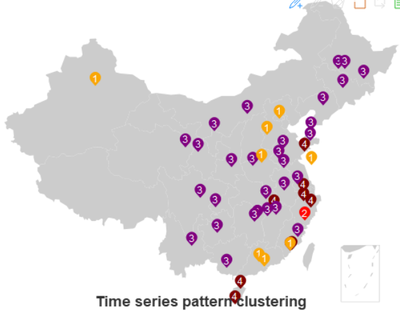
| + | If we set the number of cluster we want is 4, it can be found that in cluster2, only one city, Wenzhou is keeping going down during the 5years, which means the price of house in Wenzhou keeps decrease, other cities are all have an increase of the price index in March 2014, and then go down from April 2014 to February 2015, after February 2015, the price index increase slowly except one in cluster 1. This city is Shenzhen. From the map, it can be found that the cities in cluster4 are gathered in the coastline. Other clusters don’t have much geographic similarity. | ||
| + | [[File:Cluster.png|400px|center]] | ||
| + | [[File:Clusters in China map.png|400px|center]] | ||
| + | === Forecasting === | ||
| + | Forecasting has been represented using the timetk and geofacet package. The forecasted time series are shown against their actual time series and are shown over the China map based on the from scratch made grid. Now there are many tools to visualize and predict spatial data, but those mainly concentrate on coloring geographical regions according to the average value of a variable to produce a choropleth type map.Sometimes, more sophisticated visualizations are associated with geographical regions, but these may be time-consuming or require a dedicated team to produce. The reason why we use Geofacet is that Geofacet arranges a sequence of plots of data for different geographical entities into a grid that strives to preserve some of the original geographical orientation of the entities. It provides a powerful, but a simple-to-use contribution to visualizing spatial data. | ||
| + | ==== Forecasting methodology ==== | ||
| + | ARIMA stands for auto-regressive integrated moving average and is specified by these three order parameters: (p, d, q). The process of fitting an ARIMA model is sometimes referred to as the Box-Jenkins method. Below is ARIMA model: | ||
| + | [[File:Forecasting function.png|center]] | ||
| + | ARIMA model consist by three parts: AR(p), I(d), MA(q).<br> | ||
| + | AR(p) indicated autoregressive which means that the current time point is equal to the regression of the values of several time points in the past - because it depends only on its own past historical value and does not depend on other explanatory variables.<br> | ||
| + | I(d) is an integrated abbreviation which represent differencing time series. Because the time series analysis requires stationary, unsteady sequence needs to be transformed into a smooth sequence.<br> | ||
| + | MA(q) represent moving average, meaning that the error of the model as a combination of previous error terms.<br> | ||
| + | The advantage of this model is that it is very simple, requiring only endogenous variables without other exogenous variables. But it required stationary data and can only capture the linear relationship. | ||
| + | ==== Sweep with forecasting ==== | ||
| + | After built forecasting model for each city, one problem occurred: forecast is based on the TS system, which makes it difficult work within the Tidyverse. So next step we use Sweep package, the sweeping package converts the output from forecast modelling and forecasting functions to “tidy” data frames. Beside this benefit, sweep package is carry dates through to the end, the TS object usually lose data information, but this sweep maintains the original time series index through the whole forecasting process. Additionally, it extracts critical information into tidy data frames. | ||
| + | ==== Forecasting with geographic ==== | ||
| + | Nowadays, data analyst spends lot of their time formatting geographical information with data. However, these are mostly focused on producing contour maps by coloring the geographic area based on the average of the variables. Sometimes, more complex visualizations are associated with geographical areas, but these can be time and human power consuming. To connect data with geographical information in an easily read way, we use Geofacet to draw forecasting map. Geofacet has now become a popular graphical tool. Because it generates a wide variety of graphics and fine-tune them in reproducible ways. A key feature of it is “Faceting”, which automatically generates similar figures for subsets of data. It arranges the data for different geo-entities into a grid that preserve some of the original geographical orientation of the entities. In our project, we illustrated the locations of cities by producing time-series forecasting visualizations. Besides, we also submitted china city grid to Github for helping others. | ||
| + | ==== Insight for forecasting with Geofacet ==== | ||
| + | Below is forecasting map. Red indicate real price index and blue indicate predict value, the locations of city grid in below are exactly real location in China map. | ||
| + | [[File:Geofacet for forecasting.png|500px|center]] | ||
| + | == Application Introduction == | ||
| + | Overview-The first page is a time series overview, which users can choose the city them want to know about. | ||
| + | [[File:A1.png|center]] | ||
| + | Clustering + mapping- The second page is time series clustering function. The number of clustering, the clustering method and distance calculation method are all can choose by user. The minimum number of clusters is 3, the maximum number of clusters is 9. There are 3 types of clusters type and 4 distance calculation method can be choose. They are all have been introduced before. | ||
| + | [[File:A2.png|center]] | ||
| + | Correlation-The correlation plot shows the correlation between city to city. This is a demo step for the clustering process. From here, it can found the specific relationship between city to city. | ||
| + | [[File:A3.png|center]] | ||
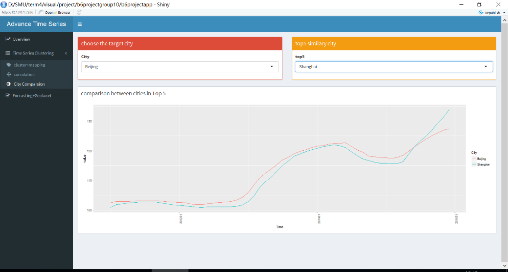
| + | City comparison-the users can choose the target city, and the application will show the top five similarity cities with the target city. The similarity is calculation from the correlation value. In this function, users can compare the cities they interested in. However, the function hasn’t realize the total automation. So only when choose the Beijing, the top five cities will show up, But other cities cannot. This is also another further work we need to do, to optimize the automation city comparison. | ||
| + | [[File:A4.png|center]] | ||
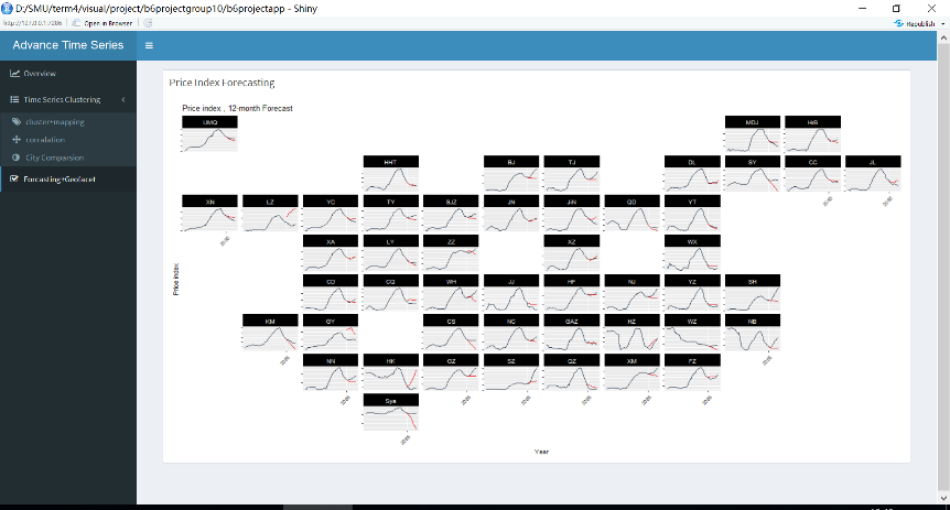
| + | Forecasting + Geofacet-This shows the forecasting result which visual by Geofacet. | ||
| + | [[File:A5.png|center]] | ||
== Future Scope == | == Future Scope == | ||
| − | + | 1. Recommend number of selected cluster based on CVI and best methodology based on compactness and separation within clusters.<br> | |
| − | The scope can be | + | 2. Combined more property related data to better understand property market develop situation.<br> |
| + | 3. The scope can be expanding, in the future, the application can use for larger region such as province, country even for intercontinental.<br> | ||
| + | 4. The city comparison should be optimizing. When choose any city, it will show the top 5 similarity cities. <br> | ||
Latest revision as of 15:54, 10 December 2017
|
|
|
|
|
Contents
Motivation and Objective
Problem
Many analysis methods and algorithms out there fail to be utilized or optimized by the users. They are either poorly derived with great visualization or accurately derived with poor visualization. R has over 10000 packages that support visualization for advanced analysis too. There is a gap in the potentiality of R and what we use in day to day life. The mainstream packages are very few which cover basic analysis and algorithms. There are many data that require advanced analysis to come up with more accurate and dependable results.
Especially, many economic data and macro economic data have a lot of scope statistically to be analysed and give major indications on the economy and other influenced markets. Even if they could be built they do not have easy access and usability to such application. So the people are loss are economists and financiars who lacks the access to applications that can easily and quickly analyse the required data in the advanced model through efficient visualuatization tools.
Solution
We have put together the best method of analysing time series in a most efficient way.The advanced time series analysis is based on state of the art time series clustering and also forecasting based on ARIMA model. This provides an accurate model for analysis of time series clustering based on DTW algorithm. This method has been visualised in different way to help in easier comparison and understanding of the characteritics of the data. The Rshiny application makes it easier for the user to choose the different the different option tha is part of the analysis. Just by few click the result is varied based on the chosen algorithm.
Housing Price Index is a major economic factor that not just depicts the housing market but also the economy.The housing prices analysis of 48 cities of China. To understand their trend and compare them with the other cities based on the distance measure. The advanced time series analysis methods helps in understanding the response of the cities and doing a comparative study over a period.
Data Preparation and Packages Used
Data Design
The data is the Housing Price Index for 5 years from 2010-2015.The data is taken from CEIC page and was cleaned to get them to 48 major cities. Different caliberations of the data was done for using them for different analysis.
To build the grid in geaofacet the the geographic location of these cities were also required. This grid was then custom made by placing each city in the specific location on a china map that up there in github.
R Packages Used
Analysis and Application
The analysis has been represented in different ways.the distance measure which is the fundamental algorithm has been represented using the correlation plot. Based on this similarity the clusters have been made.They have been mainly combined with the geographic location. The geographic location of the analysis helps in better comparison of the analysis with regards to their position in the country. There by analysis can be made whether the region or being under a particular location influence the result of the analysis. Thefore the recharts has been use to shoe the clustering in a china map and the forcasting has been showing in the china map using the geo-facet .
Time Series Analysis
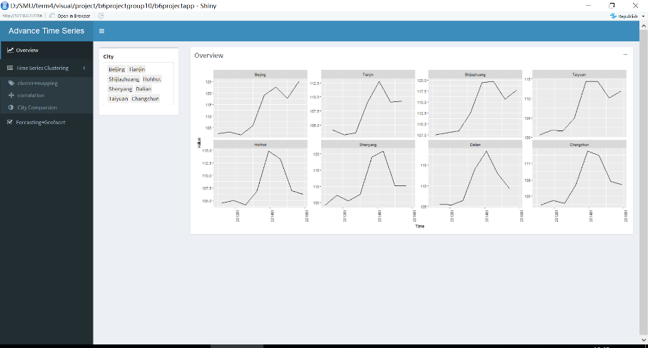
The users will be able to choose the cities they want to see the trend for. And the chosen cities will be presented. The plot of the time series trend are based on the GGPlot . The can view and compare 2or more cities by choosing the requirements. This way they can analyse close togther how the trend have been at the two selected location
Clustering
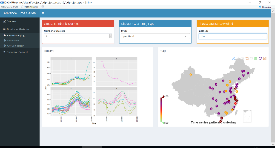
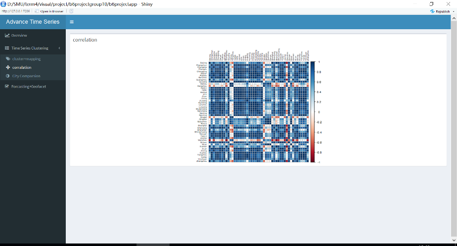
Initially the distance measure between the cities are computed. This is represented in the correlation plot. Each city can be compared against the other city. The darker the shade of the box the more correlated theya re than if they are closer towards dark red which states that theya re negatively correlated. Based on this distance measure algorith is the clustering based on. The clustering has been presented based on the users choice of the clustering details. The user get to input the number of clusters, the type of clustering and the distance measure behind the clustering. This way t allowing the users to have detailed analysis based on their optimum configuration.The clusters are representted together with their underlying cities trends. The appliciation changes as per the users requirements. Apart from the charts together, they clusters have also been depcted in the maps. The cities are clustered based in a colour. Thre by with the shades at different cities in the map, the users can understand where exactly are the clusters majorly location and if there are any outliers.
Mathematics of DTW Clustering
DTW means Dynamic Time Wrapping, which is a popular method to do the time series clustering. In time series clustering analysis, the length of the time series which need to be compared might not be the same, besides, they might only have the difference in Displacement on the timeline, which means that if the displacement is reductant, the time series which be used to compare might be the same. In these complex cases, the distance or similarity between the two-time sequences that is not effectively sought by the traditional Euclidean distance. DTW calculates the similarity between two-time series by extending and shortening the time series. There are three components necessary to most clustering approaches, The DTW is a way to measure the distance between the time series. It uses the DTW distance to calculate the similarity and then use the usual clustering method like partitional, to do the clustering. In this application, it doesn’t provide the method to evaluate the clusters, which will be one direction for our future work. 1. A measure of similarity or dissimilarity, i.e. a distance measure 2. A clustering algorithm 3. A method to evaluate clusters.
In R package, there is a package named ‘dtwclust’ which is use the dynamic time warping distance to do the time series clustering. Besides, it provides many choices of distance calculation method and clustering method, which can be choose by users. In these analysis, we choose 4 distance method and 3 clustering method to discuss. Similarity calculation description
| Similarity method | Description |
|---|---|
| Dtw_basic | Basic dtw distance. A custom version of DTW with less functionality, but faster. |
| Dtw | Optionally with a Sakoe-Chiba/Slanted-band constraint. |
| gak | Fast global alignment kernels: Distance based on (triangular) global alignment kernels |
| ibk | Keogh’s lower bound for DTW with either L1 or L2 norm for the Sakoe-Chiba constraint |
Clustering method description
| Clustering method | Description |
|---|---|
| Fuzzy | Fuzzy clustering creates a fuzzy or soft partition in which each member belongs to each cluster to a certain degree |
| Partitional | In this case, the data is explicitly assigned to one and only one cluster out of k total clusters. The total number of desired clusters must be specified beforehand, which can be a limiting factor, although this can be ameliorated by using validity indices. |
| Hierarchical | An algorithm that tries to create a hierarchy of groups in which, as the level in the hierarchy increases, clusters are created by merging the clusters from the next lower level, such that an ordered sequence of groupings is obtained. |
Compare this application with SAS and other tools, which are also inbuilt the function to do the time series clustering but only has use the Euclidean distance calculation to calculate the distance, this application is more flexible, convenient, besides, it can be alternative to expensive software. Let’s use ‘dtw_basic’ distance and partitional clustering method to describe the time series clustering progress.
Clustering Progress
In this case, we use the first step in DTW (X, Y) involves creating a local cost matrix (LCM or lcm), which has n × m Dimensions and stores all pairwise distance from X_t1to〖 Y〗_t1.
Then, step through the matrix from 〖LCM〗_11to 〖LCM〗_TT, either diagonally add the costs of each step. At each step, the aim is to find the direction which increases the cost the least. For each direction, a pre-specified step pattern assigns a weight for them. For an optimum path a={(1,1),…,(T, T)}, the DTW distance is computed as:
Demo of DTW distance between cities
Then it uses the partitional clustering to do the clusters. Firstly, it needs to set the number of clusters. Then we choose the projects randomly and compute the k centroids for each cluster. A prototyping function is applied to each cluster to update the corresponding centroid. Then, distances and centroids are updated iteratively until a certain number of iterations have elapsed, or no object changes clusters anymore. Then we can get the cluster results.
Clustering with geographic
Because this data is about the cities’ property price index, so we can further think about that if the location of cities which in the same cluster are near to each other or not. So, we label the city with clusters and put it into the China map which are built by the ‘rechart’ package.
Insight from the advanced clustering
If we set the number of cluster we want is 4, it can be found that in cluster2, only one city, Wenzhou is keeping going down during the 5years, which means the price of house in Wenzhou keeps decrease, other cities are all have an increase of the price index in March 2014, and then go down from April 2014 to February 2015, after February 2015, the price index increase slowly except one in cluster 1. This city is Shenzhen. From the map, it can be found that the cities in cluster4 are gathered in the coastline. Other clusters don’t have much geographic similarity.
Forecasting
Forecasting has been represented using the timetk and geofacet package. The forecasted time series are shown against their actual time series and are shown over the China map based on the from scratch made grid. Now there are many tools to visualize and predict spatial data, but those mainly concentrate on coloring geographical regions according to the average value of a variable to produce a choropleth type map.Sometimes, more sophisticated visualizations are associated with geographical regions, but these may be time-consuming or require a dedicated team to produce. The reason why we use Geofacet is that Geofacet arranges a sequence of plots of data for different geographical entities into a grid that strives to preserve some of the original geographical orientation of the entities. It provides a powerful, but a simple-to-use contribution to visualizing spatial data.
Forecasting methodology
ARIMA stands for auto-regressive integrated moving average and is specified by these three order parameters: (p, d, q). The process of fitting an ARIMA model is sometimes referred to as the Box-Jenkins method. Below is ARIMA model:
ARIMA model consist by three parts: AR(p), I(d), MA(q).
AR(p) indicated autoregressive which means that the current time point is equal to the regression of the values of several time points in the past - because it depends only on its own past historical value and does not depend on other explanatory variables.
I(d) is an integrated abbreviation which represent differencing time series. Because the time series analysis requires stationary, unsteady sequence needs to be transformed into a smooth sequence.
MA(q) represent moving average, meaning that the error of the model as a combination of previous error terms.
The advantage of this model is that it is very simple, requiring only endogenous variables without other exogenous variables. But it required stationary data and can only capture the linear relationship.
Sweep with forecasting
After built forecasting model for each city, one problem occurred: forecast is based on the TS system, which makes it difficult work within the Tidyverse. So next step we use Sweep package, the sweeping package converts the output from forecast modelling and forecasting functions to “tidy” data frames. Beside this benefit, sweep package is carry dates through to the end, the TS object usually lose data information, but this sweep maintains the original time series index through the whole forecasting process. Additionally, it extracts critical information into tidy data frames.
Forecasting with geographic
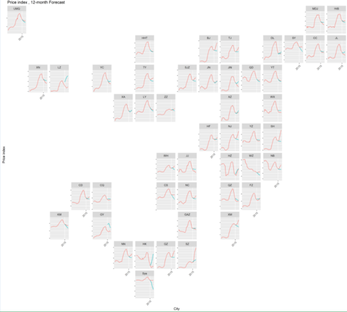
Nowadays, data analyst spends lot of their time formatting geographical information with data. However, these are mostly focused on producing contour maps by coloring the geographic area based on the average of the variables. Sometimes, more complex visualizations are associated with geographical areas, but these can be time and human power consuming. To connect data with geographical information in an easily read way, we use Geofacet to draw forecasting map. Geofacet has now become a popular graphical tool. Because it generates a wide variety of graphics and fine-tune them in reproducible ways. A key feature of it is “Faceting”, which automatically generates similar figures for subsets of data. It arranges the data for different geo-entities into a grid that preserve some of the original geographical orientation of the entities. In our project, we illustrated the locations of cities by producing time-series forecasting visualizations. Besides, we also submitted china city grid to Github for helping others.
Insight for forecasting with Geofacet
Below is forecasting map. Red indicate real price index and blue indicate predict value, the locations of city grid in below are exactly real location in China map.
Application Introduction
Overview-The first page is a time series overview, which users can choose the city them want to know about.
Clustering + mapping- The second page is time series clustering function. The number of clustering, the clustering method and distance calculation method are all can choose by user. The minimum number of clusters is 3, the maximum number of clusters is 9. There are 3 types of clusters type and 4 distance calculation method can be choose. They are all have been introduced before.
Correlation-The correlation plot shows the correlation between city to city. This is a demo step for the clustering process. From here, it can found the specific relationship between city to city.
City comparison-the users can choose the target city, and the application will show the top five similarity cities with the target city. The similarity is calculation from the correlation value. In this function, users can compare the cities they interested in. However, the function hasn’t realize the total automation. So only when choose the Beijing, the top five cities will show up, But other cities cannot. This is also another further work we need to do, to optimize the automation city comparison.
Forecasting + Geofacet-This shows the forecasting result which visual by Geofacet.
Future Scope
1. Recommend number of selected cluster based on CVI and best methodology based on compactness and separation within clusters.
2. Combined more property related data to better understand property market develop situation.
3. The scope can be expanding, in the future, the application can use for larger region such as province, country even for intercontinental.
4. The city comparison should be optimizing. When choose any city, it will show the top 5 similarity cities.

