Difference between revisions of "Project Groups"
m |
|||
| (11 intermediate revisions by 6 users not shown) | |||
| Line 70: | Line 70: | ||
'''Environmental Criminology: The Missing "W" in Whodunnit''' | '''Environmental Criminology: The Missing "W" in Whodunnit''' | ||
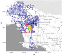
| − | + | With increased availability of crime data rich with geospatial-temporal variables, exploratory, statistical and predictive analytics can be leveraged on to understand crime occurences with the lens of environmental criminology. The application produced from this research leverages on previous works on analysing interaction and associations amongst crime data variables that is supplemented with the population data. With Los Angeles city crimes used as our case study, we demonstrate how results from various analytical methods can be displayed visually and intuitively for exploration by the casual user with interactivity catered to potential varying needs. In particular, the application displayed exploratory and predictive statistcal analytics results using radar charts, calendar plot, choropleths, small multiples of choropleths, multimodal network graphs, heat maps and geographical maps. | |
| − | |||
| − | |||
| − | |||
|| | || | ||
*[[Grp2_Proposal|Proposal]] | *[[Grp2_Proposal|Proposal]] | ||
*[[Group02_Report|Report]] | *[[Group02_Report|Report]] | ||
| − | *[ | + | *[https://rchlt.shinyapps.io/va-g2-lightapp/ Light Version of App^] |
| + | *[https://tinyurl.com/yaapkvx7/ Code for full-scale App] | ||
| + | *[https://tinyurl.com/ybmxe3d8/ Data for full-scale App] | ||
*[[Group02_Poster|Poster]] | *[[Group02_Poster|Poster]] | ||
| + | |||
| + | ^ Light Version contains 10 months of data (Jan, Feb, Aug, Sep, Dec for 2016 and 2017) | ||
| + | |||
|| | || | ||
* Matilda Tan Ying Xuan | * Matilda Tan Ying Xuan | ||
| Line 137: | Line 139: | ||
|| | || | ||
<div style="text-align:center;"> | <div style="text-align:center;"> | ||
| − | [[ | + | [[ISSS608_2017-18_T1_Group5_Report|Group 5: Aviation Expansion]]<br><br>[[File:G5_pic.jpg|250px|center]] |
</div> | </div> | ||
|| | || | ||
| Line 303: | Line 305: | ||
*[[Group12 Proposal|Proposal]] | *[[Group12 Proposal|Proposal]] | ||
*[[Group12 Poster|Poster]] | *[[Group12 Poster|Poster]] | ||
| − | *[https://koreastockcrossholding.shinyapps.io/ | + | *[https://koreastockcrossholding.shinyapps.io/ksch1203/ Application] |
*[[Group12 Report|Report]] | *[[Group12 Report|Report]] | ||
|| | || | ||
Latest revision as of 11:51, 4 December 2017
|
|
|
|
|
|
Project Groups
Please change Your Team name to your project topic and change student name to your own name
| Project Team | Project Title/Description | Project Artifacts | Project Member |
|---|---|---|---|
|
World Development Indicators: A New Visual Perspective World Development Indicators (WDI) is an extensive and holistic database compiled by World Bank focusing on countries development across the globe. It covers 20 topics with more than 1,300 time series development indicators featuring 214 nations and 38 country group which adds up to more than 7 million data points collected over the span of 56 years. The massive amount of world development data has by far exceeds the ability for students, policymakers, analysts and officials to transform the data into proper visualization for analysing and gaining insight of the global developmental landscape. Thus, creating an adverse impact on the financial and technical assistance World Bank is providing to the developing countries around the world. To address this pressing issue, the team is motivated to design and develop a single-view, dynamic and interactive visual dashboard to provide students, policymakers, analysts and officials a holistic view of the World Development Indicators data collected. |
| ||
|
Environmental Criminology: The Missing "W" in Whodunnit With increased availability of crime data rich with geospatial-temporal variables, exploratory, statistical and predictive analytics can be leveraged on to understand crime occurences with the lens of environmental criminology. The application produced from this research leverages on previous works on analysing interaction and associations amongst crime data variables that is supplemented with the population data. With Los Angeles city crimes used as our case study, we demonstrate how results from various analytical methods can be displayed visually and intuitively for exploration by the casual user with interactivity catered to potential varying needs. In particular, the application displayed exploratory and predictive statistcal analytics results using radar charts, calendar plot, choropleths, small multiples of choropleths, multimodal network graphs, heat maps and geographical maps. |
^ Light Version contains 10 months of data (Jan, Feb, Aug, Sep, Dec for 2016 and 2017) |
| |
|
Group 3: Shiny-GWR Geovisual Analytics Application |
Building a geo-visualization application to analyse district economy in east region of China with geographically weighted regression (GWR) technique Geospatial analysis was developed for problems in the environmental and life sciences, which has currently extended to almost all industries including economy, defence, utilities, social sciences, and public safety. The application of geo-visualization using geographically weighted regression (GWR) is an exploratory technique mainly intended to indicate where non-stationarity is taking place on the map. It is a good exploratory analytical tool which creates a set of location based parameter estimates, able to be mapped and analysed to give spatial information for the relationship of explanatory variables and response variable.
|
| |
|
Group 4: A tale of Bitcoin |
Ever wondered how far bitcoin's value could go? Bitcoin has recently garnered mixed reviews from two extreme ends, from China banning bitcoin to Chicago Mercantile Exchange supporting the futures trading of bitcoin. There are even more varying opinions from big investment banks to regulators. All this recent excitement is due to bitcoin’s value rising by more than 700% (as of October 2017) from the start of 2017. It is very tempting to speculate that the price will continue to go up. If it does, by how much? If it doesn’t, how hard will it fall? How is its relative performance compared to other instruments? There are many more questions from both investors as well as curious academics alike. This paper’s focus will be on the following:
|
| |
|
Linking the globe: An Interactive Dashboard for Exploring Aviation Expansion Along the "Belt and Road" The Belt and Road (B&R) refers to the land-based "Silk Road Economic Belt" and the seagoing "21st Century Maritime Silk Road". Unveiled in 2013, the strategy underlines China's push to take a larger role in global affairs with a China-centered trading network by reinvigorating the seamless flow of capital, goods and services between Asia and the rest of the world. with aim of promoting further market integration and forging new ties among communities, the routes cover more than 60 countries and regions from Asia to Europe via Southeast Asia, South Asia, Central Asia, West Asia and the Middle East. By investigating all air-routes and flights between China and the “Belt and Road” countries between 2013 and 2017, the main purpose of this project is to explore the growing trend, regional connectivity and development potential in this aviation network. A web-based visual analytics tool is implemented using R shiny with Leaflet package which can be used to easily explore and understand the flight network. |
| ||
|
How is Beijing Air Quality in 2017? On Nov 4th, Beijing Environmental Protection Agency released the news, owing to the adverse weather conditions and early winter heating as well as other factors, it is expected that there will be a continuous 4-day regional heavily polluted air quality in Beijing-Tianjin-Hebei and surrounding areas on November 4th, in addition, the air quality in some cities may reach serious pollution level….
|
| ||
|
Bike Sharing Pronto Cycle Share, branded as Pronto!, was a public bicycle sharing system in Seattle, Washington, that operated from 2014 to 2017. The system, owned initially by a non-profit and later by the Seattle Department of Transportation, included 58 stations in the city's central neighbourhoods and above 500 bicycles. Bike-sharing is a short distance transportation for people to make their life more convenient. When people use shared-bike, they can borrow and return bikes at any stations in the service station. Some stations have too many incoming bike and get jammed without enough docks for upcoming bikes, while some other stations get empty quickly and lack enough bikes for people to check out. Which station has the most passenger flow? In our project, we calculate the in degree an out degree for each station, to help user to understand how passenger usually use bike sharing service through each station point. We also divided time range into different periods, the data users can see much more details in yearly, monthly, even hourly. So that they can understand better the bike usage pattern. How to re-distribute bike at a lower cost? Because passenger will take the bike from one station to another station everyday, Company should ask employees to re-distribute bike among existent stations. In our project, we use the real map, cooperated with the degree data calculated before, to visualize a shortest path to help employees re-distribute bike in a more efficient way. |
| ||
|
Group 8: Time Series Explorer |
Time-series Explorer: Building interactive data visualisation for time series analysis Time-series analysis is a time and effort consuming endeavour. As budding data analysts, we spent considerable resources in experimenting with many variations of parameter configurations to analyse time-series data. This difficulty stems from the lack of automatic tools that can help calculate the optimized time-series parameters during model training. To tackle this challenge, we created an easy-to-use time-series exploration system that is accessible even to the uninitiated analyst. The system is able to decompose the time series data to its constituent parts, namely Seasonality, Trend and Random (Noise). It can generate several forecasting models, using Exponential Smoothing and ARIMA analysis techniques, to predict future time periods using optimization techniques. The system also allows other forms of time series data to be displayed and their forecasts compared using the given forecasting methods, within certain formats. To test the system capabilities, we adopted the Singapore Consumer Price Index (CPI) as our use case. The CPI, with its short-term forecasts, is often used for tuning Governmental policies to steer inflation rates in countries like Singapore and for foreign investors to consider allocating potential investment funds into the country. |
| |
|
Group 10:China Property Trend |
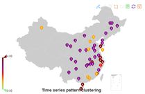
China property analysis The real-estate market is ever growing and has more stakeholders. We are here to build an app that makes an analysis of the housing prices market an easy and effective one by just a few clicks and hovering around. This way allowing the major stakeholders perform their analysis and plan their decisions more efficiently. We have used various packages such as'Recharts','Timekt','Sweep','ggplot2' that allowed users to model and visualize the housing prices indexes in different ways for different purposes. Time Series Analysis-The application will allow the user to choose the City they are interested in and the time period they want to look at. The trend of the prices during that period will be provided.This is built for analysts and agents and government officials who would like to know on the performance at a certain period of time and also a comparative study between different cities. This way they can find any outliers or a particular pattern in the indices. The time series is related to the economic policy and the effect is stressed based on the chosen policy time period. Cluster Analysis – We further develop some clusters of the cities based on their housing index reaction. This way we can group the cities whose housing market behave/ respond to the market in a similar way. The government officials and the local agents understand the markets better and plan their policies better. A waiver or cluster development centric policy can be made by the government. Forcast Analysis: Forecast analysis is done using Geofacet that we can compare the forecasted prices between the different region of the country. Geofaceting arranges a sequence of plots of data for different geographical entities into a grid that strives to preserve some of the original geographical orientation of the entities. This app can be applied to any other economic variable in China. This will be greatly helpful for economists, agents and government officials to look into the specific data and make some judgments and decisions based on it. |
| |
|
Group 11: CrimeModeler: A Visually-Driven Geospatial Modelling Tool for Crime Applications |
CrimeModeler: A Visually-Driven Geospatial Modelling Tool for Crime Applications Based on UN’s Survey of Crime Trends published in 2006, England and Wales have one of the highest crime rates among OECD countries. We have developed CrimeModeler, a geospatially modelling tool to investigate the spatial variation of crime across different districts in England and Wales, and the relationship between crime and socio-economic characteristics for each district. As it is common for neighbouring regions to have correlation in their crime rate, we compare the use of geographically weighted regression (GWR) and conventional (or global) multiple regression model to see whether a better result can be obtained from GWR. We will also investigate whether there are certain variables that have an impact on crime rate in one area but not in another. Local governments may use this information to come up with better policies to tackle crime.
|
| |
|
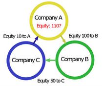
Cross Shareholding Cross shareholding is a situation in which a corporation owns stock in another company. So, technically, corporations own securities issued by other corporations. Cross shareholding can lead to double counting, whereby the equity of each company is counted twice when determining value. When double counting occurs, the security's value is counted twice, which can result in estimating the wrong value of the two companies. Cross shareholding is very common in corporate world. Sometimes, there can be more than 10 companies involved and it is very difficult for investors and regulators to track who owns how much. In this project, our group choose 1 or 2 big groups of companies from Korea and China with heavy cross shareholding between each other and conduct visualization and relationship analysis on their networks using R-Shiny so that people can have better picture of these companies’ network and easier to understand relationship between companies. |
|


