Difference between revisions of "Group01 Proposal"
| (29 intermediate revisions by the same user not shown) | |||
| Line 1: | Line 1: | ||
<!--MAIN HEADER --> | <!--MAIN HEADER --> | ||
| − | <div style="background:#565656; border:#565656; padding-left:15px; text-align: | + | <div style="background:#565656; border:#565656; padding-left:15px; text-align:left;"> |
| − | <font size = 5; color="#FFFFFF"><span style="font-family:Century Gothic;"><b> | + | [[File:grp01_headerImage.png|209px|left]] |
| − | <font size = 3; color="#FFFFFF"><span style="font-family:Century Gothic;">A web-based analytics application | + | <br> |
| + | <font size = 5; color="#FFFFFF"><span style="font-family:Century Gothic;"><b>WORLD DEVELOPMENT INDICATORS: A NEW VISUAL PERSPECTIVE</b><br></span></font> | ||
| + | <font size = 3; color="#FFFFFF"><span style="font-family:Century Gothic;">A web-based analytics application to visualize countries development across the globe</span></font> | ||
| + | <br><br> | ||
| + | <div style="background:#d16163; border:#565656; padding-left:0px; text-align:left;"><br></div> | ||
</div> | </div> | ||
| Line 32: | Line 36: | ||
<!--PROPOSAL CONTENT --> | <!--PROPOSAL CONTENT --> | ||
==Issues and Problems== | ==Issues and Problems== | ||
| − | |||
| − | |||
| − | |||
| − | |||
| − | |||
| − | |||
| − | |||
| − | |||
| + | The main goal of the World Bank is to help developing countries reduce poverty and support development through their financial products & services and innovative knowledge sharing. One of the initiative they had is the Open Data website that offers free access to comprehensive, downloadable indicators about development in countries around the globe. | ||
| + | |||
| + | World Development Indicators ([https://data.worldbank.org/data-catalog/world-development-indicators WDI]) is an extensive and holistic database compiled by World Bank focusing on countries development across the globe. It covers 20 topics with more than 1,300 time-series development indicators featuring 214 nations and 38 country group which adds up to more than 7 million data points collected over the span of 56 years. | ||
| + | |||
| + | The massive amount of world development data has by far exceeds the ability for students, policymakers, analysts and officials to transform the data into proper visualization for analysing and gaining insight of the global developmental landscape. Thus, creating an adverse impact on the financial and technical assistance World Bank is providing to the developing countries around the world. | ||
==Motivation and Objectives== | ==Motivation and Objectives== | ||
| − | |||
| − | + | The research tools available for WDI data are mostly only able to study 1 to 2-dimensional development indicators rendered on a geospatial map across a time series animation. Such visual representations do not provide comprehensive insights of the issues and problems at hand. Furthermore, analysts need to switch between different form of visualization to allow them to make better financial and technical decision in helping the developing countries. | |
| − | + | ||
| − | + | To address this pressing issue, the team is motivated to design and develop a single-view, dynamic and interactive visual dashboard to provide students, policymakers, analysts and officials a holistic view of the World Development Indicators data collected. | |
| − | |||
| − | |||
| − | |||
| − | |||
| + | The team will be using R as the code base, focusing heavily on using the functions available in the Circlize package to develop the visual application. Circlize comes with functions to render Circular layout which is an efficient way for the visualization of massive amounts of information. The flexibility of the package is based on the usage of low-level graphics functions such that self-defined high-level graphics can be easily implemented by the team for specific purposes. Together with the seamless connection between the powerful computational and visual environment in R, it gives the team more convenience and freedom to design figures for better understanding of complex patterns behind multiple dimensional data. | ||
==Review and Critics of Past Works== | ==Review and Critics of Past Works== | ||
| − | |||
| + | '''[http://maps.worldbank.org/p2e/mcmap/map.html?code=&level=&indicatorcode=0553&title=Global&org=ibrd Geo Spatial Visualization, World Data Bank]''' | ||
| + | |||
| + | [[File:Grp01_Critics01.png|600px]] | ||
| + | |||
| + | World Data Bank proprietary geospatial visualization of their data. It allows user to select one series indicator of a topic to be represented on the graphical map. The main problem here is the inability to choose more than one series indicator to be represented on the graphical map to provide a holistic view of a particular topic. | ||
| + | |||
| + | |||
| + | '''[https://www.gapminder.org/tools/#_chart-type=bubbles Global trends in health and economics using Bubble Plot, Hans Rosling]''' | ||
| + | |||
| + | [[File:Grp01_Critics02.png|600px]] | ||
| − | + | This is the classic bubble plot visualization used by Hans Rosling on during his presentation on Global trends in health and economics. This visualization supports up to 2 data dimensions data (X and Y axis) of the countries selected, across a time-series animation (years) to be displayed in the bubble plot. This is by far the best visualization representation of the health and economic trends we have seen. However, it still lacks the capability to include more than 2 data variables and other form of analytics visualization to have a deeper understanding of the issues and problems at hand. | |
| − | |||
| − | + | '''[https://nycdatascience.com/blog/student-works/healthy-life-world-health-development-indicators-explore/ Quantifying Uneven Health Development in the World, Ziqiao (Cheryl) Liu]''' | |
| − | |||
| − | |||
| + | [[File:Grp01_Critics03.png|600px]] | ||
| − | + | Expanding from Has Rosling Bubble Plot visualization techniques, Cheryl included additional line graph and histogram to visualize the trend of the world health data through country, year and topic filtering. This is another classic issue that was raised where more than one visualization need to be render across different pages to allow for a holistic visualization of the data presented. | |
| − | |||
Latest revision as of 14:26, 1 December 2017
WORLD DEVELOPMENT INDICATORS: A NEW VISUAL PERSPECTIVE
A web-based analytics application to visualize countries development across the globe
|
|
|
|
|
|
Issues and Problems
The main goal of the World Bank is to help developing countries reduce poverty and support development through their financial products & services and innovative knowledge sharing. One of the initiative they had is the Open Data website that offers free access to comprehensive, downloadable indicators about development in countries around the globe.
World Development Indicators (WDI) is an extensive and holistic database compiled by World Bank focusing on countries development across the globe. It covers 20 topics with more than 1,300 time-series development indicators featuring 214 nations and 38 country group which adds up to more than 7 million data points collected over the span of 56 years.
The massive amount of world development data has by far exceeds the ability for students, policymakers, analysts and officials to transform the data into proper visualization for analysing and gaining insight of the global developmental landscape. Thus, creating an adverse impact on the financial and technical assistance World Bank is providing to the developing countries around the world.
Motivation and Objectives
The research tools available for WDI data are mostly only able to study 1 to 2-dimensional development indicators rendered on a geospatial map across a time series animation. Such visual representations do not provide comprehensive insights of the issues and problems at hand. Furthermore, analysts need to switch between different form of visualization to allow them to make better financial and technical decision in helping the developing countries.
To address this pressing issue, the team is motivated to design and develop a single-view, dynamic and interactive visual dashboard to provide students, policymakers, analysts and officials a holistic view of the World Development Indicators data collected.
The team will be using R as the code base, focusing heavily on using the functions available in the Circlize package to develop the visual application. Circlize comes with functions to render Circular layout which is an efficient way for the visualization of massive amounts of information. The flexibility of the package is based on the usage of low-level graphics functions such that self-defined high-level graphics can be easily implemented by the team for specific purposes. Together with the seamless connection between the powerful computational and visual environment in R, it gives the team more convenience and freedom to design figures for better understanding of complex patterns behind multiple dimensional data.
Review and Critics of Past Works
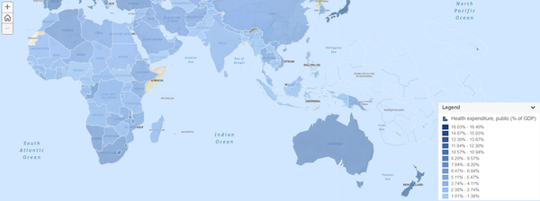
Geo Spatial Visualization, World Data Bank
World Data Bank proprietary geospatial visualization of their data. It allows user to select one series indicator of a topic to be represented on the graphical map. The main problem here is the inability to choose more than one series indicator to be represented on the graphical map to provide a holistic view of a particular topic.
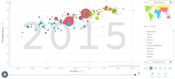
Global trends in health and economics using Bubble Plot, Hans Rosling
This is the classic bubble plot visualization used by Hans Rosling on during his presentation on Global trends in health and economics. This visualization supports up to 2 data dimensions data (X and Y axis) of the countries selected, across a time-series animation (years) to be displayed in the bubble plot. This is by far the best visualization representation of the health and economic trends we have seen. However, it still lacks the capability to include more than 2 data variables and other form of analytics visualization to have a deeper understanding of the issues and problems at hand.
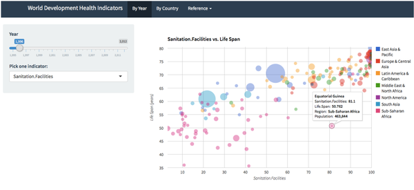
Quantifying Uneven Health Development in the World, Ziqiao (Cheryl) Liu
Expanding from Has Rosling Bubble Plot visualization techniques, Cheryl included additional line graph and histogram to visualize the trend of the world health data through country, year and topic filtering. This is another classic issue that was raised where more than one visualization need to be render across different pages to allow for a holistic visualization of the data presented.


