Difference between revisions of "Analysis"
Jump to navigation
Jump to search
m |
|||
| (3 intermediate revisions by the same user not shown) | |||
| Line 5: | Line 5: | ||
| | | | ||
|} | |} | ||
| + | |||
| + | |||
<h2>Preliminary Analysis in JMP </h2> | <h2>Preliminary Analysis in JMP </h2> | ||
| Line 21: | Line 23: | ||
| + | <br> | ||
| + | <br> | ||
<h2>Data Analysis in Tableau </h2> | <h2>Data Analysis in Tableau </h2> | ||
| − | [[File:Matilda sp1.png| | + | |
| + | |||
| + | <h6>Analysis of travel patterns</h6> | ||
| + | |||
| + | [[File:Matilda sp1.png|800px|center]] | ||
| + | |||
| + | |||
| + | |||
| + | |||
| + | |||
| + | <h6>Comparison with content from posts </h6> | ||
| + | |||
| + | [[File:Matilda sp2.png|800px|center]] | ||
| + | |||
| + | |||
| + | |||
| + | <h6>Hourly microblog feed dashboard</h6> | ||
| + | |||
| + | [[File:Matilda sp3.png|800px|center]] | ||
| + | |||
| + | |||
| + | |||
| + | <h6>Strategy for target narrowing</h6> | ||
| + | |||
| + | [[File:Matilda sp4.png|800px|center]] | ||
| + | |||
| + | |||
| + | |||
| + | <h6>Creating a holistic view </h6> | ||
| + | |||
| + | [[File:Matilda sp5.png|800px|center]] | ||
| + | |||
| + | |||
| + | |||
| + | <h6>Proliferation of disease dashboard</h6> | ||
| + | |||
| + | [[File:Matilda sp6.png|800px|center]] | ||
| + | |||
| + | |||
| + | |||
| + | <h2>Insights from Analysis</h2> | ||
| + | |||
| + | |||
| + | |||
| + | <h6>Suspicious events: Possible human to human transmission</h6> | ||
| + | |||
| + | [[File:Matilda sp7.png|800px|center]] | ||
| + | |||
| + | |||
| + | |||
| + | |||
| + | <h6>Suspicious events: Possible wind and water transmission</h6> | ||
| + | |||
| + | [[File:Matilda sp8.png|800px|center]] | ||
| + | |||
| + | |||
| + | |||
| + | <h2>Results and conclusion</h2> | ||
| + | |||
| + | |||
| + | |||
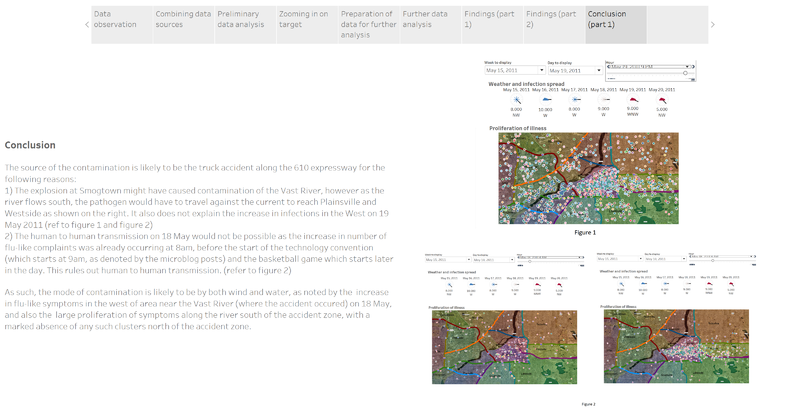
| + | <h6>Origin and channel of transmission</h6> | ||
| + | |||
| + | [[File:Matilda sp9.png|800px|center]] | ||
| + | |||
| + | |||
| + | |||
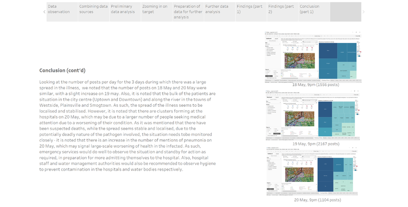
| + | <h6>Deployment of emergency services</h6> | ||
| + | |||
| + | [[File:Matilda sp10.png|800px|center]] | ||
Latest revision as of 18:35, 16 October 2017
| Overview | Data Preparation | Analysis and Results |
Contents
Preliminary Analysis in JMP

Due to the possibility of describing sickness in slang or terms which we are not as familiar with, the JMP text explorer was used to identify such terms through its in-built text analysis function.Terms such as those circled in red in the figure below were considered when compiling the list of symptoms to filter the posts with, in order to get more accurate results.
Also notable were its mention of a music festival and a truck accident, which we would later learn more about in our following analysis through visualisation of the data in Tableau.
Data Analysis in Tableau
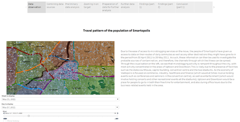
Analysis of travel patterns

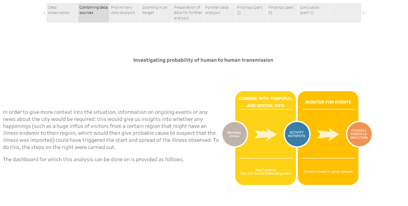
Comparison with content from posts

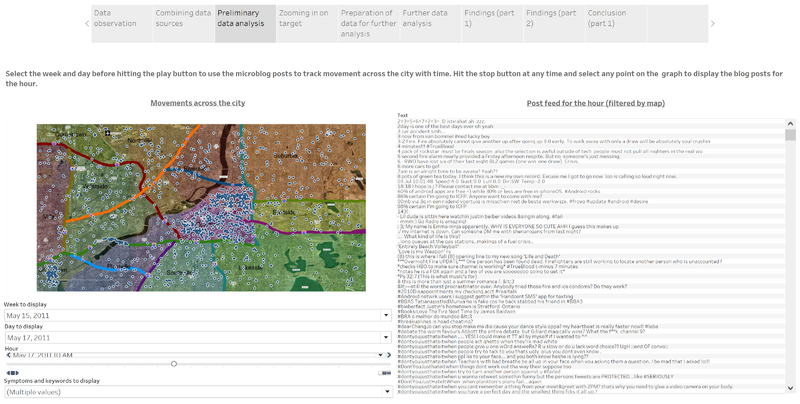
Hourly microblog feed dashboard

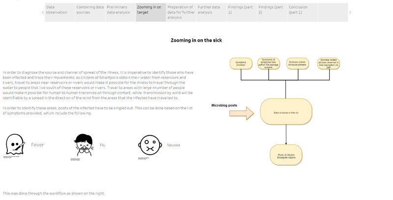
Strategy for target narrowing

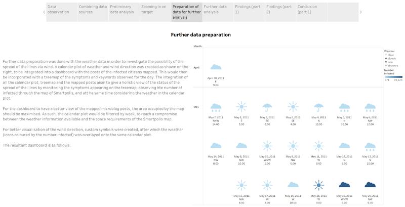
Creating a holistic view

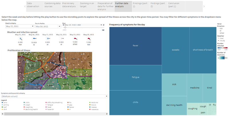
Proliferation of disease dashboard

Insights from Analysis
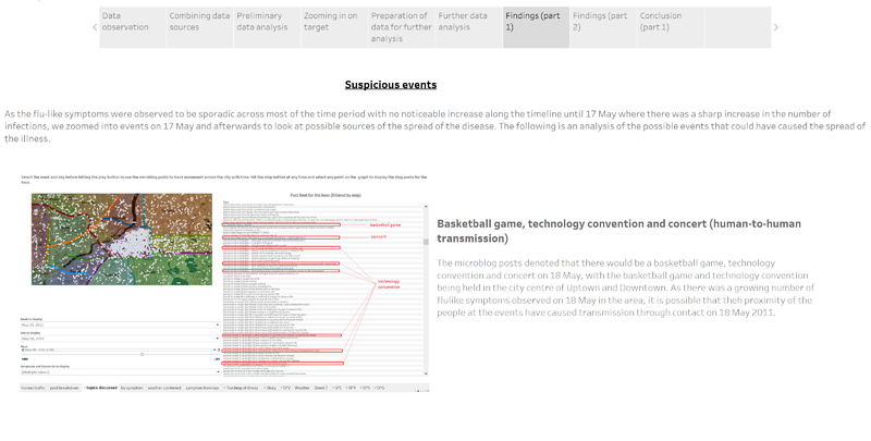
Suspicious events: Possible human to human transmission

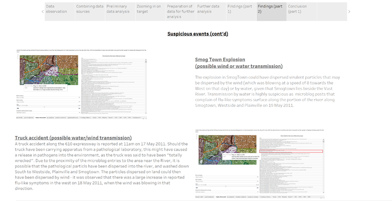
Suspicious events: Possible wind and water transmission

Results and conclusion
Origin and channel of transmission

Deployment of emergency services
