Difference between revisions of "ISSS608 2017-18 T1 Assign ZHANG LIDAN"
| Line 32: | Line 32: | ||
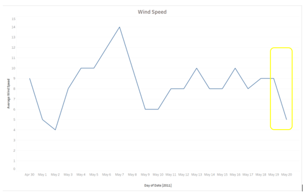
Nonetheless, there is good news that it was a slower wind speed on May 20. Thus, the number of infected people may increase in a slower speed. | Nonetheless, there is good news that it was a slower wind speed on May 20. Thus, the number of infected people may increase in a slower speed. | ||
[[File:10.png|600px|center]] | [[File:10.png|600px|center]] | ||
| + | ===Stomach problems distribution=== | ||
| + | |||
==reference== | ==reference== | ||
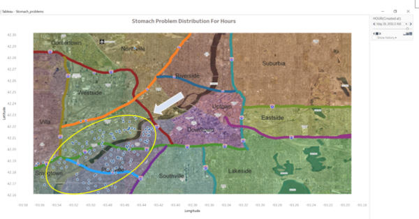
| − | + | There is another outbreak of stomach problem at 2 am on May 19, which happened below the 610 Highway and along the downstream of the Vast River. | |
| + | [[File:11.png|600px|center]] | ||
==feedback== | ==feedback== | ||
Revision as of 23:26, 12 October 2017
Contents
Background
Data Preparation
To better deal with the data, I import the microblog data set into the JMP at first. This dataset contains a lot of useful information. For example, I can use the location axis and the timestamp to identify where these rows are located. Then, through tokenizing and stemming the words in each message, I can filter the high frequency words and flulike-related keywords for further data exploration. The microblogs dataset contains 1,023,077 rows. Firstly, I need to separate the location into longitude and latitude. Then, because these locations are at the western, hemisphere, I should reverse the longitude coordinates into negative value. Next, to exclude the irrelevant information, I create the subset dataset which consists of main flulike symptoms, such as chill, flu, fever, sweat, pain, fatigue, ache, cough, breath, nausea, vomit, diarrhea. Here, I use the Text Explorer in JMP to generate these new columns.
Next, I create the bar chart to display the frequency of microblogs including the symptom words. From this table, it can be noticeable that there is a sharply increase in the frequency from May 18 to May 20, 2011.
Aiming to explore what happens from May 18 to May 20, I decide to reload the microblog dataset into JMP. Through observing the words in the text, I find the words are not only related to flulike symptoms, but also related to stomach problems. Then, I generate one dataset contains flulike symptoms like breath, cough, fatigue, fever, flu, and pneumonia, another dataset contains stomach ache symptoms like diarrhea, nausea, stomach and vomit.
Original and epidemic spread
Flulike problems distribution
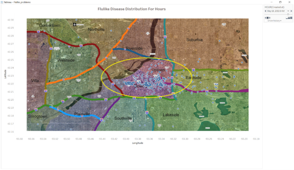
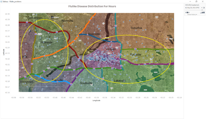
There are 29243 rows talking about some of the flulike symptoms. After I import the dataset and map and adjust the latitude and longitude coordinates, I use the Pages functions to observe the changes of the distribution by hours from April 30 to May 20. At 8 am on May 18, there was an outbreak of flulike disease in the Downtown, I guess it might be happen in Vastopolis Dome and Convention Center.
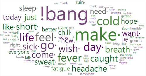
To confirm whether there is an outbreak of flulike disease in these areas, I display a Word Cloud to identify the location.
reasons of this flulike disease start
From the messages on May 17 and 18, there may be an Art Festival or Concert in Downtown. Besides, there was a supply for food. Therefore, the outbreak possibly started owing to the food or person-to-person. From the weather dataset, it was west wind from May 16 to May 19, so people in the Eastside were infected with flulike disease, however people in the west part were not. Therefore, I can identify this flu spread mainly because of airborne.
After 6 pm, most people went back to home after work, so other areas were infected gradually. From the following bar chart, there is an increase in daytime population among Downtown, Westside, Uptown. So, there are a large possibility for people who worked in Downtown and Uptown but lived in other areas infecting their families after work.
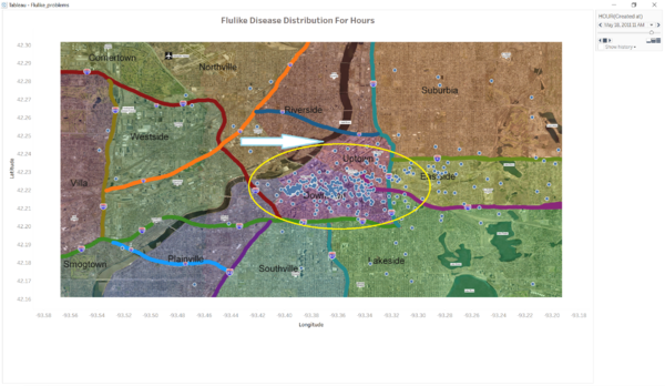
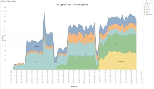
From 12 am, most people were ready to sleep, so there is less information about flu. However, from 2 am May 19, there is another outbreak of flu. I create another chart to show the changes of each symptom among different hours. In the following chart, it can be observed that it really exists an outbreak from 2 am on May 19. A large quantity of people caught the flu and more people were coughing and got a fever. In addition, there is no decrease in the number of flulike disease in next 48 hours.
From 7 am on May 20, there were lot of people go to hospital because of the serious flulike symptoms. It can be seen from the following map.
Nonetheless, there is good news that it was a slower wind speed on May 20. Thus, the number of infected people may increase in a slower speed.
Stomach problems distribution
reference
There is another outbreak of stomach problem at 2 am on May 19, which happened below the 610 Highway and along the downstream of the Vast River.

