Difference between revisions of "Group01 Report"
| Line 84: | Line 84: | ||
| − | == | + | ==CASE STUDY: Ministry of Health Data Analyst== |
Use case using Health Topic | Use case using Health Topic | ||
Revision as of 09:35, 2 December 2017
WORLD DEVELOPMENT INDICATORS: A NEW VISUAL PERSPECTIVE
A web-based analytics application to visualize countries development across the globe
|
|
|
|
|
|
Contents
Visual Design Framework
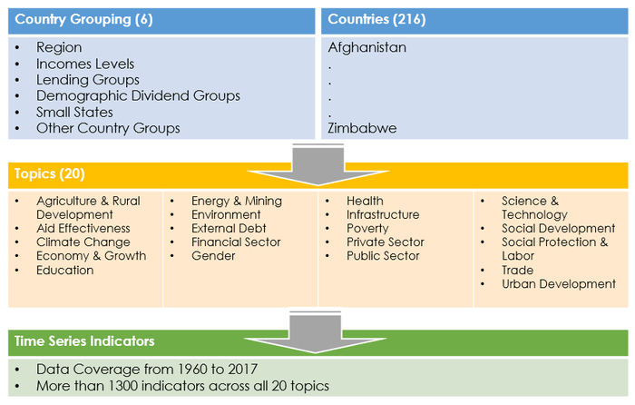
Raw Data
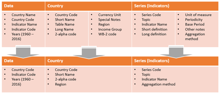
Data Tables
Visual Structure
Circlize in R
For development of the visual application, R will be used as the base code with the focus on using Circlize package to create the graphical visualization for WDI data.
The reason for selecting the Circlize package is that Circular layout is an efficient way for the visualization of massive amounts of information. This package provides an implementation of circular layout generation in R and provide the flexibility the use low-level and high-level graphics functions as defined by the team for specific purposes. Together with the seamless connection between the powerful computational and visual environment in R, it gives the team more convenience and freedom to design figures for better understanding complex patterns behind multiple dimensional data.
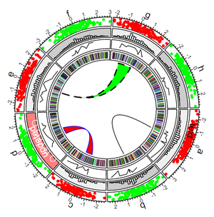
Circular visualization is commonly used in Genomics and related omics fields due to its efficiency in revealing associations in high dimensional genomic data. Other used case includes visualizing human movement related to Global Migration where movement can be plotted using Chord diagram function within the circular plot. In fact, this project where the team is undertaking will possibly be the first known project to use circular plot to represent the multi-dimensional data of the World Development Indicators.
Data structure and display
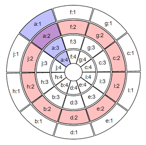
- A circular layout is composed of sectors, tracks and cells.
- As illustrated in the figure below, the pink circle is known as track, the blue section represents a sector and the intersection of a sector and a track is called a cell.
- Within each cell circlize allows the data to be displayed in the form of line graph, bar chart, histogram, scatterplot, heatmap, etc.
- For the inner-most track, Circlize also allows chord diagram to rendered to visualize movement as well as dendrogram to be rendered for clustering purposes.
Visual Representation
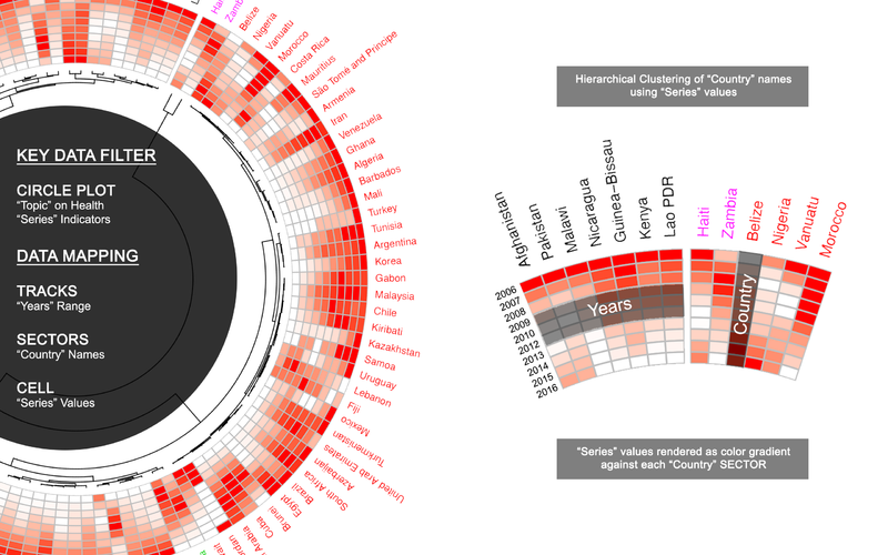
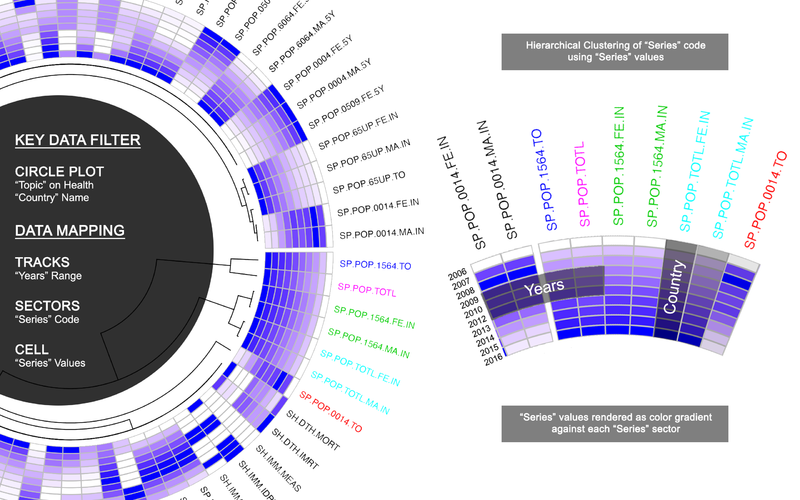
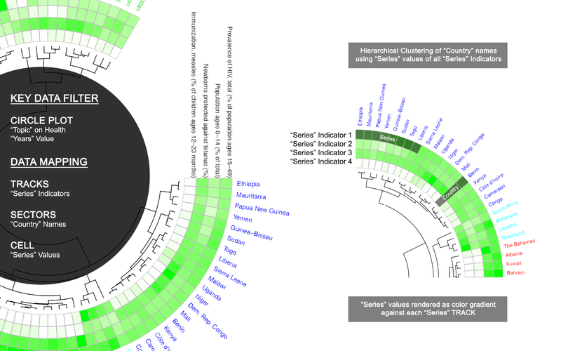
WDI data will be mapped into 3 circular plot in for 3 different type of visual representation as illustrated below:
Circular Plot (SeriesTrend)
Circular Plot (Country Trend)
Circular Plot (Series Comparison)
CASE STUDY: Ministry of Health Data Analyst
Use case using Health Topic
Limitation and Future Works
Limitation of the current application
The World Development Indicators visualization application are currently having the following limitations.
- Due to the incumbent restriction of the Shiny package, maximum file size allowed to be uploaded is 30MB which does not allow the application to load the full 56 years of data into the application unless manual remove of data is performed after downloading it from World Bank Data. Additionally, the application is also designed to only accept .csv file.
- Circular Plot is restricted by it’s 360 degrees view it is not advisable to selected too many data variables to be display all at once.
- The data range of the selected series indicator must not have any "blank" values, else the application will automatically exclude it from the final visual representation.
- The application currently only support trends analysis through the heatmap colour gradient representation. There is no other visual representation of the absolute values in other graphical form.
- As hierarchical clustering will be performed, the No. of Cluster cannot be less than the No. of Sector values selected to allow clustering to happen.
Future improvement of the application
The World Development Indicators visualization application has a lot of potential to be extended and enhanced further.
- The data file upload function could be replaced with an automated API call to read future data uploaded by World Bank data to allow for real-time analysis and exploration.
- The data model could be enhanced to automatically include new series indicators that World Bank might add from time to time.
- The application can also be enhanced to allow for country grouping filtering such as region, Incomes Levels, Lending Groups, etc. classified under the World Bank database.


