Difference between revisions of "Group 8 Report"
| Line 161: | Line 161: | ||
Type in the following package names under the ''"Packages"'' field and click 'Install'. | Type in the following package names under the ''"Packages"'' field and click 'Install'. | ||
| − | ''shiny, DT | + | ''shiny, DT, tidyverse, broom, sweep, tibbletime, lubridate, timetk, forecast, stringr, cowplot, shinycssloaders'' |
3. After the packages have finished installing, open the project files and click on ''"Run App"''. | 3. After the packages have finished installing, open the project files and click on ''"Run App"''. | ||
Revision as of 17:34, 1 December 2017
|
|
|
|
|
Contents
Abstract
Time-series analysis is a time and effort consuming endeavour. As budding data analysts, we spent considerable resources in experimenting with many variations of parameter configurations to analyse time-series data. This difficulty stems from the lack of automatic tools that can help calculate the optimized time-series parameters during model training. To tackle this challenge, we created an easy-to-use time-series exploration system that is accessible even to the uninitiated analyst. The system is able to decompose the time series data to its constituent parts, namely Seasonality, Trend and Random (Noise). It can generate several forecasting models, using Exponential Smoothing and ARIMA analysis techniques, to predict future time periods using optimization techniques. The system also allows other forms of time series data to be displayed and their forecasts compared using the given forecasting methods, within certain formats. To test the system capabilities, we adopted the Singapore Consumer Price Index (CPI) as our use case. The CPI, with its short-term forecasts, is often used for tuning Governmental policies to steer inflation rates in countries like Singapore and for foreign investors to consider allocating potential investment funds into the country. This paper seeks to document the eventual system functionalities and its underlying design principles.
1. Motivation of the application
During our personal data analysis research and experiences, we discovered a lack of freely available analysis tools that can help us optimize the parameter settings of time-series models. The result is a large amount of time and effort utilized to try out different combinations of parameters and waiting for the models to be trained in order to find one with the highest accuracy rates. An ideal time series system is one that would help estimate the model's accuracy rates automatically while data analysis is performed, so it is easy to choose the best models for further scrutiny. This system in particular would encompass features that are easy to understand for data exploration and accept generic forms of time-series data.
Besides fulfilling the need to utilize a better application for time series modelling, we are also motivated to explore the complex time-related trends of Singapore's CPI throughout the years (1990-2017) for different categories. We would like to use time-series visualization techniques such as tables and line charts representing Trend, Seasonality and Random (Noise) to investigate any potential insights and to display potential forecasts to the audience. The team was curious on how different categories of goods and services constitute a country's CPI index, and how these different categories of data would look like during our visualization. Hence, we find that the Singapore CPI data would make a suitable use case in our application.
Our objectives of this project can thus be summarized into the following points:
1. Provide interactive platform to illustrate the trends and seasonalities within given time-series data (i.e. Singapore's CPI) using exploratory filters and automatic optimization methods.
2. Discover data insights using visualization and interactivity that cannot be easily represented using raw data.
3. Make use of freely available Singapore economic data to arouse the interests of potential viewers and increase their curiosity on the current state of Singapore's consumer goods and services.
Our desire to work on this project is encouraged by the Singapore Government's initiative of 'SmartNation.sg', where data is made readily available to the general public for in-depth analysis. These datasets often provide interesting observations and opportunities for anyone who care to investigate.
2. Review and critic on past works
Professional visualization tools, such as Tableau, offer specialized features to perform visualization. But their primary goal is not in analyzing time-series data, but more on visualizing time-series data. Even though they do offer model training functionality via their scripting language, it can be quite a hassle to handle. A user would have to be proficient in importing non-native libraries into the tableau project and have to learn a new syntax to produce results.
Specialized data analysis tools such as SAS JMP and SAS Enterprise Miner offer comprehensive analytical features that can allow complex time-series models to be built. But it is exactly due to their list of functions that can intimidate even the seasoned data analysts. Their user interfaces can be cluttered with feature options and the visualizations that result from the analyses are lackluster compared to the graphs generated from visualization software like Tableau.
Both types of tools are well-appreciated by the data science community for different reasons, but it is with hope that our proposed application can fit nicely into the niche not covered by these two extremes.
3. Design framework
To design the ideal application we have in mind, we explore different system design and aesthetic principles learnt in our data visualization journey. These will be described and highlighted in detail in the following sub-sections.
3.1 Interface
Starting from the system's interface, the general color scheme consists of a calming shade of blue, with great areas of white and light grey. This color scheme is meant to reduce anxiety for data analysts trying to perform time-series data analysis. We also used consistent UI elements (from the Shinythemes package) throughout the pages to give users a sense of familiarity. UI controls are almost always placed on the left and visualizations on the right.
Our system's look-and-feel is designed in accordance to Shneiderman's mantra[1], his famous quote being: "Overview, zoom and filter, details on demand". This is illustrated in the way we organize the steps and our UI elements.
Overview
From the first tab: "Upload Data File", we allow the user to upload a time-series csv file and they will be able to preview the kind of data that is going to be analyzed. There is also a table located at the side panel describing the metadata of the uploaded data. These features allow a general grasp of the data before any actual data analysis.
Zoom and filter
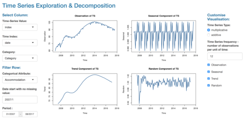
In the second tab, "Exploration", the left panel showcases a comprehensive set of filters that allow the user to narrow down the records in the dataset. Selection of different values would automatically result in the update of individual time-series charts on the main screen area, showing the zoomed in trend and seasonality data that was derived from the observation data.
Details on Demand
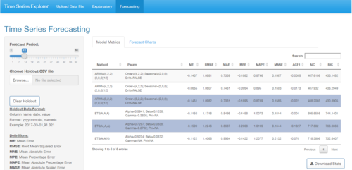
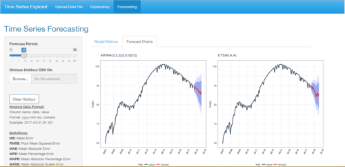
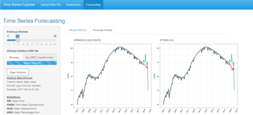
In the third tab, "Forecasting", the data has been focused and the user is now able to implement forecasting. Models with optimized parameters will be generated right from the start to provide convenience to the user and displayed in a sortable datatable. Forecast charts generated after model selection also extend and contract based on the number of models selected to provide some ease of visual comparisons. The forecasted time periods use a stark red line to denote its importance, along with two different shades of blue to denote the confidence intervals. Additional holdout data is also in a different shade of cyan, with this information present in the legend. The color distinctions are deliberate to allow users to easily distinguish between different information types. Due to the possible small size of the charts when multiple have been selected, title bars and background gridlines have been provided to guide the user.
3.2 Functionality Design
To ensure that the system has the necessary functions to perform accurate time series analysis without being too cluttered and overwhelming, the system functions are grouped into three simple steps.
Data Manipulation
Users are able to upload their own data via the first interface tab, the data files need to be pre-processed into certain formats before the upload can commence. The interface provided would allow some forms of data transformations such as the transposition of columns, the generation of an index column as a substitute for a missing datetime column, and the indication of missing time series periods. These functionalities are required because time series analysis needs data to be indexed by a form of datetime field. Metadata information of the uploaded dataset would be displayed for easy viewing and the uploaded dataset can also be previewed from the main panel.
Data Exploration
Users would then be able to explore the uploaded data, by interacting with the provided filter functions, such as denoting whether the data is additive or multiplicative trend, toggling the start and end dates of the data, and setting the frequency of the time-series periods. The system provides a feature to decompose time-series information into its constituent parts: Observation, Seasonal, Trend, Random (Noise). From the separate parts, users can understand the different time-series patterns and derive insights.
Forecasting
Finally, users would also be able to forecast time-series data that have been filtered out from the Data Exploration step. The forecasting techniques will utilize Exponential Smoothing and ARIMA techniques to perform predictions. An optimization algorithm will be used along with existing packages to find the best set of parameters and the top three models of each technique will be selected based on their AIC, BIC values. Once selected, the models can then be graphed on the page as a comparison.
3.3 R Programming and usage of R Packages
The application will be programmed using R, a versatile open-source programming language with numerous libraries/packages to choose from. The main package that we will be using is named "Shiny", and it is integral to produce our application in an interactive web format.
Various other packages will be used to allow our application to function properly, below is a list that describes what the packages are used for.
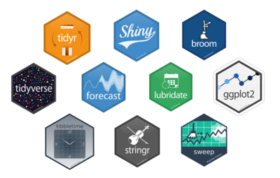
- Tidyverse - tidyr, dplyr, ggplot2:[2] A suite of commonly used libraries that allow the programmer to tidy and manipulate data easily. Data formats can be difficult to type cast or "coerce" into the relevant formats we want for our application. So these packages help us perform these transformations easier. ggplot2 in particular is our base package in terms of visualizing time-series charts. It follows the "Grammer of Graphics" framework, providing easy to use commands to customize our charts' look-and-feel.
- Shinythemes:[3] Aesthetics can be important to provide the user with a good experience. We used the Shinythemes package to provide consistent UI (user interface) elements from pre-packaged themes for our users.
- forecast[4], broom, sweep:[5] Besides "tidying" up the data formats for easier arrangement and manipulation, data models need to be "tidied" as well for easy forecasting functionality without any loss of information. The popular and powerful "forecast" package uses ts (time-series) objects that can be difficult to manipulate, and they are not known to always be compatible with other packages. We used "broom" and "sweep" packages to tackle this issue. The "sw_sweep" function from the sweep package uses broom-style tidiers to extract model infomation into 'tidy' data frames. The "sweep" package also uses the "timekit" package at the back-end to maintain the original time series index throughout the whole process.
- lubridate[6], tibbletime[7], timetk:[5] Due to the multiple different time-series formats we have to accept into our system, we used multiple datetime manipulation packages such as "lubridate", "tibbletime", and "timetk" to perform time-based data subsetting, conversion, manipulation, and extraction of datetime indices from ts objects from the "forecast" package.
- stringr:[8] The R language is not known for its strong string manipulation features, and normally requires the help of the "stringr" package to provide more advanced string-related functionality. With this package, we can use functions such as "str_count", "str_split", and "str_replace" to create valuable information for display.
- DT:[9] The "DT" package allows sortable data tables with filtering and paging functionality, instead of the base static tables provided by R for our user.
- cowplot:[10] Rendering dynamic graphs would normally entail having fixed positions of the charts on the main screen. This package allows graphs to be arranged dynamically into a single R Shiny "renderPlot" function with the chart dimensions changing based on the number of charts we would like to display.
- shinycssloaders:[11] Due to the long loading times during our model training process, we utilized this package to provide loading animations during long waits. This informs the user that patience will be rewarded while the model parameters are being optimized.
- rsconnect:[12] Finally, the "rsconnect" package allows us to upload our work onto a web domain directly from our IDE tool, R Studio. The application will then be open to the public for use.
4. Demonstration
To use a time-series dataset for our application for demonstration, we adopted the use case of using Singapore's Consumer Price Index (CPI) data. CPI is an economic measure of a country that is often used by foreign investors to consider investments into a particular country or for potential migrants to assess the standards of living for the country's citizens. The data describes how affordable or unaffordable goods or services are in the form of average weighted scores.
The Singapore CPI data that we are exploring is extracted from data.gov.sg[13], a Singapore government website that houses public data for the use of the nation's smart data initiative, 'SmartNation.sg'. The data is in a monthly format that reveals the figures from January 1961 to August 2017, while the index reference period is 2014. The data uses an overall index to represent any changes in the price level of the whole basket of items, and can also be drilled down to its sub-indices for different categories and sub-categories of goods and services. For our system analysis, we plan to use filtered data from 1990 onwards.
4.1 Sample test cases
<coming soon>
4.2 Interpretation of results
<coming soon>
5. Discussion
What has the audience learned from your work?
What new insights or practices has your system enabled?
A full blown user study is not expected, but informal observations of use that help evaluate your system are encouraged.
<coming soon>
6. Future Work
Given time constraints, the current application is only able to process limited types of time series data formats such as monthly-based data or datasets with system-generated indices. In the future, it would be good to cater to data of various formats, such as weekly and quarterly period data. If possible, data captured in miniscule time-scales such as seconds or minutes, should also be possible time data formats for the system to accept for analysis.
The system should also have a comprehensive error message system that can provide customized instructions or error handling features when one tries to perform operations that exceed the system's abilities.
More forecasting methods can be incorporated into the system. Techniques such as Extrapolation, Linear Prediction, Trend Estimation, Growth Curve, and Neural Network can be further explored to provide potential analytical features to users.
7. Installation guide
Data Preparation:
Datasets for upload need to be in .csv format. Since the data is of time-series type, a datetime field is recommended with minimal missing data.
Holdout data needs to be in .csv format as well with fixed columns, named as: <date> <value> The 'date' column format needs to be converted into the format: "yyyy-mm-dd" before uploading. The 'value' column format needs to be numeric.
Online Use:
The recommended web browser would be Google Chrome for accessing our application webpage.
Besides that, no other special tools are required.
Local Use:
At the point of the project, R Studio version 1.1.383 was used to create the application.
1. Install R Studio version 1.1.383 from: https://www.rstudio.com/
2. Open the installed R Studio application, and under the top menu, select Tools > Install Packages...
Type in the following package names under the "Packages" field and click 'Install'.
shiny, DT, tidyverse, broom, sweep, tibbletime, lubridate, timetk, forecast, stringr, cowplot, shinycssloaders
3. After the packages have finished installing, open the project files and click on "Run App".
8. User Guide
This section details the actual steps in using the system.
Step 1:
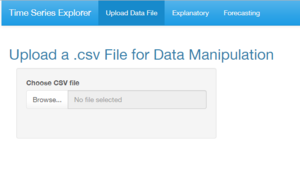
When the app loads, users can click on the "Browse..." button in the "Upload Data File" tab, to select a time-series data .csv file to upload.
Step 2:
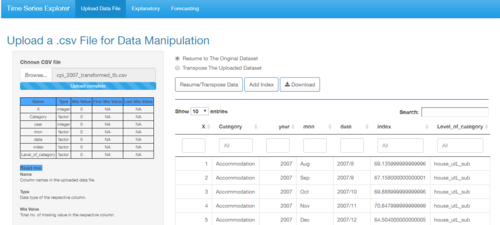
After the upload is complete, users can see several sections of information.
On the left-hand side panel, the table displays the various column names (Name), data type (Type), the count of missing records (Mis Value), as well as the position of the missing values (First Mis Value, Last Mis Value).
The main screen on the right, will show a preview of the uploaded data, complete with filter, search, paging and sorting functions.
Step 2.1 (optional):
- If the uploaded dataset does not have a datetime column for time-series analysis, users have an option to click on "Add Index", to generate a new column named "newIndex" that is essentially a running number index column. This will then be converted into a pseudo-datetime column for visualization later.
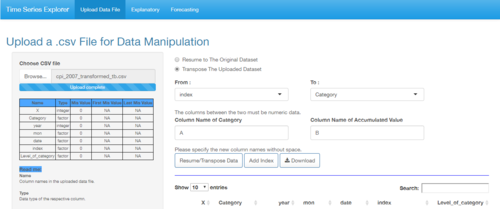
- Users can also click on the "Transpose The Uploaded Dataset" radio button to perform some data transformations from row to column. After selecting the "From:" and "To" field, enter in the newly renamed "Column Name of Category" and "Column Name of Accumulated Value", before clicking on the "Resume/Transpose Data" button. The transposed columns will appear at the far-right of the preview table.
- For any desire to revert any changes made, simply click on the "Resume to The Original Dataset" radio button, and click again on the "Resume/Transpose Data" button to revert all changes back to the original dataset.
- Users can also click on the "Download" button to download the transformed dataset onto their local drive.
Step 3:
Click on the "Explanatory" tab, and there are many filter options to use at the left-hand panel. In the "Select Column:" section, choose the data columns for "Time-Series Value", "Time Index" and "Category" to dynamically load the type of attributes to filter.
The main screen will display the time-series chart for the main observation data selected, along with its decomposed Seasonal, Trend and Random components.
These charts are useful to understand the behaviour of the time-series data.
Users can then change the "Categorical Attribute", "Date start with no missing value" and "Period" fields to filter out the records.
For the "Customise Visualisation" section, there is also an option to denote whether the time-series data is "multiplicative" or "additive".
Seasoned analysts would know that the calculations done for these two types of time-series data are quite different.
The "Time Series Frequency" can also be set, with the default value of "12" to denote months in a year.
Step 3.1 (optional):
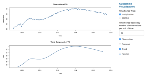
Users can also filter out the sub-graphs by clicking on their respective checkboxes at the end. All four sub-graph checkboxes are checked by default.
Step 4:
After making the selections from the left-hand panel, click on the "Forecasting" tab to allow the system to run a series of calculations to find the best parameters for both Exponential Smoothing and ARIMA models.
After giving it sometime, a table will be generated on the main screen. These are the best models chosen for their lowest AIC/BIC values and users can compare the various accuracy scores (based on train data only).
Users can then click on the various rows for closer scrutiny and click on the "Forecast Charts" tab to generate line charts with their respective forecasts.
The "Forecast Period" slider on the left hand panel allows users to select how far ahead the charts can forecast up to.
To save the model parameters, click on the "Download Stats" button. To save the charts, simply right-click and copy the charts to the clipboard or save manually.
Step 4.1 (optional):
There is also an option for the user to upload "Holdout data" by clicking on the browse button under the slider.
Once uploaded, the charts will automatically reflect the additional actual data in the line charts, for comparison with the predicted values.
Click on the "Clear Holdout" button to clear the holdout line from the charts.
Model Results Interpretation:
Interpreting the forecasting results requires some understanding on how the "ets()" and "auto.arima()" functions from the powerful "forecast" package work. From the ETS forecasting metrics, the letters A, M, and N stand for "additive", "multiplicative", and "none" respectively. From the ARIMA model metrics, the three parameters in the function stand for "number of autoregressive term", "number of non-seasonal differences", and "number of lagged forecast error terms or moving average term" respectively. The method column value that shows ETS(A,A,A), is describing an "Additive Holt-Winters' Method with Additive Errors" model, and a value of ARIMA(1,1,0) is describing a "Differenced first order AR model". More examples can be found under the reference links.[14][15]
Users can then choose the models based on their preferred accuracy or goodness-of-fit measures, such as Mean Error, Root Mean Squared Error, or AIC/BIC scores.
The generated charts themselves are pretty straightforward to interpret, with red lines denoting forecasted values, cyan lines as uploaded holdout data, and the blue regions of the chart denote 80% and 95% confidence intervals.
9. Acknowledgements
We thank Prof. Kam Tin Seong for his unending patience and his availability to offer us his consultation advice.
References
- ↑ Brown, Simon.[1] "Shneiderman's mantra", Posted on 8 January 2015, Retrieved on 30 November 2017
- ↑ tidyverse.org. [2] "R packages for data science", Retrieved on 30 November 2017
- ↑ Chang, W, RStudio, and etc. [3] "shinythemes: Themes for Shiny", Retrieved on 30 November 2017
- ↑ Hyndman, R, and etc. [4] "forecast: Forecasting Functions for Time Series and Linear Models", Retrieved on 30 November 2017
- ↑ 5.0 5.1 www.business-science.io. [5] "Open Source Software For Business & Financial Analysis", Retrieved on 30 November 2017
- ↑ Spinu, V, and etc. [6] "lubridate: Make Dealing with Dates a Little Easier", Retrieved on 30 November 2017
- ↑ Vaughan, D, and etc. [7] "tibbletime: Time Aware Tibbles", Retrieved on 30 November 2017
- ↑ Wickham, H and RStudio. [8] "stringr: Simple, Consistent Wrappers for Common String Operations", Retrieved on 30 November 2017
- ↑ Xie, Y, and etc. [9] "DT: A Wrapper of the Javascript Library 'DataTables'", Retrieved on 30 November 2017
- ↑ Wilke, C, and etc. [10] "cowplot: Streamlined Plot Theme and Plot Annotations for 'ggplot2'", Retrieved on 30 November 2017
- ↑ Sali, A, and etc. [11] "shinycssloaders: Add CSS Loading Animations to 'shiny' Outputs", Retrieved on 30 November 2017
- ↑ Allaire, J. [12] "rsconnect: Deployment Interface for R Markdown Documents and Shiny Applications", Retrieved on 30 November 2017
- ↑ Government of Singapore. [13], Last Updated on 30 November 2017, Retrieved on 30 November 2017
- ↑ Hyndman, R.[14] "Forecasting using R", Retrieved on 30 November 2017
- ↑ Nau, R. [15] "Introduction to ARIMA: nonseasonal models", Retrieved on 30 November 2017

